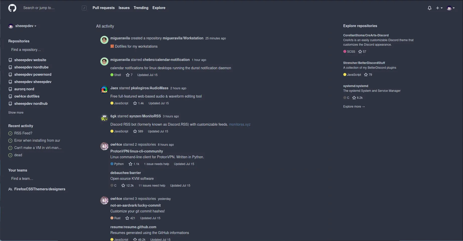
🎨 github theme based on the nord color scheme
nordhub by sheep
Imported and mirrored from https://github.com/sheeepdev/nordhub/raw/main/nordhub.user.css
Details
Authorsheep
LicenseCC-BY-4.0
Categorygithub
Created
Updated
Code size20 kB
Code checksumf093b58f
Statistics
Learn how we calculate statistics in the FAQ.
Failed to fetch stats.
Description
Notes
Userstyle doesn't have notes.Source code
Source code has over 10K characters, so we truncated it. You can inspect the full source code on install link./* ==UserStyle==
@name nordhub
@description 🧊 an arctic, north-bluish theme for github
@namespace https://github.com/sheeepdev/nordhub
@homepageURL https://github.com/sheeepdev/nordhub
@supportURL https://github.com/sheeepdev/nordhub/issues
@author sheep <me@sheepdev.xyz> (https://github.com/sheeepdev)
@version 2.0.0
@license CC-BY-4.0
==/UserStyle== */
@-moz-document domain('github.com') {
:root {
--bg: #2e3340;
--bg-light: #3b4252;
--bg-lighter: #434c5e;
--bg-lightest: #4c556a;
--bg-transparent: #2e3340f1;
--accent: #5e81ac;
--accent-light: #81a1c1;
--accent-lighter: #88c0d0;
--accent-lightest: #8fbcbb;
--text-color: #d8dee9;
--white: #d4d7db;
--green: #a3be8c;
--orange: #d08770;
--red: #bf616a;
}
body {
background: var(--bg);
color: var(--text-color);
min-height: 100vh;
}
.Box, .color-bg-primary, .gh-header, .orghead, .Box-row--gray {
background: var(--bg) !important;
}
.Box--responsive, .Box-header--blue, .Box-row {
border: none;
}
.Box-header--blue {
background: var(--bg-light)
}
.Box.mb-3 {
background: var(--bg-light) !important;
border-radius: 20px !important;
border: none;
}
.Box-header--blue {
border-radius: 20px;
}
a {
color: var(--accent)
}
.Header, .color-bg-secondary, .timeline-comment, .timeline-comment-header, .gh-header .gh-header-sticky.is-stuck + .gh-header-shadow, .header-search-wrapper, .jump-to-field-active, .color-bg-tertiary, .color-bg-canvas-inset, .markdown-body img, .rgh-clean-dashboard .js-news-feed-event-group, .rgh-clean-dashboard .dashboard .flex-items-baseline.py-3 {
background: var(--bg) !important;
color: var(--text-color);
border: none;
}
.timeline-comment--caret::before {
background-color: var(--bg) !important;
}
.State--open {
background: var(--green);
color: var(--text-color);
border: none;
}
.gh-header-meta, .Link--secondary, .color-text-secondary, .color-text-tertiary, .UnderlineNav-octicon, .UnderlineNav-item {
color: var(--text-color) !important;
}
.Link--secondary:hover, .social-count:hover {
color: var(--accent) !important;
}
.jump-to-suggestions-results-container .navigation-focus .jump-to-suggestions-path, .jump-to-suggestions-results-container [aria-selected="true"] .jump-to-suggestions-path {
background: var(--accent);
border: none;
}
.jump-to-suggestions {
box-shadow: none;
border-radius: 20px;
border: none;
}
.UnderlineNav .Counter {
background: var(--bg-lightest);
color: var(--text-color);
}
.UnderlineNav-item.selected, .UnderlineNav-item[aria-current]:not([aria-current="false"]), .UnderlineNav-item[role="tab"][aria-selected="true"] {
border-bottom-color: var(--accent)
}
.btn.hover, .btn:hover, [open] > .btn, .btn, .social-count {
background: var(--bg-light);
border: none;
}
.text-pink {
color: var(--accent) !important;
}
.btn .octicon, .subnav-search-icon, .subnav-search-input, .subnav-search-input::placeholder {
color: var(--text-color);
}
.SelectMenu-modal {
border: none;
border-radius: 20px;
background: var(--bg-light);
box-shadow: none;
}
.SelectMenu-item, .SelectMenu-list {
background: var(--bg-light);
}
.menu {
background: var(--bg-light);
border-radius: 20px;
border: none;
}
.menu-item, .repo-language-color {
border: none;
}
.input-contrast, .input-contrast:focus {
background: var(--bg-light);
border: none;
}
.form-control.focus, .form-control:focus, .form-select.focus, .form-select:focus {
box-shadow: none;
}
.open.octicon {
color: var(--green)
}
.Link--primary:hover, .p-label:hover, .team-mention:hover, .user-mention:hover, .Link--muted:hover {
color: var(--accent) !important;
}
.p-label, .repo {
color: var(--text-color)
}
.color-border-secondary, .border-bottom, .py-3, .rgh-clean-dashboard .dashboard .js-all-activity-header + div {
border: none !important;
}
.Link--muted {
color: var(--text-color) !important;
}
.rgh-clean-dashboard .dashboard .flex-items-baseline .f6.mt-2 {
opacity: 100% !important;
}
.input-contrast::placeholder {
color: var(--text-color)
}
.f4 > a {
color: var(--text-color)
}
.owner .text-normal, .btn-primary.disabled, .btn-primary:disabled, .btn-primary[aria-disabled="true"] {
color: var(--text-color) !important;
}
.text-bold.min-width-0.flex-auto > span, .text-bold.min-width-0.flex-auto, .TimelineItem-badge {
color: var(--text-color)
}
.markdown-body h1, .markdown-body h2 {
border: none;
}
.color-text-success {
color: var(--green) !important;
}
.discussion-timeline-actions, .page-responsive .previewable-comment-form .comment-form-head.tabnav, .tabnav-tab.selected, .tabnav-tab[aria-current]:not([aria-current="false"]), .tabnav-tab[aria-selected="true"], .timeline-comment--caret.current-user::before {
background: var(--bg);
border: none;
}
.TimelineItem::before, .TimelineItem-badge {
background: var(--bg-lightest) !important;
border: none;
}
.color-text-danger {
color: var(--red) !important;
}
.btn-primary.disabled, .btn-primary:disabled, .btn-primary[aria-disabled="true"] {
background: var(--green);
border: none;
opacity: 70%
}
.dropdown-menu, .merge-status-item, .merge-status-list {
background: var(--bg-light);
border: none;
box-shadow: none;
border-radius: 20px;
}
.checks-list-item.selected .checks-list-item-name {
background: var(--accent) !important;
border-top-right-radius: 20px;
border-bottom-right-radius: 20px;
}
.color-bg-success-inverse {
background: var(--green) !important;
}
.commit-ref {
border-radius: 10px;
background: var(--accent)
}
.commit-ref > .css-truncate-target > a {
color: var(--text-color)
}
.full-commit, .full-commit .commit-meta, .file {
background: var(--bg);
border: none;
}
.file-header, .file {
background: var(--bg-light);
border-radius: 20px;
}
.js-expandable-line:hover .blob-num:not(:hover) .directional-expander:first-child, .js-expandable-line:hover .blob-num:not(:hover) + .blob-code, .blob-num-expandable .directional-expander:hover, .blob-num-expandable .directional-expander, tr.js-expandable-line:nth-child(16) > td:nth-child(2), .blob-expanded .blob-code, .blob-expanded .blob-num, .btn.selected, .btn[aria-selected="true"] {
background: var(--bg-light) !important;
}
tr.js-expandable-line:nth-child(56) > td:nth-child(2) {
background: var(--bg-light) !important;
}
tr:not(.blob-expanded) + .blob-expanded .blob-code, tr:not(.blob-expanded) + .blob-expanded .blob-num, .blob-expanded + tr:not(.blob-expanded) .blob-code, .blob-expanded + tr:not(.blob-expanded) .blob-num {
border: none;
}
tr.js-expandable-line:nth-child(16) {
border-bottom-left-radius: 20px !important;
}
.js-expandable-line:hover .blob-num:not(:hover) .directional-expander:first-child, .js-expandable-line:hover .blob-num:not(:hover) + .blob-code {
background: var(--accent) !important;
}
.blob-code-deletion .x, .blob-code-deletion, .blob-num-deletion {
background: var(--red)
}
.blob-code-addition, .blob-code-addition .x, .blob-num-addition {
background: var(--green)
}
.blob-num-addition, .commit-branches {
color: var(--text-color)
}
.blob-code-inner, .blob-code-deletion .x, .blob-code-addition .x {
color: #FFFFFF
}
.pl-smw, .pl-v {
color: var(--accent-lightest)
}
.blob-num-deletion {
color: var(--text-color)
}
.upload-enabled.focused {
box-shadow: none;
}
.upload-enabled textarea {
border: none;
}
.btn-link, .btn-outline:hover, [open] > .btn-outline, .btn-outline, [open] > .btn-outline {
color: var(--accent);
}
.diffstat-block-added {
outline: none;
background: var(--green)
}
.diffstat-block-deleted {
outline: none;
background: var(--red);
}
.diffstat-block-neutral {
outline: none;
background: var(--bg-lightest)
}
a > .css-truncate, .follow-list .follow-list-info {
color: var(--text-color);
}
.tabnav-tab, .Counter {
border: none;
}
.Counter {
background: var(--bg-lightest)
}
.btn-outline.disabled, .btn-outline:disabled, .btn-outline[aria-disabled="true"], .BtnGroup > a {
background: var(--bg-light);
color: var(--text-color);
}
.btn-outline:disabled:hover {
color: var(--accent)
}
.Box {
border: none;
box-shadow: none !important;
}
.border, .dropdown-divider {
border: none !important;
}
#feature-enrollment-toggle > button {
color: var(--text-color);
}
.dropdown-item:focus, .dropdown-item:hover {
background: var(--accent)
}
.css-truncate.css-truncate-target.width-fit.color-text-primary.text-left > span:hover, .js-user-status-details.details-reset.details-overlay.details-overlay-dark:hover {
color: var(--accent)
}
.Box-header {
background: var(--bg-light);
border: none;
}
.blankslate p, .blankslate-icon, .issue-meta-section .octicon, .TimelineItem--condensed .TimelineItem-badge {
color: var(--text-color)
}
.subnav-item.selected, .subnav-item[aria-current]:not([aria-current="false"]), .subnav-item[aria-selected="true"] {
background: var(--accent);
border: none;
}
.merged.octicon {
color: var(--accent-light)
}
.closed.octicon, .reverted.octicon {
color: var(--red)
}
.js-issue-row .text-gray [aria-label*="approval"]::before, .js-issue-row .color-text-secondary [aria-label*="approval"]::before {
color: var(--green) !important;
}
.rgh-collaborator {
border: none !Important;
}
.State--merged, .rgh-clean-conversation-headers-non-default-branch {
color: var(--text-color);
background: var(--accent-light);
border: none;
}
.signed-commit-badge.verified:hover {
border: none;
}
.signed-commit-badge.verified, .signed-commit-verified-label, .signed-commit-header .octicon-verified {
color: var(--green)
}
.TimelineItem-break {
background: var(--bg);
border: none;
}
.btn {
border-...