Enhances XVideos' Large Player by making the video player span the full width of the page, similar to YouTube's Theatre Mode.
XVideos Theatre Mode by butt_plung3r
Details
Authorbutt_plung3r
LicenseNo License
Categoryxvideos
Created
Updated
Code size4.1 kB
Code checksum533c3931
Statistics
Learn how we calculate statistics in the FAQ.
Failed to fetch stats.
Description
Notes
This stylesheet makes use of modern CSS features. TLDR: use a modern, up-to-date browser.
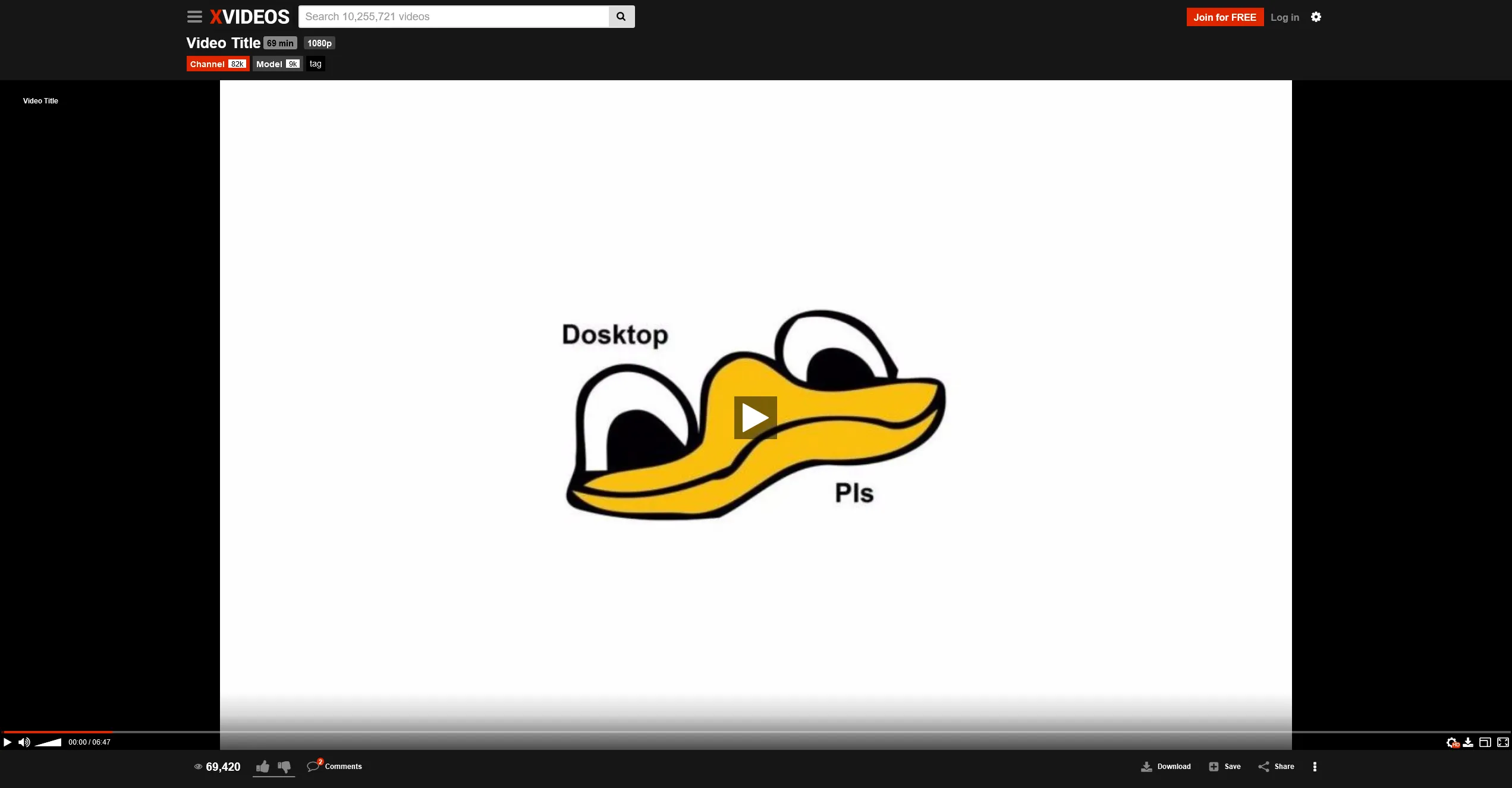
Make sure to toggle large player on.
Source code
/* ==UserStyle==
@name           XVideos Theatre Mode
@namespace      butt_plung3r
@version        2025-03-02.1
@description    XVideos for the big screen! Use large player.
@author         butt_plung3r
==/UserStyle== */

@-moz-document domain("xvideos.com") {

	body {
		width: 100%;
		padding-left: 4px;
		padding-right: 4px;
	}

	.head__top.width-full-body,
	.head__menu-line.width-full-body {
		width: 100%;
		margin-left: 0;
		margin-right: 0;
	}

	#page {
		max-width: unset;
	}
	#header,
	#nav,
	.search-premium-tabs,
	.page-title,
	.search-filters,
	.video-metadata,
	#video-player-bg,
	#video-tabs,
	.related-content,
	#tabComments_bottom_page,
	#footer {
		max-width: 1280px !important;
		margin: 0 auto !important;
		padding: 0 0.5rem !important;
	}
	#search-associates {
		max-width: 1280px !important;
		margin-left: auto !important;
		margin-right: auto !important;
	}


	#page.video-page {
		#content > *:not(#video-player-bg) {
			display: none !important;
		}
		#video-player-bg {
			display: block;
			margin-left: auto;
			margin-right: auto;
		}
		.player-enlarged {
			#video-player-bg {
				max-width: unset !important;
				padding: 0 !important;

				#html5video.embed-responsive,
				#player {
					padding-bottom: min(56.25%, 99vh);
				}
			}
		}
	}

	#html5video #hlsplayer .video-bg-pic {
		.video-click-handler,
		.video-pic {
			left: 0;
			width: 100%;
			margin: 0;
		}
	}

	/* Related vids */

	#page .mozaique {
		display: grid;

		& > .clearfix {
			display: none;
		}
		& > .pagination {
			grid-column-start: 1;
		}
		& > .thumb-block {
			width: 100%;
		}
		.premium-results-line {
			display: none !important;

			grid-column-start: 1;

			display: flex;
			flex-flow: row wrap;

			.premium-results-line-title,
			.premium-results-line-see-more {
				width: 100%;
			}
		}
	}

	/* Responsive fixes */
	/* Max constraints */

	@media (max-width: 767px) {
		body.body--video .head__top {
			width: 100%;
		}
		#mobile-header-links,
		#page.video-page #content {
			margin-left: 0;
			margin-right: 0;
		}
	}

	/* Min constraints */

	@media (min-width: 480px) {
		#page .mozaique .premium-results-line .thumb-block {
			width: 100%;
		}
	}

	@media (min-width: 640px) {
		#page .mozaique {
			grid-template-columns: repeat(2, 1fr);

			& > .pagination {
				grid-column-end: 3;
			}
			.premium-results-line {
				grid-column-end: 3;

				.thumb-block {
					width: 50%;
				}
			}
		}
	}

	@media (min-width: 960px) {
		#page .mozaique {
			grid-template-columns: repeat(3, 1fr);

			& > .pagination {
				grid-column-end: 4;
			}
			.premium-results-line {
				grid-column-end: 4;

				.thumb-block {
					width: 33%;
				}
			}
		}
	}

	@media (min-width: 1280px) {
		#page .mozaique {
			grid-template-columns: repeat(4, 1fr);

			& > .pagination {
				grid-column-end: 5;
			}
			.premium-results-line {
				grid-column-end: 5;

				.thumb-block {
					width: 25%;
				}
			}
		}
	}

	@media (min-width: 1440px) {
		#header,
		#nav,
		.search-premium-tabs,
		.page-title,
		.search-filters,
		.video-metadata,
		#video-player-bg,
		#video-tabs,
		.related-content,
		#tabComments_bottom_page,
		#footer {
			max-width: 1920px !important;
		}
		#search-associates {
			max-width: 1920px !important;
		}
	}

	@media (min-width: 1600px) {
		#page .mozaique {
			grid-template-columns: repeat(5, 1fr);

			& > .pagination {
				grid-column-end: 6;
			}
			.premium-results-line {
				grid-column-end: 6;

				.thumb-block {
					width: 20%;
				}
			}
		}
	}

	@media (min-width: 1920px) {
		#page .mozaique {
			grid-template-columns: repeat(6, 1fr);

			& > .pagination {
				grid-column-end: 7;
			}
			.premium-results-line {
				grid-column-end: 7;

				.thumb-block {
					width: calc(100% / 6);
				}
			}
		}
	}

	/* Optional Styles */

	.related-content {
		max-width: unset !important;
	}

}