Better Web Discord by ifreaku
Details
Authorifreaku
LicenseNo License
Categorydiscord
Created
Updated
Code size128 kB
Code checksum24871ce7
Statistics
Learn how we calculate statistics in the FAQ.
Failed to fetch stats.
Description
Notes
Change Log
- Added Radial Status - 30 Jan 2022
- Added Better Badges - 30 Jan 2022
- Added Modern Channel Indicators - 30 Jan 2022
Issues
- Some Features won't Work on Mozilla Firefox (Maybe).
Source code
Source code has over 10K characters, so we truncated it. You can inspect the full source code on install link./* ==UserStyle==
@name Better Web Discord
@version 20220204.13.21
@namespace userstyles.world/user/ifreaku
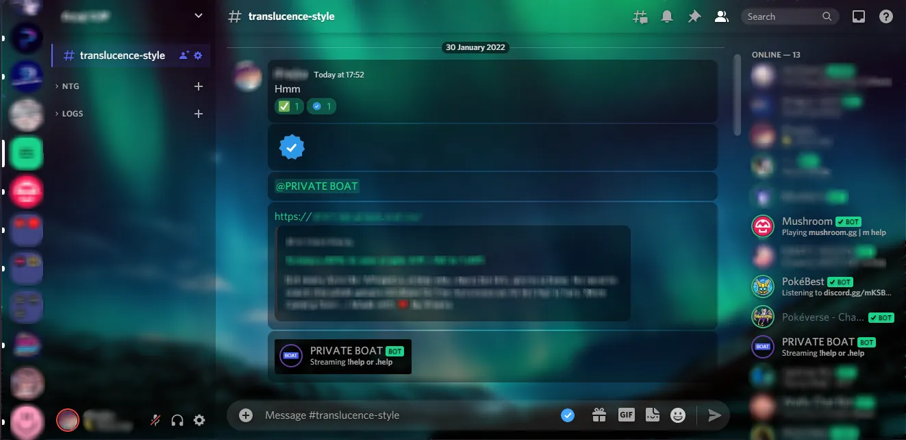
@description **Better Web Discord** taken from **Better Discord** App **Themes And Plugins** To Make Your **Web Discord Better**.
------------------------------------------------------------------------------------------------
### Themes And Plugins I Used.
- [Translucence](https://betterdiscord.app/theme/Translucence)
- [RadialStatus](https://betterdiscord.app/theme/RadialStatus)
- [Better Badges](https://betterdiscord.app/theme/Better%20Badges)
- [Modern Channel Indicators](https://betterdiscord.app/theme/Modern%20Channel%20Indicators)
@author ifreaku
@license No License
==/UserStyle== */
@-moz-document domain("discord.com") {
/* ...
@preprocessor stylus
@var select theme "Theme" ["dark:Dark theme", "light:Light theme"]
... */
@import url("https://capnkitten.github.io/BetterDiscord/Themes/user-icons.css");
/* Theme */
@import url("https://discordstyles.github.io/RadialStatus/dist/RadialStatus.css");
/* RadialStatus */
@import url('https://mr-miner1.github.io/Better-Badges/src/badges.css');
/* Better Badges */
@import url('https://discord-theme-addons.github.io/modern-channel-indicators/src/support/compiled.css');
/* Modern Channel Indicaters */
:root {
--app-bg: url(https://i.imgur.com/bgmVeyt.jpg);
--app-blur: 6px;
--app-margin: 1px;
--app-radius: 10px;
--app-accent-image: none;
--app-accent-rgb: 27, 213, 140;
--app-accent-opacity: 1;
--app-accent-text: #000;
--sidebar-color: rgba(0, 0, 0, 0.4);
--main-content-color: rgba(0, 0, 0, 0.2);
--messages-color: rgba(0, 0, 0, 0.4);
--messages-radius: var(--app-radius);
--messages-padding: 8px;
--mention-rgb: var(--app-accent-rgb);
--mention-hover-color: var(--app-accent-text);
--mention-alt: #5274e9;
--notification-color: #fff;
--textarea-color: 255, 255, 255;
--textarea-alpha: 0.1;
--textarea-alpha-focus: 0.15;
--textarea-text-color: #fff;
--textarea-radius: 22px;
--input-height: 36px;
--input-radius: calc(var(--input-height) / 2);
--card-color: rgba(0, 0, 0, 0.4);
--card-color-hover: rgba(0, 0, 0, 0.5);
--card-color-select: rgba(0, 0, 0, 0.7);
--card-radius: var(--app-radius);
--button-color: rgba(var(--app-accent-rgb), var(--app-accent-opacity));
--button-action-color: #000;
--button-text-color: var(--app-accent-text);
--button-radius: var(--app-radius);
--button-alt-color: var(--card-color);
--alert-color: #f04747;
--alert-action-color: #fff;
--alert-text-color: #fff;
--popout-color: rgba(0, 0, 0, 0.55);
--popout-blur: 8px;
--popout-header-opacity: 0.3;
--popout-header-shadow: 0px 3px 9px 0px rgba(0, 0, 0, 0.25);
--popout-radius: var(--app-radius);
--popout-shadow: 0 8px 10px 1px rgba(0, 0, 0, 0.14), 0 3px 14px 2px rgba(0, 0, 0, 0.12), 0 5px 5px -3px rgba(0, 0, 0, 0.2);
--nowplaying-color: 88, 101, 242;
--streaming-color: 89, 54, 149;
--spotify-color: 29, 185, 84;
--supporter-color: rgba(var(--app-accent-rgb), var(--app-accent-opacity));
--tooltip-color: rgba(var(--app-accent-rgb), var(--app-accent-opacity));
--tooltip-text-color: var(--app-accent-text);
--tooltip-font-size: 14px;
--tooltip-padding: 8px 12px;
--tooltip-radius: var(--app-radius);
--tooltip-shadow: var(--elevation-high);
--interactive-normal: #aaa;
--interactive-hover: #ddd;
--interactive-active: #fff;
--interactive-muted: #777;
--channels-default: #aaa;
--header-secondary: #dfdfdf;
--background-primary: transparent;
--background-modifier-hover: rgba(255, 255, 255, 0.075);
--background-modifier-selected: rgba(255, 255, 255, 0.125);
--background-modifier-accent: rgba(255, 255, 255, 0.175);
--channels-default: var(--interactive-normal);
--text-muted: var(--interactive-normal);
--transition-time: 250ms;
--transition-type: cubic-bezier(0.4, 0, 0.2, 1);
--scrollbar-color: 255, 255, 255;
--scrollbar-color-alt: 0, 0, 0;
--scrollbar-opacity: 0.2;
--scrollbar-opacity-hover: 0.3;
--scrollbar-width: 10px;
--font-primary: Whitney, "Helvetica Neue", Helvetica, Arial, sans-serif !important;
--font-display: Whitney, "Helvetica Neue", Helvetica, Arial, sans-serif !important;
--rs-small-spacing: 1px;
/* Gap between avatar and status for members list/dms | MUST end in px */
--rs-medium-spacing: 2px;
/* Gap between avatar and status for User popout | MUST end in px */
--rs-large-spacing: 3px;
/* Gap between avatar and status for User profiles | MUST end in px */
--rs-small-width: 2px;
/* Thickness of status border for members list/dms | MUST end in px */
--rs-medium-width: 3px;
/* Thickness of status border for User popout | MUST end in px */
--rs-large-width: 4px;
/* Thickness of status border for User profile | MUST end in px */
--rs-avatar-shape: 50%;
/* 50% for round - 0% for square */
--rs-online-color: #43b581;
/* Colour for online status */
--rs-idle-color: #faa61a;
/* Colour for idle status */
--rs-dnd-color: #f04747;
/* Colour for dnd status */
--rs-offline-color: #636b75;
/* Colour for offline status */
--rs-streaming-color: #643da7;
/* Colour for streaming status */
--rs-invisible-color: #636b75;
/* Colour for invisible status - Note: this will only show for your own invisibility */
--rs-phone-color: var(--rs-online-color);
/* Colour of the ring and phone icon when a user is on their phone | */
--rs-phone-visible: block;
/* Visibility of the phone icon next to a users avatar. | block = visible | none = hidden */
--badge-size: 22px;
/*discord defualt = 18px, theme defualt = 22px;*/
--badge-margin: 1.5px;
/*discord default = 2px, theme defualt = 1.5px*/
--badges-everywhere-size: 15px;
/*default = 15px*/
/* ---- base -- */
--indicator-hovered: rgba(79, 84, 92, 0.25);
--indicator-rounding: var(--popout-radius);
;
--indicator-border-info: 2px solid;
/* ---- selected -- */
--indicator-selected: 88, 101, 242;
--indicator-selected-border: rgba(var(--indicator-selected));
--indicator-selected-background: rgba(var(--indicator-selected), 0.1);
--indicator-selected-hover: rgba(var(--indicator-selected), 0.18);
/* ---- unreads -- */
--indicator-unread: 255, 255, 255;
--indicator-unread-border: rgba(var(--indicator-unread), 0.6);
--indicator-unread-background: rgba(var(--indicator-unread), 0.01);
/* ---- connected -- */
--indicator-connected: 87, 242, 135;
--indicator-connected-border: rgba(var(--indicator-connected));
--indicator-connected-background: rgba(var(--indicator-connected), 0.1);
--indicator-connected-hover: rgba(var(--indicator-connected), 0.18);
}
/*
*
* APP ELEMENTS
*
*/
body {
background-color: transparent;
}
.appMount-2yBXZl {
background: var(--app-bg);
background-repeat: no-repeat;
background-position: center;
background-size: cover;
}
.layers-OrUESM {
z-index: 1;
}
.layers-OrUESM {
margin: calc(var(--app-margin) / 2) var(--app-margin) var(--app-margin) var(--app-margin);
border-radius: var(--app-radius);
overflow: hidden;
}
.layers-OrUESM:before {
position: absolute;
content: " ";
width: calc(100% + (var(--app-margin) * 2));
height: calc(100% + (var(--app-margin) * 2) + 24px);
top: calc((var(--app-margin) + 24px) * -1);
left: calc(var(--app-margin) * -1);
background-image: var(--app-bg);
background-repeat: no-repeat;
background-position: center;
background-size: cover;
background-attachment: fixed;
filter: blur(var(--app-blur));
pointer-events: none;
z-index: -1;
}
.typeMacOS-3V4xXE + .app-3xd6d0 .layers-OrUESM {
margin: var(--app-margin);
}
.app-2CXKsg,
.bg-1QIAus {
background-color: transparent;
}
.appMount-2yBXZl * {
text-shadow: 0px 1px 2px rgba(0, 0, 0, 0.5);
}
.anchor-1MIwyf {
color: rgba(var(--app-accent-rgb), var(--app-accent-opacity));
}
.appMount-2yBXZl svg {
filter: drop-shadow(0px 1px 2px rgba(0, 0, 0, 0.5));
}
::selection {
background: rgba(var(--app-accent-rgb), 0.65);
color: var(--app-accent-text);
}
/* APP ELEMENTS -> TOP BAR */
.titleBar-1it3bQ {
height: 24px;
}
.wordmarkWindows-2dq6rw {
color: #fff;
}
.withFrame-2dL45i {
margin-top: 0;
}
.winButton-3UMjdg {
height: 100%;
top: 0;
color: #fff;
}
.platform-osx .wrapper-1_HaEi {
margin-top: 0;
padding-top: 35px;
}
.platform-osx .tree-3tCaw8 {
margin-top: 32px;
}
.typeMacOS-3V4xXE {
top: var(--app-margin);
left: var(--app-margin);
}
.typeMacOS-3V4xXE .macButtons-eIdy0e {
width: 72px;
border-top-left-radius: var(--app-radius);
}
.typeMacOS-3V4xXE .macButtons-eIdy0e .macButton-2M5W_9 {
cursor: pointer;
}
.topic-11NuQZ a {
color: rgba(var(--app-accent-rgb), var(--app-accent-opacity));
}
/* APP ELEMENTS -> NOTIFICATION BAR */
.notice-2FJMB4,
.notice-1tZwqv,
.noticeWrapper-8z511t,
.colorInfo-1kEg3T,
.noticeSurvey-1XW9Ln.noticeInfo-3_iTE1.notice-2FJMB4.size14-y91Il2.height36-36OHCc {
/*margin: 0 var(--app-margin);*/
background-color: rgba(var(--app-accent-rgb), var(--app-accent-opacity));
background-image: var(--app-accent-image);
/*border-radius: 18px !important;*/
border-radius: 0;
border-top-right-radius: var(--app-radius);
box-shadow: none;
color: var(--app-accent-text);
}
.notice-2HEN-u,
.noticeStreamerMode-2TSQpg {
margin: 0;
background-color: rgba(var(--streaming-color), 0.5);
border-radius: 0 !important;
color: #fff;
}
.notice-2FJMB4 + .notice-2FJMB4 {
margin-top: 4px;
}
#outdatedPlugins > span,
#pluginNotice #outdatedPlugins span {
color: var(--app-accent-text) !important;
}
.notice-2FJMB4 .button-1MICoQ {
color: var(--app-...