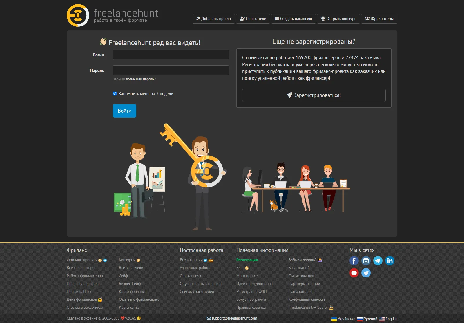
Freelancehunt Dark Theme
Freelancehunt Dark Theme by foxhands
Details
Authorfoxhands
LicenseNo License
Categoryfreelance
Created
Updated
Size8.5 kB
Statistics
Learn how we calculate statistics in the FAQ.
Failed to fetch stats.
Description
Notes
Userstyle doesn't have notes.Source code
/* ==UserStyle==
@name         Freelancehunt Dark Theme
@version      20220217.07.44
@namespace    userstyles.world/user/foxhands
@description  Freelancehunt Dark Theme

https://taplink.cc/foxhand7
@author       foxhands
@license      No License
==/UserStyle== */

@-moz-document url-prefix("https://freelancehunt.com/"), url-prefix("https://freelancehunt.work/") {
.introjs-tooltip,
.color-orange {
    background: peru;
}


.specialization .rating-container .rating-block,
table.table-adaptive>tbody>tr>td,
.redesigned-container .well,
.table-double-striped tbody tr:nth-child(4n+3),
.table-double-striped tbody tr:nth-child(4n+1),
.qq-gallery.qq-uploader,
.btn-default.active.focus,
.btn-default.active:focus,
.btn-default.active:hover,
.btn-default:active.focus,
.btn-default:active:focus,
.btn-default:active:hover,
.open > .dropdown-toggle.btn-default.focus,
.open > .dropdown-toggle.btn-default:focus,
.open > .dropdown-toggle.btn-default:hover,
.btn-default.focus,
.btn-default:focus,
.btn-default.active,
.btn-default:active,
.open > .dropdown-toggle.btn-default,
.form-control[disabled],
.form-control[readonly],
fieldset[disabled] .form-control .alert-warning,
ul.portfolio-snippets li,
.select2-container--default .select2-selection--single,
.job-list-item,
.select2-dropdown,
.table-striped > tbody > tr:nth-of-type(odd),
.promo-page-header,
.progress,
.news,
.poweredFooter,
.panel,
#skill-group-selector .panel-heading,
.select2-container--default .select2-results__option--highlighted[aria-selected],
.select2-container--default .select2-results__option[aria-selected=true],
.select2-container--default .select2-selection--multiple .select2-selection__choice,
.btn-success,
.nav-pills > li.active > a,
.nav-pills > li.active > a:focus,
.nav-pills > li.active > a:hover,
.nav > li > a:focus,
.nav > li > a:hover,
.select2-container--default .select2-selection--multiple,
.popover-title,
.real-skill-bar-container .progress-bar,
#activity-feed tr,
.active-tasks-widget ul.tasks,
ul.tags li > span,
.chat-box .arrow-box-left,
.alert-success,
.file-uploader-drag-and-drop,
.gray-theme.fr-box.fr-basic .fr-wrapper,
.gray-theme.fr-toolbar,
ul.nav.nav-tabs.fancy > li > a,
.alert-info,
.widget > div.widget-header,
.progress-steps li.done > div,
.progress-steps li,
.chat-box-thread #thread-messages-load > div,
.chat-box-thread .message-body,
.well,
.dropdown-menu > li > a:focus,
.dropdown-menu > li > a:hover,
.pagination ul > .active > a,
.pagination ul > .active > span,
.pagination ul > li > a:focus,
.pagination ul > li > a:hover,
.dropdown-menu,
.btn-default:hover,
.btn-default,
.form-control,
.table-normal,
.table-normal tbody tr:nth-child(2n),
.table-normal tbody tr,
.table-normal thead tr th,
body:not(.frontpage),
body,
#top-nav,
ul.filter li.public-link,
.sidenav
  {
    background-color: #222 !important;
    color: #ddd;
  }

  .qq-gallery .qq-upload-button,
.thumbnail,
.select2-container--default .select2-search--dropdown .select2-search__field,
.popover,
.img-thumbnail,
.modal-content,
.gray-theme.fr-desktop .fr-command.fr-btn-hover,
.gray-theme.fr-desktop .fr-command.fr-expanded,
.gray-theme.fr-desktop .fr-command:focus,
.gray-theme.fr-desktop .fr-command:hover,
ul.nav.nav-tabs.fancy > li.dropdown.open > a,
ul.nav.nav-tabs.fancy > li > a:hover,
ul.nav.nav-tabs.fancy > li.active > a,
ul.nav.nav-tabs.fancy > li.active > a:focus,
ul.nav.nav-tabs.fancy > li.active > a:hover,
.progress-steps li:last-child,
.pagination > ul > li > a,
.page
  {
    background-color: #333;
    color: #ddd;
  }

  .progress-steps li > div.active
  {
    background-color: #222;
  }

  .introjs-tooltip,
ul.portfolio-snippets li,
.thumbnail,
.select2-container--default.select2-container--focus .select2-selection--multiple,
.select2-container--default .select2-selection--multiple,
.select2-container--default .select2-selection--single,
.job-list-item,
.btn-success,
.select2-container--default .select2-selection--multiple,
.profile-completeness-widget,
.active-tasks-widget ul.tasks,
.chat-box .arrow-box-left,
.file-uploader-container,
.fr-box,
.fancy-tab-container,
.widget,
.well,
.btn-default,
.input-group > input.form-control,
.form-control,
.table-normal tbody tr:nth-child(2n),
.table-normal,
.table-normal tbody tr,
.table-normal thead tr th,
.sidenav
  {
    border: 1px solid #555;
  }

  .tree a:focus,
.tree a:hover,
#skill-group-selector .panel a:hover,
#skill-group-selector .panel ul li.active,
#skill-group-selector .panel ul li a:hover,
.dropdown-menu a:hover
  {
    text-decoration: underline !important;
  }

  .redesigned-container .btn-default.focus, .redesigned-container .btn-default:focus, .redesigned-container .btn-default:hover,
.select2-container--default .select2-selection--single .select2-selection__rendered,
.job-list-item .job-description,
.job-list-item .job-name,
.job-list-item .company .company-name,
.job-list-item .company .company-name:hover,
.redesigned-container .panel.panel-stealth .panel-heading,
.tree a:focus,
.tree a:hover,
.tree a,
.text-muted,
#skill-group-selector .panel a:hover,
#skill-group-selector .panel ul li.active,
#skill-group-selector .panel ul li a:hover,
#skill-group-selector .panel a,
.redesigned-container .btn-default,
h3.profile-section-header,
.widget-header,
a.like-text,
.close:focus,
.close:hover,
.close,
.gray-theme.fr-box.fr-basic .fr-element,
.gray-theme.fr-popup .fr-command.fr-btn,
.gray-theme.fr-toolbar .fr-command.fr-btn,
h1,
h2,
h3,
h4,
h5,
.chat-box-thread .message-header .profile-name,
.dropdown-menu > li > a,
.message-threads-filter-panel i,
.sidenav > li > a,
a,
a:hover,
a:active,
a:focus
  {
    color: #ddd;
  }

  .form-control:focus
  {
    box-shadow: none;
  }

  #activity-feed tr:hover,
.sidenav > li > a:focus,
.sidenav > li > a:hover,
.sidenav > li.active > a
  {
    background-color: #444 !important;
    color: #ddd;
  }

  .progress-steps li > div:after
  {
    border-left-color: #ddd;
  }

  .progress-steps li.done + li > div:before,
.progress-steps li > div:before
  {
    border-left-color: #222;
  }

  .fr-toolbar,
.sidenav > li > a
  {
    border-bottom: 1px solid #444 !important;
  }

  .table-normal > tbody > tr > td
  {
    border-top: 1px solid #444;
  }

  table.table-adaptive>tbody>tr>td,
ul.nav.nav-tabs.fancy > li > a,
ul.nav.nav-tabs.fancy > li.dropdown.open > a,
ul.nav.nav-tabs.fancy > li > a:hover,
.chat-box-thread #thread-messages-load > div,
.chat-box-thread .message-body
  {
    border: none !important;
  }

  body:not(.frontpage)
  {
    background-image: none;
  }

  .alert-success,
.alert-info
  {
    border-color: #00ae5a;
      color: seagreen;
    background-color: #222222;
  }


.alert-warning {
    border-color: #e08a10;
    color: sandybrown;
    background-color: #222222;
}

  .blur
  {
    pointer-events: all;
    opacity: 1;
    -webkit-filter: none;
    -moz-filter: none;
    -o-filter: none;
    -ms-filter: none;
    filter: none;
  }

  .progress-steps li > div.active
  {
    color: #FFC107;
  }

div.alert-warning>a {
    color: #ddd;
}

/** if not verification **/
.verification-list-items .verification-item .verification-item-hints {
    text-align: center;
    background-color: #555555;
}

.verification-list-items .verification-item .verification-item-name {
    font-size: 24px;
    color: #fff;
    background-color: #555;
}
.verification-list-items .verification-item .verification-item-btn-block {
    align-items: flex-end;
    background-color: #555;
}

/** btn color **/

.btn-primary.active.focus, .btn-primary.active:focus, .btn-primary.active:hover, .btn-primary:active.focus, .btn-primary:active:focus, .btn-primary:active:hover, .open>.dropdown-toggle.btn-primary.focus, .open>.dropdown-toggle.btn-primary:focus, .open>.dropdown-toggle.btn-primary:hover {
    color: #fff;
    background-color: #222222;
    border-color: #333333;
}
.btn-primary {
    background-color: #2d4261;
    border-color: #2D4263;
}

.btn-primary:hover {
    background-color: #2d4863;
    border-color: #2d4863;
}

/** flicks**/
span.flicks {
    padding: 3px 6px;
    color: #fff;
    border-radius: 3px;
    background-color: peru;
    font-weight: 700;
}

/* tags */
ul.tags>li .tag {
    display: block;
    padding: 0 10px;
    border-radius: 4px;
    text-decoration: none;
    background-color: #222222;
    text-transform: lowercase;
    white-space: nowrap;
    transition: all .1s linear;
    color: #aaa;
    height: 20px;
    font-size: 13px;
    line-height: 20px;
}

ul.tags>li .tag:hover {
    color: #999;
    background-color: #11141c;
}

}