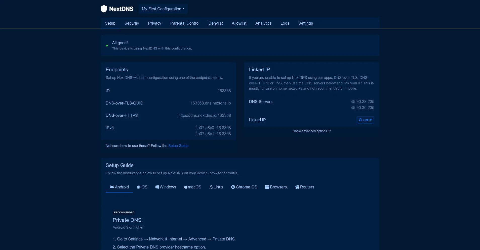
Custom theme for NextDNS.io with configurable colors.
NextDNS - custom theme by tidy-easy-stockade
Details
Authortidy-easy-stockade
LicenseCopyleft
Categorynextdns
Created
Updated
Code size15 kB
Code checksum25686388
Statistics
Learn how we calculate statistics in the FAQ.
Failed to fetch stats.
Description
Notes
Choose your colors in the Stylus settings.
Done mainly for me, but you are welcome to suggest changes: gritty.flag9090@fastmail.com
Source code
Source code has over 10K characters, so we truncated it. You can inspect the full source code on install link./* ==UserStyle==
@name NextDNS.io
@version 1.1.13
@namespace userstyles.world/user/tidy-easy-stockade
@description Dark theme for NextDNS.io
@author tidy-easy-stockade
@license No License
@preprocessor stylus
@var color baseColor "Base Theme Color" #000c1a
@var color accentColor "Accent Theme Color" #0d7dff
==/UserStyle== */
@-moz-document domain("my.nextdns.io") {
/**
* Config
**/
:root {
--accent: accentColor;
--accent-darken: var(--accent-30);
--accent-darken-100: darken(accentColor, 70%);
--accent-5: lighten(accentColor, 5%);
--accent-10: lighten(accentColor, 10%);
--accent-20: lighten(accentColor, 20%);
--accent-30: lighten(accentColor, 30%);
--accent-40: lighten(accentColor, 40%);
--accent-50: lighten(accentColor, 50%);
--accent-60: lighten(accentColor, 60%);
--accent-70: lighten(accentColor, 70%);
--accent-80: lighten(accentColor, 80%);
--accent-90: lighten(accentColor, 90%);
--accent-100: lighten(accentColor, 100%);
if dark(baseColor) {
--base-0: lighten(baseColor, 0%);
--base-5: lighten(baseColor, 5%);
--base-10: lighten(baseColor, 10%);
--base-20: lighten(baseColor, 20%);
--base-30: lighten(baseColor, 30%);
--base-40: lighten(baseColor, 40%);
--base-50: lighten(baseColor, 50%);
--base-60: lighten(baseColor, 60%);
--base-70: lighten(baseColor, 70%);
--base-80: lighten(baseColor, 80%);
--base-90: lighten(baseColor, 90%);
--base-100: lighten(baseColor, 100%);
} else {
--base-0: darken(baseColor, 0%);
--base-5: darken(baseColor, 5%);
--base-10: darken(baseColor, 10%);
--base-20: darken(baseColor, 20%);
--base-30: darken(baseColor, 30%);
--base-40: darken(baseColor, 40%);
--base-50: darken(baseColor, 50%);
--base-60: darken(baseColor, 60%);
--base-70: darken(baseColor, 70%);
--base-80: darken(baseColor, 80%);
--base-90: darken(baseColor, 90%);
--base-100: darken(baseColor, 100%);
}
--background: baseColor;
--card-background: var(--base-5);
--card-footer-background: var(--base-10);
--button-background: var(--card-background);
--button-border: var(--base-20);
--dropdown-background-hover: var(--base-20);
--dropdown-background-active: var(--dropdown-background-hover);
--nav-background: var(--card-background);
--text-color: var(--base-70);
}
}
@-moz-document domain("my.nextdns.io") {
/**
* Global
**/
body {
background-color: var(--background);
color: var(--text-color);
}
a {
color: var(--accent-20);
&:hover {
color: var(--accent-50);
}
}
/**
* Buttons
*/
.btn-primary {
background-color: var(--accent);
color: var(--accent-darken-100);
border-color: var(--accent);
&:hover {
background-color: darken(accentColor, 20%);
border-color: darken(accentColor, 20%);
}
&.focus,
&:focus {
box-shadow: none;
}
}
.btn-outline-primary {
color: var(--accent);
border-color: var(--accent);
&:hover {
background-color: var(--accent);
color: var(--accent-90);
}
}
.btn-light,
.btn-light:disabled {
background-color: var(--button-background);
color: var(--text-color);
border-color: var(--button-border);
transition: border .3s, opacity .3s;
}
.btn-light:disabled {
opacity: .5;
}
.btn-light.focus, .btn-light:focus, .btn-light:hover,
.btn-light:not(:disabled):not(.disabled).active, .btn-light:not(:disabled):not(.disabled):active, .show > .btn-light.dropdown-toggle,
.dropdown-menu {
background-color: var(--button-background);
color: var(--text-color);
border-color: var(--accent-darken);
}
.btn-light:not(:disabled):not(.disabled).active:focus, .btn-light:not(:disabled):not(.disabled):active:focus, .show > .btn-light.dropdown-toggle:focus {
box-shadow: none;
border-width: 2px;
}
.dropdown-item, .dropdown-item.text-primary, .dropdown-item.active, .dropdown-item:active, .dropdown-item:focus, .dropdown-item:hover, .text-primary.dropdown-item:focus, .text-primary.dropdown-item:hover {
color: var(--text-color) !important;
}
.dropdown-item.active, .dropdown-item:active {
background-color: var(--dropdown-background-active);
}
.dropdown-item:focus, .dropdown-item:hover {
background-color: var(--dropdown-background-hover);
}
.dropdown-divider {
border-color: var(--accent-darken);
}
/**
* Forms
**/
.form-control,
.form-control:focus,
.custom-select,
.custom-select:focus {
background-color: var(--base-10);
}
.form-control,
.custom-select {
color: var(--base-60);
border-color: var(--base-20);
}
.form-control:focus,
.custom-select:focus {
color: var(--text-color);
border-color: var(--accent-darken);
box-shadow: none;
}
input.form-control {
&::placeholder {
color: var(--accent-50);
}
}
.form-select {
--bs-border-color: var(--base-20);
background-color: var(--card-background);
background-image: none;
}
.custom-control-label::before {
background-color: var(--base-5);
border-color: var(--accent);
}
.custom-control-label::after {
background-color: var(--accent-5) !important;
}
.custom-control-input:checked ~ .custom-control-label::before {
background-color: var(--accent-60);
border-color: var(--accent-10);
}
/* Checkbox */
.form-check {
position: relative;
&-label {
--size: 8px;
background-color: var(--base-0);
display: block;
width: var(--size);
height: var(--size);
margin-top: calc(var(--size) / -2);
margin-bottom: 0;
border: none;
border-radius: 50%;
position: absolute;
top: 50%;
left: 0;
transform: translateX(calc(var(--size) / 2));
transition: transform .3s;
}
&-input {
--bs-border-color: var(--base-40);
background-color: var(--base-30);
&,
&:checked {
background-image: none !important;
}
&:checked {
--bs-border-color: var(--accent-20);
background-color: var(--accent-20);
border-color: var(--bs-border-color);
+ .form-check-label {
transform: translateX(20px);
}
}
}
}
/**
* Helpers
**/
.text-muted {
color: var(--base-70) !important;
}
.list-group-item {
--bs-list-group-border-color: var(--base-20);
img[src*="data"] {
filter: brightness(0) invert(1);
}
}
/**
* Modal
**/
.modal-content {
background-color: var(--base-5);
}
.modal-header {
color: var(--text-color);
border-bottom-color: var(--base-20);
html:not(.tw) &,
& {
background-color: var(--base-20);
}
.close {
color: var(--text-color);
}
.btn-close {
background: none;
color: var(--text-color);
filter: none;
display: flex;
align-items: center;
justify-content: center;
position: relative;
&::before {
content: "\2715";
font-size: 1.5em;
line-height: 1;
}
&:focus {
--bs-btn-close-focus-shadow: 0 0 0 .2em currentcolor;
}
}
}
.modal-footer {
border-top-color: var(--base-10);
}
}
@-moz-document domain("my.nextdns.io") {
/**
* my.nextdns.io
**/
[data-bs-theme] .Header {
background-color: var(--background);
border-bottom-color: var(--base-10);
position: relative;
}
[data-bs-theme] .Header::after {
content: "";
display: block;
border-bottom: 1px solid hsl(0, 0%, 15%);
position: absolute;
bottom: -2px;
right: 0;
left: 0;
}
.Header {
img {
if dark(baseColor) {
filter: brightness(0) invert(1);
} else {
filter: brightness(0) saturate(100%);
}
}
.show.dropdown {
.dropdown-item {
+ div {
display: none;
}
}
}
}
/**
* Navigation
**/
.nav {
background: var(--nav-background) !important;
border: none;
}
.nav .nav-link {
color: var(--text-color);
border: 2px solid transparent;
transition: border .3s;
}
.nav .nav-link:focus {
border-color: var(--accent);
}
.nav .nav-link:hover {
border: 2px solid transparent;
border-bottom-color: var(--accent);
}
.nav .nav-link.active {
background-color: transparent;
color: var(--text-color);
border: 2px solid transparent;
border-bottom-color: var(--accent-darken);
}
/**
* Content
**/
.card,
.list-group-item {
background-color: var(--card-background);
color: var(--text-color);
}
.list-group-item {
background-color: lighten(baseColor, 7%) !important;
transition: background-color .3s;
}
.list-group-item:hover {
background-color: var(--base-5) !important;
}
.list-group-item .btn-link {
color: var(--base-100) !important;
}
/**
* Setup Guide
**/
.Setup {
.card {
&-body {
span {
&[style*="rgb(46"] {
color: var(--accent) !important;
}
&[style*="27)"] {
color: var(--accent-40) !important;
}
&[style*="54)"] {
color: var(--base-60) !important;
}
}
}
}
}
#setup-guide .nav-link {
color: var(--text-color);
border-bottom: 2px solid transparent;
border-radius: 0;
transition: border .3s;
}
#setup-guide .nav-link:hover {
border-bottom-color: var(--accent-darken);
}
#setup-guide .nav-link.active {
background-color: transparent;
border-bottom-color: var(--accent);
}
#setup-guide .d-inline-block,
#setup-guide .list-group-item .mt-2 {
background-color: var(--base-10) !important;
border-color: var(--base-20) !important;
}
#setup-guide .list-group-item .mt-2 .notranslate {
color: var(--text-color) !important;
}
/**
* Privacy
**/
.list-group-flush {
.list-group-item[style^="border-left:"] {
border-left-color: var(--base-30) !important;
}
}
/**
* Parental Control
**/
.list-gr...