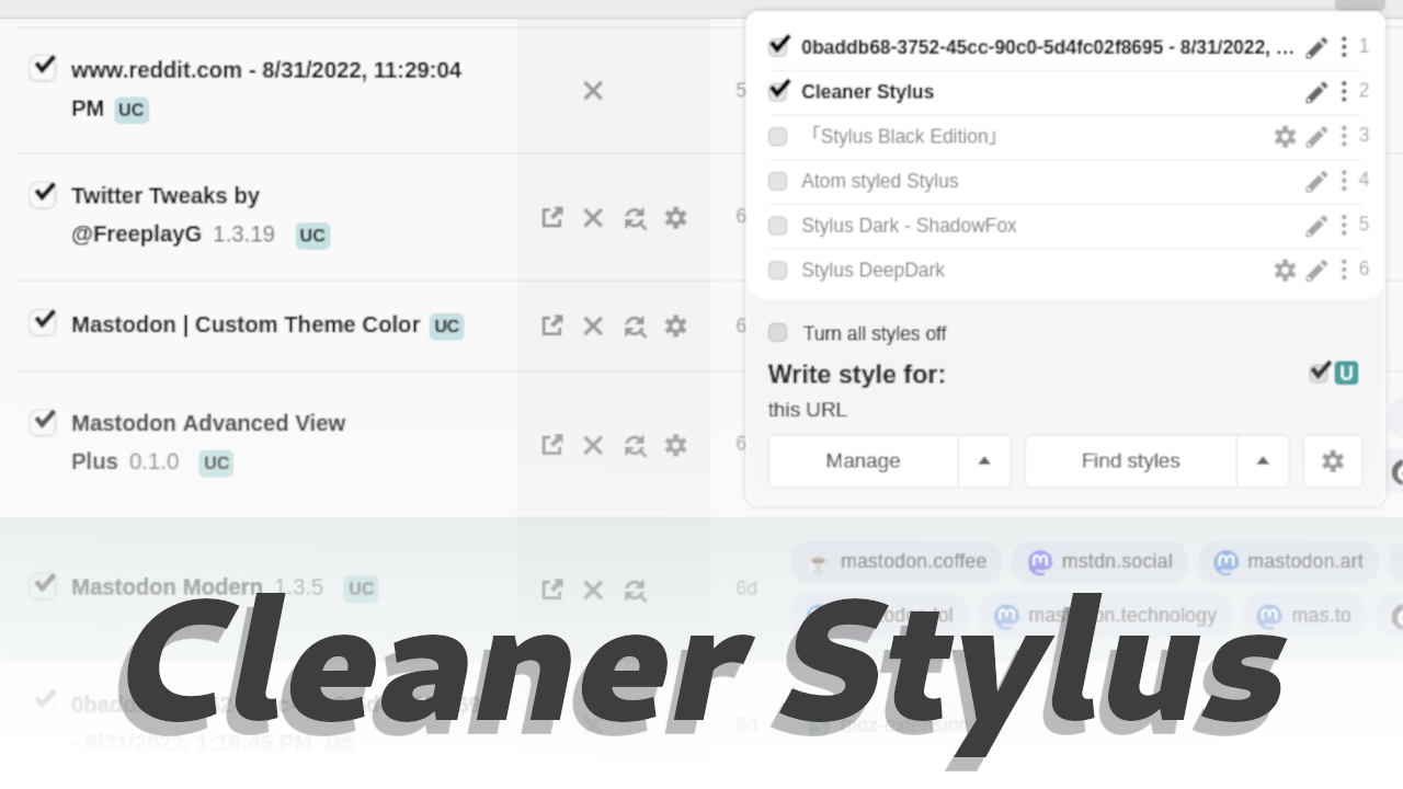
Should be fixed for the new Stylus update
Makes the Stylus extension look a bit nicer!
Works with other styles that change only colors.
Imported and mirrored from https://codeberg.org/Freeplay/UserStyles/raw/branch/main/cleaner-stylus.user.css
AuthorFreeplay
LicenseNo License
CategoryStylus
Created
Updated
Code size19 kB
Code checksum82ff09a6
Learn how we calculate statistics in the FAQ.
Failed to fetch stats.
Should be fixed for the new Stylus update
Makes the Stylus extension look a bit nicer!
Works with other styles that change only colors.
/* ==UserStyle==
@name           Cleaner Stylus
@version        1.4.3
@description    Makes the Stylus extension look a bit nicer!
@preprocessor   stylus

 -- AUTHOR STUFF --
@namespace      Freeplay
@author         Freeplay (https://freeplay.codeberg.page/)
@homepageURL    https://codeberg.org/Freeplay/UserStyles
@supportURL     https://codeberg.org/Freeplay/UserStyles/issues
==/UserStyle== */

@-moz-document url-prefix("moz-extension://"), url-prefix("chrome-extension://") {
	#stylus-manage, #stylus-popup, #stylus {
		transition background-color .2s
		--border 1px solid rgba(100,100,100,.2)
		button, #find-styles-link {
			border-color: rgba(0,0,0,0.1) !important;
			border-radius: 4px !important;
			&:not(#save-button) {
				padding: 8px 14px !important;
			}
			background-image: none;
			height: auto !important;
			width unset !important
			transition background-color .2s
		}
		.split-btn {
			display flex
			position relative
			// border-ra
			button:first-of-type {
				border-top-right-radius 0 !important
				border-bottom-right-radius 0 !important
				flex-grow 1
			}
			button:last-of-type {
				border-top-left-radius 0 !important
				border-bottom-left-radius 0 !important
				padding-inline 12px !important
				&::after {
					// margin-bottom 1px
				}
			}
		}
		.split-btn-menu {
			box-shadow 0 4px 12px rgba(0,0,0,.1) !important
			border-radius 6px
			border 0
			margin-bottom 18px !important
			left 0
			right 0
			min-width max-content
		}
		.filter-selection {
			// margin 0 !important
			inset unset !important
			border-radius 6px
			overflow hidden
			display flex
			align-items center
			// background-color rgba(100,100,100,0.05)
			border var(--border)

			margin-bottom 4px
			> label {
				// padding 12px
				height 2.5em !important
				padding-right 6px
				border-right var(--border)
			}
			.select-resizer {
				position relative
				inset unset
				flex-grow 1
				// padding 7px
				height 2.5em
				align-items center
				padding-bottom 2px
				box-sizing border-box
				select {
					margin-left 0 !important
					padding-left 6px
					position absolute
					inset 0 !important
					height unset
					width 100% !important
				}
				svg {
					top unset
					right .5em
				}
				&:hover, &:focus {
					background-color rgba(100,100,100,0.1)
				}
			}
		}
		.sorter-selection {
			height 2.5em
			align-items center
			select {
				height 100%
				padding-inline .4em
			}
			svg {
				top unset
				right .5em
			}
		}
		input, select {
			border: var(--border) !important;
			border-radius: 4px !important;
		}
		.checkbox-wrapper {
			height max-content
			align-self center
		}
		.checkbox-container {
			margin-right .5em
		}
		.filter-selection .select-resizer > select {
			border: none !important;
		}
		.svg-icon.checked {
			transform: scale(1.7) translate(1px,-1.5px) !important;
		}
		#header {
			box-shadow: 2px 0 24px rgba(0,0,0,0.07);
		}
		#header-resizer {
			opacity 0
			&:hover {
				opacity 1
			}
		}

		.menu-items-wrapper, #message-box > div, #confirm > div, #stylus-options {
			border: none;
			border-radius: 6px;
			overflow: hidden;
			#options-title {
				border-top-left-radius: 6px;
				border-top-right-radius: 6px;
				overflow: hidden;
			}
			#options {
				border-bottom-left-radius: 6px;
				border-bottom-right-radius: 6px;
			}
		}
		.colorview-swatch {
			border: 1px solid rgba(0, 0, 0, 0.1) !important;
			border-radius: 4px !important;
		}
		a.color-swatch {
			border: none;
			border-radius: 4px !important;
			margin: 4px;
			box-sizing: border-box;
			bottom: 0;
			right: 0;
			height: 12px !important;
			width: 52px !important;
		}

		.select-resizer > select, #only-updates > span {
			margin-left: 4px !important;
		}


		#installed {
			padding-top: 4px;
			padding-bottom: 4px;
			border-bottom: none;
			border 0 !important
			.entry {
				position relative
				margin: 0 4px;
				margin-top 1px
				background-color: transparent;
				border-radius: 6px;
				// border-bottom: 1px solid rgba(0,0,0,.07);
				transition background-color .2s
				display flex
				align-items center
				&::before {
					top unset
				}
				&:not(:first-of-type)::after {
					content: "";
					position: absolute;
					inset-inline 10px
					top: -1px;
					border-bottom: var(--border);
				}
				&:hover {
					background-color: hsla(180, 50%, 30%, 0.07);
					&::after, & + .entry::after {
						opacity 0
					}
				}
				.entry-content {
					height: auto;
					flex-grow 1
					overflow hidden
					.style-name {
						padding: 0px;
						padding-left: 30px;
						&::before {
							background: transparent;
						}
						.checker, .svg-icon.checked {
							top: 7.5px !important;
						}
					}
				}
			}
		}

	}
	#stylus-install-usercss {
		#header {
			padding 20px
		}
		#header-contents {
			#install-wrapper {
				display flex
				flex-wrap wrap
				align-items center
				.install {
					flex-grow 1
					margin-right 1em
					padding-right 3em !important
				}
			}
			.meta-description {
				font-size 1.1em
				margin 0
			}
		}

	}
	#stylus-manage, #stylus-install-usercss {
		#header {
			background inherit
			padding 24px 24px
			// border-right var(--border)
			box-shadow none
			border-right 1px solid rgba(100,100,100,0.1)
			// border-bottom 6px solid #339999
			// border-bottom-right-radius 10px
			h1 {
				opacity .9

			}
			button {
				// flex-grow 1
				margin-right 6px
				.split-btn > ^[-1..-1]:first-child {
					margin-right 0 !important
				}

			}
			#search-help, #sorter-help {
				margin 0
				margin-left .4em
				align-self center
			}
			.settings-column {
				margin 0 !important
			}
			details, #sort-wrapper {
				// padding 24px
				// padding-bottom 0
				// border var(--border)
				border-top var(--border)
				// border-radius 6px
				// overflow hidden
				// margin-inline -16px
				padding-block 20px
				margin-block 0 !important
				// box-shadow 0 8px 24px rgba(0,0,0,0.04)
				// background-color white
				// background-color rgba(255,255,255,0.03)
				&::marker {
					position absolute
					right 0
				}
				summary {
					// display flex
					margin 0
					// border-bottom var(--border)
					margin -12px !important
					// margin-bottom 0 !important
					padding-top 12px !important
					padding-inline 16px !important
					& + * {
						margin-top 12px
					}
					// margin-bottom 12px !important
					// padding 0
					padding 8px 12px
					// background-color rgba(100,100,100,0.03)
					h2 {
						font-size 1.2em
						// font-weight 500
						margin-left .2em
						text-transform uppercase
						font-size .9em
						opacity .8
						// margin-right auto
					}
				}
			}
			#search-wrapper {
				display flex
				flex-wrap wrap
				align-items center
				width 100%
				input, select {
					padding .4em
					padding-right 16px
					height 2.5em
					width 100%

				}
				.select-wrapper {
					display flex
					align-items center
					flex-grow 1
					margin-top 6px
					// width 100%
					select {
						width 100% !important
					}
					svg {
						top unset !important
						margin-top 1px
						right 6px
					}
				}
			}

		}
		#manage-text {
			line-height 2
			text-underline-offset .3em
			letter-spacing .05em
			opacity .85
			span {
				&::after {
					content: "/"
					margin-inline 1em !important
				}
			}

		}
	}
	.oldUI #stylus-manage #installed {
		max-width: 100%;
		.entry {
			margin: 20px;
			max-width: 100%;
			box-sizing: border-box;
			// border-radius: 0;
			border: 1px solid rgba(0,0,0,0.07);
			background: none !important;
			transition: box-shadow .2s;
			&:hover {
				box-shadow: 0 8px 24px rgba(0,0,0,0.1);
			}
			p {
				padding: 0;
			}
			.actions {
				max-width: 100%;
				button, a {
					flex-grow: 1;
					display: flex;
					justify-content: center;
				}
				button {
					padding: 10px 16px !important;
					border-radius: 6px !important;
				}
			}
		}
	}
	.newUI #stylus-manage #installed {
		// border: 0 !important;
		// font-family system-ui
		background-color rgba(100,100,100,0.04)
		box-shadow 0 0 0 24px rgba(100,100,100,0.04)
		margin 0
		padding-top 0
		.entry {
			align-items unset !important
			transition background .2s
/* 			border-radius 16px */
			// opacity .8
			vertical-align: center
			margin-inline 0 !important
/* 			margin 0 !important */
			padding 0 !important
			line-height 2em
			flex-wrap nowrap
			width 100% !important
			border-radius 0 !important
			.style-name {
				padding: 15px 10px;
				padding-left: 45px;
				opacity .9
				max-height max-content !important
				padding-right: 45px
				.homepage {
					position absolute
					right 0
					width var(--action-size) !important
					margin-right var(--action-margin) !important
				}
			}

			.style-name::before {
				content: unset !important;
			}
			.checkmate {
				margin-right 1.5em
				// height 100%
				position absolute
				margin 0
				// line-height 100%
				left 1.5em
				margin-top .4em
				input {
					background none
					border-width 1px !important
					transform scale(1.5)
					border-radius 4px !important
					margin-block 0 !important
				}
			}
			.actions > *, .homepage {
				transform translateY(0.125rem)
			}
			.actions {
/* 				position relative
				margin auto
				padding 0 !important
				padding-right 2px !important
				margin 0 !important */
				&::before {
					content ""
					position absolute
					inset 0
					left calc(-14px - (var(--action-size)))
					background-color rgba(100,100,100,0.04)
					pointer-events none
				}
				> * {
					// padding .5em
					// border-radius 12px
					// background-color rgba(100,100,100,0.1)
/* 					margin-block 0 !important */
					&:last-child {
						margin-right 0
					}
					svg {
						width 100%
					}
				}
			}
			.style-info {
				padding-inline .5em
			}
			.applies-to {
				padding 15px
				.targets {
					display flex
					flex-wrap wrap
					gap .5em
					.target {
/* 						display flex !important */
						padding .4em .8em
						background...