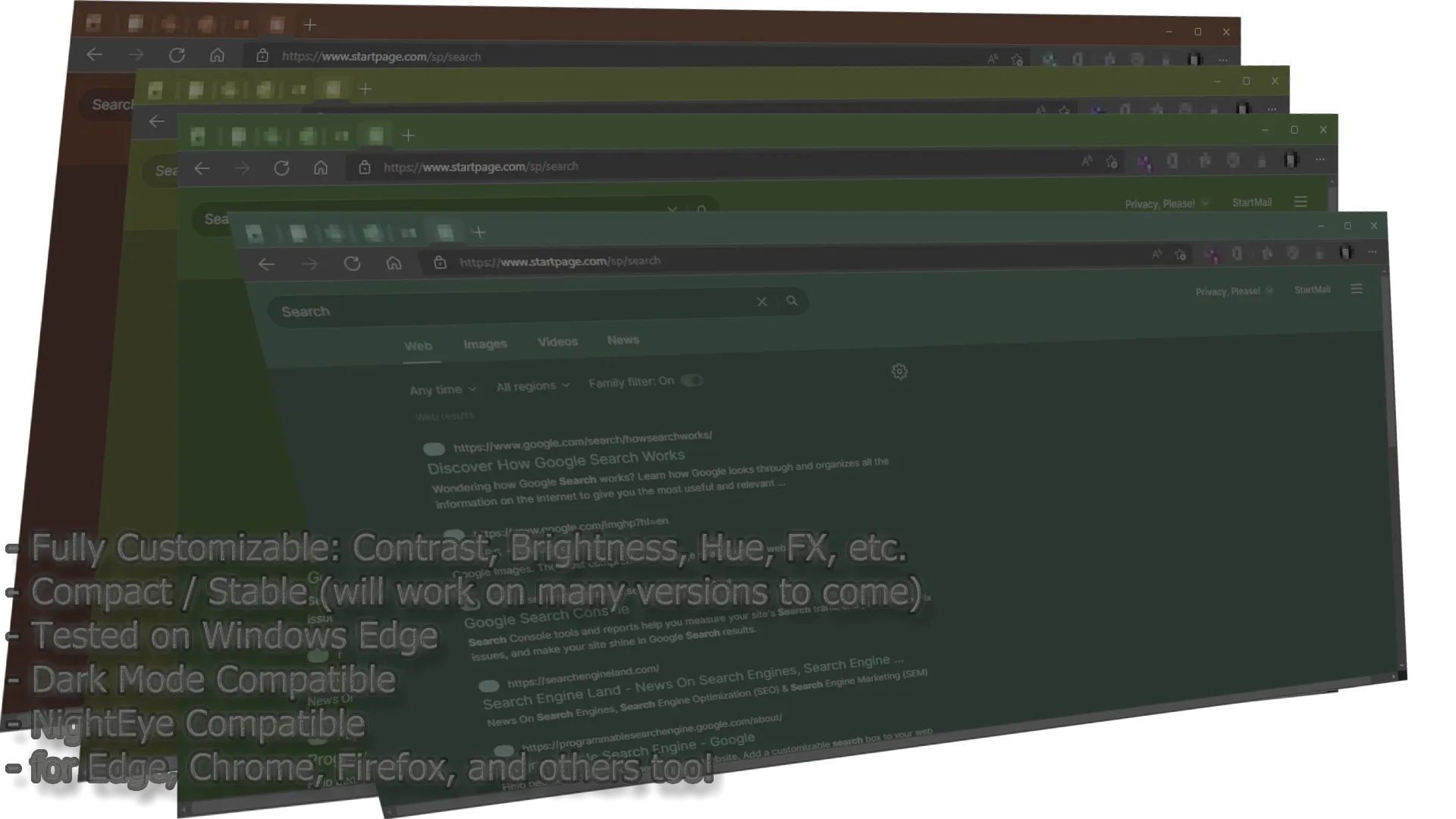
Alternate colors for startpage using filters. These are hardware accelerated if you have a video card that supports it (newer than 2020 should always be).
startpage.com - alternate colors by osirisgothra
Details
Authorosirisgothra
LicenseShare Alike, Creative Commons
Categorystartpage.com
Created
Updated
Code size3.2 kB
Code checksum93c6bfd0
Statistics
Learn how we calculate statistics in the FAQ.
Failed to fetch stats.
Description
Notes
See in-document notes for details. This style will require you to adjust to your taste, unless you are fine with the defaults, the settings are placed in variables to make adjustments easy. If you use stylish, this should be even easier as the changes are real-time (instant).
The On-Glass Effect is not yet added because of the way the page is laid out as a table. Separating content would go beyond CSS into java, which obviously cannot be done with CSS alone.
Source code
/* ==UserStyle==
@name         startpage.com - alternate colors
@version      20220314.18.36
@namespace    userstyles.world/user/osirisgothra
@description  Alternate colors for startpage using filters. These are hardware accelerated if you have a video card that supports it (newer than 2020 should always be).


@author       osirisgothra
@license      Share Alike, Creative Commons
==/UserStyle== */

@-moz-document domain("startpage.com") {

/*
This is not a dark-light theme selector, it only MODIFIES the colors of the dark or light theme
you have currently chosen in the SETTINGS menu so do that FIRST. Once you have it set to dark or light
(or whatever other theme you want that they have) you can further customize the exact colors by using
the simple values below

keep in mind any COLOR values you specify will be affected by these filters too,
so if you want your drop shadow to be green, and your hue rotate is 230deg, you will need to make it blue

any "amount" value that is decimal, should be in the range of 0.0 to 1.0

any "color" (brightness, saturation, contrast) value should be in range of -2.0 to 2.0 though higher values may work in some cases

the "hue" values are in degrees and can be in the range of -360deg to 0, to 360deg (positive)   Note that negatives are just the same as positives
so the absolute value is considered like so:
0deg	-360deg		same thing
1deg    -359deg     same again
45deg	-315deg		same thing
90deg   -217deg		same thing
135deg  -225deg     same thing again..
180deg  -180deg        and...
225deg  -135deg        so on...
217deg  -90deg
315deg  -45deg
359deg  -1deg
360deg  -0deg
be sure to note that -90deg is NOT the same as -90deg, but -180deg IS the same as 180deg only because 360-180=180
also, values BEYOND 360 (in both negative and positive, will WRAP, so 390deg will be treated as 20deg, and -390 as -20)
if it passes 360*2 or 360*200000 it will wrap again and again, as long as the internal buffer can handle the number though
its HIGHLY suggested not to do that! <not my fault if you break something in those cases!>

TODO: apply to individual bottom-level elements instead of entire document
      (unsure about background filtering, though)

update: document is compatible with dark mode flag, to a certain degree

*/

:root {
	/**/

      --rotate-hue: 133deg;
        --saturate: 1.6200059;
        --contrast: 1;
      --brightness: 0.64;
           --sepia: 0.0;
--inversion-amount: 0.0;
--drop-shadow-amount: 1.25;
	/* color below is in the format of RED,GREEN,BLUE (values are 0 (least amount of color) to 255 (most amount of color)) */
	/* remember these values are calculated before the above settings, so red (255,0,0) will become blue if you have hue rotated 180deg */
--drop-shadow-color: 255,0,0;
--drop-shadow-spread: 15px;
}

body { filter: hue-rotate(var(--rotate-hue))  saturate(var(--saturate)) contrast(var(--contrast)) brightness(var(--brightness)) sepia(var(--sepia)) invert(var(--inversion-amount)) !important; }
.image-container    { opacity: 0.25; backdrop-filter: blur(3px); filter: drop-shadow(rgba(var(--drop-shadow-color),var(--drop-shadow-amount)) 1px 1px var(--drop-shadow-spread)); }
a:hover { filter: none !important; }


}