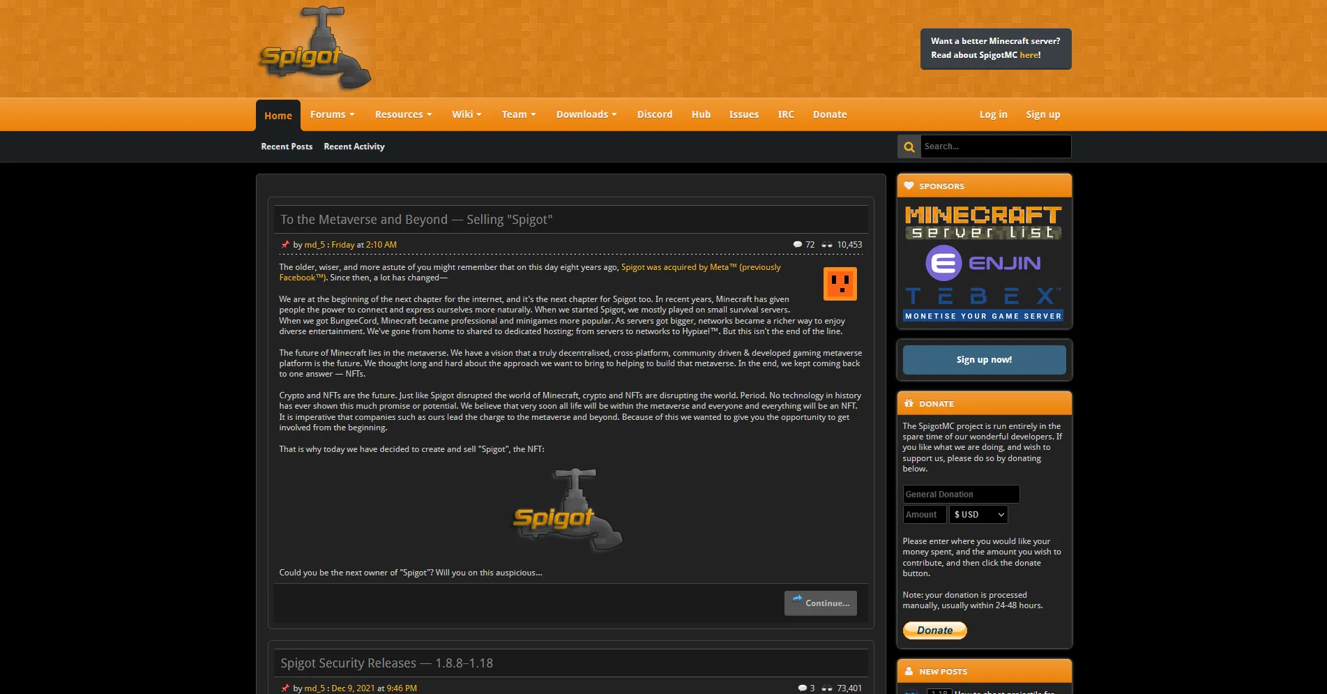
A new dark mode theme for spigotmc.org
With a bunch of customization options.
SpigotMC NewDark by janmm14
Details
Authorjanmm14
LicenseGPL v3
Categoryspigotmc.org
Created
Updated
Code size142 kB
Code checksum6c1a45be
Statistics
Learn how we calculate statistics in the FAQ.
Failed to fetch stats.
Description
Notes
GitHub: https://github.com/Janmm14/spigotmc-newdark
Credits of the thread icons go to https://userstyles.org/styles/144069/spigot-dark-theme
Choosable options:
- Dim spigotmc orange
- Make header black
- OLED option - black instead of dark gray
- Remove header (adds small spigotmc logo to ghome button)
- Remove huge margins and borders on home and wiki pages
- Choose whether inline code has white or black background
- Increase width of code blocks
- Remove orange background of breadcrumbs/sidebar titles
- More compact post meta styling (rating, date, signature, action buttons)
- Animated rising bubbles background option
Source code
Source code has over 10K characters, so we truncated it. You can inspect the full source code on install link./* ==UserStyle==
@name SpigotMC NewDark
@namespace github.com/Janmm14/spigotmc-newdark
@version 1.6.8
@description SpigotMC.org NewDark mode userstyle. https://userstyles.world/style/4051/spigotmc-newdark
@preprocessor less
@author Janmm14
@var range dim "Dim spigotmc orange" [1, 0.4, 1, 0.025]
@var checkbox black_header "Black header background" 1
@var checkbox oled "OLED / darkgray -> black background in many places" 1
@var checkbox olednostripe "if OLED, no list background stripes" 0
@var checkbox noorange "No orange background" 1
@var checkbox no_header "Remove the header" 1
@var checkbox nomargin "Less margin on spigotmc home news feed and wiki pages" 1
@var checkbox nobg "No border around home page articles (enable less margin)" 1
@var checkbox icode_dark "Should inline code [icode] have dark background" 1
@var number codeblockrightmargin "Right margin of code blocks (+1)" [141, 1, 1000, 1, 'px']
@var checkbox msg_signature "New post-meta (footer) design (buttons, date, ratings)" 1
@var checkbox hover_rating "when width smaller, hide rating until hovered" 0
@var checkbox rating_no_text "do not display rating text name" 0
@var checkbox popup_fix "if some popups are 1px wrong" 1
@var checkbox bg_bubbles "Background bubbles" 0
@var checkbox bg_bubbles_dark "Dark orange bubbles" 0
@var checkbox donate_shine "Donation shine effect" 0
@var checkbox bg_dbg "Background bubble debug" 0
==/UserStyle== */
@-moz-document url-prefix("https://spigotmc.org"), url-prefix("https://www.spigotmc.org") {
html {
background: black;
&:before {
content: @dim;
display: none;
}
--black: #000;
--black-l: #000;
--inner-bg: #222;
--inner-bg-d: #222;
--inner-bg-l: #222;
--inner-bg-dark: #1a1a1a;
--inner-bg-dark-d: #1a1a1a;
--inner-bg-dark-l: #1a1a1a;
--inner-bg-verydark: #111;
--inner-bg-verydark-l: #111;
--inner-bg-verydark-d: #111;
--post-bg: #2a2a2a;
--post-bg-iframe: #2a2a2a;
--oled-stripe-bg: rgba(255, 255, 255, .068); /* #111 */
& when (@oled = 1) {
--black: #0009;
--black-l: #0000;
--inner-bg: #0009;
--inner-bg-d: #000;
--inner-bg-dark: #0009;
--inner-bg-dark-d: #000;
--inner-bg-verydark: #0009;
--inner-bg-verydark-d: #000;
--inner-bg-l: #0000;
--inner-bg-dark-l: #0000;
--inner-bg-verydark-l: #0000;
--post-bg: #0000;
--post-bg-iframe: #0009;
& when (@olednostripe = 1) {
--oled-stripe-bg: #0000;
}
}
--orange: rgb(239, 182, 28);
--orange: #efb61c;
--orange-dark: rgb(237, 129, 6);
--orange-dark: #ed8106;
/* unused
--orange-bg: #efb61c;
& when (noorange = 1) {
--orange-bg: #000;
}
/***/
}
body {
background: black;
color: #d3d3d3;
}
html:has(body[contenteditable=true]) {
background: var(--post-bg-iframe);
}
body[contenteditable=true] {
background: transparent;
}
a[href]:hover {
color: #ccc;
}
input {
accent-color: var(--orange);
}
.spigot_headerReadAboutWrapper a:hover {
color: var(--orange);
}
.primaryContent a, .ugc a:link, .ugc a:visited {
color: var(--orange);
}
#AccountMenu ul.links a:hover, .articleItem a:hover {
color: var(--orange);
}
.explain .CurrentStatus {
color: #d3d3d3;
}
.hasTabLinks #navigation .navTabs .navTab.selected .navLink {
border-bottom-color: #1b1e22;
& when(@oled = 1) {
border-bottom-color: #000;
}
}
#navigation {
.navTabs {
.navTab {
border-radius: 7px 7px 0 0;
}
.navTab .navLink {
border-radius: 6px 6px 0 0;
}
.navTab.PopupOpen .navLink {
height: 45px;
}
.navTab.selected {
.navLink {
background-color: #1b1e22;
& when (@black_header = 1) {
z-index: 1;
& when (@bg_bubbles = 1) {
box-shadow: black 0px 0px 9px 5px;
}
}
& when (@oled = 1) and (@black_header = 0) {
background: #000;
}
& when(@oled = 1) and (@black_header = 1) {
background: #000;
border: 1px solid #30353b;
padding: 0 11px;
margin-top: 2px;
z-index: 1;
border-bottom-width: 1px;
}
--rds: 6px;
&::before, &::after {
width: 6px;
height: 6px;
bottom: -6px;
background: transparent;
border-bottom: 6px solid #1b1e22;
z-index: 1;
& when (@oled = 1) and (@black_header = 0) {
border-bottom-color: black;
}
& when(@oled = 1) and (@black_header = 1) {
width: 8px;
height: 8px;
bottom: -1px;
background: var(--black-l);
border-bottom-color: #30353b;
border-bottom-width: 1px;
}
}
&::before {
left: -6px;
border-radius: 0 0 12px 0;
border-right: 6px solid #1b1e22;
& when (@oled = 1) and (@black_header = 0) {
border-right-color: black;
}
& when(@oled = 1) and (@black_header = 1) {
left: -9px;
border-radius: 0 0 var(--rds) 0;
border-right-width: 1px;
border-right-color: #30353b;
box-shadow: black 6px 6px 0 6px;
}
}
&::after {
right: -6px;
border-radius: 0 0 0 12px;
border-left: 6px solid #1b1e22;
& when (@oled = 1) and (@black_header = 0) {
border-left-color: black;
}
& when(@oled = 1) and (@black_header = 1) {
right: -9px;
border-radius: 0 0 0 var(--rds);
border-left-width: 1px;
border-left-color: #30353b;
box-shadow: black -6px 6px 0 6px;
}
}
}
&:nth-child(2) {
& when (@no_header = 1) {
.navLink {
position: relative;
z-index: 12;
& when (@oled = 1) {
border-bottom-width: 1px;
}
}
}
&::before when (@no_header = 1) {
content: '';
position: relative;
display: inline-block;
z-index: 13;
margin-right: calc(-7px - 4px);
top: 40px;
left: calc(-100% - 5px);
width: 6px;
height: 6px;
background: transparent;
border-radius: 0 0 12px 0;
border-bottom: 6px solid #1b1e22;
border-right: 6px solid #1b1e22;
& when (@oled = 1) and (@black_header = 0) {
border-bottom-color: black;
border-right-color: black;
}
& when(@oled = 1) and (@black_header = 1) {
background: var(--black-l);
border-bottom-color: #30353b;
border-bottom-width: 1px;
}
& when (@oled = 1) and (@black_header = 1) {
border-bottom: 1px solid #30353b;
border-right: 1px solid #30353b;
top: 35px;
left: calc(-100% - 6px - 4px);
width: 8px;
height: 8px;
border-radius: 0 0 6px 0;
border-right-width: 1px;
border-right-color: #30353b;
box-shadow: black 6px 6px 0 6px;
/*dbg*
border-color: red;
background-color: green;
z-index: 30;/**/
}
}
}
}
}
}
.navTabs .navLeft {
...