It will get better
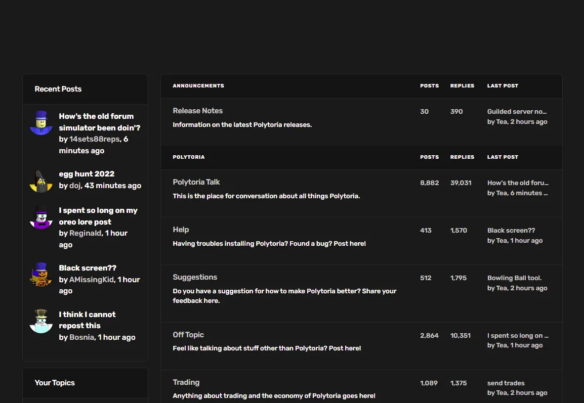
PolyToria Dark theme (Beta) by as1
Details
Authoras1
LicenseNo License
Categorypolytoria.com
Created
Updated
Code size7.9 kB
Code checksum9d4b636e
Statistics
Learn how we calculate statistics in the FAQ.
Failed to fetch stats.
Description
Notes
Userstyle doesn't have notes.Source code
/* ==UserStyle==
@name           Polytoria Theme
@namespace      github.com/openstyles/stylus
@version        1.0.0
@description    A new userstyle
@author         Me
==/UserStyle== */

@-moz-document url-prefix("https://polytoria.com") {
/* Hope you enjoy my fun theme made by me. */
    /* Made by AS from Mopaiv and jumper21367 from Polytoria. */

    /* */

    /*. */

    body, html {
        background-color: #1a1a1a;
    }

    footer small:after {
        display: block;
        margin-top: 0.8rem;
        content: "Dark theme created by Index, thank you so much. :D";
    }

    .navbar {
        background-color: #191919;
        border-color: #292929;
    }

    hr, hr.dropdown-divider {
        border-color: #292929;
    }

    .header-body {
        border-bottom-color: #292929;
    }

    .card {
        background-color: #1a1a1a;
        border-color: #292929;
        /* box-shadow: 0 .75rem 1.5rem #191919; */
        box-shadow: none;
        color: #fff;
    }

    a, a:hover, a:focus, a.text-reset:hover *, a.text-reset:focus * {
        color: #ccc !important;
    }

    .form-control, .form-control:hover, .form-control:focus, .dropdown-menu {
        background-color: #1a1a1a;
        border-color: #292929;
    }

    .form-control::placeholder {
        /* color: #3e3e3e; */
        color: #ccc;
        text-shadow: none;
    }

    select.form-control, select.form-control:hover, select.form-control:focus, select.custom-select, select.custom-select:hover, select.custom-select:focus {
        background-color: #1a1a1a;
        border-color: #292929;
    }

    .header-pretitle {
        color: #555;
    }

    #poly-chat-toggler {
        background-color:#1a1a1a ;
    }

    .navbar-vertical .nav-item a.nav-link, #topbar input#headerSearchDesktop::placeholder {
        color: #6f6f6f;
    }

    #topbar .input-group-prepend i {
        color: #6f6f6f;
    }

    .list-group-item {
        border-color: #292929;
    }

    .dropdown-item {
        color: #ccc;
    }

    .dropdown-item:hover {
        color: #fff;
    }

    .nav-pills .nav-link.active {
        background-color: #1a1a1a;
        border: 1px solid #292929;
    }

    small {
       color: #ccc !important;
    }

    .btn.btn-sm.btn-rounded-circle.btn-white, .btn.btn-sm.btn-rounded-circle.btn-white:hover, .btn.btn-sm.btn-rounded-circle.btn-white:focus {
        background-color:#1a1a1a ;
        border-color: #292929;
    }

    .card-header, h4.card-header, .table thead th {
        color: #fff !important;
        background: #141414;
        border-color: #292929;
    }

    .table thead th a, .table thead th a:hover, .table thead th a:focus, .table thead th a.text-reset, .table thead th a.text-reset:hover, .table thead th a.text-reset:focus {
        color: #fff !important;
    }

    .table td, .table th {
        border-color: #292929;
    }

    #postContentInput, #postContentInput:hover, #postContentInput:focus, #postTitleInput, #postTitleInput:hover, #postTitleInput:focus, #redeem-form .form-control, #redeem-form .form-control:hover, #redeem-form .form-control:focus {
        background-color: #202020 !important;
    }

    #postContentInput::placeholder, #postTitleInput::placeholder, #redeem-form .form-control::placeholder {
        color: #dbdbdb;
    }

    footer.border-top {
        border-color: #292929 !important;
    }

    .form-control.disabled, .form-control.disabled:hover, .form-control.disabled:focus, .form-control[disabled], .form-control[disabled]:hover, .form-control[disabled]:focus {
        background-color: #1a1a1a;
        border-color: #292929;
        color: #ccc;
    }

    .nav-tabs .nav-item.show .nav-link, .nav-tabs .nav-link.active {
        border-color: transparent transparent #292929;
    }

    .text-secondary, .text-muted {
        color: #474747 !important;
    }

    .border {
        border: 1px solid #292929 !important;
    }

    .bg-light {
        background-color: #1a1a1a !important;
    }

    p.small.text-muted, small.text-muted, ul.small.text-muted {
        color: #ccc !important;
    }

    .tooltip-inner {
        background-color: #1a1a1a !important;
        border: 1px solid #292929 !important;
    }

    .modal-content {
        background-color: #1a1a1a;
    }

    .modal-header, .modal-footer {
        background-color: #1a1a1a;
    }

    button.close[data-dismiss="modal"], button.close[data-dismiss="modal"]:hover, button.close[data-dismiss="modal"]:focus {
        color: #fff;
    }

    /*
    REVERT STYLE FOR BLOG SUBDOMAIN (blog.polytoria.com)
    body.home-template, body.post-template {
        background-color:#1a1a1a ;
    }

    .post-card-title {
        color: #15171a;
    }

    .post-card-primary-tag, .article-byline-meta a, .article-tag a {
        color: #15171a !important;
    }

    .post-card-byline-content a {
        color: #373c44 !important;
    }

    .gh-head-button.gh-portal-close {
        color: #000 !important;
    }
    */

    .card-title {
        color: #ccc;
    }

    h3, h2, p, span[style="font-size: 20px; font-weight: 400"], .header-title {
        color: #fff;
    }

    #games_accordion .card-header button {
        color: #ccc !important;
    }

    .nav-tabs {
        border-color: #181818;
    }

    /*
    REVERT STYLE FOR SCRIPTING API DOCUMENTATION SUBDOMAIN (docs.polytoria.com)
    html.js-focus-visible body {
        background-color: #ffffff;
        color: #000 !important;
    }

    html.js-focus-visible p, html.js-focus-visible h1, html.js-focus-visible h2, html.js-focus-visible h3, html.js-focus-visible h4, html.js-focus-visible h5, html.js-focus-visible h6 {
        color: #000 !important;
    }

    html.js-focus-visible article a, html.js-focus-visible article a:hover, html.js-focus-visible article a:focus {
        color: #526cfe !important;
    }

    html.js-focus-visible .md-nav__item.md-nav__item--active a, html.js-focus-visible .md-nav__item.md-nav__item--active a:hover, html.js-focus-visible .md-nav__item.md-nav__item--active a:focus {
        color: #2094f3 !important;
    }
    */

    /*
    REVERT STYLE FOR API DOCUMENTATION SUBDOMAIN (api.polytoria.com/docs/)
    div.swagger-ui {
        background-color: #fafafa;
    }

    div.swagger-ui p, div.swagger-ui h1, div.swagger-ui h2, div.swagger-ui h3, div.swagger-ui h4, div.swagger-ui h5, div.swagger-ui a, div.swagger-ui a:hover, div.swagger-ui a:focus {
        color: #000 !important;
    }
    */

    quote.text-muted {
        color: #a6a6a6 !important;
    }

    footer a, footer a:hover, footer a:focus {
        color: #ccc;
    }

    .breadcrumb-item.active {
        color: #ccc;
    }

    .btn.btn-success, .btn.btn-success:hover, .btn.btn-success:focus {
        color: #fff !important;
    }

    td, td.text-muted {
        color: #ccc !important;
    }

    /*
    .btn-outline-dark {
        background: #0f0f0f !important;
        border-color: #090909 !important;
    }

    .btn-outline-dark, .btn-outline-dark:hover, .btn-outline-dark:focus {
        color: #fff !important;
    }
    */

    .p-5 .display-2 i, .p-5 h5.text-muted, center .display-2 i, center h3.text-secondary, center h5.text-muted {
        color: #ccc !important;
    }

    footer a.text-muted, footer a.text-muted:hover, footer a.text-muted:focus {
        color: #ccc !important;
    }
}