Dark Userstyle for bugs.telegram.org. With it, you can enable wide mode, and various colors of the default palette.
Telegram Kaefer by riedler
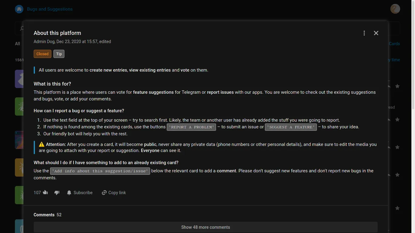
Mirrored from https://github.com/RiedleroD/userstyles-riedler/raw/master/telegram_k%C3%A4fer.user.css
Details
Authorriedler
LicenseCC BY-SA 4.0
Categorybugs.telegram.org
Created
Updated
Code size6.1 kB
Code checksumc0ae818b
Statistics
Learn how we calculate statistics in the FAQ.
Failed to fetch stats.
Description
Notes
Version: 1.0.1
Changelog:
- styled highlighted text
- fixed some unstyled tags in search bar
- styled search form arrow's background and selection border
- styled card stati "fixed" and "added"
- fixed background overflow in some card thumbnails
Source code
/* ==UserStyle==
@name			Telegram Käfer
@namespace		https://github.com/RiedleroD/userstyles-riedler/
@version		1.0.1
@description	Black & wide style for bugs.telegram.org
@author			Riedler
@preprocessor	stylus
@var	color	bg0		"Background 0"	#151515
@var	color	bg1		"Background 1"	#242424
@var	color	bg2		"Background 2"	#333
@var	color	bg3		"Background 3"	#424242
@var	color	txtl	"Light Text"	#FFF
@var	color	txt		"Text"			#EEE
@var	color	txtd	"Dark Text"		#AAA
@var	color	grn		"Green"			#8F8
@var	color	yel		"Yellow"		#ff8
@var	color	org		"Orange"		#f82
@var	color	cyn		"Cyan"			#2ae
@var	select	wid		"Width"			{"Narrow":"narrow","Wide":"wide","Ultra-Wide":"uwide"}
==/UserStyle== */

shade(cl)
	background-color rgba(cl,0.3)
	color rgba(cl,0.9)
	border-color rgba(cl,0.5)
shade2(cl)
	background-color rgba(cl,0.4)
	color cl
	border-color rgba(cl,0.6)
shade3(cl)
	background-image linear-gradient(rgba(cl,0.3),rgba(cl,0.3))
	background-color bg0
	color rgba(cl,0.9)
	border-color rgba(cl,0.5)
@-moz-document domain("bugs.telegram.org"){
	body{
		background-color:bg0;
		color:txt;
	}
	if(wid==wide){
		.container{
			max-width:95%;
		}
		.bt-layer-content{
			width:90%;
		}
	}else if(wid==uwide){
		.container{
			max-width:100%;
		}
		.bt-layer-content{
			width:100%;
		}
	}
	header .header-wrap,
	header.sticky .sticky-box{
		background-color:bg0;
	}
	a.bt-card-row:hover{
		background-color:bg1;
	}
	.bt-card{
		&-action,
		&-row-body{
			& mark.highlight{
				shade(yel);
			}
		}
		&-title,
		&-preview{
			color:txt;
		}
	}
	.bt-card-thumb-status{
		shade3(grn);
		.thumb-feature &{
			shade3(cyn);
		}
	}
	.bt-card-thumb:not(.thumb-icon){
		background-color:#0000;
	}
	.form-control{
		color:txtd;
	}
	.bt-main-search-form{
		& .select{
			box-shadow:inset 0 0 0 1px bg2;
		}
		& .select-enter{
			background-color:cyn;
		}
		& .field-focused .select{
			box-shadow:inset 0 0 0 2px cyn;
		}
	}
	.select{
		background-color:bg0;
	}
	.select .items-list{
		background-color:bg0;
	}
	.bt-sort-item.selected{
		&,
		&:hover{
			color:txt;
		}
	}
	.bt-select-query .select .search-item{
		& .select-list-item{
			background-color:bg2;
			color:txtd;
			border:solid 1px txtd;
			box-sizing:border-box;
			&.private,
			&.c-green{
				shade(grn);
			}
			&.c-lightgreen{
				shade(yel);
			}
			&.c-orange{
				shade(org);
			}
			&.internal,
			&.c-cyan{
				shade(cyn);
			}
		}
		&.selected .select-list-item{
			background-color:bg3;
			color:txt;
			&.private,
			&.c-green{
				shade2(grn);
			}
			&.c-lightgreen{
				shade2(yel)
			}
			&.c-orange{
				shade2(org);
			}
			&.internal,
			&.c-cyan{
				shade2(cyn);
			}
		}
	}
	.dropdown-menu{
		background-color:bg0;
	}
	.bt-dropdown-wrap{
		& span.dropdown-menu{
			border-color:rgba(txt,0.06);
			box-shadow:0 1px 2px rgba(txt,0.07)
		}
		& ul.dropdown-menu>li>.bt-dropdown-item{
			color:txtd;
		}
		& ul.dropdown-menu>li>a.bt-dropdown-item{
			&:hover,
			&:focus{
				color:txtd;
				background-color:bg1;
			}
		}
	}
	.bt-layer-content{
		background-color:bg0;
		box-shadow:0 0 12px rgba(txt,.3);
	}
	.bt-issue-title .cd-author{
		color:txt;
	}
	.bt-issue-label{
		color:txtd;
	}
	.bt-comment-service-text,
	.bt-issue-tags .bt-status,
	.bt-subscription-tags .bt-status,
	.bt-card-action .bt-status,
	.bt-select-query .select .selected-item{
		border:solid 1px;
		box-sizing:border-box;
		shade(txtd);
		&.c-orange{
			shade(org);
		}
		&.c-cyan{
			shade(cyn);
		}
		&.c-green{
			shade(grn);
		}
		&.c-lightgreen{
			shade(yel);
		}
	}
	.bt-issue-tags .bt-tag,
	.bt-issue-tags .bt-status{
		border:solid 1px;
		box-sizing:border-box;
		shade(txt);
	}
	.bt-markdown{
		& blockquote::before{
			background-color:rgba(cyn,0.8);
		}
		& pre,
		& code{
			border:solid 1px;
			box-sizing:border-box;
			shade(txt);
		}
	}
	.bt-layer-block+.bt-layer-block::before{
		border-bottom:solid 2px bg1;
		box-sizing:border-box;
		background-color:bg0;
	}
	.bt-comments-more{
		background-color:bg1;
		color:txtd;
		&:hover{
			color:txt;
			background-color:bg2;
		}
	}
	.bt-action-btn{
		color:txtd;
		&.bt-reply-btn:hover,
		&.bt-action-menu-btn:hover{
			background-color:bg1;
		}
	}
	.bt-comment.highlight{
		background-color:bg2;
	}
	a.bt-comment-reply-content{
		color:txtd;
	}
	.bt-comment-author{
		color:txt;
	}
	.bt-layer-close:hover,
	.bt-menu-btn.dropdown-toggle:hover,
	.open .bt-menu-btn.dropdown-toggle{
		background-color:bg2;
	}
	.btn-primary{
		background-color:rgba(cyn,0.6);
		color:txt;
		&:hover,
		&:focus,
		&:active{
			background-color:rgba(cyn,0.8);
			color:txth;
		}
		&-green{
			&:hover,
			&:focus,
			&:active{
				background-color:rgba(grn,0.7);
			}
			&,
			&.disabled,
			&[disabled]{
				background-color:rgba(grn,0.6);
			}
		}
	}
	.radio-item .radio-input-icon,
	.checkbox-item .checkbox-input-icon{
		background-color:bg1;
		border-color:bg3;
		&::before{
			border-color:cyn;
		}
		&::after{
			background-color:cyn;
		}
	}
	.cd-dialog-options{
		&.disabled{
			& .radio-item .radio-input-icon{
				border-color:bg3;
			}
			& input.radio{
				&:disabled ~ .radio-label{
					color:txtd;
				}
				&:checked ~ .radio-label{
					color:txt;
				}
			}
		}
		& .radio-item .radio-input + .radio-label{
			color:txtd;
		}
	}
	.cd-comment-input-wrap .input.cd-comment-input{
		border-color:bg3;
	}
	.cd-btn{
		background-color:rgba(cyn,0.8);
		color:txt;
		&:hover,
		&:focus{
			background-color:rgba(cyn,0.9);
		}
	}
	.bot-feature .bt-comment{
		&-author-name.cd-bot{
			color:rgba(grn,0.6);
		}
		&-photo.cd-bot{
			background-color:rgba(grn,0.6);
		}
	}
	.popup{
		background-color:bg0;
		box-shadow:0 0 12px rgba(txt, .3);
	}
	input.cd-form-control,
	textarea.cd-form-control,
	.input.cd-form-control{
		box-shadow:inset 0 -1px 0 bg1;
	}
}