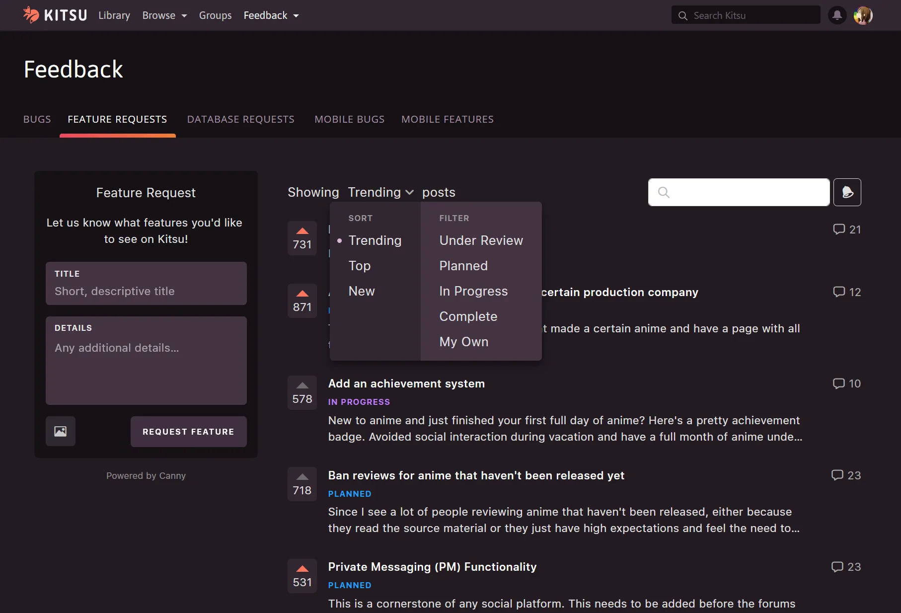
Makes the feedback page actually darkthemed which isn't currently possible on Kitsu's end.
Kitsu Canny Dark-Theme (feedbacks page) by reinachan
Imported and mirrored from https://github.com/Reinachan/Kitsu-CSS-Tweaks/raw/main/kitsu-feedback-dark.user.css
Details
Authorreinachan
LicenseMIT
Categorykitsu
Created
Updated
Code size6.2 kB
Code checksum92461707
Statistics
Learn how we calculate statistics in the FAQ.
Failed to fetch stats.
Description
Notes
Userstyle doesn't have notes.Source code
/* ==UserStyle==
@name         Kitsu Canny Dark-Theme (feedbacks page)
@description  Makes the feedback page actually darkthemed which isn't currently possible on Kitsu's end.
@author       Reinachan
@version      1.3.1
@license      MIT
@preprocessor less
@namespace    https://github.com/Reinachan
==/UserStyle== */

@-moz-document domain("kitsu.io") {
  .w-100 > iframe {
    background-color: unset;
  }
}
@-moz-document url-prefix("https://widget.canny.io/") {
  /*----------------------- Canny --------------------------*/

  :root {
    --secondary-background-color: #161116;
    --foreground-background-color: #161116;

    --input-background-color: #433443;

    --sort-background-color: #312631;
    --filter-background-color: #433443;

    --vote-background-color: #312631;

    --notification-header-color: #312631;
    --notification-background-color: #433443;
    --notification-footer-hover-color: #2a212a;
    --notification-hover-color: #392c39;
  }

  body {

    // General Content
    div, p, a, h1, h2, h3, h4, h5, span  {
      color: #e0e0e0;
    }

    // Post sorting
    .postListMenu .menu .selector .dropdown {
      background-color: var(--sort-background-color);
      box-shadow: 0 5px 10px rgba(7, 5, 9, .6);

      .sorts {
        border-right: none;

        .option:hover {
          background: #23212c;
        }
      }

      .filters {
        background-color: var(--filter-background-color);
        border-radius: 0 5px 5px 0;

        .option:hover {
          background: #1A1821;
        }
      }
      .dot {
        background-color: rgb(220, 183, 217)!important;
      }
    }

    // Notifications
    .dropdownPortal .notificationsDropdownContainer .notificationsDropdown {
      background-color: var(--notification-background-color);
      border: none;
      border-radius: 5px;

      .notificationsDropdownHeader,
      .notificationsDropdownFooter {
        background-color: var(--notification-header-color);
        border: none;
      }
      .notificationsDropdownHeader {
        border-radius: 5px 5px 0 0;

        span {
          color: #f78888!important;

          &:hover {
            color: #f9acac!important;
          }
        }
      }
      .notificationsDropdownFooter {
        border-radius: 0 0 5px 5px;

        &:hover {
          background-color: var(--notification-footer-hover-color);
        }
      }
    }

    .notification:hover,
    .widgetHome .mainContainer .postList .widgetButtons .notificationsMenu .iconButton:hover {
      background-color: var(--notification-hover-color);
    }

    .notificationsMenu:hover {
      background-color: transparent!important;
    }

    // Votes
    .postVotes {
      background-color: var(--vote-background-color);
      border: 1px solid var(--vote-background-color);

      span {
        color: #dcdcdc;
      }

      .upvote {
        border-bottom-color: #6c6c6c;

        &.voted {
          border-bottom-color: #FD755C!important;
        }
      }
    }
    .postCommentCount span {
      color: #aaa;
    }

    // Mentions
    .postList .topContainer .postListMenu .menu .text {
      color: #e0e0e0;
    }

    // Comments
    .commentBody {
      .line, p, span {
        color: #f2f2f2;
      }

      span.mention {
        color: #ffc5c3;
      }

      .line a, p a, span a {
        color: lightblue!important;
      }
    }

    .postBody .markdown {
      .line a, p a, span a {
        color: lightblue!important;
      }
    }

    // Username
    .userLockup .userInfo {
      .authorName, .name {
        color: #ff8c89;

        &.admin {
          color: #e95de0 !important;
        }
      }
    }

    .postListItem .postLink .body .postTitle span {
      color: white;
    }

    .widgetBoardDetails .sidebarBackground {
      background-color: var(--foreground-background-color)!important;
      opacity: 1;
    }

    // Reply, Timestamp, and likes
    .commentMenu .menu {
      .menuLink div,
      .menuLike div {
        color: #c8c8c8;

        &:hover {
          color: #e5e5e5;
        }
      }

      .menuLike .like svg path {
        filter: brightness(200%);
      }
    }

    .postMenu {
      .deleteLink,
      .editLink,
      .timestamp {
        color: #c8c8c8;

        &:hover {
          color: #e5e5e5;
        }
      }
    }
    .postMerge .bottomContainer {
      .mergeMenu .timestamp {
        color: #c8c8c8;
        &:hover {
          color: #e5e5e5;
        }
      }

      .mergeContainer .timestamp {
        color: #c8c8c8;
      }
    }

    .postStatusChange .bottomContainer .timestamp,
    .notification .timestamp {
      color: #c8c8c8;
    }

    // Comment composer
    .commentComposer .composerForm {
      background: #1A1821;
      border: 1px solid #09080c;
      border-radius: 5px;

      .autoResizeTextarea {
        border-radius: 5px 5px 0 0;
      }

      .buttonBar {
        border-top: 1px solid #09080c;

        .imageInput .fileInput .fileInputButton {
          background: #2e2931;
          color: #c9c9c9;

          &:hover {
            color: #f9f9f9;
            background: #342b39;
          }

          .icon.icon-image {
            color: inherit;
          }
        }
      }
    }


    // Image upload
    .widgetBoardDetails .createPostForm .fileInput div:not(.spinner) {
      background: #2e2931;

      .icon-image {
        color: #c9c9c9;
        &:hover {
          color: #f9f9f9;
          background: #342b39;
        }
      }
    }

    // Request Feature Button
    button.cannyButton:hover {
      opacity: 1;
      filter: brightness(110%);
    }

    // Inputs
    .textInput, .autoResizeTextarea {
      background: var(--input-background-color);

      .inset {
        color: #e8e8e8;
      }
      .inputContainer {
        input, textarea {
          color: white;
        }
        input::placeholder, textarea::placeholder {
          color: white;
        }
      }
    }
  }
}