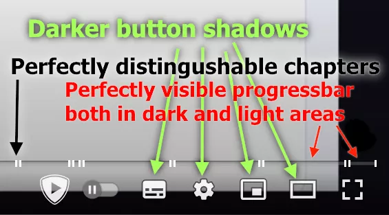
A small tweak that adds chapter separators, a shadow to the timeline, and anything under it so that it is easier to see it on a light background.
Youtube: Better timeline and text visibility by tutah1
Details
Authortutah1
LicenseCC BY-NC
CategoryYouTube
Created
Updated
Code size1.8 kB
Code checksum6b77d23a
Statistics
Learn how we calculate statistics in the FAQ.
Failed to fetch stats.
Description
Notes
Небольшой твик, добавляющий тень к линии времени и всему, что ниже, чтобы было проще увидеть их на светлом фоне. Также добавляет разделитель к главам, так что их теперь проще визуально разделять.
Before:
After:


16.05.2022 update: made buttons and section name shadow stringer, added a gradient to timeline, so it's easy to see it both on the light and black backgrounds
17.02.2023 update: now the chapters have borders, so it's much easier to distinguish them
20230217.16.48: added text-shadow to chapter description pop-up on mouse hover
29.08.2024 update: chapter borders now have different implementation, fixing the issue when the last chapter is moved to a new line
Source code
/* ==UserStyle==
@name         Youtube: Better timeline and text visibility
@version      20240829.21.25
@namespace    userstyles.world/user/tutah1
@description  Небольшой твик, добавляющий тень ко времени и другим элементам проигрывателя, чтобы их было проще увидеть на светлом фоне.
@author       tutah1
@license      No License
==/UserStyle== */

@-moz-document url-prefix("https://www.youtube.com/watch") {
.ytp-time-current,
.ytp-time-separator,
.ytp-time-duration,
/*time below*/
.ytp-chapter-title-content,
/*chapter description text below*/
.ytp-tooltip-title > span /*chapter description pop-up (on mouse hover)*/
{
	text-shadow: 1px 1px 2px black, 0 0 5px black;
}
.ytp-svg-shadow {
	stroke-opacity: 0.55;
}

.ytp-chapter-hover-container {
	background: linear-gradient(180deg, #00000073, transparent);
	box-sizing: border-box;
}

.ytp-chapter-hover-container::before,
.ytp-chapter-hover-container::after { /*Borders*/
	content: "";
	position: absolute;
	top: 0;
	bottom: 0;
	width: 2px;	/* Border width */
	background: #fff;	/* Border color */
}

.ytp-chapter-hover-container::before {
	left: 0;
	/* Border left */
}

.ytp-chapter-hover-container::after {
	right: 0;
	/* Border right  */
}

.ytp-chapter-hover-container::before,
.ytp-chapter-hover-container::after {
	height: 140%; /*Make it a little bigger than preview line*/
	margin-top: -1px; /*center it, костыль™*/
}

.ytp-chapter-hover-container:hover {
	border-right: solid #f1f1f1 5px;
	border-left: solid #fff 5px;
}

.caption-window.ytp-caption-window-bottom { /*I don't remember what is it for*/
	background: transparent!important;
}
}