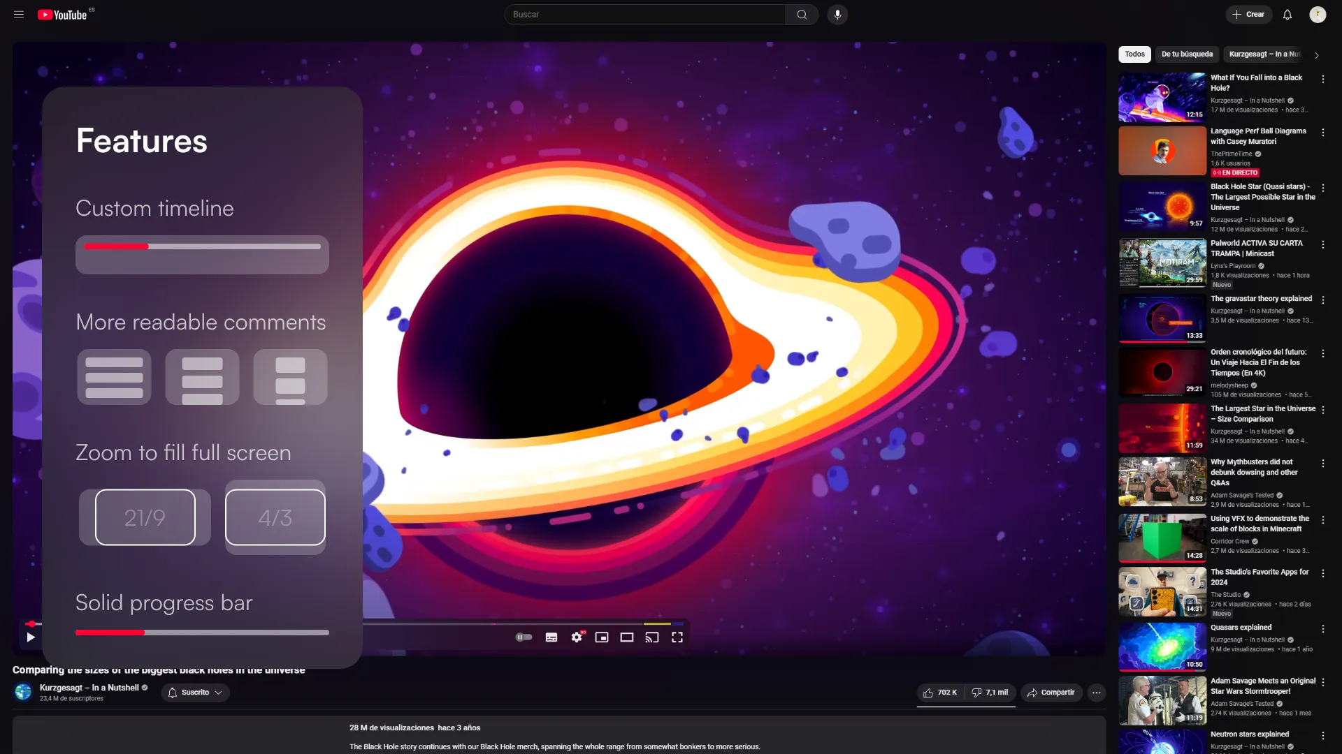
Take advantage of your large screen without compromising text readability.
Full width youtube (with optional Zoom to Fill) by sergio9929
Details
Authorsergio9929
LicenseNo License
Categoryyoutube
Created
Updated
Size7.2 kB
Statistics
Learn how we calculate statistics in the FAQ.
Failed to fetch stats.
Description
Notes
Custom timeline
Customize the appearence of the video timeline:
- Off (Default)
- Normal
- Cinematic lighting
- Light cinematic
More readable comments
Customize how wide the video description and comments section is:
- Off
- Recommended (Default)
- Wide
Zoom to Fill fullscreen
Zooms to fill the whole screen in full screen mode. Works in all screen sizes and every video aspect ratio:
- On / Off
Solid progress bar
Replaces the new progress bar gradient with a solid red:
- On / Off
Source code
/* ==UserStyle==
@name           Full width youtube
@homepageURL    https://userstyles.world/style/538/full-width-youtube
@supportURL     https://github.com/sergio9929/userstyles/issues
@namespace      userstyles.world/user/sergio9929
@version        20250219.0.0
@description    Take advantage of your large screen
@author         sergio9929 (https://sergio-rodriguez.web.app/)

@preprocessor   stylus
@var            select      timeline            "Custom timeline"                       {
  "Off*":                   "0",
  "Normal":                 "100",
  "Cinematic lighting":     "50",
  "Light cinematic":        "15",
}
@var            select      comments            "More readable comments"                {
  "Off":                    "0",
  "Recommended*":           "80rem",
  "Wide":                   "120ch",
}
@var            checkbox    expand-playlists    "Expand playlists to fill the screen"   0
@var            checkbox    fill-screen         "Zoom to Fill full screen"              0
@var            checkbox    progress            "Solid progress bar"                    0
==/UserStyle== */
@-moz-document domain("youtube.com") {
    :root {
        --sergio-margin: var(--ytd-margin-3x);
    }

    #columns {
        width: 100% !important;
        max-width: 100% !important;
    }

    #primary {
        width: 100% !important;
        max-width: 100% !important;
    }

    #player {
        /* prevent overflow of cinematic lighting */
        contain: layout;
    }

    /*
     * ========= START: YOUTUBE BUG =========
     * fix youtube's bug where the channel card overflows the sidebar.
     * detected on 2025-2-2.
     * check back in a month or so.
     */
    #info-section.ytd-channel-renderer {
        flex-direction: column;
    }

    #avatar-section.ytd-channel-renderer {
        max-width: 168px !important;
        min-width: initial !important;
        margin-right: 0;
        padding-right: 8px;
    }

    #avatar-section.ytd-channel-renderer .channel-link.ytd-channel-renderer {
        height: 100%;
    }

    #avatar.ytd-channel-renderer {
        width: auto;
    }
    /*
     * ========= END: YOUTUBE BUG ===========
     */
    #player-container-outer {
        width: 100% !important;
        max-width: 100% !important;
        max-height: calc(100vh - var(--ytd-margin-14x) - var(--ytd-margin-6x) * 2) !important;
    }

    #player-container-inner #player-container {
        max-height: calc(100vh - var(--ytd-margin-14x) - var(--ytd-margin-6x) * 2) !important;
    }

    #player-container-inner .html5-video-container video {
        width: 100% !important;
        height: auto !important;
        left: 0 !important;
        max-height: calc(100vh - var(--ytd-margin-14x) - var(--ytd-margin-6x) * 2) !important;
    }

    #player-container-inner .ytp-tooltip.ytp-bottom {
        top: auto !important;
        bottom: 50px !important;
    }

    #player-container-inner .ytp-tooltip.ytp-bottom.ytp-preview:not(.ytp-text-detail) {
        bottom: 100px !important;
    }

    #player-container-inner .ytp-tooltip.ytp-bottom.ytp-preview.ytp-text-detail {
        bottom: 50px !important;
    }

    #movie_player .html5-main-video {
        object-fit: contain;
    }

    if fill-screen {
        #movie_player.ytp-fullscreen .html5-video-container {
            height: 100% !important;
        }

        #movie_player.ytp-fullscreen .html5-main-video {
            top: 0 !important;
            left: 0 !important;
            width: 100% !important;
            height: 100% !important;
            object-fit: cover !important;
        }
    }

    if comments {
        #bottom-row.ytd-watch-metadata {
            flex-direction: column;
            margin-right: 0;
        }

        #bottom-row > .ytd-watch-metadata,
        #description-inner.ytd-watch-metadata,
        ytd-metadata-row-container-renderer,
        #expandable-metadata,
        #ticket-shelf,
        #merch-shelf,
        #comments {
            font-size: 15px;
            line-height: 1.5;
            max-width: comments;
            min-width: auto;
            display: block;
            margin-inline: auto;
            width: 100%;
        }

        #bottom-row > #description {
            max-width: 100%;
            padding-inline: 12px;
        }

        ytd-watch-metadata[has-teaser-carousel]:not([description-collapsed]) #teaser-carousel.ytd-watch-metadata {
            width: auto;
        }

        #info-container {
            margin-bottom: 1em;
        }

        #info-container .animated-rolling-number-wiz {
            font-size: 15px;
        }

        #content-text.ytd-comment-renderer {
            font-size: inherit;
        }

        #paid-comment-background.ytd-comment-renderer,
        #comment.ytd-comment-thread-renderer {
            border-radius: var(--sergio-margin);
        }
    }

    if timeline > 0 {
        @media (min-width: 1800px) {
            #player-container-inner .ytp-tooltip.ytp-bottom {
                bottom: 80px !important;
            }

            #player-container-inner .ytp-tooltip.ytp-bottom.ytp-preview:not(.ytp-text-detail) {
                bottom: 120px !important;
                margin-left: var(--sergio-margin) !important;
            }

            #player-container-inner .ytp-tooltip.ytp-bottom.ytp-preview.ytp-text-detail {
                bottom: 80px !important;
            }

            #player-container-inner .ytp-chrome-bottom {
                padding: var(--sergio-margin) !important;
                padding-bottom: 0 !important;
                background-color: hsla(0, 0%, 5.88%, timeline * 1%) !important;
                border-radius: var(--sergio-margin) !important;
                bottom: var(--sergio-margin) !important;
                if timeline < 100 {
                    backdrop-filter: blur(timeline * 2px) !important;
                }

                /* left: var(--sergio-margin) !important;
                right: var(--sergio-margin) !important;
                margin: auto !important; */
            }

            #player-container-inner .ytp-progress-bar-container {
                width: calc(100% - var(--sergio-margin) * 2);
                left: var(--sergio-margin);
            }

            #player-container-inner .ytp-left-controls {
                margin-left: calc(-1 * var(--sergio-margin));
            }

            #player-container-inner .ytp-right-controls {
                margin-right: calc(-1 * var(--sergio-margin));
            }
        }
    }

    if progress {
        /* html[refresh],
        [refresh] {
            --yt-spec-static-brand-red: #f00;
            --yt-spec-static-overlay-background-brand: rgba(204, 0, 0, 0.9);
            --yt-spec-static-brand-black: #212121;
        } */
        #progress,
        .ytp-play-progress,
        .ytp-swatch-background-color {
            background: var(--yt-spec-static-brand-red) !important;
        }
    }

    if expand-playlists {
        .ytd-watch-flexy {
            --ytd-watch-flexy-panel-max-height: calc(100vh - var(--ytd-margin-14x) - var(--ytd-margin-6x) * 2);
        }
    }
}