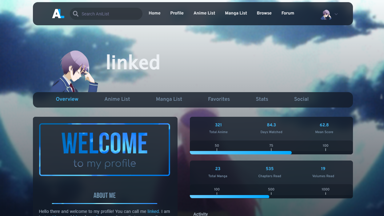
The custom profile css that I am using on my AniList profile with Automail
credits to Sigma
Authorlinked
LicenseNo License
Categoryanilist
Created
Updated
Code size42 kB
Code checksum13bb034a
Learn how we calculate statistics in the FAQ.
Failed to fetch stats.
The custom profile css that I am using on my AniList profile with Automail
credits to Sigma
Automail, so you can use it yourself: Automai Github Repo
Tutorials to set up custom css on anilist:
· by Kurisu-chan
· by Differ812
/* ==UserStyle==
@name           AL profile linked
@namespace      github.com/openstyles/stylus
@version        1.0.0
@description    A new userstyle
@author         linked
==/UserStyle== */

@-moz-document domain("anilist.co") {
    /*
        Cool Custom CSS for AniList
        Version - 1.1.5

        Written by Sigma. Edited by cakes.
        * anilist.co/user/Sigma
        * anilist.co/user/cakes

        Follow my GitHub for updates
        Visit https://zenbu.moe to find out about a cool new platform

        Licensed under the MIT license - http://opensource.org/licenses/MIT
        Copyright (c) 2021 2021.css

        ============================

        Main changes:
        * Navigation bar
        * Banner
        * Overview stats
        * Activity feed
        * Activity progress entries
        * Colors and UI

        ============================

    */
    /*===============================================
        Importing all animations
    ===============================================*/
    @charset "UTF-8";

    /*!
     * animate.css - https://animate.style/
     * Version - 4.1.1
     * Licensed under the MIT license - http://opensource.org/licenses/MIT
     *
     * Copyright (c) 2020 Animate.css
     */
    :root {
        --animate-duration: 1s;
        --animate-delay: 1s;
        --animate-repeat: 1
    }


    @keyframes shakeY {
        0%,
        to {
            -webkit-transform: translateZ(0);
            transform: translateZ(0)
        }
        10%,
        30%,
        50%,
        70%,
        90% {
            -webkit-transform: translate3d(0, -10px, 0);
            transform: translate3d(0, -10px, 0)
        }
        20%,
        40%,
        60%,
        80% {
            -webkit-transform: translate3d(0, 10px, 0);
            transform: translate3d(0, 10px, 0)
        }
    }

    .animate__shakeY {
        -webkit-animation-name: shakeY;
        animation-name: shakeY
    }

    @-webkit-keyframes swing {
        20% {
            -webkit-transform: rotate(15deg);
            transform: rotate(15deg)
        }
        40% {
            -webkit-transform: rotate(-10deg);
            transform: rotate(-10deg)
        }
        60% {
            -webkit-transform: rotate(5deg);
            transform: rotate(5deg)
        }
        80% {
            -webkit-transform: rotate(-5deg);
            transform: rotate(-5deg)
        }
        to {
            -webkit-transform: rotate(0deg);
            transform: rotate(0deg)
        }
    }

    @keyframes swing {
        25% {
            -webkit-transform: rotate(15deg);
            transform: rotate(15deg)
        }
        50% {
            -webkit-transform: rotate(-15deg);
            transform: rotate(-15deg)
        }
        75% {
            -webkit-transform: rotate(10deg);
            transform: rotate(10deg)
        }
        to {
            -webkit-transform: rotate(-10deg);
            transform: rotate(-10deg)
        }
    }

    .animate__swing {
        -webkit-transform-origin: top center;
        transform-origin: top center;
        -webkit-animation-name: swing;
        animation-name: swing
    }

    @keyframes bounceIn {
        0%,
        20%,
        40%,
        60%,
        80%,
        to {
            -webkit-animation-timing-function: cubic-bezier(.215, .61, .355, 1);
            animation-timing-function: cubic-bezier(.215, .61, .355, 1)
        }
        0% {
            opacity: 0;
            -webkit-transform: scale3d(.3, .3, .3);
            transform: scale3d(.3, .3, .3)
        }
        20% {
            -webkit-transform: scale3d(1.1, 1.1, 1.1);
            transform: scale3d(1.1, 1.1, 1.1)
        }
        40% {
            -webkit-transform: scale3d(.9, .9, .9);
            transform: scale3d(.9, .9, .9)
        }
        60% {
            opacity: 1;
            -webkit-transform: scale3d(1.03, 1.03, 1.03);
            transform: scale3d(1.03, 1.03, 1.03)
        }
        80% {
            -webkit-transform: scale3d(.97, .97, .97);
            transform: scale3d(.97, .97, .97)
        }
        to {
            opacity: 1;
            -webkit-transform: scaleX(1);
            transform: scaleX(1)
        }
    }

    .animate__bounceIn {
        -webkit-animation-duration: .75s;
        animation-duration: .75s;
        -webkit-animation-duration: calc(var(--animate-duration)*0.75);
        animation-duration: calc(var(--animate-duration)*0.75);
        -webkit-animation-name: bounceIn;
        animation-name: bounceIn
    }

    @keyframes zoomIn {
        0% {
            opacity: 0;
            -webkit-transform: scale3d(.3, .3, .3);
            transform: scale3d(.3, .3, .3)
        }
        50% {
            opacity: 1
        }
    }

    .animate__zoomIn {
        -webkit-animation-name: zoomIn;
        animation-name: zoomIn
    }

    @keyframes fadeInRight {
        0% {
            opacity: 0;
            -webkit-transform: translate3d(0, 100%, 0);
            transform: translate3d(0, 100%, 0)
        }
        to {
            opacity: 1;
            -webkit-transform: translateZ(0);
            transform: translateZ(0)
        }
    }

    .animate__fadeInRight {
        -webkit-animation-name: fadeInRight;
        animation-name: fadeInRight
    }

    @keyframes fadeInRight {
        0% {
            opacity: 0;
            -webkit-transform: translate3d(100%, 0, 0);
            transform: translate3d(100%, 0, 0)
        }
        to {
            opacity: 1;
            -webkit-transform: translateZ(0);
            transform: translateZ(0)
        }
    }

    .animate__fadeInRight {
        -webkit-animation-name: fadeInRight;
        animation-name: fadeInRight
    }

    /*===============================================
        Body element modifications
    ===============================================*/
    body {
        cursor: url(https://i.imgur.com/jWpt4CC.png), auto;
        overflow: overlay;
        background: rgba(var(--color-background)) !important;
        /*box-shadow: inset 0 200px 50px rgba(0,0,0,0.7);*/
        z-index: 0;
    }

    body::-webkit-scrollbar {
        background-color: rgba(255, 255, 255, 0);
        width: 20px;
    }
    body::-webkit-scrollbar-track {
        background-color: rgba(255, 255, 255, 0);
    }
    body::-webkit-scrollbar-thumb {
        border: 8px solid rgba(0, 0, 0, 0);
        background-color: rgba(141, 178, 219, 0.75);
        background-clip: padding-box;
        border-radius: 9999px;
    }
    body::-webkit-scrollbar-thumb:hover {
        border: 6px solid rgba(0, 0, 0, 0);
    }

    .about .content-wrap[data-v-5c30286e]::-webkit-scrollbar {
        background-color: rgba(255, 255, 255, 0);
        width: 4px
    }
    .about .content-wrap[data-v-5c30286e]::-webkit-scrollbar-track {
        background-color: rgba(255, 255, 255, 0);
    }
    .about .content-wrap[data-v-5c30286e]::-webkit-scrollbar-thumb {
        background-color: rgba(141, 178, 219, 0.20);
        border-radius: 10px;
    }

    /*===============================================
        Turning 3 site themes into 1
    ===============================================*/
    :root,
    body,
    .site-theme-dark,
    .site-theme-contrast {
        --color-background: 12, 19, 30;
        --color-foreground: 19, 28, 40;
        --color-foreground-grey: 15, 22, 31;
        --color-foreground-grey-dark: 6, 12, 19;
        --color-foreground-blue: 15, 22, 31;
        --color-foreground-blue-dark: 6, 12, 19;
        --color-text: 159, 173, 189;
        --color-text-light: 114, 138, 161;
        --color-text-lighter: 133, 150, 165;
        --color-shadow-blue: 0, 5, 15;
        --color-background-1200: 251, 251, 251;
        --color-background-1100: 240, 243, 246;
        --color-background-1000: 221, 230, 238;
        --color-background-900: 201, 215, 227;
        --color-background-800: 173, 192, 210;
        --color-background-700: 139, 160, 178;
        --color-background-600: 116, 136, 153;
        --color-background-500: 100, 115, 128;
        --color-background-400: 81, 97, 112;
        --color-background-300: 30, 42, 56;
        --color-background-100: 21, 31, 46;
        --color-background-200: 11, 22, 34;
        --color-gray-1200: 251, 251, 251;
        --color-gray-1100: 240, 243, 246;
        --color-gray-1000: 221, 230, 238;
        --color-gray-900: 201, 215, 227;
        --color-gray-800: 173, 192, 210;
        --color-gray-700: 139, 160, 178;
        --color-gray-600: 116, 136, 153;
        --color-gray-500: 100, 115, 128;
        --color-gray-400: 81, 97, 112;
        --color-gray-300: 30, 42, 56;
        --color-gray-100: 21, 31, 46;
        --color-gray-200: 11, 22, 34;
        --cc-foreground: 21, 34, 50;

        background: rgb(var(--color-background));
    }

    /*===============================================
        Navigation bar modifications
    ===============================================*/
    .nav .wrap {
        display: grid;
        grid-template-columns: 70px auto auto 70px;
    }
    .nav .wrap .links {
        grid-column-start: 3;
        margin-left: -25px;
    }

    .nav .wrap .search {
        grid-column-start: 2;
        grid-row-start: 1;
        padding: 10px;
        background: rgba(0, 0, 0, 0.2);
        border-radius: 35px;
        width: 100%;
        cursor: text;
    }

    .nav .wrap .search:after {
        content: "Search AniList";
        margin-left: 10px;
        color: #777a9e;
    }

    .nav .wrap .user {
        grid-column-start: 4;
        grid-row-start: 1;
    }

    /*===============================================
        Header modifications
    ===============================================*/
    .site-theme-dark .nav-unscoped.transparent,
    .site-theme-dark .nav-unscoped {
        background: rgb(var(--color-foreground));
    }

    .site-theme-dark .nav-unscoped.transparent:hover {
        background: rgb(var(--color-foreground));
    }


    .hea...