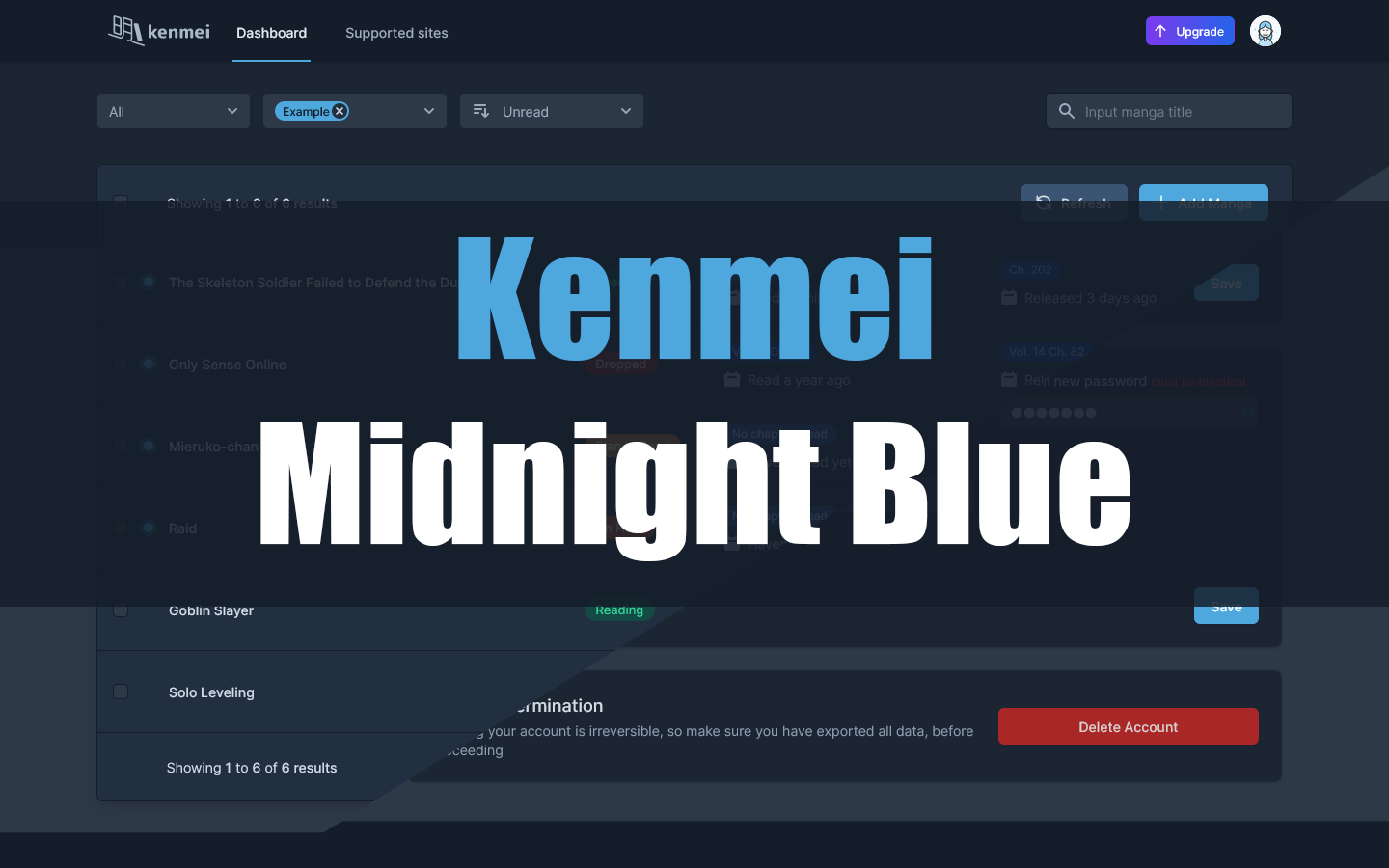
This is a dark userstyle for Kenmei with a blue color palette. It completely restyles all elements of the website to dark with slight tweaks to some elements to better fit in with the theme.
Kenmei Midnight Blue by ushruff
Imported and mirrored from https://github.com/ush-ruff/Kenmei-Midnight-Blue/raw/main/kenmei.user.css
Details
Authorushruff
LicenseGNU GPLv3
Categorykenmei
Created
Updated
Code size36 kB
Code checksum2deb127b
Statistics
Learn how we calculate statistics in the FAQ.
Failed to fetch stats.
Description
Notes
Features
-
All element restyled in theme colors.
-
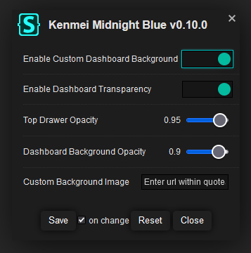
Option to customize your dashboard with a custom background image. (Please make sure to enter the URL within quotation marks to avoid errors)
-
Option to create a semi-transparent dashboard. (Only available to use alongside custom background image)
-
Source code
Source code has over 10K characters, so we truncated it. You can inspect the full source code on install link./* ==UserStyle==
@name Kenmei Midnight Blue
@namespace github.com/ush-ruff
@homepageURL https://github.com/ush-ruff/Kenmei-Midnight-Blue
@version 0.21.0
@description A new userstyle
@author ushruff
@preprocessor stylus
@var checkbox customBG "Custom Dashboard Background" 1
@var checkbox enableTransparency "Dashboard Transparency" 1
@var range topdrawerOpacity "Top Drawer Opacity" [0.95, 0, 1, 0.05]
@var range dashboardOpacity "Dashboard Background Opacity" [0.9, 0, 1, 0.05]
@var text customBgImage "Custom Background Image" "Enter url within quotes"
==/UserStyle== */
@-moz-document domain("kenmei.co") {
$bg1=#2e3947;
$bg2=#222f41;
$bg3=#1c2633;
$bg4=#141d29;
$bg5=#3c5474;
:root {
/*
--bg-1: #7400B8;
--bg-2: #6930C3;
--bg-3: #5E60CE;
--bg-4: #5390D9;
--bg-5: #4EA8DE;
--bg-6: #48BFE3;
--bg-7: #56CFE1;
--bg-8: #64DFDF;
--bg-9: #72EFDD;
--bg-10: #80FFDB;
*/
/*
--bg-1: #334154;
--bg-2: #1f2936;
--bg-3: #23262c;
--bg-4: #1a1d21;
*/
/*
--bg-1: #2e3947;
--bg-2: #222f41;
--bg-3: #1c2633;
--bg-4: #141d29;
--bg-5: #3c5474;
*/
--bg-1: $bg1;
--bg-2: $bg2;
--bg-3: $bg3;
--bg-4: $bg4;
--bg-5: $bg5;
scrollbar-color: var(--bg-5) var(--bg-3);
scrollbar-width: thin;
}
html {
background: var(--bg-4);
}
#app .router--wrapper {
background-color: var(--bg-1)
}
.bg-white {
background-color: var(--bg-3);
}
.dark_bg-blueGray-700,
.dark_bg-slate-700 {
background-color: var(--bg-1);
}
.dark_bg-gray-900 {
background-color: var(--bg-4);
}
.bg-gray-100 {
background-color: var(--bg-1);
}
.hover_bg-gray-100:hover {
background-color: var(--bg-4);
}
.bg-blue-500 {
background-color: #4EA8DE;
}
.bg-blue-600 {
background-color: #4EA8DE;
}
@css {
.hover_bg-blue-600\/90:hover {
background-color: #48BFE3;
}
}
.text-black {
color: #e3eaf2;
}
.hover_text-gray-300:hover {
color: #d4dce6;
}
.hover_text-gray-900:hover {
color: #e3eaf2;
}
.text-gray-400 {
color: #9dabbe;
}
.text-gray-500 {
color: #8f9db0;
}
.text-gray-700 {
color: #7a8696;
}
.text-gray-900 {
color: #6d798a;
}
.dark_text-white {
color: #d4dce6;
}
.border-gray-100 {
border-color: var(--bg-5);
}
.border-gray-200 {
border-color: var(--bg-1);
}
.border-gray-300 {
border-color: #6d798a;
}
.dark_border-gray-700 {
border-color: var(--bg-1);
}
.text-blue-600 {
color: #4EA8DE;
}
.sm_bg-transparent {
background-color: transparent;
}
.sm_divide-gray-100 > :not([hidden]) ~ :not([hidden]) {
border-color: var(--bg-1);
}
/* LOGIN */
.modal-body[data-v-7fb6ed76] {
.btn--link {
color: #4EA8DE;
&:hover {
color: #48BFE3;
}
}
label, .dark_text-white {
color: #9dabbe !important;
}
}
/* SKELETON LOADING */
.bg-gray-400 {
background-color: var(--bg-5);
}
.list-row__regular:hover .bg-gray-400 {
background-color: var(--bg-4);
}
#app, .vfm__content {
.skeleton-loader,
.skeleton-loader--text,
.skeleton-loader--badge,
.skeleton-text,
.skeleton--subtitle,
.skeleton--badge {
background-color: var(--bg-5);
}
}
/* FOOTER */
#app footer {
background-color: var(--bg-4);
border-color: var(--bg-3);
h5 {
color: #d4dce6;
}
.link {
color: #7a8696;
&:hover {
color: #9dabbe;
}
}
}
/* POPUP */
.el-message {
background-color: var(--bg-5);
border-color: var(--bg-1);
color: #d4dce6;
}
.el-message .el-icon-info,
.el-message--info .el-message__content {
color: inherit;
}
/* UPDATE PROMPT */
#app .prompt-wrapper {
background-color: var(--bg-4);
box-shadow: 0 0 10px rgba(black, 0.4);
button {
padding: 0.25rem 0.5rem;
background-color: var(--bg-4);
&:focus {
--tw-ring-offset-color: var(--bg-4);
--tw-ring-color: #4EA8DE;
}
}
.button--primary {
color: #4EA8DE;
&:hover, &:focus {
color: #48BFE3;
}
}
.button--secondary {
color: #9dabbe;
&:hover, &:focus {
color: #d4dce6;
}
}
}
/* HEADER */
#app header {
.desktop-links > div:first-child img {
filter: brightness(2);
}
.desktop-link {
color: #9dabbe;
&:focus, &:hover {
border-color: currentColor;
color: #d4dce6;
}
&.router-link-active {
border-color: #4EA8DE;
color: #4EA8DE;
}
}
.profile .btn--input {
background-color: var(--bg-1);
&:hover, &:focus {
--tw-ring-color: #4EA8DE;
}
kbd {
background-color: var(--bg-3);
border-color: var(--bg-4);
}
}
.profile .btn-avatar:focus {
--tw-ring-offset-color: var(--bg-4);
--tw-ring-color: #4EA8DE;
}
.dropdown-wrapper {
background-color: var(--bg-2);
.dark_text-white:not(.text-gray-900) {
color: #d4dce6;
}
.profile-link {
color: #9dabbe;
&:focus, &:hover {
background-color: var(--bg-5);
color: #d4dce6;
}
}
.header {
border-color: var(--bg-5);
}
}
}
.router-link-active img {
filter: brightness(1.65)
}
/* LANDING PAGE */
#landing-page {
h1 {
color: #e3eaf2;
}
h2, h3, h4, h5 {
color: #d4dce6;
}
p {
color: #9dabbe;
}
.secondary-text {
color: #7a8696;
}
.btn-action {
background-color: #4EA8DE;
color: #e3eaf2;
&:hover {
background-color: #48BFE3;
}
&:focus {
--tw-ring-offset-color: var(--bg-3);
}
}
.icon {
background-color: #4EA8DE;
color: #e3eaf2;
}
.stats-container {
background-color: var(--bg-2);
border: 1px solid var(--bg-1);
.stat-count {
color: #4EA8DE;
}
.stat-text {
color: #9dabbe;
}
}
.card {
background-color: #4EA8DE;
.text-blue-200 {
color: #e3eaf2;
}
h2 {
color: #fff;
}
a {
font-weight: 600;
background-color: #e3eaf2;
color: #4EA8DE;
&:hover {
background-color: #d4dce6;
}
}
}
}
/* Hero Image */
.hero-text + div {
.svg--wrapper {
background-color: var(--bg-2);
}
.img-wrapper {
margin-inline-start: 3rem;
padding: unset;
background-image: url(https://raw.githubusercontent.com/ush-ruff/Kenmei-Midnight-Blue/main/images/sc-01.png);
border-radius: 0.25rem;
box-shadow: 0 0 15px 5px rgba(0, 0, 0, 0.2);
picture {
display: none;
}
}
}
/* TOP DRAWER */
/* Header Buttons - Select, Filter, Sort, Add, Etc. */
#app {
.container--actions button,
.container--actions + div > div > button,
[aria-labelledby="filter-heading"] button {
background-color: var(--bg-1);
border-color: var(--bg-3);
color: #9dabbe;
&:hover, &:active, &[aria-expanded="true"] {
color: #d4dce6;
}
&:focus {
border-color: #4EA8DE;
--tw-ring-color: #4EA8DE;
--tw-ring-shadow: 0 0 0 1px var(--tw-ring-color);
--tw-ring-offset-shadow: unset;
}
.dark_text-white {
color: inherit;
}
}
.container--actions + div > div > button,
[aria-labelledby="filter-heading"] button {
/* Button with Tags selected */
&:has(> div) {
color: #9dabbe;
.bg-gray-100 {
font-weight: 500;
background-color: #4EA8DE;
color: var(--bg-4);
&:hover {
filter: brightness(0.85);
}
}
[role="separator"] {
background-color: #9dabbe;
}
}
/* Reset Button */
&.reset-button {
background-color: #b55151;
color: #d4dce6;
&:hover {
filter: brightness(1.15);
}
}
}
.container--actions + div > div.flex-none button:first-of-type {
background-color: var(--bg-1);
border-color: var(--bg-1);
color: #9dabbe;
&:hover {
color: #e3eaf2;
}
}
}
/* Dropdown */
#radix-vue-select-content-1,
#radix-vue-select-content-2,
#radix-vue-select-content-3,
#radix-vue-select-content-123,
#radix-vue-select-content-124,
#radix-vue-popover-content-4,
#radix-vue-popover-content-5,
#radix-vue-popover-content-6,
#radix-vue-popover-content-27,
#radix-vue-popover-content-125,
#radix-vue-popover-content-126,
#radix-vue-popover-content-127,
#radix-vue-select-content-v-0,
#radix-vue-select-content-v-1,
#radix-vue-popover-content-v-9,
#radix-vue-popover-content-v-10,
#radix-vue-popover-content-v-11,
#radix-vue-popover-content-v-12,
#radix-vue-popover-content-v-33,
#radix-vue-popover-content-v-389 {
background-color: var(--bg-4);
border: 1px solid var(--bg-4);
scrollbar-width: thin;
.bg-white {
background-color: var(--bg-4);
}
/* Search */
[cmdk-input-wrapper] {
border-color: var(--bg-1);
color: #9dabbe;
}
/* Options*/
[role="listbox"],
[role="group"] {
color: #9dabbe;
}
[role="option"] {
color: #9dabbe;
&:hover, &:focus, &[data-highlighted] {
background-color: var(--bg-2);
color: #d4dce6;
}
}
.os-scrollbar .os-scrollbar-handle {
backgr...