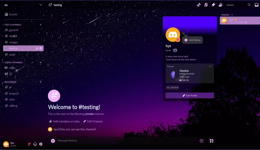
a purple theme for Discord with lots of customization options
Authorfurthir
LicenseNo License
CategoryDiscord
Created
Updated
Code size48 kB
Code checksumeb7edd6
Learn how we calculate statistics in the FAQ.
Failed to fetch stats.
a purple theme for Discord with lots of customization options
Still works on old UI if you want to revert
Customization
Custom settings that you can change to your liking such as custom background images, accent colors, background blur, compact sidebar drawer, and hiding some buttons such as call, help, and chat buttons.
Custom BG Image
To use your own background image, upload your image to either an image hosting site (e.g. postimg) or Discord, latter being the easiest. Choose 'Custom' as the background image and make sure to surround with url() in the settings. Make sure 'Patch CSP to allow style assets' is enabled in Stylus' options under Advanced.
Transparent UI
transparent ui
RGB home button
I got bored but I guess it looks cool
Hidden buttons
Gets rid of those annoying chat buttons (GIF, Stickers, Nitro gift), and help button.
Custom profile colors for profile themes
Choose your own colors for profile themes to your liking.


/* ==UserStyle==
 * @name         Discord Purple Night
 * @namespace    discord.com
 * @version      0.23.1
 * @author       Fython
 * @description  Purplized theme for Discord with lots of customization
 * @updateURL    https://raw.githubusercontent.com/Furthir/custom-css/main/DiscordMain.css?dummy=.user.css
 * @homepageURL  https://github.com/Furthir/custom-css/
 * @preprocessor stylus

// var checkbox 	image-groups 	"Group Multi-attachment messages" 	1
 @var checkbox 	sidebar-drawer	"Sidebar drawer"		 		 	1
 @var checkbox	rgbhome			"RGB Home Button"					0
 @var checkbox 	hide-chat-btn	"Hide chat buttons" 				1
 @var checkbox 	hide-call-btn	"Hide call buttons"					0
 @var checkbox	hide-nitro		"Hide Nitro tabs"					1
 @var checkbox  hide-dl-button  "Hide download button"              1
 @var color		accentColor 	"Accent Color"	 					#CF5FB5
 @var color		altAccent 		"Alt Accent Color"					rebeccapurple
 @var color		selectColor 	"Selection Color"		        	rgba(255, 80, 230, 0.2)
 @var text sep "-------------------------------" ___________________
 ----------------------------------------
 @var select bg-img "Background Image" {
 "Default": 		"url(https://ftn.s-ul.eu/pyVX6DgO )",
 "Energy":			"url(https://ftn.s-ul.eu/L03unytl)",
 "Lightscape":		"url(https://ftn.s-ul.eu/Xe8OXY1r)",
 "Skylake":			"url(https://ftn.s-ul.eu/EpXIznx4)",
 "Custom":			"custom-bg",
 "AMOLED":			"black",
 "None": 			"#18191b",
}

 @var text 		custom-bg	"Custom BG, include url()" 		"url()"
 @var range 	bg-blur  	"Background blur"             	[0, 0, 10, 1, "px"]
 @var color		bgoverlay	"Background Overlay"			rgba(0,0,0,0.26)

 @var text sep2 "-------------------------------" ___________________
 ----------------------------------------
 @var color		statusOnline	"Online Status Color"		rgba(207, 95, 181, 1)
 @var color		statusIdle		"Idle Status Color"			rgba(17, 239, 171, 1)
 @var color		statusDND		"DND Status Color"			rgba(255, 0, 0, 1)
 @var color		statusOffline	"Offline Status Color"		rgba(0, 0, 0, 1)

 @var text sep3 "-------------------------------" ___________________
 ----------------------------------------
 @var checkbox	customPrf		"Custom Profile Colors"			1
 @var checkbox	overridePrf		"Override Nitro Profile Colors"	0
 @var color		prfPrimary		"Profile Primary Color"			rgba(100 , 0, 255, 1)
 @var color		prfSecond		"Profile Secondary Color"		rgba(80, 0, 82, 1)
 @var color		prfBodyBG		"Profile Body Color"			rgba(0, 0, 0, 0.4)
 @var color 	prfOverlay		"Profile Overlay Color"			rgba(0, 0, 0, 0.5)
 @var checkbox  noprffx			"Disable Profile Effects"		1
 @var checkbox	noprfdeco		"Disable Profile Decorations"	1

 @var select	cfont	"Font"	{
  "Whitney (old)":		"Whitney",
  "Cursive":			"Cursive",
  "Serif":				"Serif",
  "Poynter":			"Poynter",
  "Noto Sans":			"Noto Sans",
  "gg sans (bad)":		"gg sans",
 }
 @var color		cfolder			"Custom Folder Color"		rgba(50, 70, 202, 0.4)
 @var number 	searchWidth		"Search box width"			[414, 400, 1000, 1, 'px']
 @var number	mlistWidth		"Member list width"			[244, 200, 350, 1, 'px']
 @var number	clistWidth		"Channel list width"		[313, 150, 400, 1, 'px']

==/UserStyle== */

/* set variables */
sT = background-color 0.25s ease
prfBorder = transparent
accentHover = (accentColor + rgb(35,35,35) - rgba(0,0,0,0.6))
altHover = (altAccent + rgba(20,20,20,-0.2))
accentDark = (accentColor - rgb(50,70,50))
defBG = rgba(0,0,0,0.35)
fade = opacity 0.15s ease-in

/* fonts */
@font-face {
	font-family: Whitney;
	font-style: normal;
	src: url("https://cdn.jsdelivr.net/gh/Furthir/custom-css@main/fonts/Whitney/whitney-book.woff2");
}

@font-face {
	font-family: Whitney-fancy;
	font-style: fancy;
	src: url("https://cdn.jsdelivr.net/gh/Furthir/custom-css@main/fonts/Whitney/whitney.woff2");
}

@font-face {
	font-family: Poynter;
	font-style: normal;
	src: url("https://cdn.jsdelivr.net/gh/Furthir/custom-css@main/fonts/Poynter/PoynterText%20Regular.woff2");
}
@-moz-document domain("discord.com") {
/* Root Discord backgrounds and colors changes */
/* BG Image */
.theme-dark, .theme-light {
	--background-primary: defBG !important;
	--background-secondary: none !important;
	--background-secondary-alt: none !important;
	--background-tertiary: bg-img !important;
}

/* Selection color */
::selection {
	background-color: selectColor;
}

/* remove/merge homepage backgrounds*/
.theme-light .container-2cd8Mz, .theme-dark .container-2cd8Mz {
	background-color: transparent !important;
}

.nowPlayingColumn-1eCBCN {
	background: none !important;
}

.scroller-hE2gWq {
	border: none;
}

.emptyCard-KDifrB {
	background: defBG;
}

.app_b1f720, [class^="bg_"] {
	background-image: var(--background-tertiary);
	background-position: unset;
	background-size: cover !important;
	box-shadow: inset 0 0 0 2000px bgoverlay; /* used for darkening background */
	background-repeat: no-repeat !important;
}

/* server list */
nav[aria-label="Servers sidebar"] {
    background: bgoverlay;
}

/* channel list/profile sidebar */
.sidebar_a4d4d9 {
    background: bgoverlay;
}

/* chat */
div[class^="chat_"] {
    background: bgoverlay;
}

main[class^="chatContent_"] {
    background: none;
}

/* forum channel background */
.chat__52833, .forumOrHome__75784, .container_b181b6 {
	background: transparent !important;
}

/* voice channel background */
.callContainer-HtHELf .theme-dark {
	background: none !important;
}

/* loading */
.loading-1yrGTe {
	background: none !important;
}

/* ??? */
.contentRegion-3HkfJJ {
	background: none !important;
}

/* settings page */
.sidebarRegionScroller-FXiQOh, .contentRegion_c25c6d, .contentRegionScroller_c25c6d {
	background: none !important;
}

/* app directory */
.theme-light .directoryModal-YJsOMv, .theme-dark .directoryModal-YJsOMv {
	background-color: transparent !important;
}

/* title/topbar */
.container-ZMc96U.themed-Hp1KC_ {
	background: none !important;
}

/* full app background removal */
.app-3xd6d0, .mobileApp-3_TCAV {
	background: none !important;
}

body, .appMount_c99875{
    background: none;
}

.content-1SgpWY {
	background: none !important;
}

.layer-86YKbF.baseLayer-W6S8cY {
	background-color: transparent !important;
}

.bg-1QIAus {
	background-color: transparent !important;
}

.chat-2ZfjoI {
	background: none !important;
}

.appMount-3lHmkl, body {
	background-color: var(--background-tertiary) !important;
}

.theme-light .scroller-3X7KbA, .theme-dark .scroller-3X7KbA {
    background: none;
}

body {
	background: transparent !important;
}

/* user list sidebar */
.container-2o3qEW {
	background: none;
}

/* server discover page */
.theme-dark .pageWrapper_fef757, .theme-light .pageWrapper_fef757 {
	background-color: rgba(0,0,0,0.2);
}

/* download apps pop */
.downloadApps-14IgKV {
	background-color: rgba(0,0,0,0.6) !important;
}

/* darken login background */
.wrapper_f5f4c9 {
	box-shadow: inset 0 0 0 2000px rgba(0, 0, 0, 0.5);
}

/* Discord Root CSS */
.theme-dark, .theme-light {
	--header-primary: (accentColor + rgb(5,5,5));
	--header-secondary: (accentColor - rgb(10,10,10));
	--text-normal: #e4f2ff;
	--text-muted: (accentColor + rgb(25,20,25));
	--text-link: var(--background-accent);
	--text-link-low-saturation: var(--background-accent);
	--text-positive: var(--background-accent);
	--interactive-normal: (accentColor + rgb(10,10,10));
	--interactive-hover: (accentColor + rgb(20,60,60));
	--interactive-active: (accentColor + rgb(25,20,25));
	--interactive-muted: (accentColor - rgb(60,60,60));
	--background-accent: accentColor;
	--background-floating: rgba(0,0,0,0.5);
	--background-mobile-primary: #ffa4f047;
	--background-mobile-secondary: #ff97f173;
	--background-modifier-accent: (accentColor - rgba(90,49,60,0.6));
	--background-modifier-active: (accentColor + rgb(40,40,40) - rgba(0,0,0,0.5));
	--background-modifier-selected: (accentColor - rgba(0,0,0,0.3));
	--background-modifier-hover: (accentHover);
	--background-message-hover: (accentColor - rgba(50,50,50,0.8));
	--mention-foreground: (accentColor + rgb(50,50,50)) !important;
	--mention-background: (accentColor - rgba(0,0,0,0.7))  !important;
	--channels-default: (accentColor - rgb(25,30,25));
	--modal-background: rgba(0,0,0,0.3);
	--modal-footer-background: transparent;
	--input-background: rgba(0,0,0,0.5);
	--info-positive-text: #cdffe9;
	--info-warning-text: #d7fffc;
	--info-danger-text: #d2fff9;
	--info-help-text: #cefff0;
	--scrollbar-thin-track: transparent;
	--scrollbar-auto-thumb: #cccccc2e;
	--scrollbar-auto-track: #f2f2f20f;
	--scrollbar-auto-scrollbar-color-thumb: #e3e5e838;
	--scrollbar-auto-scrollbar-color-track: #f2f3f533;
	--elevation-stroke: 0 0 0 1px rgba(6, 6, 7, 0.08);
	--elevation-low: 0 1px 0 rgba(6, 6, 7, 0.1), 0 1.5px 0 rgba(6, 6, 7, 0.025), 0 2px 0 rgba(6, 6, 7, 0.025);
	--elevation-medium: 0 4px 4px rgba(0, 0, 0, 0.08);
	--elevation-high: 0 8px 16px rgba(0, 0, 0, 0.16);
	--guild-header-text-shadow: 0 1px 1px hsla(0, 0%, 100%, 0.4);
	--channeltextarea-background: #a2a2a20a;
	--activity-card-background: rgba(0,0,0,0.2);
	--textbox-markdown-syntax: #3b46541f;
	--button-positive-background: accentColor;
	--button-positive-background-hover: (accentColor - rgba(0,0,0,0.3));
	--button-positive-background-active: (accentColor + rgb(29,3,60));
	--button-positive-background-disabled: (accentColor - rgba(50,50,50,0.3));
	--button-secondary-background: (altAccent - rgb(20,20,28));
	--button-secondary-background-hover: altHover;
	--button-secondary-background-active: (altAccent + rgb(29,3,60) - rgba(0,0,0,0.1));
	--button-secondary-background-disabled: (altAccent - rgba(50,50,50,0.3));
	--deprecated-card-bg: #00ffff38;
	--deprecated-card-editable-bg: rgb(246 246 247 / 57%);
	--deprecated-store-bg: #05ffff29;
	--deprecated-quickswitcher-input...