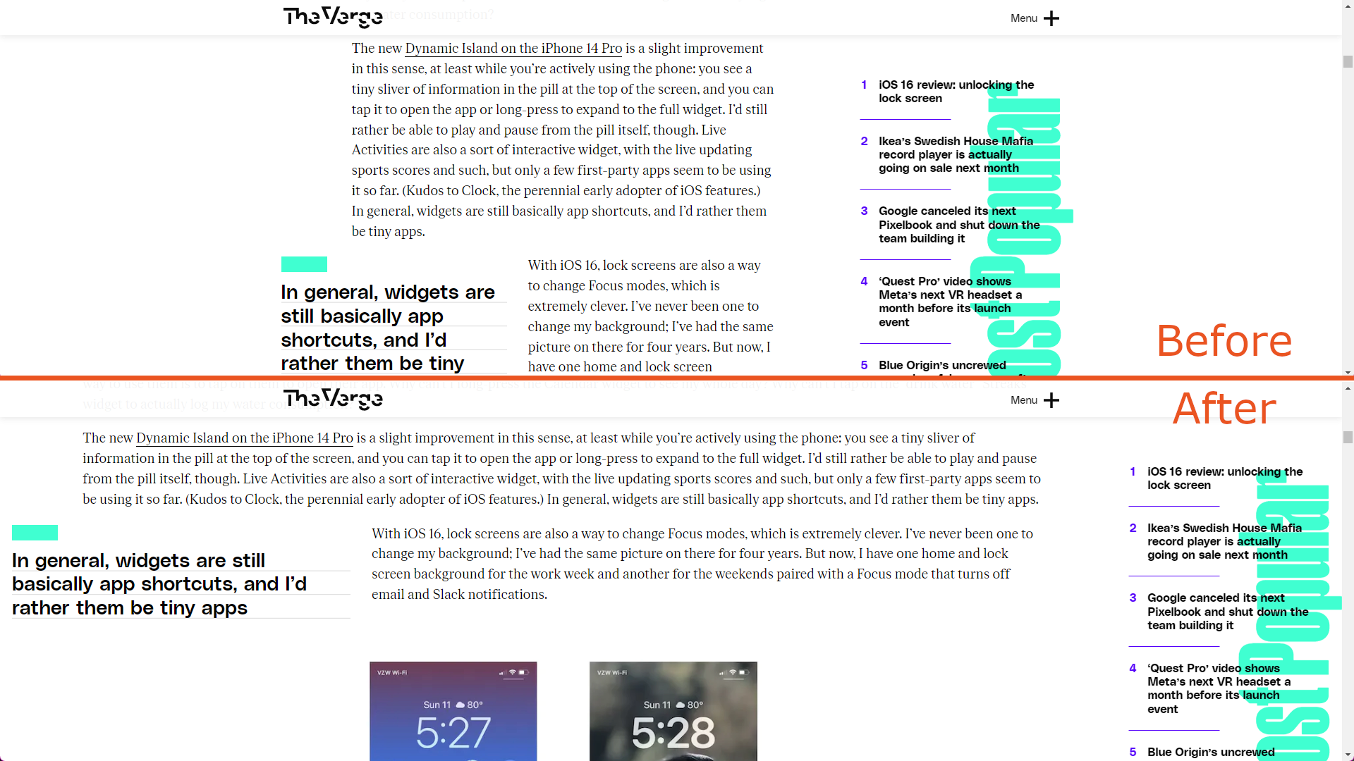
Make the articles content from the TheVerge.com 2022-25 design use more of the available space.
Wider theverge.com (2022-25 redesign) by mkody
Details
Authormkody
LicenseWTFPL
Categorytheverge
Created
Updated
Size2.8 kB
Statistics
Learn how we calculate statistics in the FAQ.
Failed to fetch stats.
Description
Notes
Make the articles content from the TheVerge.com 2022-25 design use more of the available space.
The "hero" or "title" part of the articles is put at the fixed max-width still, and some elements are edited to adapt to the changes.
If needed, you can contact me on Bluesky (@kdy.ch) or on the Fediverse (@kody@wubba.boo).
Source code
/* ==UserStyle==
@name         Wider theverge.com (2022-25 redesign)
@version      20250131.11.13
@namespace    ch.kdy.wider-theverge-2022
@description  Make the articles content from the TheVerge.com 2022/2023 design use more of the available space.
@author       mkody
@license      WTFPL
==/UserStyle== */

@-moz-document domain("theverge.com") {
  /* Only on large width */
  @media (min-width: 1180px) {
    /* (pre-2025) Yeet the max width on articles */
    article.mx-auto.w-full.max-w-container-lg,
    .duet--article--article-body-component-container {
      max-width: calc(100% - 12px);
    }

    /* (2025) Yeet the max width on articles */
    .duet--layout--entry-body-container,
    .duet--layout--entry-body-container .duet--layout--entry-body {
      max-width: calc(100% - 200px);
    }

    /* Keep the hero at the max width tho (except if fullbleed) */
    article.mx-auto.w-full.max-w-container-lg .duet--article--lede:not(.fullbleed) {
      max-width: 1100px;
    }

    /* Have the special lede align more with the content */
    .duet--ledes--standard-lede-bottom {
      margin-left: 100px
    }

    /* Have a max-width and center blocks (like galleries and big images) */
    article.mx-auto.w-full.max-w-container-lg .duet--article--article-body-component.block.clear-both:not(.md\:float-left):not(.md\:float-right),
    .duet--article--block-placement:not(.md\:float-left):not(.md\:float-right):not(.duet--article--block-placement:has(.duet--article--article-pullquote)) {
      margin-left: auto;
      margin-right: auto;
      max-width: 600px;
    }

    /* Some elements have been shifted to fit the default layout, remove the negative margin-left */
    div.duet--article--article-body-component .md\:-ml-100,
    div.duet--article--article-body-component .md\:ml-\[-100px\] {
        margin-left: auto;
    }

    /* Wider floating blocks
       (not implemented for the early-2025 upate) */
    article.mx-auto.w-full.max-w-container-lg .md\:float-left.md\:w-\[320px\],
    article.mx-auto.w-full.max-w-container-lg .md\:float-right.md\:w-\[320px\] {
      width: calc(320px * 1.2);
    }

    /* On quick-posts, wider comments */
    .duet--page-layout--quick-post .w-full .md\:mx-auto > div {
      margin-right: 0;
      width: 100%;
    }

    /* Wide streams */
    .duet--page-layout--stream article,
    .duet--page-layout--stream .duet--layout--entry-body {
      max-width: calc(100% - 200px);
    }

    /* Set the width on pictures and embeds in streams */
    .duet--page-layout--stream-article figure,
    .duet--page-layout--stream .duet--layout--entry-image,
    .duet--page-layout--stream .duet--media--embed {
      margin: 20px auto;
      max-width: 600px !important;
    }
  }
}