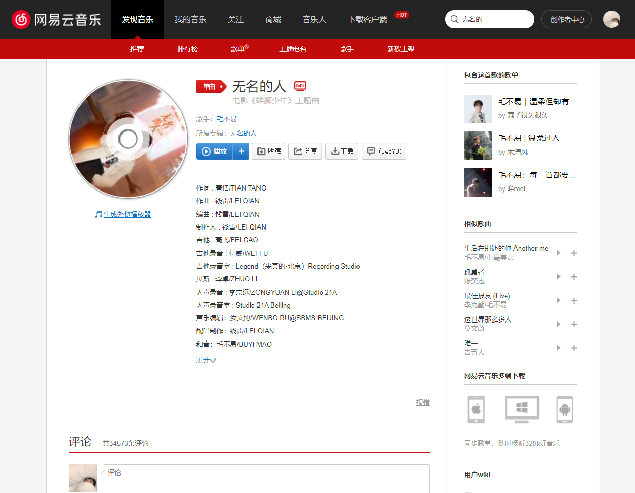
增加了黑胶光碟旋转


Authorxiaolongmr
LicenseNo License
Categoryhttps://music.163.com
Created
Updated
Code size2.2 kB
Code checksumb395603d
Learn how we calculate statistics in the FAQ.
Failed to fetch stats.
/* ==UserStyle==
@name           网易云光碟胶片
@namespace      github.com/openstyles/stylus
@version        1.0.0
@description    A new userstyle
@author         Me
==/UserStyle== */


@-moz-document domain("music.163.com"),
regexp("https?://music.163.com/(song|album).*") {
    /*=============✨✨【网易云光碟胶片】✨✨添加时间:2022年1月24号================*/
    /* 优化记录📑 */
    /*===2022/01/24:学习借鉴的项目:https://userstyles.org/styles/141395/cd
    =====001:
    */
    /* 待解决❌ */
    /*===001:与该正则表达式匹配的网址: https?://music.163.com/(song|album|playlist).*  去除playlist好像没有用,暂时没时间细看
    =====001:
    */
    .g-mn4 .u-cover {
        border-radius: 50% !important;
        box-shadow: 0 0 3px #333, 1px 1px 5px #888 !important;
        width: 210px !important;
        height: 210px !important;
    }
    .g-mn4 .u-cover::before {
        content: "";
        background: repeating-radial-gradient(#fff, #fff 15px, #888 16px, #888 17px, #fff 18px, #fff 26px, #ffffffbb 27px, #ffffffbb 38px, transparent 39px, transparent 44px, #aaa 45px, #aaa);
        border-radius: 50%;
        height: 90px;
        width: 90px;
        left: 60px;
        top: 60px;
        position: absolute;
        z-index: 9999;
    }
    .g-mn4 .u-cover:after {
        content: " ";
        box-shadow: -1px 1px 2px #a7a7a7, -1px -1px 2px #a7a7a7, 1px 1px 3px #333 inset;
        border-radius: 50%;
        height: 32px;
        width: 32px;
        left: 89px;
        top: 89px;
        position: absolute;
        z-index: 99999;
    }
    .g-mn4 .u-cover img {
        position: absolute !important;
        z-index: 999 !important;
        border-radius: 50% !important;
        width: 206px !important;
        height: 206px !important;
        left: 2px !important;
        top: 2px !important;
        margin: 0 !important;
        animation: rotate 180s linear infinite !important;
    }
    @keyframes rotate {
        0% {
            transform: rotate(0deg);
        }
        100% {
            transform: rotate(3600deg);
        }
    }
    .g-mn4 .msk {
        display: none !important;
    }
}