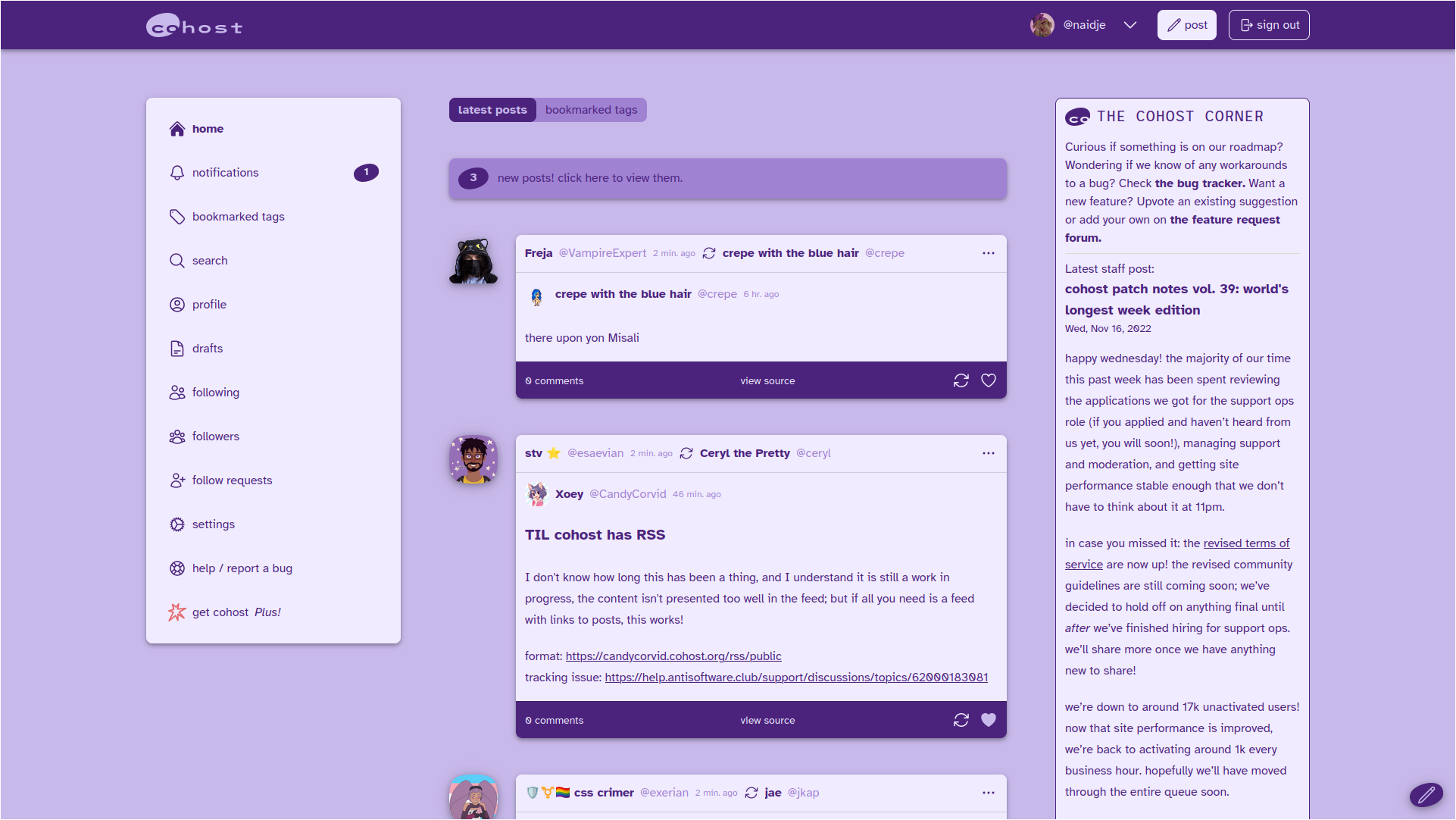
A purple and lilac userstyle for cohost.org.
Cohost Purple by naidje
Mirrored from https://github.com/naidje/cohost-purple/raw/main/cohost-purple.user.css
Details
Authornaidje
LicenseNo License
Categorycohost
Created
Updated
Size35 kB
Statistics
Learn how we calculate statistics in the FAQ.
Failed to fetch stats.
Description
Notes
The code is a bit messy, and not everything is themed yet, but the vast majority of the site should work.
It doesn't work well in dark mode tho. Sorry.
Source code
Source code has over 10K characters, so we truncated it. You can inspect the full source code on install link./* ==UserStyle==
@name Cohost Purple
@namespace github.com/openstyles/stylus
@version 1.3.3
@description A purple userstyle for cohost.org
@author naidje
==/UserStyle== */
@-moz-document domain("cohost.org") {
:root {
--color-notWhite: 200 185 235;
/* ^ original 255 249 242 */
--color-notBlack: 75 35 125;
/* ^ original 25 25 25 */
--color-cherry: 75 35 125;
/* ^ original 131 37 79 */
--color-strawberry: 75 35 125;
/* ^ original 229 107 111 */
--color-mango: 240 235 255;
/* ^ original 255 171 92 */
--color-longan: 140 95 210;
/* ^ original 255 216 168 */
--color-white: 240 235 255;
/* ^ original 255 255 255. it's white */
--color-black: 30 20 60;
/* ^ original 69420 666 66 jk its black. 0 0 0 */
--color-green: 50 210 120;
--color-red: 190 100 200;
--color-tertiary-300: 160 130 210;
/* and more */
--color-compose-button-600: 115 80 160;
--color-compose-button-400: 135 100 200;
/* ^ the line inbetween 'post now' and the carat */
--color-mango-100: 160 130 210;
/* ^ used for some smaller backgrounds */
--color-longan-100: 240 235 255;
/* ^ used for some smaller backgrounds */
--color-longan-300: 160 130 210;
/* ^ used for some button backgrounds */
--color-gray-300: 240 235 255;
/* ^ used for some separators */
--color-gray-400: 240 235 255;
/* ^ used for comments link under posts */
--color-gray-500: 160 128 208;
/* ^ used for timestamps and tags */
--color-gray-600: 160 128 208;
/* ^ used for user @ links */
--color-gray-800: 45 25 75;
/* ^ used for embed links */
--color-sidebar-bg: 240 235 255;
--color-sidebar-text: 75 35 125;
--color-accent: 75 35 125;
--color-sidebar-accent: var(--color-accent)!important;
/* ^ sidebar colors */
--color-highlight: 245 245 255;
/* ^ mouseover highlight color for notifications page */
--color-askbox: 230 220 255;
}
/* login button */
#login-form .hover\:bg-foreground-600:hover {
color: rgb(var(--color-notWhite)/var(--tw-text-opacity));
background-color: rgb(var(--color-compose-button-600)/var(--tw-bg-opacity));
}
#login-form .active\:bg-foreground-700:active {
--tw-bg-opacity: 1;
background-color: rgb(var(--color-longan-300)/var(--tw-bg-opacity));
}
/* "report a bug" widget */
.gQnPtz:hover {
box-shadow: rgba(0, 0, 0, 0.2) 0px 2px 8px;
transform: scale(1.04);
transition: all 0.5s linear 0s;
background: rgb(var(--color-longan-300)) radial-gradient(circle, transparent 1%, rgb(var(--color-longan-300)) 1%) center center / 15000%;
}
.gQnPtz {
color: rgb(var(--color-notBlack));
background: rgb(var(--color-longan-300));
}
.dcxZoa {
height: 184px;
position: relative;
background: rgb(var(--color-longan-300)) 0% 0% / contain;
color: rgb(var(--color-notBlack));
}
.jfbagZ {
border-radius: 8px;
padding: 9px 18px 12px;
box-shadow: rgba(0, 0, 0, 0.3) 0px 2px 4px 0px;
background: rgb(var(--color-longan-300));
}
.jfbagZ:hover {
background: rgb(var(--color-longan-300));
}
/* various types of text */
.text-notBlack, .prose, .prose-stone {
color: rgb(var(--color-notBlack)/var(--tw-text-opacity));
--tw-prose-headings: rgb(var(--color-notBlack));
--tw-prose-bold: rgb(var(--color-notBlack));
--tw-prose-quotes: rgb(var(--color-notBlack));
--tw-prose-quote-borders: rgb(var(--color-notWhite));
--tw-prose-bullets: rgb(var(--color-notBlack));
--tw-prose-counters: rgb(var(--color-notBlack));
--tw-prose-hr: rgb(var(--color-notWhite));
--tw-prose-captions: rgb(var(--color-notBlack));
--tw-prose-body: rgb(var(--color-notBlack));
--tw-prose-lead: rgb(var(--color-notBlack));
--tw-prose-links: rgb(var(--color-notBlack));
--tw-prose-code: rgb(var(--color-notBlack));
--tw-prose-pre-code: rgb(var(--color-white));
--tw-prose-pre-bg: rgb(var(--color-notBlack));
--tw-prose-th-borders: rgb(var(--color-white));
--tw-prose-td-borders: rgb(var(--color-white));
--tw-prose-invert-body: rgb(var(--color-white));
--tw-prose-invert-headings: rgb(var(--color-white));
--tw-prose-invert-lead: rgb(var(--color-notWhite));
--tw-prose-invert-links: rgb(var(--color-white));
--tw-prose-invert-bold: rgb(var(--color-white));
--tw-prose-invert-counters: rgb(var(--color-notWhite));
--tw-prose-invert-hr: rgb(var(--color-notBlack));
--tw-prose-invert-quotes: rgb(var(--color-white));
--tw-prose-invert-quote-borders: rgb(var(--color-notBlack));
--tw-prose-invert-captions: rgb(var(--color-notWhite));
--tw-prose-invert-code: rgb(var(--color-white));
--tw-prose-invert-pre-code: rgb(var(--color-notWhite));
--tw-prose-invert-pre-bg: rgb(0 0 0 / 50%);
--tw-prose-invert-th-borders: rgb(var(--color-notBlack));
--tw-prose-invert-td-borders: rgb(var(--color-notBlack));
}
.hover\:bg-red:hover {
--tw-bg-opacity: 1;
background-color: rgb(var(--color-black)/var(--tw-bg-opacity));
}
.border-red {
--tw-border-opacity: 1;
border-color: rgb(var(--color-notBlack)/var(--tw-bg-opacity));
}
.hover\:fill-cherry-700:hover {
fill: rgb(var(--color-black)/var(--tw-bg-opacity));
}
/*notification page and popover */
#conotifpopover {
--np-accent: var(--color-cherry);
--np-accent-fg: var(--color-notWhite);
--np-notif-accent: var(--color-cherry);
--np-notif-bg: var(--color-white);
--np-notif-fg: var(--color-notBlack);
--np-notif-divider: var(--color-notWhite);
--np-notif-target-fg: var(--color-gray-600);
--np-date-header: var(--color-tertiary-300) !important;
--np-date-header-fg: var(--color-notBlack);
--np-popover-bg: var(--color-sidebar-bg);
--np-popover-outline: var(--color-notWhite);
--np-popover-fg: var(--color-notBlack) !important;
--np-button-bg: var(--color-foreground);
--np-button-active-bg: var(--color-foreground-700);
--np-button-fg: var(--color-notWhite);
--np-cohost-shadow-light: 0px 4px 5px rgba(25, 25, 25, 0.14), 0px 1px 10px rgba(25, 25, 25, .12), 0px 2px 4px rgba(0, 0, 0, .2);
--np-cohost-shadow-dark: 0px 4px 5px rgba(0, 0, 0, 0.14), 0px 1px 10px rgba(0, 0, 0, .12), 0px 2px 4px rgba(0, 0, 0, .2);
}
#conotifpopover .np-header .np-header-button svg {
color: rgb(var(--np-popover-fg));
}
#conotifpopover .np-header .np-header-button.np-is-active svg {
color: rgb(var(--np-button-fg));
}
#conotifpopover .np-notification .np-inner-notif .np-grouped-notif-projects .np-collapsed-container .np-expand-button svg {
color: rgb(var(--np-popover-fg));
}
time.font-league {
color: rgb(var(--color-notBlack) / var(--tw-text-opacity))!important;
}
.flex-wrap {
color: rgb(var(--color-notBlack) / var(--tw-text-opacity))!important;
}
#conotifpopover .np-popover-arrow::before {
content: '';
position: absolute;
right: 100%;
top: 0;
width: 16px;
height: 16px;
border: 8px solid transparent;
border-right-color: transparent;
border-right-color: rgb(var(--np-popover-outline));
box-sizing: border-box;
}
#conotifpopover .np-popover-arrow::after {
content: '';
position: absolute;
right: 100%;
top: 1px;
width: 14px;
height: 14px;
border: 7px solid transparent;
border-right-color: transparent;
border-right-color: rgb(var(--color-white));
box-sizing: border-box;
}
.bg-tertiary-300.flex-row {
--tw-bg-opacity: 1;
background-color: rgb(var(--color-longan-300) / var(--tw-bg-opacity));
}
[id^="headlessui-menu-button-\:"] .ui-open\:rotate-180 {
color: rgb(var(--color-notBlack));
}
/* notification popover old version*/
.conotifs-popover .inner-grouped-expand-button {
color: rgb(var(--color-notBlack));
}
.conotifs-popover .inner-open {
color: rgb(var(--color-notBlack));
text-decoration: none;
}
.conotifs-popover .header-page-control:hover {
border-color: rgb(var(--color-notBlack));
}
.conotifs-popover .inner-popover .inner-contents {
flex: 1;
overflow-x: hidden;
overflow-y: scroll;
background: rgb(var(--color-white));
}
.conotifs-popover .inner-popover .inner-arrow::before {
content: '';
position: absolute;
right: 100%;
top: 0;
width: 16px;
height: 16px;
border: 8px solid transparent;
border-right-color: transparent;
border-right-color: var(--color-longan-300);
box-sizing: border-box;
}
.conotifs-popover .inner-popover .inner-arrow::after {
content: '';
position: absolute;
right: 100%;
top: 1px;
width: 14px;
height: 14px;
border: 7px solid transparent;
border-right-color: transparent;
border-right-color: rgb(var(--color-white));
box-sizing: border-box;
}
.conotifs-popover .inner-popover {
color: rgb(var(--color-bg-text));
--popover-background: rgb(var(--color-sidebar-bg));
--popover-outline: rgb(var(--color-longan-300));
}
.conotifs-popover .inner-grouped-shroud {
position: absolute;
pointer-events...