Give your stylus a new ui.....
Stylus 2.0 by him
Details
Authorhim
LicenseNo License
Categorychrome-extension://clngdbkpkpeebahjckkjfobafhncgmne/
Created
Updated
Code size7.2 kB
Code checksum9fc8d944
Statistics
Learn how we calculate statistics in the FAQ.
Failed to fetch stats.
Description
Notes
Userstyle doesn't have notes.Source code
/* ==UserStyle==
@name Stylus 2.0
@namespace userstyles.world/user/him
@version 1.0.0
@description A new userstyle
@author Him
==/UserStyle== */
@-moz-document url-prefix("chrome-extension://") {
/* Insert code here... */
}
/*scrollbar*/
/* width */
::-webkit-scrollbar {
width: 10px !important;
border-radius: 100px;
}
/* Track */
::-webkit-scrollbar-track {
box-shadow: none !important;
border-radius: 10px !important;
background: #161616 !important;
}
/* Handle */
::-webkit-scrollbar-thumb {
background: #161616 !important;
border-radius: 100px !important;
}
/* Handle on hover */
::-webkit-scrollbar-thumb:hover {
background: #161616 !important;
border-radius: 100px !important;
}
/*body*/
.CodeMirror-scroll{
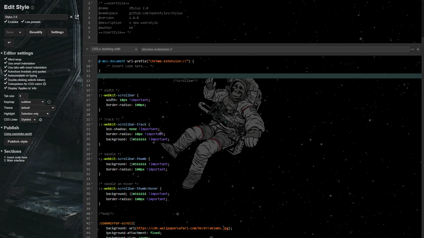
background: url(https://cdn.wallpapersafari.com/96/87/akiW8x.jpg);
background-attachment: fixed;
background-size: cover;
background-blend-mode: color;
background-color: rgba(0, 0, 0, .7);
}
#sections{
background-color: #00000003
}
#save-button,.split-btn-pedal .usercss-only,#,#beautify{
height: 90px;
color: white;
border-radius: 5px;
font-family:
}
@-moz-document regexp('^(moz|chrome)-extension://.*$') {
/* Main interface */
*, *:before, *:after {
box-shadow: none !important;
}
/* width */
::-webkit-scrollbar {
width: 10px !important;
border-radius: 100px;
}
/* Track */
::-webkit-scrollbar-track {
box-shadow: none !important;
border-radius: 10px !important;
background: #161616 !important;
}
/* Handle */
::-webkit-scrollbar-thumb {
background: #161616 !important;
border-radius: 100px !important;
}
/* Handle on hover */
::-webkit-scrollbar-thumb:hover {
background: #161616 !important;
border-radius: 100px !important;
}
/*body*/
body{
background-image: url(https://starwarsblog.starwars.com/wp-content/uploads/2020/04/star-wars-backgrounds-38.jpg);
background-attachment: fixed;
background-size: cover;
font-size: 70%
}
#sections{
background-color: #00000003
}
#save-button,.split-btn-pedal .usercss-only,#,#beautify{
height: 90px;
color: white;
border-radius: 5px;
font-family:
}
#header {
color: text-1 !important;
background: bg-1 !important;
}
.section-editor {
color: text-1 !important;
background: bg-1 !important;
}
a {
color: text-1 !important;
&:hover {
color: highlight !important;
}
}
input, select {
background: bg-1 !important;
color: text-1 !important;
border: 1px solid text-1 !important;
border-radius: border-radius !important;
&:focus {
border-color: highlight !important;
}
}
button {
background: bg-1 !important;
color: text-1 !important;
border-radius: border-radius !important;
&:hover {
color: highlight !important;
border-color: highlight !important;
cursor: pointer !important;
}
}
.dropdown-content {
border: 1px solid text-1 !important;
background: bg-1 !important;
a:hover {
color: highlight !important;
background: bg-1 !important;
}
}
.svg-icon, .svg-icon.checked, .select-arrow {
fill: text-1 !important;
&:hover {
fill: highlight !important;
}
}
#stylus-options #options-title, #stylus-popup #installed {
background: bg-1 !important;
color: text-1 !important;
}
#stylus-options #options, #stylus-popup {
background: bg-2 !important;
color: text-1 !important;
}
#stylus-manage {
background: bg-1 !important;
color: text-1 !important;
}
#help-popup {
background: bg-1 !important;
border: 1px solid text-1 !important;
.title {
color: text-1 !important;
background: bg-1 !important;
border-bottom: 1px solid text-1 !important;
}
.contents {
color: text-1 !important;
.can-close-on-esc {
padding: 2px !important;
}
.keymap-list {
color: text-1 !important;
}
}
}
.menu-items-wrapper {
background: bg-1 !important;
border: 1px solid text-1 !important;
.menu-title {
border-bottom: 1px solid text-1 !important;
}
}
.onoffswitch {
.slider + span:before {
background: text-2 !important;
}
.slider:checked + span:before {
background: highlight !important;
}
}
#installed {
.entry {
.style-name:hover:before {
background: linear-gradient(to right, hsla(hue(highlight), 79.6%, 44.1%, 0.2), hsla(hue(highlight), 20%, 10%, 0.05) 50%, transparent);
}
&.usercss {
.style-name-link:after {
if (!dark(highlight)) {
color: bg-1 !important;
} else {
color: text-1 !important;
}
background: highlight !important;
}
}
}
}
.all-styles-hidden-by-filters:before, .all-styles-hidden-by-filters:after {
color: text-1 !important;
}
.install {
border: 1px solid highlight !important;
text-shadow: none !important;
}
.install::before, .install:active::before, .install:active:hover::before{
background: bg-1 !important;
border: none !important;
}
/* Code editor */
.CodeMirror {
background: bg-1 !important;
color: text-1 !important;
line-height: 1.4em !important;
font-size: 14px !important;
.CodeMirror-line {
padding-left: 10px !important;
}
.CodeMirror-gutters {
background: bg-1 !important;
border-color: highlight !important;
}
.CodeMirror-selected, .CodeMirror-activeline-background {
color: bg-1 !important;
background: bg-2 !important;
}
.CodeMirror-cursor {
border-color: text-1 !important;
}
.cm-meta {
color: text-1 !important;
}
.cm-comment {
color: text-2 !important;
}
.cm-matchhighlight {
color: getForegroundColor(highlight) !important;
background: highlight !important;
}
}
#search-replace-dialog {
color: text-1 !important;
background: bg-1 !important;
.CodeMirror-search-field {
color: text-1 !important;
}
}
}