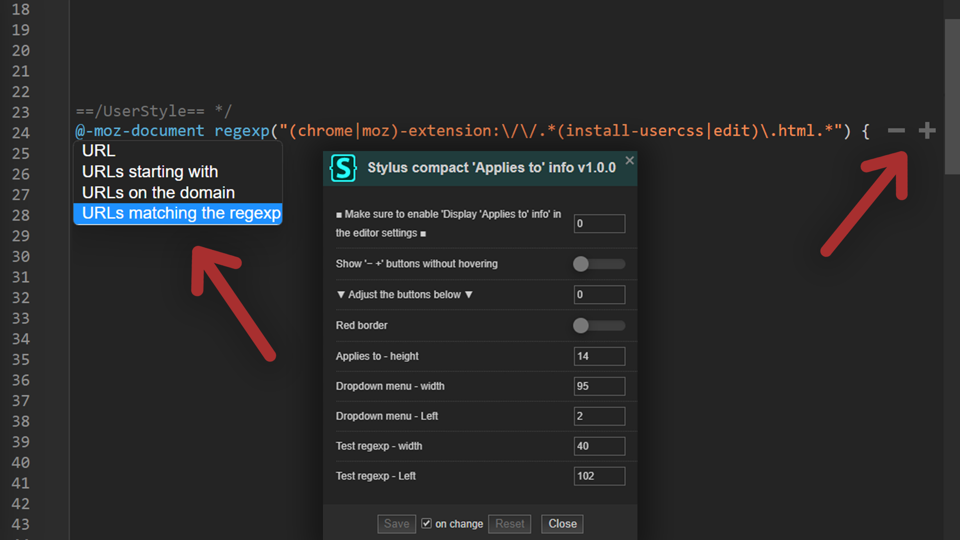
Very minimalistic 'Applies to' info. Click on '@-moz-document' to open the dropdown menu
Stylus compact 'Applies to' info by pabli
Details
Authorpabli
LicenseMIT
Categorychrome-extension
Created
Updated
Size3.1 kB
Statistics
Learn how we calculate statistics in the FAQ.
Failed to fetch stats.
Description
Notes
⚠️ Make sure to enable "Display 'Applies to' info" in the editor settings.
The dropdown menu only works for the first url.
Source code
/* ==UserStyle==
@name           Stylus compact 'Applies to' info
@namespace      https://github.com/pabli24
@version        1.0.2
@description    Very minimalistic 'Applies to' info. Click on '@-moz-document' to open dropdown menu (only works for the first url).
@author         Pabli
@homepageURL    https://userstyles.world/style/7612/stylus-compact-applies-to-info
@supportURL     https://userstyles.world/style/7612/stylus-compact-applies-to-info
@license        MIT
@preprocessor   stylus
@var            number   p0      "⚠️ Make sure to enable \"Display 'Applies to' info\" in the editor settings" [0,0,0,1]
@var            checkbox remAdd  "Show '− +' buttons without hovering"                                         0
@var            number   p1      "▼ Adjust the buttons below ▼"                                                [0,0,0,1]
@var            checkbox redBor  "Red border"                                                                  0
@var            number   aHeight "Applies to - height"                                                         ['px', 14, 0, null]
@var            number   aWidth  "Dropdown menu - width"                                                       ['px', 95, 0, null]
@var            number   aLeft   "Dropdown menu - left"                                                        ['px', 2, null, null]

==/UserStyle== */
@-moz-document regexp("(chrome|moz)-extension:\/\/.*(install-usercss|edit)\.html.*") {

.usercss {
	.CodeMirror-linewidget {
		width: auto !important
		height: 0 !important
		left: 0 !important
		padding: 0 !important
		transition: opacity 0.3s
		unless remAdd {
			opacity: 0
		}
		if redBor {
			opacity: 1
		}
		&:hover {
			opacity: 1
		}
		.applies-to {
			background-color: transparent
			position: absolute
			width: 100%
			min-height: 0
			border-top: 0
			border-bottom: 0
			border-width: 0
			margin: 0
			padding: 0
			pointer-events: none
			user-select: none
			select {
				background: transparent
				border: none
				option {
					background: var(--bg, hsl(0, 0%, 14%))
					color: var(--fg, hsl(0, 0%, 80%))
				}
			}
			.applies-to-item {
				position: absolute
				width: 100%
				margin-bottom: 0
				.applies-value-wrapper {
					flex-grow: 1
					display: flex
					justify-content: flex-end
					align-items: center
				}
				&:first-child .select-wrapper {
					z-index: 9
				}
				.select-wrapper, .applies-value-wrapper > * {
					pointer-events: auto
				}
				.select-wrapper .applies-type {
					height: aHeight
					width: aWidth
					left: aLeft
					position: relative
					color: transparent
					cursor: pointer
				}
				if redBor {
					.applies-type {
						border: 1px solid red !important
					}
				}
			}
			.add-applies-to, .remove-applies-to {
				height: auto
			}
			label, .applies-value,
			.select-wrapper::before, .select-wrapper::after {
				display: none !important
			}
		}
	}
	.CodeMirror-activeline .applies-to::before {
		background-color: transparent
	}
}

}