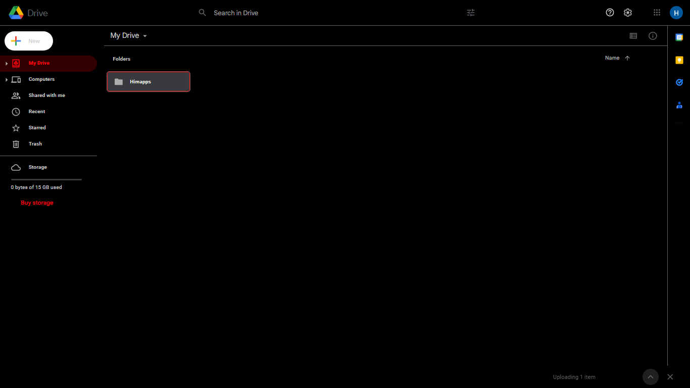
Gives You a black UI Drive with extended customizations........
Black Drive by him
Details
Authorhim
LicenseNo License
Categorydrive.google.com
Created
Updated
Code size52 kB
Code checksum10c56393
Statistics
Learn how we calculate statistics in the FAQ.
Failed to fetch stats.
Description
Notes
Userstyle doesn't have notes.Source code
Source code has over 10K characters, so we truncated it. You can inspect the full source code on install link./* ==UserStyle==
@name Google Drive Dark
@namespace userstyles.world/user/him
@author Him
@version 0.2.14
@preprocessor stylus
@var color accentColor "Accent Color" #8ab4f8
@var color darkColor "Dark Color" #202124
@var color dark2 "Dark 2" #28292C
@var color dark3 "Dark 3" #393A3D
@var color dark4 "Dark 4" #5f6368
@var color text1 "Primary Text Color" #ffffff
@var color text2 "Secondary Text Color" #e8eaed
@var color text3 "Tertiary Text Color" #9aa0a6
@var number overlayOpacity "Overlay Opacity" [0.08, 0, 0.5, 0.01]
@var number overlayOpacity2 "Overlay Opacity 2" [0.14, 0, 0.5, 0.01]
@var number disabledOpacity "Disabled Opacity" [0.38, 0, 1, 0.01]
@var select activationMode "Enable Based On" ["Always", "System:System Setting*", "Never"]
@var select embedOn "Enable For Embeds" ["Match:Match Setting", "Always", "System", "Never"]
@var select enableShare "Enable For Share Menu" ["Match:Match Setting", "Always", "System", "Never"]
==/UserStyle== */
white = text1;
light = text2;
dark1 = darkColor;
accent = accentColor;
detransparentify(top, bottom = #fff, opacity) {
rgb(
(1 - opacity) * red(bottom) + opacity * red(top),
(1 - opacity) * green(bottom) + opacity * green(top),
(1 - opacity) * blue(bottom) + opacity * blue(top)
);
}
/* === MAIN === */
@-moz-document regexp("https?:\/\/drive\.google\.com\/drive.*") {
activate() {
// ROOT VARIABLES
.XV0XSd.KkxPLb {
--dt-background: darkColor;
--dt-on-background: text1;
--dt-outline: dark2;
--dt-on-disabled: #25282a;
--dt-disabled: #35383b;
--dt-inverse-on-surface: dark4;
--dt-inverse-surface: dark2;
--dt-on-surface-variant: text3;
--dt-on-surface: text3;
--dt-surface-variant: dark1;
--dt-surface1: dark2;
--dt-surface1-shadow: 0 1px 2px 0 rgba(60, 64, 67, 0.3), 0 1px 3px 1px rgba(60, 64, 67, 0.15);
--dt-surface2: #fff;
--dt-surface2-shadow: 0 1px 2px 0 rgba(60, 64, 67, 0.3), 0 2px 6px 2px rgba(60, 64, 67, 0.15);
--dt-surface3: #fff;
--dt-surface3-shadow: 0 1px 3px 0 rgba(60, 64, 67, 0.3), 0 4px 8px 3px rgba(60, 64, 67, 0.15);
--dt-surface4: #fff;
--dt-surface4-shadow: 0 2px 3px 0 rgba(60, 64, 67, 0.3), 0 6px 10px 4px rgba(60, 64, 67, 0.15);
--dt-surface5: #fff;
--dt-surface5-shadow: 0 4px 4px 0 rgba(60, 64, 67, 0.3), 0 8px 12px 6px rgba(60, 64, 67, 0.15);
--dt-surface: #fff;
--dt-scrim: rgba(32, 33, 36, 0.6);
--dt-on-primary-container: #3c4043;
--dt-on-primary: #fff;
--dt-primary-action-state-layer: accentColor;
--dt-primary-action-stateful: accentColor;
--dt-primary-action: accentColor;
--dt-primary-container-icon: accentColor;
--dt-primary-container-link: accentColor;
--dt-primary-container: #e8f0fe;
--dt-primary-icon: #fff;
--dt-primary-link: #fff;
--dt-primary-outline: #185abc;
--dt-primary: #1a73e8;
--dt-on-secondary-container: text3;
--dt-on-secondary: #fff;
--dt-secondary-action-state-layer: #3c4043;
--dt-secondary-action-stateful: #202124;
--dt-secondary-action: text2;
--dt-secondary-container-icon: #3c4043;
--dt-secondary-container-link: accentColor;
--dt-secondary-container: #f1f3f4;
--dt-secondary-icon: #fff;
--dt-secondary-link: #fff;
--dt-secondary-outline: #3c4043;
--dt-secondary: #3c4043;
--dt-on-tertiary-container: #3c4043;
--dt-on-tertiary: #fff;
--dt-tertiary-action-state-layer: #137333;
--dt-tertiary-action-stateful: #0d652d;
--dt-tertiary-action: #137333;
--dt-tertiary-container-icon: #137333;
--dt-tertiary-container-link: #137333;
--dt-tertiary-container: #e6f4ea;
--dt-tertiary-icon: #fff;
--dt-tertiary-link: #fff;
--dt-tertiary-outline: #137333;
--dt-tertiary: #188038;
--dt-error-action-state-layer: #c5221f;
--dt-error-action-stateful: #b31412;
--dt-error-action: #c5221f;
--dt-error-container-icon: #c5221f;
--dt-error-container-link: #c5221f;
--dt-error-container: #fce8e6;
--dt-error-icon: #fff;
--dt-error-link: #fff;
--dt-error-outline: #b31412;
--dt-error: #d93025;
--dt-on-error-container: #3c4043;
--dt-on-error: #fff;
--dt-on-warning-container: #3c4043;
--dt-on-warning: #202124;
--dt-warning-action-state-layer: #ea8600;
--dt-warning-action-stateful: #202124;
--dt-warning-action: #3c4043;
--dt-warning-container-icon: #3c4043;
--dt-warning-container-link: #3c4043;
--dt-warning-container: #fef7e0;
--dt-warning-icon: #3c4043;
--dt-warning-link: #3c4043;
--dt-warning-outline: #ea8600;
--dt-warning: #f9ab00;
}
body {
color: light;
background-color: darkColor;
}
body[jsaction='UjQMac:.CLIENT;wINJic:.CLIENT'] {
background: none;
backdrop-filter: blur(10px);
}
.g3Fmkb {
background: var(--dt-background);
}
:focus {
outline-color: accentColor;
}
input {
font-family: Roboto, RobotoDraft, Helvetica, Arial, sans-serif;
}
::placeholder {
/* Chrome, Firefox, Opera, Safari 10.1+ */
color: light !important;
opacity: 1 !important;
/* Firefox */
}
a {
color: accentColor;
}
.a-Va-Zb-vb:focus, .a-Va-Zb-vb:hover {
border: 1px solid transparent;
box-shadow: inset 0 -2px 0 0 accentColor;
}
/* drive text next to logo */
.gb_Vc .gb_Xd {
color: text2;
}
.gb_0c .gb_2d {
color: text2;
}
/* various top menu bar/navbar things */
.ak25Me {
border-bottom: none;
}
.gb_qa svg, .gb_Cc svg, .gb_Zc .gb_fe, .gb_Oc .gb_fe {
color: light;
fill: light;
}
.gb_pa svg, .gb_Ac svg, .gb_Wc .gb_5d, .gb_Mc .gb_5d {
color: light;
}
.a-qc-La {
background: transparent;
}
.a-U-J-x {
color: light;
}
.a-U-ye-ha > .a-U-J .a-U-Ze svg, .a-U-xc-J .a-Ng-c-wk svg, .a-U-J .a-U-Ze svg {
fill: light;
}
.Hb-ja-Na .a-U-xc:focus .a-U-ye.a-U-Vd-jh>.a-U-J {
background-color: dark3;
border-color: accentColor;
}
.a-U-ye-ha > .a-U-J > .a-U-J-x {
color: accentColor;
}
.a-Ng-c-ha svg {
fill: accentColor;
}
.a-D-B {
background-color: dark2;
}
/* app switcher icon active state */
.gb_C[aria-expanded=true] .gb_Ve, .gb_C[aria-expanded=true] .gb_We {
fill: accentColor;
}
/* some icons */
.gb_qa svg, .gb_Bc svg, .gb_Xc .gb_6d, .gb_Nc .gb_6d {
color: light;
}
/* svg icons */
.a-s-fa-Ha-pa {
fill: light;
}
header#gb {
background-color: dark2 !important;
}
.gb_sa svg, .gb_Fc svg, .gb_8c .gb_he, .gb_Rc .gb_he {
color: light;
}
/* == SCROLL BAR == */
::-webkit-scrollbar-track {
background: transparent;
}
.a-t-j .a-s-oe:focus::-webkit-scrollbar-track, .a-t-j .a-s-oe:hover::-webkit-scrollbar-track {
background-color: transparent;
}
body::-webkit-scrollbar-track-piece {
background-color: transparent;
border-color: transparent;
}
::-webkit-scrollbar-track:hover {
background-color: unset;
}
/* == LEFT SIDEBAR == */
/* left sidebar background */
.ZHllM, .ALpC8b {
background: dark1;
}
/* left sidebar item hover */
:not(.a-U-ye-ha)>.a-U-J:hover, :not(.a-U-ye-ha)>.a-U-J-W {
background-color: dark2;
}
/* active left sidebar item */
.a-U-ye-ha > .a-U-J {
background-color: rgba(accentColor, 0.2);
}
/* drag and drop over left sidebar item */
.a-U-ye:not(.a-U-ye-ha) .a-U-J.a-l-Sa-Wa-ka {
background-color: rgba(accentColor, 0.2);
}
/* new button */
.a-ec-Gd .Kzazxf.x6jRSb {
background-color: dark3;
color: white;
box-shadow: 0 1px 2px 0 rgba(black, overlayOpacity), 0 1px 3px 1px rgba(black, overlayOpacity);
}
.a-ec-Gd .Kzazxf.x6jRSb:hover, .a-ec-Gd .Kzazxf.x6jRSb:focus {
background-color: dark2;
}
.a-U-J-x {
color: light;
}
/* FILE CREATION MENU */
/* dividers between file type and arrow */
.a-S8Cb5b-aa:before {
border-left-color: rgba(text1, overlayOpacity);
}
/* TOP BAR */
.gb_oa svg, .gb_Ec svg, .gb_1c .gb_3d, .gb_Qc .gb_3d {
color: light;
}
/* search bar */
.gb_Se {
background: dark1;
&.gb_Te {
background: dark3;
}
}
// .gb_4e, .gb_Ue, .gb_Te, .gb_Ne {
// background: darkColor !important;
// }
// .gb_Me {
// background: dark3;
// }
// .gb_Qe {
// background: dark1;
// }
// .gb_Le {
// background: darkColor;
// }
.gb_rf, .gb_of, .gb_gf, .gb_ff, .gb_cf {
color: white !important;
&::placeholder {
color: light !important;
}
}
/* search bar active */
.gb_7e.gb_8e, .gb_Ve.gb_We, .gb_Ue.gb_Ve, .gb_Te.gb_Ue {
background: dark3 !important;
transition: 0.2s ease-in-out;
}
.gb_Le.gb_Me {
background: dark3;
}
.gb_Qe.gb_Re {
background: dark3;
}
/* search bar active icons */
.gb_Ne.gb_Oe button svg {
color: light;
}
/* search bar bg */
.a-D-B-WErN3d-j {
border-bottom-color: dark3;
}
/* search bar input (old) */
.gb_ef, .gb_Te.gb_Ue .gb_ef, .gb_8e, .gb_Ne.gb_Oe .gb_8e, .gb_6e, .gb_Le.gb_Me .gb_6e {
color: white;
caret-color: white;
}
/* search bar input */
.gb_df {
color: text2;
}
/* search bar input active */
.gb_Se.gb_Te .gb_df {
color: text1;
}
/* search bar buttons while search is active */
.gb_Te.gb_Ue button svg {
color: white;
}
/* current folder */
.h-R-w-d.a-l-S-Pc-w-d, .Q62IOe {
color: white;
}
.a-l-S-Pc-w-d.h-R-w-d-W {
background-color: dark3;
}
.a-l-S-Pc-w-d.h-R-w-d-pb {
background-color: rgba(accentColor, 0.1);
color: accentColor;
}
.a-D-B .a-l-S-Pc-w-d.h-R-w-d-pb .a-w-d-aa-zd svg {
fill: accentColor;
}
/* top toolbar icons */
.a-c-d.h-R-d-pb, .Hb-ja-Na .a-c-d.h-R-d-Pb.h-R-...