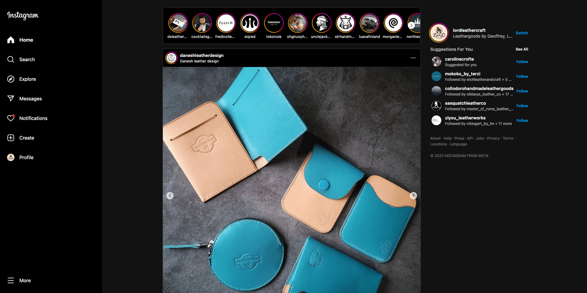
A custom stylesheet to provide bigger photos on Instagram main feed.
instagram.com - Bigger Feed on Desktop by geoffreycrofte
Details
Authorgeoffreycrofte
LicenseNo License
Categoryinstagram.com
Created
Updated
Code size2.1 kB
Code checksumcd24bcd3
Statistics
Learn how we calculate statistics in the FAQ.
Failed to fetch stats.
Description
Notes
1.0.1
- Update of the code after a Meta dev decided to poop in their code.
1.0.0
- First version, add 2 breakpoints of 1200 and 1600 px to bring the feed width respectively to 580 and 840px.
Source code
/* ==UserStyle==
@name           instagram.com - 23/12/2022 13:22:10
@namespace      github.com/geoffreycrofte
@version        1.0.0
@description    A stylesheet to make Instagram Desktop Feed larger
@author         Geoffrey Crofte (https://geoffreycrofte.com)
==/UserStyle== */

@-moz-document domain("instagram.com") {

    /**
     * Main Feed content is the section's first div direct children.
     * Section is a flex container dimensioned like the following:
     * max-width: calc( 470px + var(--feed-sidebar-padding) + var(--feed-sidebar-width) )
     * so we have CSS Custom Properties to play with. (why 470px isn't a variable though?)
     */

    /* Let's fix the "width of the feed's not a variable "*/
    main[role="main"] > div > section {
        --feed-width: 470px;

        max-width: calc( var(--feed-width) + var(--feed-sidebar-padding) + var(--feed-sidebar-width) );
    }

    /**
     * Developers of Instagram are using float left and margin-right on a flex item...
     * Why? Do they need a training in CSS? Maybe :p
     * @see https://css-tricks.com/is-css-float-deprecated/
     */
    main[role="main"] > div > section > div:first-child,
    main[role="main"] > div > section > div:first-child div[style*="max-width"] {
        float: none; /* This does nothing except remove the trash code */
        margin-right: 0;  /* This does nothing except remove the trash code */
        max-width: var(--feed-width)!important; /* Instagram devs are so dirty */
    }

    /**
     * Now I'm making main feed wider if we have some space to do it.
     */
    @media screen and (min-width: 1200px) {
        main[role="main"] > div > section {
            --feed-width: 580px;
        }
    }

    @media screen and (min-width: 1600px) {
        main[role="main"] > div > section {
            --feed-width: 840px;
        }
    }

    /* I don't go above to have a proper height for the Reels videos */
    /* Like so, the picture are well dimensioned and the Reels fit on the screen.*/

}