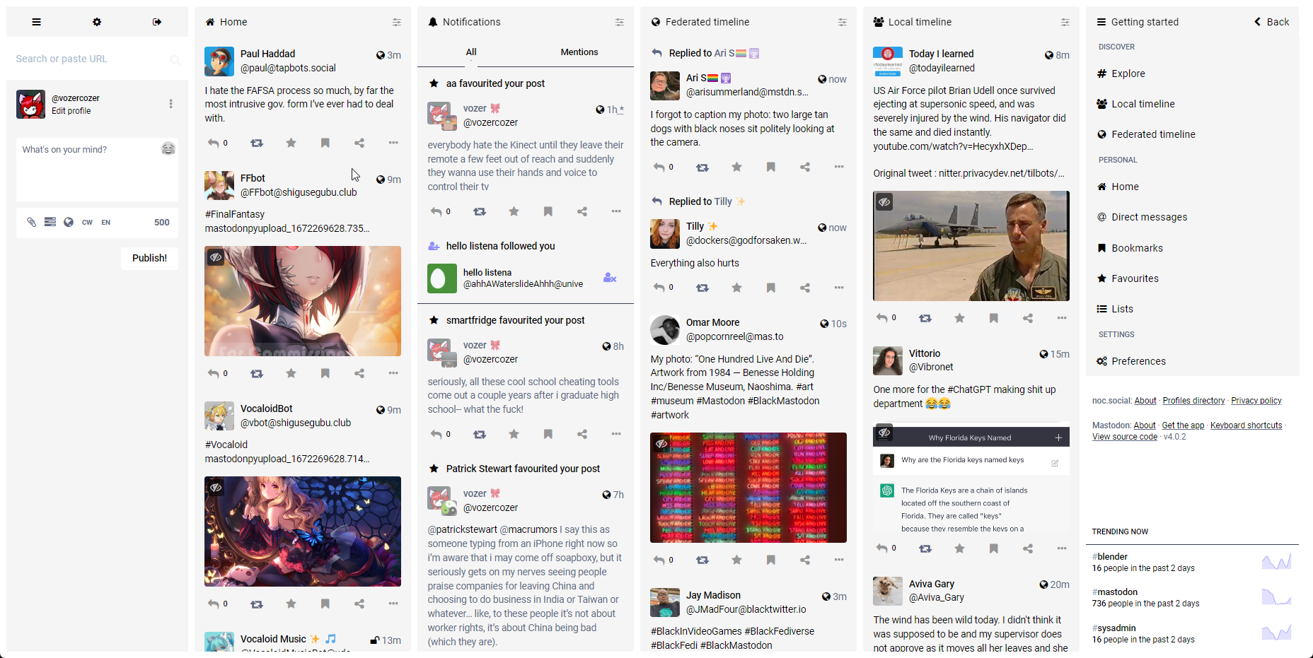
A bright, light, white theme for Mastodon. I got inspired from my visit to the 09'er region.
Lights On for Mastodon Advanced View by slippinggitty
Details
Authorslippinggitty
LicenseMIT
Categorymastodon.social
Created
Updated
Size5.1 kB
Statistics
Learn how we calculate statistics in the FAQ.
Failed to fetch stats.
Description
Notes
A bright, light, white theme for Mastodon. I got inspired from my visit to the 09'er region.
Source code
@-moz-document domain("noc.social"), domain("mastodon.social"), domain("universeodon.com") {
        /* ==UserStyle==
    @name         Lights On for Mastodon
    @description  A light, bright, white theme.
    @author       Vozer
    @namespace    https://github.com/SlippingGitty/userstyles
    @version      1.0.0
    ==/UserStyle== */

@import url('https://slippinggittys-discord-Themes.github.io/Espresso-Discord-Theme/themes/light/newspaper.css');


/*---------- Background Color -----------
> Behind the content
*/
body {
    background: var(--PGBackground2);
}

/* --------- Accent --------------
> Icons, Links, Star/Bookmark/Reply/Share
> Buttons
*/
.reply-indicator__content a.unhandled-link,
.status__content a.unhandled-link,
.column-header__back-button,
.icon-button.bookmark-icon.active,
.column-header__icon,
.column-header__icon,
.fa-home:before,
.fa-cog:before,
.fa-gear:before,
.fa-sign-out:before,
.fa-bars:before,
.fa-navicon:before,
.fa-reorder:before,
.fa-chevron-left:before,
.column-back-button,
.status__content a,
span,
.column-link__icon {
    color: var(--accent);
}

.fa-sliders:before,
.fa-file-text:before {
    color: var(--accent-selected);
}

.icon-button.star-icon.active,
.notification__favourite-icon-wrapper .star-icon,
.no-reduce-motion .icon-button.star-icon.activate > .fa-star {
    color: var(--accent) !important;
}

.icon-button {
    color: var(--accent-selected);
}

.button {
    background-color: var(--PGBackground2) !important;
    border-color: var(--accent);
    color: var(--accent);
}

/* --------- Main Content --------------
> Columns
> Drawers
> Status
> Notifications
> Column Headers
> Account Headers
> Getting Started
*/
.column > .scrollable {
    background: var(--PGBackground2);
}

.column > .scrollable::-webkit-scrollbar {
    display: none;
}

.column-header > button {
    color: black;
}

.status__content .status__content__text.status__content__text--visible,
.account__display-name strong,
.status__display-name strong,
.display-name__account,
.navigation-bar strong {
    color: black;
}

.column-link {
    background-color: var(--PGBackground);
}

.ui__header {
    display: none;
}

.column-link:hover {
    background-color: var(--PGBackground) !important;
}

.drawer__inner {
    background-color: var(--PGBackground);
}

.drawer__header,
.column-subheading {
    background-color: var(--PGBackground);
}

.drawer__inner.darker,
.search-results__section h5,
.search-results__header {
    background: var(--PGBackground);
}

.drawer__inner::-webkit-scrollbar,
.drawer__pager::-webkit-scrollbar {
    display: none;
}

.drawer__inner.darker,
.search-results__section h5,
.search-results__header {
    background: var(--PGBackground);
}


.status-card.compact {
    border-color: var(--accent-selected);
}

.detailed-status {
    background-color: var(--PGBackground);
}

.status-card,
.account__header__bio .account__header__fields dl {
    background-color: var(--PGBackground);
}

.status-card__image,
.account__header__bar {
    background-color: var(--PGBackground);
}

.status__wrapper,
.compose-form .compose-form__modifiers {
    background-color: var(--PGBackground);
}

.status {
    border-bottom: 0px solid #393f4f;
}

.detailed-status__action-bar {
    background-color: var(--PGBackground);
    border: solid var(--accent) 1px;
}

.reply-indicator {
    background-color: var(--PGBackground) !important;
    border-color: var(--accent);
    color: var(--accent);
}

.reply-indicator__content,
.display-name {
    color: white;
}

.notification {
    background-color: var(--PGBackground);
}

.notification__message,
.account {
    background-color: var(--PGBackground);
}

.notification__filter-bar button.active {
    color: var(--accent)
}

.notification__filter-bar button.active:after {
    border-color: var(--PGBackground);
}

.notification__filter-bar button:hover {
    border: solid 2px var(--accent-selected);
}

.column-header,
.column-header__button,
.column-header__back-button,
.column-back-button {
    background-color: var(--PGBackground);
}

.drawer__inner__mastodon {
    display: none;
}

.account__section-headline a,
.account__section-headline button,
.notification__filter-bar a,
.notification__filter-bar button {
    background-color: var(--PGBackground);
}

.account__section-headline,
.notification__filter-bar {
    background: #1f232b00;
}

.getting-started__wrapper {
    background-color: var(--PGBackground);
}

/* --------- Text Feilds --------------
> Search
> Compose
*/
.search__input {
    background: var(--PGTextBackground);
}

.compose-form .compose-form__buttons-wrapper {
    background-color: var(--PGBackground2);
}

.compose-form .compose-form__buttons-wrapper {
    background-color: var(--PGBackground2);
}

.compose-form .autosuggest-textarea__textarea,
.compose-form .spoiler-input__input {
    color: black;
    background-color: var(--PGBackground2);
}
}