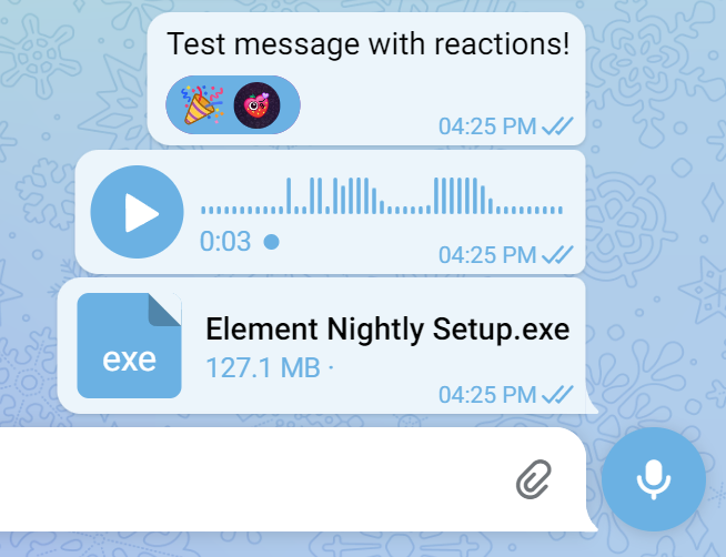
All accents on dark/light modes can be changed with just only color picker (others will be automatically changed depending on primary), so you can feel the desktop Telegram experience!
Telegram Themes REIMAGINED by amaruelle
Details
Authoramaruelle
LicenseCC Zero
Categoryweb.telegram.org
Created
Updated
Size9.2 kB
Statistics
Learn how we calculate statistics in the FAQ.
Failed to fetch stats.
Description
Notes
- Initial release
Source code
/* ==UserStyle==
@name           web.telegram.org - 1/18/2023, 3:36:15 PM
@namespace      github.com/openstyles/stylus
@version        1.0.0
@description    A new userstyle
@author         Me
@preprocessor stylus
@var color accentColor "Accent Color" #fff
@var select theme "Select theme" ["dark:Dark theme", "light:Light theme"]
==/UserStyle== */

@-moz-document domain("web.telegram.org") {

    if theme == dark
    {
        .bubble.is-out{
            --message-background-color: accentColor;
        }

        :root{
            --primary-color: accentColor;
            --avatar-color-top: lightness(accentColor, 70);
            --avatar-color-bottom: lightness(accentColor, 50);
            --message-out-primary-color: lighten(accentColor, 30);
            --light-filled-message-primary-color: lightness(accentColor, 20);
            --dark-primary-color: darken(accentColor, 10);
            --light-primary-color: lightness(accentColor, 20);
            --message-highlightning-color: transparentify(accentColor, 0.2)!important;
            --chatlist-status-color: complement(accentColor);
            --link-color:  lighten(complement(accentColor), 20);
            --light-secondary-text-color: transparentify(complement(accentColor), 0.1)!important;
            --message-checkbox-color: complement(accentColor);
        }

        .bubble-call-subtitle.arrow-green:before{
            color: lightness(accentColor, 30);
        }

        .reply:hover{
            background-color: darken(accentColor, 30)!important;
        }

        .bubble.is-out .time .inner:after, .bubble.is-out .time:after{
            color: lightness(accentColor, 80);
        }

        .bubble.is-out .time .inner{
            color: lightness(accentColor, 80);
        }

        .bubble.is-out .bubble-call-subtitle, .bubble.is-out .contact-number, .bubble.is-out .document-size{
            --message-out-status-color: lightness(accentColor, 80);
        }

        .menu-horizontal-div-item.active .c-ripple__circle, html.no-touch .menu-horizontal-div-item.active:active, html.no-touch .menu-horizontal-div-item.active:hover{
            background-color: saturation(lightness(accentColor, 10), 10);
        }

        .document-ico{
            background-color: lighten(accentColor, 30)
        }

                .bubble-content{
            border-radius: 20px!important;
            padding: 5px!important;
        }

        .bubble-tail{
            display: none!important;
        }

        .bubble{
            margin: 0 auto 0.5rem;
        }

        .bubble.is-in.is-group-last.can-have-tail .bubble-content, .bubble.is-in.is-group-last.can-have-tail .poll-footer-button{
            border-bottom-left-radius: 20px!important;
        }

        .bubble.is-out.is-group-last.can-have-tail .bubble-content, .bubble.is-out.is-group-last.can-have-tail .poll-footer-button{
            border-bottom-right-radius: 20px!important;
        }

        .attachment.media-container{
            border-radius: 20px!important;
        }

        .sidebar-header.topbar{
            border-radius: 20px!important;
            margin-top: 10px!important;
            margin-right: 5px!important;
            margin-left: 5px!important;
            padding: 5px;
            width: 98%;
        }

        .topbar:before{
            border-radius: 20px!important;
        }

       .sidebar-content.sidebar-slider.tabs-container, #column-right{
            border-top-left-radius: 20px!important;
            border-bottom-left-radius: 20px!important;
        }

        .sidebar-left-section.no-delimiter{
            border-radius: 20px!important;
            margin: 10px;
        }

        .pinned-audio.pinned-container.is-floating{
            border-radius: 20px!important;
            margin: 5px 0;
        }

        .pinned-audio-progress-wrapper{
            margin: auto auto;
            width: 95%;
        }

        .pinned-container.is-floating:before{
            border-radius: 20px!important;
        }

        .bubble.with-reply-markup.bubble-content{
            border-bottom-right-radius: 20px!important;
        }

        .bubbles-inner{
            width: 95%!important;
            margin: auto auto;
        }

        .pinned-message.pinned-container.is-floating{
            margin: 5px 0!important;
            border-radius: 20px!important;
            box-shadow: 1px 0px 5px 5px rgba(0,0,0,.1);
        }

        .menu-horizontal-div-item.rp.active{
            border-radius: 20px!important;
            margin: 5px 10px!important;
            background-color: darken(accentColor, 30);
            height: 75%
        }

        .menu-horizontal-div-item.rp{
            border-radius: 20px!important;
            margin: 5px 10px!important;
            height: 75%
        }

        .menu-horizontal-div i{
            display: none!important;
        }

        .html.no-touch .menu-horizontal-div-item:active, html.no-touch .menu-horizontal-div-item:hover{
            border-radius: 20px!important;
        }
    }

    if theme == light
    {
        .bubble.is-out{
            --message-background-color: lighten(accentColor, 30);
        }

        :root{
            --primary-color: accentColor;
            --avatar-color-top: lightness(accentColor, 60);
            --avatar-color-bottom: lightness(accentColor, 40);
            --message-out-primary-color: accentColor;
            --light-filled-message-primary-color: lightness(accentColor, 90);
            --dark-primary-color: darken(accentColor, 10);
            --light-primary-color: lightness(accentColor, 90);
            --message-highlightning-color: transparentify(accentColor, 0.2)!important;
            --chatlist-status-color: complement(accentColor);
            --link-color:  complement(accentColor);
            --light-secondary-text-color: transparentify(complement(accentColor), 0.1)!important;
            --message-checkbox-color: complement(accentColor);
        }

        .document-ico{
            background-color: accentColor;
        }

        .bubble.is-out .bubble-call-subtitle, .bubble.is-out .contact-number, .bubble.is-out .document-size{
            --message-out-status-color: accentColor;
        }

        .bubble-content{
            border-radius: 20px!important;
            padding: 5px!important;
        }

        .bubble-tail{
            display: none!important;
        }

        .bubble{
            margin: 0 auto 0.5rem;
        }

        .bubble.is-in.is-group-last.can-have-tail .bubble-content, .bubble.is-in.is-group-last.can-have-tail .poll-footer-button{
            border-bottom-left-radius: 20px!important;
        }

        .bubble.is-out.is-group-last.can-have-tail .bubble-content, .bubble.is-out.is-group-last.can-have-tail .poll-footer-button{
            border-bottom-right-radius: 20px!important;
        }

        .attachment.media-container{
            border-radius: 20px!important;
        }

        .sidebar-header.topbar{
            border-radius: 20px!important;
            margin-top: 10px!important;
            margin-right: 5px!important;
            margin-left: 5px!important;
            padding: 5px;
            width: 98%;
        }

        .topbar:before{
            border-radius: 20px!important;
        }

       .sidebar-content.sidebar-slider.tabs-container, #column-right{
            border-top-left-radius: 20px!important;
            border-bottom-left-radius: 20px!important;
        }

        .sidebar-left-section.no-delimiter{
            border-radius: 20px!important;
            margin: 10px;
        }

        .pinned-container-wrapper.rp{
            border-radius: 20px!important;
        }

        .pinned-container.is-floating:before{
            border: none!important;
        }

        .bubble.with-reply-markup.bubble-content{
            border-bottom-right-radius: 20px!important;
        }

        .bubbles-inner{
            width: 95%!important;
            margin: auto auto;
        }

        .pinned-message.pinned-container.is-floating{
            margin: 5px 0!important;
            border-radius: 20px!important;
            box-shadow: 1px 0px 5px 5px rgba(0,0,0,.1);
        }

        .menu-horizontal-div-item.rp.active{
            border-radius: 20px!important;
            margin: 5px 10px!important;
            background-color: lighten(accentColor, 30);
            height: 75%
        }

        .menu-horizontal-div-item.rp{
            border-radius: 20px!important;
            margin: 5px 10px!important;
            height: 75%
        }

        .menu-horizontal-div i{
            display: none!important;
        }

        .html.no-touch .menu-horizontal-div-item:active, html.no-touch .menu-horizontal-div-item:hover{
            border-radius: 20px!important;
        }
    }
}