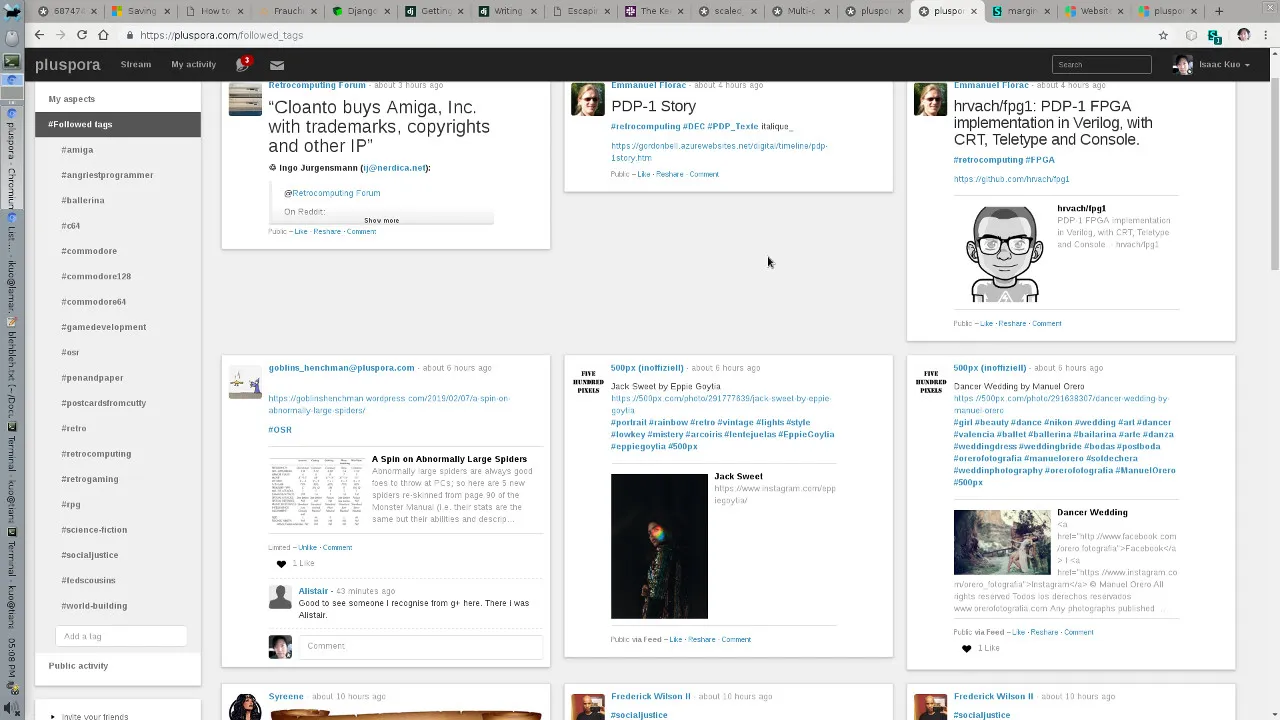
Multi-Column stream, comments, auto-expand content, and notification drop-down tweaks.
Diaspora Multi-Column by isaackuo
Details
Authorisaackuo
Licensepublic domain
Categorypluspora.com
Created
Updated
Code size3.6 kB
Code checksum996cfa43
Statistics
Learn how we calculate statistics in the FAQ.
Failed to fetch stats.
Description
Notes
Userstyle doesn't have notes.Source code
/* ==UserStyle==
@name           Diaspora Multi-Column
@namespace      USO Archive
@author         Isaac Ji Kuo
@description    `This includes several enhancements:TALLER NOTIFICATIONS DROPDOWN (Doc Edward Morbius)EXPAND ALL POSTS (Gible Fog)TRIPLE COLUMN STREAM (Isaac Ji Kuo)FIVE COLUMN PHOTOS (Isaac Ji Kuo)TRIPLE COLUMN COMMENTS (Isaac Ji Kuo)CUSTOM FONT SIZE (Isaac Ji Kuo)`
@version        20220221.2.6
@license        CC0-1.0
@preprocessor   uso
==/UserStyle== */
@-moz-document domain("diaspora.glasswings.com"), domain("diasp.org"), domain("pluspora.com") {
/* ===== CUSTOM FONT SIZE ===== Isaac Ji Kuo */

/* uncomment and change from 13px to desired size */

/* body, .form-control { font-size: 13px; } */

/* ===== TALLER NOTIFICATIONS DROPDOWN ===== Doc Edward Morbius */

.navbar.navbar-fixed-top .nav-badges .dropdown-menu .notifications {
    max-height: calc(85vh - 4em);
    min-height: 8em;
}

/* ===== EXPAND ALL POSTS ===== Gible Fog */

.expander{ display:none; }
.stream-element .collapsible,
.stream-element .collapsible.collapsed {
    max-height: 800px;
    overflow-y: auto!important;
    height: unset!important;
}

/* ===== MULTI COLUMN STREAM ===== Isaac Ji Kuo */

/* Five column if wide enough */
@media only screen and (min-width: 2000px) {
  #main-stream > div:not([class='clearfix row']) {
    display: grid;
    grid-template-columns: 20% 20% 20% 20% 20%;
    grid-row-gap: 0px;
    grid-column-gap: 20px;
  }
}
/* Triple column if wide enough */
@media only screen and (min-width: 1081px) and (max-width: 1999px) {
  #main-stream > div:not([class='clearfix row']) {
    display: grid;
    grid-template-columns: 33% 33% 33%;
    grid-row-gap: 0px;
    grid-column-gap: 20px;
  }
}
/* Double column otherwise */
@media only screen and (max-width: 1080px) {
  #main-stream > div:not([class='clearfix row']) {
    display: grid;
    grid-template-columns: 50% 50%;
    grid-row-gap: 0px;
    grid-column-gap: 20px;
  }
}

body>.container-fluid>.row>.col-md-3 { height: 40px; overflow: hidden; }
body>.container-fluid>.row>.col-md-3:hover { height: 100%; }
body>.container-fluid>.row>.col-md-9 { width: 97%; }
.container-fluid { max-width: none; }

/* ===== FIVE COLUMN PHOTOS ===== Isaac Ji Kuo */

/* for four columns, change 20% to 25% */

#main-stream > div[class='clearfix row'] > div[class*='photo loaded'] { width: 20%; }

/* ===== MULTI COLUMN COMMENTS ===== Isaac Ji Kuo */

/* Quad column if wide enough */
@media only screen and (min-width: 2000px) {
  #single-post-content.col-md-6.single-post-content {
    width: 25%; }
  #single-post-interactions.col-md-6.single-post-interactions {
    width: 75%;
    column-count: 4;
    column-width: calc(25% - 5px);
    column-gap: 5px;
  }
  .comment.media { break-inside: avoid; }
}
/* Double column if wide enough */
@media only screen and (min-width: 1081px) and (max-width: 1999px) {
  #single-post-content.col-md-6.single-post-content {
    width: 35%; }
  #single-post-interactions.col-md-6.single-post-interactions {
    width: 65%;
    column-count: 2;
    column-width: calc(50% - 5px);
    column-gap: 5px;
  }
  .comment.media { break-inside: avoid; }
}

/* THIS STYLE IS NOW COMMENTED OUT DUE TO SOME SORT OF WEIRD PROBLEMS */

/* For four columns, column-count: 4; column-width: 25%;  */

/*
#single-post-container > div { column-count: 3; column-width: 33%; }
#single-post-content.col-md-6.single-post-content { width: 99%; break-inside: avoid; }
#single-post-interactions.col-md-6.single-post-interactions { width: 99%; }
.comment.media { break-inside: avoid; }
*/

}