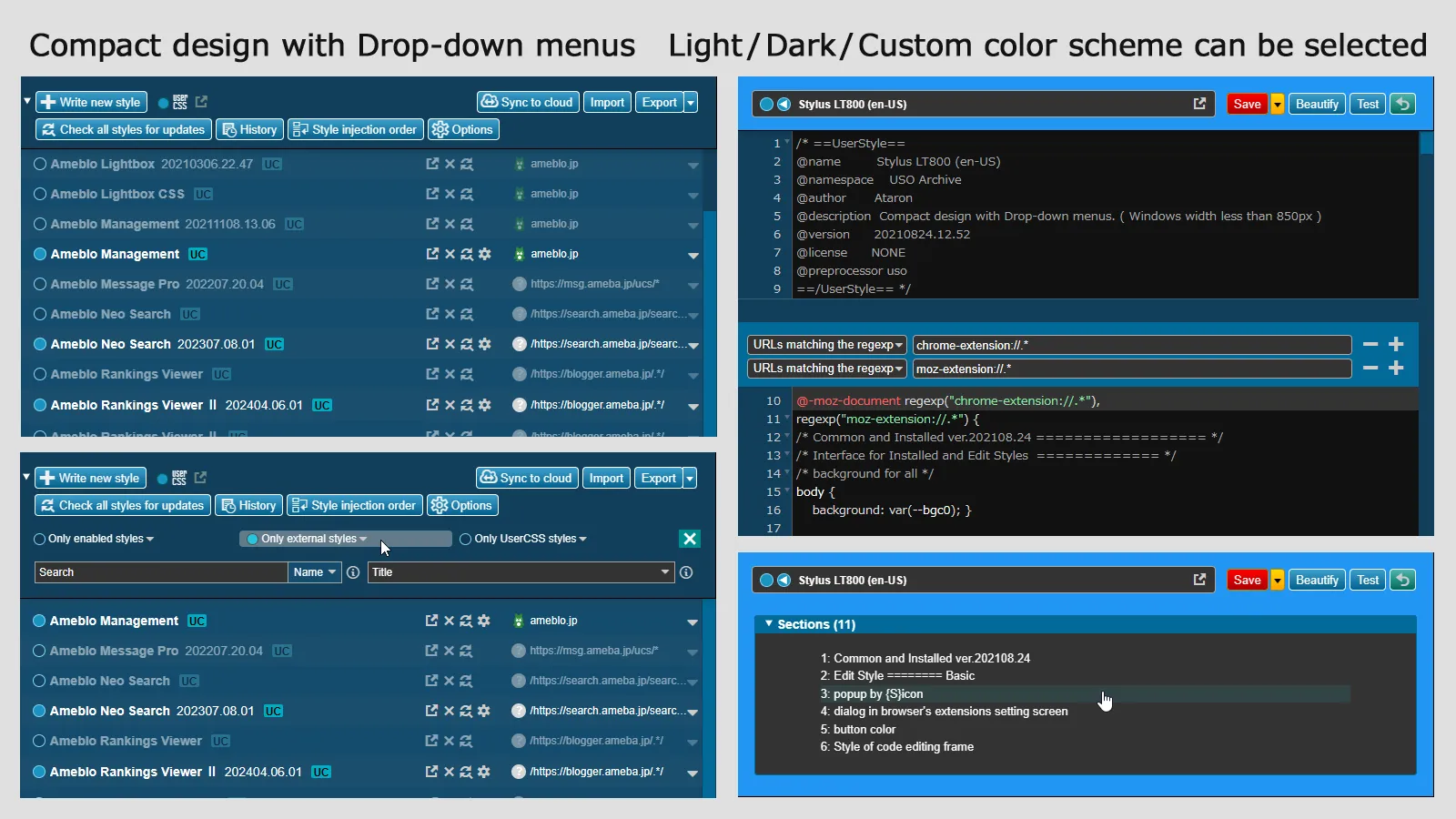
Stylus arrangement : dark-light color scheme and pull-down menu for narrow width
Stylus LT800 (en-US) by personwritep
Details
Authorpersonwritep
LicenseNo License
Categorychrome-extension://.*
Created
Updated
Code size34 kB
Code checksum9c0d31fa
Statistics
Learn how we calculate statistics in the FAQ.
Failed to fetch stats.
Description
Notes
Compact design with Drop-down menus. ( Windows width less than 850px )
This style is for Stylus / Chrome Edge Firefox.
: When the Window width is wide,"LT800" is a design just adding button look.
: On the other hand, if the window width is less than 850px, it will change to a compact design pursuing user friendliness.
: In addition, it designed to reduce the loss of CSS code by user's misoperation.
: This style is also very convenient when editing while comparing old and new codes with double windows.
2025.01.30
On the "CSS Editing screen", the font color of the "Publish" button when the link is enabled has been corrected.
2025.01.02
Supports for changing the button design on the management screen.
2024.12.15
Support for updating of the "Write style for" and "Manage/Find/Options" sections of the "Stylus-popup".
2024.08.22
Supports button design changes for "Style injection order" and "Back to style manager".
Supports "setting button" of "Live preview".
2024.04.15
Fixed the "Popup" button design.
2023.12.23
Corrected the color scheme of input frames such as "Editor Settings" and "Style Settings" on the "Edit Screen".
Fixed the design of the "Enable" and "Auto Preview" buttons and the interruption of "Style Settings" when the window is narrow.
Updated the bright line design at the search hit position on the scroll bar of the "Edit Screen".
2023.11.05
Completed repairs for the November 2023 "Stylus" update.
2023.06.24
Introduced the option "Settings" and introduced a font specification menu for the style edit frame.
2023.06.21
Fixed the problem that the vertical scroll bar is doubled on the edit screen of "Usercss" with a width of 850px or less.
2023.03.28
Changed the specification of "@preprocessor" to "stylus".
2023.03.27
Width adjustment of the "action" icon part of the style list of the "management screen".
2023.02.17
Corresponds to "Style installation confirmation screen". Added "radio button" design.
Corresponds to updated width control for style list in "manage screen".
2023.02.15
Corrected,
"Management Screen": The design of the style list and Usercss icons.
"Edit Screen": Beautify dialog and Import frame.
2022.06.09
Corrected version for updates. (2)
2022.06.06
Corrected version for updates. (1)
2021.08.24
Supported "version display from UserStyles.world" in the installation style list on the management screen.
2021.08.18
Corrected the layout of the "info" icon in the management screen menu and the text color and layout of "Publish" in the edit screen menu. And also modified the layout of the Format dialog.
2021.04.03
Improved the line display above the "Apply to" display on the edit screen.
2021.03.28
The selected "TOC" line is now highlighted on the "Usercss" edit screen.
Source code
Source code has over 10K characters, so we truncated it. You can inspect the full source code on install link./* ==UserStyle==
@name Stylus LT800 (en-US)
@namespace userstyles.world
@author personwritep
@description Stylus arrangement : dark-light color scheme and pull-down menu for narrow width
@version 202501.30.01
@license NO-REDISTRIBUTION
@preprocessor stylus
@var select design_mode "Total Design" {
"Dark Mode": "dark_mode",
"Light Mode": "light_mode" }
@var text editor_font "Editor font-family" Meiryo
@var text editor_fontsize "Editor font-size" small
@var text editor_lineheight "Editor line-height" 20px
@var checkbox clear_editor 'Enhanced editor design' 1
@var checkbox no_pulldown 'Disable pull-down menu' 0
==/UserStyle== */
@-moz-document regexp("chrome-extension://.*"),
regexp("moz-extension://.*") {
/* Common and Installed ver.202501.30.01 ================== */
/* Interface for Installed and Edit Styles ============= */
/* background for all */
body {
background: var(--bgc0); }
/* menu - left side */
#header {
background: var(--bgc1);
border-right: 1px solid var(--bgc9);
overflow-x: hidden; }
/* header menu title */
#header h1,
#header h2 {
color: var(--bgc6); }
#header summary::marker {
color: var(--bgc6); }
/* header basic letter */
#header a,
#header p,
#header span,
#header h3,
#header label,
#header li,
#faviconsHelp,
#toc,
#usw-link-info {
color: var(--bgc6); }
i {
color: var(--bgc12); }
i:hover {
color: var(--bcg6); }
/* button */
button {
padding: 5px 7px;
height: 24px;
line-height: 13px;
border: 1px solid;
border-radius: 4px;
outline: none;
overflow: hidden; }
/* check button */
input[type="checkbox"]:not(.slider) {
border-radius: 12px; }
/* Installed Styles ======== Basic ====================== */
/* filter */
#filters-stats {
border-radius: 4px;
background: var(--bgc8) !important; }
#filters .filter-selection {
margin-bottom: 4px;
border-radius: 4px;
overflow: hidden; }
#header .filter-selection label {
padding: 0 0 3px 8px; }
#header .filter-selection input {
margin-top: 3px; }
#filters #only-updates span {
padding: 3px 0 0; }
#filters label:hover,
#filters .filter-selection:hover {
background: rgba(255, 255, 255, .3); }
#filters .filter-selection select {
color: var(--bgc6); }
#filters .filter-selection option {
background: var(--bgc7); }
#filters .select-wrapper::after {
color: var(--bgc12); }
/* filters match no styles */
body.all-styles-hidden-by-filters:before,
body.all-styles-hidden-by-filters:after {
color: var(--bgc8); }
/* search and sort */
#search,
#manage\.newUI\.sort {
color: var(--bgc6);
background: var(--bgc7); }
#filters input::-webkit-input-placeholder {
color: var(--bgc6); }
#manage\.searchMode {
color: var(--bgc6);
background:var(--bgc0); }
#manage\.searchMode option {
background: var(--bgc0); }
#sort-wrapper {
margin-bottom: 1.2em; }
.select-wrapper::after {
color: var(--bgc12); }
/* update history */
#message-box > div {
border-radius: 4px; }
#message-box-title {
border-radius: 4px 4px 0 0; }
#message-box-buttons {
border-radius: 0 0 4px 4px; }
#message-box-close-icon i {
color: #000; }
/* Caution local edits */
#check-all-updates-force {
background: linear-gradient(#f00 0%, #ac0000 100%);
height: auto; }
/* Usercss SW */
#stylus-manage #newStyleAsUsercss:checked + i {
color: var(--bgc6); }
/* backup-buttons */
#backup-buttons button {
margin-bottom: 8px; }
/* Get styles */
#manage-text a[href] {
display: inline-block;
height: 14px;
padding: 0 2px;
margin: 0 2px 0 7px;
border-radius: 4px;
text-decoration: none;
transition: .25s; }
/* Export (compatible mode) */
#backup-buttons .split-btn-menu {
background: var(--bgc7); }
#manage-text a[href]:hover {
color: #000;
background: rgba(255, 255, 255, 0.7); }
#manage-text > :not(:last-child):after {
content: "";
margin: 0; }
/* check button in installed list */
#installed .style-name input[type="checkbox"]:not(.slider) {
height: 14px;
width: 14px;
flex: 0 0 14px;
border-radius: 14px;
margin-bottom: 1px; }
/* balance of width : style-name and applies-to */
.style-name {
--name-width: 60ch;
max-width: 60%; }
/* disable click on around style name */
.style-name {
pointer-events: none; }
.style-name-link {
text-decoration: none;
pointer-events: auto; }
/* style name no underline */
.style-name:hover .style-name-link {
text-decoration: none; }
/* installed list -- letters and icons */
.enabled .style-name-link,
.enabled .applies-to {
color: var(--bgc6); }
.enabled .actions,
.enabled i,
.entry:hover i {
color: var(--bgc12); }
.entry.enabled .style-name:hover .style-name-link {
color: var(--bgc6); }
.entry.disabled .style-name-link,
.entry.disabled .applies-to,
.entry.disabled i {
opacity: 0.5;
color: var(--bgc6); }
.disabled .style-name:hover .style-name-link {
color: var(--bgc6);
opacity: 1; }
.entry:hover i:hover {
color: var(--bgc6);
opacity: 1; }
/* style-name unified in bold */
.disabled h2 .style-name-link {
font-weight: bold; }
/* expander button */
.entry.enabled .expander i {
color: var(--bgc12); }
/* version display from UserStyles.world */
.style-info[data-type=version] {
color: var(--bgc6); }
/* Usercss mark */
.entry.usercss .style-name-link::after {
content: "UC";
display: inline-block;
height: 14px;
padding: 0 2px;
margin-left: 1ex;
line-height: 16px;
font-size: 12px;
border-radius: 2px;
white-space: nowrap;
background-color: #00acc1;
color: #000; }
.disabled.usercss .style-name-link::after {
background-color: #3798b4; }
/* style link icon */
.style-name a.homepage {
margin: -2px 0.1em -3px 0.25em;
pointer-events: auto; }
/* actions icons */
.actions {
flex: 0 0 calc(1 * (var(--action-size) + var(--action-margin)));
min-width: 65px; }
.actions a.delete {
margin: 0 4px -1px 0; }
.actions a.check-update {
margin: -2px 0 -2px -4px; }
.actions a.configure-usercss {
margin: 0 0 -1px 2px; }
/* time display color */
.style-info[data-type=size],
.style-info[data-type=age] {
color: #64b5f6 !important; }
/* Installed Styles ======== Less than 850px =============== */
@media screen and (max-width: 850px) {
/* menu header -manage- */
#stylus-manage #header {
position: absolute;
top: 0;
display: flex;
flex-direction: column;
background: var(--bgc2);
border-bottom: 1px solid var(--bgc9);
z-index: 112;
width: 100%;
min-width: 600px;
height: auto;
min-height: initial;
max-height: 80px;
column-count: 1;
overflow: hidden;
transition: max-height 1s ease-out; }
#stylus-manage #header:hover {
max-height: 450px; }
#stylus-manage #header h1 {
display: none; }
/* Turn all styles off */
#stylus-manage #disableAll-label {
display: none; }
/* manage settings */
#manage-settings {
flex-direction: column-reverse; }
/* filters */
#filters {
flex-flow: row wrap;
position: relative; }
/* filters stats */
#stats {
position: absolute;
top: -1px;
right: 0;
padding: 0;
z-index: 1; }
#stats span {
display: none; }
#stats i {
margin: 0; }
/* filter selection */
.filter-selection {
width: unset;
min-width: 32%; }
.filter-selection:nth-child(5) {
width: 100%; }
/* filters match no styles */
body.all-styles-hidden-by-filters:before {
content: "\2191";
top: 15rem;
left: 10rem; }
body.all-styles-hidden-by-filters:after {
top: 19rem;
left: 4rem; }
/* search and sort */
#search-wrapper,
#sort-wrapper {
margin: 8px 0 0; }
#search-wrapper i.i-info,
#sort-wrapper i.i-info {
margin-right: 0.5em; }
/* actions */
#actions {
flex-flow: row; }
.compact-layout [id=actions] main {
margin: 30px 0 -8px 0; }
/* update progress bar */
#update-progress {
position: absolute; }
/* write new style */
#add-style {
position: absolute;
top: 16px;
left: 16px; }
#add-style-as-usercss-wrapper {
position: absolute;
top: 18px;
left: 150px; }
/* update all */
#update-all {
width: 100%; }
#apply-all-updates {
margin-top: 1em;
height: auto;
width: 100%;
padding-right: 300px; }
#update-all-no-updates {
display: block;
margin: 1em 0 0;
padding: 8px 1em;
border-radius: 4px;
background: var(--bgc4);
box-shadow: inset 0 0 0 1px var(--bgc3); }
#check-all-updates-force {
margin-top: -6px;
height: auto;
width: 100%;
background: linear-gradient(#f00 0%, #ac0000 100%); }
[id="actions"] #backup {
position: absolute;
top: 16px;
right: 16px;
margin: 0; }
/* links */
#links {
display: none; }
/* installed list */
#stylus-manage #installed {
display: block !important;
position: absolute;
top: 80px;
padding-left: 0;
padding-bottom: 10px;
margin: 0 !important;
width: 100%;
height: calc(100vh - 80px);
overflow-y: scroll; } }
/* Installed Styles ======== Less than 600px =============== */
@media screen and (max-width: 600px) {
#stylus-manage {
overflow: hidden; } } }
@-moz-document regexp("chrome-extension://.*"),
regexp("moz-extension://.*") {
/* Edit Style ======== Basic ========================= */
/* info-icon */
#stylus-edit i {
color: var(--bgc12); }
#stylus-edit i:hover {
color: var(--bcg6); }
/* style name */
#name {
height: 30px;
padding: 2px 0 1px 8px;
border: 1px solid #aaa;
border-radius: 4px;
font-weight: bold !important;
color: var(--bgc6);
background: var(--bgc7); }
/* enabled button */
#basic-info-enabled {
margin-top: 8px; }
#enabled,
#editor\\.livePreview {
height: 15px;
width: 15px;
margin-top: -1px; }
#editor\\.livePreview:before {
content: "◀";
font: 12px/12px Meiryo;
color: #fff; }
#stylus-edit #disableAll-label {
display: inline-block;
width: 100%;
margin: 4px 1px; }
/* mozilla format help */
#stylus-edit #to-mozilla-help i {
color: var(--bgc12); }
/* Save as template */
#actions .split-btn-menu {
background: var(--bgc7); }
/* Back to style manager */
#stylus-edit #cancel-button {
position: relative;
width: 23px;
height: 22px;
padding: 0 0 0 4px;
font-size: 0;
line-height: 24px;
border: 1px solid #fff;
border-radius: 4px; }
#stylus-edit #cancel-button:hover {
border-color: var(--c50); }
#stylus-edit i.i-undo {
color: #ccc;
transition: color 0s; }
#stylus-edit i.i-undo:hover {
color: #fff; }
/* Editor settings */
#options input[type="number"],
#options select {
color: var(--bgc6);
background: var(--bgc7); }
/* Style settings */
#styleOpts input[...