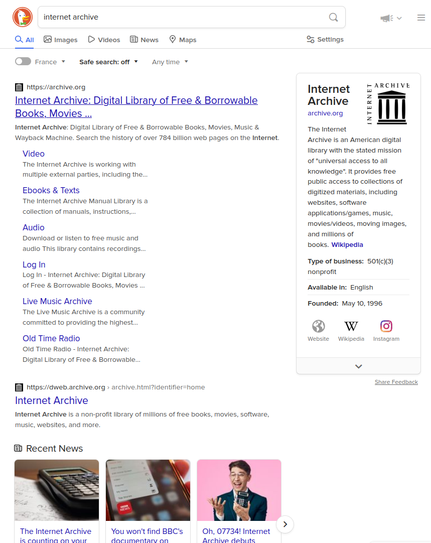
Show more content on small viewports. In image search, wraps search options instead of hiding them, and wraps more images in results.
DuckDuckGo - More On Smaller Viewports by squarecrow
Details
Authorsquarecrow
LicenseNo License
Categoryduckduckgo.com
Created
Updated
Code size2.1 kB
Code checksumede3141a
Statistics
Learn how we calculate statistics in the FAQ.
Failed to fetch stats.
Description
Notes
Userstyle doesn't have notes.Source code
/* ==UserStyle==
@name DuckDuckGo - More On Smaller Viewports
@namespace duckduckgo.com
@version 1.0.0
@description Show more content on small viewports. In image search, wraps search options instead of hiding them, and wraps more images in results.
@author squaresheets
==/UserStyle/== */

@-moz-document domain("example.com") {
.is-link-style-exp.is-not-mobile-device .results--sidebar {
    margin-left: 10px;
    max-width: 448px;
}

@media (max-width: 1079px) and (min-width: 591px) {
    .is-link-style-exp.is-not-mobile-device #links_wrapper {
        min-width: unset;
    }
}

#links_wrapper {
    display: flex;
    flex-wrap: wrap;
}

.is-not-mobile-device .site-wrapper,
.is-not-mobile-device body,
.is-link-style-exp.is-not-mobile-device,
.results--sidebar,
.is-link-style-exp.is-not-mobile-device #links_wrapper {
    min-width: unset;
}


.results--main {
    flex: 0.5;
    flex-grow: 1;
}


.results--sidebar {
    margin: 10px;
    flex-grow: 0.5;
    flex-basis: 240px;
}

.LQVY1Jpkk8nyJ6HBWKAk {
    white-space: unset;
}

.is-not-mobile-device {
    min-width: unset;
}


/* metabar wrap override */
.metabar__dropdowns {
    overflow-x: unset;
    overflow-y: unset;
}

.metabar__in {
    line-height: 33px;
    white-space: unset;
}

.metabar__in,
.metabar__dropdowns-wrap,
.is-not-mobile-device .metabar__dropdowns {
    height: unset;
}

.metabar__dropdowns-wrap::before,
.metabar__dropdowns-wrap::after {
    content: unset;
}

.is-not-mobile-device .metabar__dropdowns {
    margin: 0px 10px;
}

/* force all image search entries to wrap */
.is-mobile .tileview__images {
    display: flex;
    flex-wrap: wrap;
    justify-content: space-around;
}

.tile.tile--img.has-detail {
    min-width: unset !important;
    /*width: unset !important;*/
    max-width: 100%;
    flex-basis: 100px;
    /* For spacing,
if justify-content cuts off too much on thin canvases.
A real eye-sore when it shifts though. Enable at own risk. */
    /*margin-left: auto !important;*/
    /*margin-right: auto !important;*/
}
}