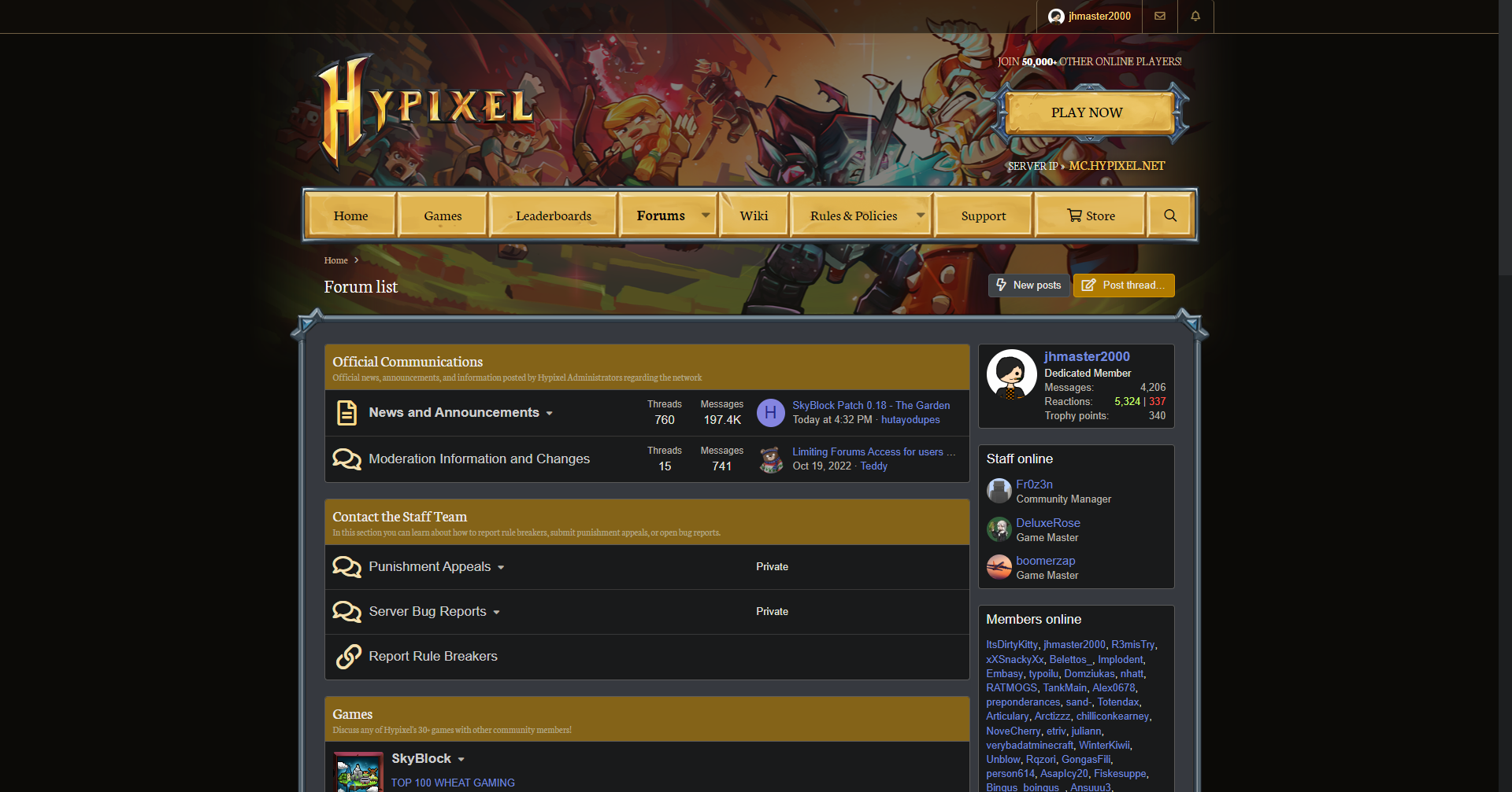
A custom CSS script to darken the Hypixel websites, including the forums, the store, and the support site. Simple and elegant, to the comfort of your eyes.
Darkpixel by jhmaster
Details
Authorjhmaster
LicenseCC BY-NC-ND
Categoryhypixel
Created
Updated
Size348 kB
Statistics
Learn how we calculate statistics in the FAQ.
Failed to fetch stats.
Description
Notes
IMPORTANT: Enable "Expose iframes" on your Stylus settings for full functionality.
Changelog & Version History
Current Version
v4.0.0: The Customization Update
- Added customization options!
- Initially only a select few core colors can be customized, such as links and headers colors, if you'd like to be able to change a color not currently customizable simply make a request for it!
- Toggle between the old ratings and the current new ones!
- Toggle the website header at the top of every page for a more compact view!
- Bugfixes
- Fixed links being an ugly dark blue color due to a website update.
- Fixed an incorrectly sized border around some buttons.
- Fixed collapsed announcement posts having a white gradient before being expanded.
- Adjusted the new message indicator from dull gold to red, matching alerts.
Version History
v3.8.2: Fixed GMerald rating displaying incorrectly as a Useful rating. (To disambiguate, the original Mod Emerald rating is now grayscale)
Older versions and changelogs available at:
https://userstyles.org/styles/167218/darkpixel (No longer updated!)
Source code
Source code has over 10K characters, so we truncated it. You can inspect the full source code on install link./* ==UserStyle==
@name Darkpixel
@version 20250004.0.0
@namespace https://userstyles.world/user/jhmaster
@description A custom CSS script to darken the Hypixel websites, including the forums, the store, and the support site. Simple and elegant, to the comfort of your eyes.
@author jhmaster
@license CC BY-NC-ND
@preprocessor stylus
@var color COLOR_LINKS "Links/Mentions Color" #7289da
@var color COLOR_LINKS_HOVER "Links/Mentions Color on Hover" #e5c0a5
@var color COLOR_LINKS_VISITED "Visited Links Color" #B6C
@var color COLOR_FORUM_HEADERS "Forums Homepage Headers Color" #846318
@var color COLOR_BREADCRUMBS "Breadcrumbs Color" #c5ad90
@var checkbox TOGGLE_HIDE_HEADER "Hide Website Header" 0
@var checkbox TOGGLE_OLD_RATINGS "Use Old Ratings" 1
==/UserStyle== */
:root {
--COLOR_LINKS: COLOR_LINKS;
--COLOR_LINKS_HOVER: COLOR_LINKS_HOVER;
--COLOR_LINKS_VISITED: COLOR_LINKS_VISITED;
--COLOR_FORUM_HEADERS: COLOR_FORUM_HEADERS;
--COLOR_BREADCRUMBS: COLOR_BREADCRUMBS;
}
@-moz-document regexp("https:\\/\\/hypixel\\.net($|\\/.+|\\/|\\?.+|\\?|#.+|#)|https:\\/\\/web\\.archive\\.org\\/web\\/.+\\/https:\\/\\/hypixel\\.net($|\\/.+|\\/|\\?.+|\\?|#.+|#)") {
@css {
table {
border-color: #575757;
}
mark {
background-color: #cc0;
color: #e8e6e3
}
html {
background-color: #181a1b!important;
border-color: #555;
color: #e4e2df
}
ul.social-links li a {
box-shadow: rgba(0, 0, 0, .2) 0 -3px 0 inset;
color: #fff
}
.button.button--splitTrigger button.button-text,
a.button.button--splitTrigger button.button-text {
background-image: initial;
background-color: transparent;
border-top-color: initial;
border-bottom-color: initial;
border-left-color: initial;
border-right-color: transparent;
color: inherit
}
.toggleButton > input:checked + span {
color: #eae8e5;
background-image: initial;
background-color: #3e4245;
border-color: #52565c #51545a #51545a #52565c
}
.toggleButton > input:checked + span.button--splitTrigger > .button-menu:active,
.toggleButton > input:checked + span.button--splitTrigger > .button-menu:focus,
.toggleButton > input:checked + span.button--splitTrigger > .button-menu:hover,
.toggleButton > input:checked + span.button--splitTrigger > .button-text:active,
.toggleButton > input:checked + span.button--splitTrigger > .button-text:focus,
.toggleButton > input:checked + span.button--splitTrigger > .button-text:hover,
.toggleButton > input:checked + span:not(.button--splitTrigger):active,
.toggleButton > input:checked + span:not(.button--splitTrigger):focus,
.toggleButton > input:checked + span:not(.button--splitTrigger):hover {
background-color: #3a4452
}
meter.meterBar {
background-image: none;
background-color: #1d1f20
}
.globalAction-block i {
background-color: #b07b00;
box-shadow: rgba(0, 0, 0, .5) 1px 1px 2px
}
.avatar img {
background-color: #191a1b
}
.block-footer .iconic:hover > i,
.block-footer.dataList-cell--fa > a:hover > i,
.dataList-cell .iconic:hover > i,
.dataList-cell.dataList-cell--fa > a:hover > i,
.formRow .iconic:hover > i,
.formRow.dataList-cell--fa > a:hover > i,
.inputChoices .iconic:hover > i,
.inputChoices.dataList-cell--fa > a:hover > i,
.inputGroup .iconic:hover > i,
.inputGroup.dataList-cell--fa > a:hover > i,
.message-cell--extra .iconic:hover > i,
.message-cell--extra.dataList-cell--fa > a:hover > i {
color: #edc67e
}
.select2 .select2-selection ul > li.select2-selection__choice {
color: #cdc9c2;
background-image: initial;
background-color: #1b1d1e;
border-color: #3b3b3b
}
.bbTable > table > tbody > tr > th,
.bbTable > table > thead > tr > th {
background-image: initial;
background-color: #1f2123;
border-color: #5a5a5a #5a5a5a #b57e19
}
.bbTable > table > tbody > tr > td,
.bbTable > table > thead > tr > td {
background-image: initial;
background-color: #191a1b;
border-color: #5a5a5a
}
.pairs.pairs--plainLabel > dt,
legend {
color: inherit
}
.bbCodeDemoBlock-item > dt {
color: #bab5ab
}
.bbCodeDemoBlock-item > dd {
background-image: initial;
background-color: #1b1d1e;
border-color: #393939
}
.lg-outer #lg-dropdown-overlay {
background-color: rgba(0, 0, 0, .25)
}
a {
background-color: transparent
}
::placeholder {
color: #bab5ab
}
body,
button,
input,
select,
textarea {
background-color: #181a1b;
border-color: #555;
color: #e8e6e3
}
::selection {
background-color: #005ccc;
color: #fff
}
input:-webkit-autofill,
select:-webkit-autofill,
textarea:-webkit-autofill {
background-color: #545b00!important;
color: #e8e6e3!important
}
::-webkit-scrollbar {
background-color: #1c1e1f;
color: #c5c1b9
}
::-webkit-scrollbar-thumb {
background-color: #2a2c2e
}
::-webkit-scrollbar-thumb:hover {
background-color: #323537
}
::-webkit-scrollbar-thumb:active {
background-color: #3d4143
}
::-webkit-scrollbar-corner {
background-color: #181a1b
}
a,
a:hover,
abbr[title] {
text-decoration-color: initial
}
abbr[title] {
border-bottom-color: initial
}
.menu-linkRow:hover i[aria-hidden=true]::after,
.u-concealed a:hover .fa,
.u-concealed--icon a:hover .fa,
a.u-concealed--icon:hover .fa,
a.u-concealed:hover .fa,
a:hover,
.bbWrapper a:not(.bbCodeBlock-sourceJump):hover {
color: var(--COLOR_LINKS_HOVER)
}
ul.social-links li.facebook a {
background-image: initial;
background-color: #2d4474
}
ul.social-links li.twitter a {
background-image: initial;
background-color: #07799c
}
ul.social-links li.youtube a {
background-image: initial;
background-color: #902420
}
ul.social-links li.contact a {
background-image: initial;
background-color: #306d4b
}
ul.social-links li.rss a {
background-image: initial;
background-color: #cc5200
}
.has-pointer-nav .iconic > input:focus + i::after,
.has-pointer-nav .iconic > input:focus + i::before,
.has-pointer-nav :focus {
outline-color: initial
}
.u-cloaked,
.u-cloaked a,
.u-concealed,
.u-concealed a,
.u-concealed--icon,
.u-concealed--icon a {
text-decoration-color: inherit!important;
color: inherit!important
}
.u-concealed a:hover,
a.u-concealed:hover {
text-decoration-color: initial!important
}
.u-textColor {
color: #e4e2df
}
.u-dimmed {
color: #cdc9c2
}
.pairs > dt,
.u-muted {
color: #bab5ab
}
.u-dimmed a,
.u-faint a,
.u-muted a {
color: inherit;
text-decoration-color: initial
}
.u-featuredText {
color: #e8b556
}
.u-accentText {
color: #f7a36c
}
.u-dimmed a:hover,
.u-dt[title],
.u-faint a:hover,
.u-muted a:hover {
text-decoration-color: initial
}
.iconic > input,
.u-dt[title],
.u-srOnly {
border-color: initial
}
.textHighlight.textHighlight--attention,
.u-accentText a {
color: #ffc233
}
.categoryList-header a:hover,
.categoryList-item {
text-decoration-color: initial
}
.categoryList-header.categoryList-header--muted,
.categoryList-itemDesc {
color: #bab5ab
}
.categoryList-header {
color: #e8b556
}
.block-header a:hover,
.categoryList-header,
.categoryList-link,
.categoryList-link:hover,
.categoryList-toggler,
.categoryList-toggler:hover {
text-decoration-color: initial
}
.blocks-textJoiner > span::before,
.blocks.blocks--separated + .blocks {
border-top-color: #5a5a5a
}
.blocks-header.blocks-header--strong {
color: #cdc9c2
}
.block-outer .block-outer-hint,
.blocks-header,
.blocks-header.blocks-header--strong .blocks-desc {
color: #bab5ab
}
...