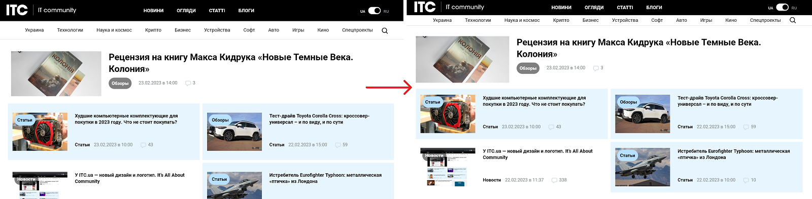
Стили, которые делают новый редизайн сайта более компактным и ПК-френдли.
Большинство изменений на cкриншотах
Authorukr
LicenseMIT License
Categoryitc.ua
Created
Updated
Code size3.7 kB
Code checksumc4686fe8
Learn how we calculate statistics in the FAQ.
Failed to fetch stats.
Стили, которые делают новый редизайн сайта более компактным и ПК-френдли.
Большинство изменений на cкриншотах
/* ==UserStyle==
@name           ITC.ua
@namespace      ITC.ua
@version        0.0.3
@description    A new userstyle for itc.ua
@author         Ukr
==/UserStyle== */

@-moz-document domain("itc.ua") {
body.singular .entry-content {
  line-height: 1.5;
}
#header .menu-main li a {
  line-height: 50px;
}
#menu-golovne-menyu-v-shaptsi {
  height: 50px;
}
@media (min-width: 768px) {
  #header .logo {
  top: 5px;
}
}
.switch {
  top: 12px;
}
#header .menu-tags a {
  line-height: 35px;
}
#header .search_btn {
  line-height: 30px;
}
@media (min-width: 1024px) {
  .block-in-loop {
  margin-bottom: 15px;
}
}
@media (min-width: 769px) {
  .featured-in-new .row .col-lg-6 {
  margin-left: 5px;
}
}
@media (min-width: 1024px) {
  .featured-in-new .col-12 {
  margin-bottom: 5px;
}
}
@media (min-width: 769px) {
  .featured-in-new .row .col-lg-6 {
  padding: 20px 30px;
  width: calc(50% - 22px);
}
}
#black-search {
  top: 85px;
}
#header .search_btn.open {
  font-size: inherit;
}
#black-search #searchform {
  height: 100px;
  padding: 25px 10px;
}
.input-lg {
  height: 35px;
}
#sidebar .post + .post {
  margin: 15px -15px 0;
}
#sidebar .post:not(.post-1) .col-img {
  margin-bottom: 10px;
}
#sidebar .block h3 {
  display: flex;
  padding: 10px 0;
  border-radius: 20px;
  justify-content: center;
}
#content .post.block-in-loop + .post.block-in-loop, #content .home-themes-wrp, #content .home-themes-wrp + .post.block-in-loop {
  padding-top: 15px;
}
@media (min-width: 769px) {
  #featured-new {
  margin-top: 35px;
  padding: 0 0px 20px 40px;
}
}
.home-spec-3 .row {
  padding: 20px 0;
}
.b-top-but {
  line-height: 55px;
  font-size: 30px;
}
.b-top-but {
  width: 50px;
  height: 50px;
}
#sidebar .xoxo .block + .block {
  margin-top: 10px;
}
@media (min-width: 769px) {
 .home .col-sidebar {
  padding-top: 15px;
}
}
#content .block-in-loop-style1 {
  margin: 50px 0 !important;
}
.featured-in-new > .block-in-loop > .row > .col-img {
  padding-left: 5px;
}
#black-search #s {
  font-size: 20px;
  height: 46.6667px;
  margin-left: 10px;
}
.tags-new {
  padding-bottom: 20px;
}
#sidebar a.entry-title {
  font-size: 16px;
}
body:not(.buddypress, .cmc-advanced-single-page) .entry-content ul:not(.toc_list) li {
  padding-bottom: 10px;
  margin-bottom: 10px;
  padding-left: 20px;
}
body:not(.buddypress, .cmc-advanced-single-page) .entry-content ul:not(.toc_list) li::before {
  top: 9px;
}
body:not(.buddypress, .cmc-advanced-single-page) .entry-content ul:not(.toc_list) {
  margin-bottom: 35px;
}
.wp-video {
  margin-bottom: 20px;
}
body:not(.buddypress) .entry-content ol li {
  margin-bottom: 5px;
}
body:not(.buddypress) .entry-content ol li::before {
  width: 40px;
  height: 40px;
  top: -8px;
}
body:not(.buddypress) .entry-content ol li {
  padding-left: 55px;
}
body:not(.buddypress) .entry-content ol {
  margin-bottom: 20px;
}
body:not(.buddypress, .cmc-advanced-single-page) .entry-content ul:not(.toc_list) {
  margin-bottom: 20px;
}
@media (min-width: 769px) {
  .featured-in-new > .block-in-loop .col-img a.thumb-responsive {
  padding-bottom: 25%;
}
}
.sn.clearfix {
  display: flex;
  justify-content: space-between;
}
.switch-dark, .switch {
  top: 8px;
}
.login-link {
    display: flex;
    padding: 10px 15px !important;
    top: 8px !important;
}
/* Отключаем блоги на сайте. Чтобы включить функцию, нужно раскомментировать эти строки
.block-in-loop-blogs {
    display: none;
}
*/
}