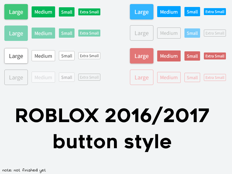
This will make the buttons hopefully more faithful to how they looked in 2016, based off the 2016 and 2017 styleguide pages from the Wayback Machine.
ROBLOX 2016/2017 Accurate Buttons by lemonadesnake
Details
Authorlemonadesnake
LicenseCC BY-NC 3.0
Categoryroblox.com
Created
Updated
Code size34 kB
Code checksum7df2cf5a
Statistics
Learn how we calculate statistics in the FAQ.
Failed to fetch stats.
Description
Notes
Use with other existing 2016/2017/2018 themes if you want it to display properly. Results with default layout or other themes may vary/look off.
Please credit me if you use this in your theme.
CHANGELOG
05/03/23: There was an error in the style, which caused the URL to not work. Additionally, there as a line causing the CSS to cancel out, but it is fixed now.
Source code
Source code has over 10K characters, so we truncated it. You can inspect the full source code on install link./* ==UserStyle==
@name ROBLOX 2016/2017 Accurate Buttons
@namespace LemonadeSnake
@version 1.0.3
@description This will make the buttons hopefully more faithful to how they looked in 2016, based off the 2016 and 2017 styleguide pages from the Wayback Machine.
@author LemonadeSnake
==/UserStyle== */
@-moz-document domain(roblox.com) {
.rbx-header .navbar-search {
box-sizing: border-box;
margin-top: 6px;
position: relative;
border-radius: 3px;
}
input.form-control.input-field {
border-radius: 3px !important;
}
.light-theme .btn-primary-md {
border-radius: 3px;
}
.light-theme .btn-primary-lg {
-webkit-user-select: none;
-moz-user-select: none;
-ms-user-select: none;
user-select: none;
-webkit-transition: box-shadow 200ms ease-in-out;
-o-transition: box-shadow 200ms ease-in-out;
transition: box-shadow 200ms ease-in-out;
border: 1px solid transparent;
border-top-color: transparent;
border-right-color: transparent;
border-bottom-color: transparent;
border-left-color: transparent;
background-color: #02b757;
border-color: #02b757;
color: #fff;
cursor: pointer;
display: inline-block;
font-weight: 400;
height: auto;
text-align: center;
white-space: nowrap;
vertical-align: middle;
padding: 15px 15px;
font-size: 21px;
line-height: 100%;
border-radius: 5px;
}
.light-theme .btn-secondary-md:link {
color: rgb(255, 255, 255);
}
.light-theme .btn-primary-md {
-webkit-user-select: none;
-moz-user-select: none;
-ms-user-select: none;
user-select: none;
transition: box-shadow 200ms ease-in-out;
border: 1px solid transparent;
border-top-color: transparent;
border-right-color: transparent;
border-bottom-color: transparent;
border-left-color: transparent;
background-color: #02b757;
border-color: #02b757;
color: #fff;
cursor: pointer;
display: inline-block;
font-weight: 400;
height: auto;
transition: all,0.2s,ease-in-out;
text-align: center;
white-space: nowrap;
vertical-align: middle;
padding: 9px 9px;
font-size: 18px;
line-height: 100%;
border-radius: 3px;
}
.light-theme .btn-primary-md:hover, .light-theme .btn-primary-md:focus {
background-color: #3FC679;
box-shadow: 0 1px 3px rgba(150,150,150,0.74);
border-color: #3FC679;
color: #fff;
cursor: pointer;
}
#upgrade-now-button {
background-color: #00a2ff;
border-color: #00a2ff;
color: #ffffff;
border-radius: 3px;
line-height: 7px;
}
#upgrade-now-button:hover {
background-color: #32B5FF;
box-shadow: 0 1px 3px rgba(150,150,150,0.74);
border-color: #32B5FF;
color: #fff;
cursor: pointer;
}
.light-theme .btn-secondary-xs {
-webkit-user-select: none;
-moz-user-select: none;
-ms-user-select: none;
user-select: none;
transition: box-shadow 200ms ease-in-out;
border: 1px solid transparent;
border-top-color: transparent;
border-right-color: transparent;
border-bottom-color: transparent;
border-left-color: transparent;
background-color: #00A2FF;
border-color: #00A2FF;
color: #fff;
cursor: pointer;
display: inline-block;
font-weight: 400;
height: auto;
text-align: center;
white-space: nowrap;
vertical-align: middle;
padding: 4px 4px;
font-size: 14px;
line-height: 100%;
border-radius: 3px;
}
.light-theme .btn-secondary-xs:hover, .light-theme .btn-secondary-xs:focus {
background-color: #32B5FF;
box-shadow: 0 1px 3px rgba(150,150,150,0.74);
border-color: #32B5FF;
color: #fff;
cursor: pointer;
}
.light-theme .btn-secondary-md:hover, .light-theme .btn-secondary-md:focus {
background-color: #32B5FF;
box-shadow: 0 1px 3px rgba(150,150,150,0.74);
border-color: #32B5FF;
color: #fff;
cursor: pointer;
}
.light-theme .btn-secondary-md {
-webkit-user-select: none;
-moz-user-select: none;
-ms-user-select: none;
user-select: none;
transition: box-shadow 200ms ease-in-out;
border: 1px solid transparent;
border-top-color: transparent;
border-right-color: transparent;
border-bottom-color: transparent;
border-left-color: transparent;
background-color: #00A2FF;
border-color: #00A2FF;
color: #fff;
cursor: pointer;
display: inline-block;
font-weight: 400;
height: auto;
text-align: center;
white-space: nowrap;
vertical-align: middle;
padding: 9px 9px;
font-size: 18px;
line-height: 100%;
border-radius: 3px;
}
.light-theme .btn-growth-md, button.btn-primary-md.ng-binding[ng-click="chat()"] {
-webkit-user-select: none;
-moz-user-select: none;
-ms-user-select: none;
user-select: none;
transition: box-shadow 200ms ease-in-out;
border: 1px solid transparent;
border-top-color: transparent;
border-right-color: transparent;
border-bottom-color: transparent;
border-left-color: transparent;
background-color: #02b757;
border-color: #02b757;
color: #fff;
cursor: pointer;
display: inline-block;
font-weight: 400;
height: auto;
text-align: center;
white-space: nowrap;
vertical-align: middle;
padding: 9px 9px;
font-size: 18px;
line-height: 100%;
border-radius: 3px;
}
.light-theme .btn-growth-md:hover {
background-color: #3FC679;
box-shadow: 0 1px 3px rgba(150,150,150,0.74);
border-color: #3FC679;
color: #fff;
cursor: pointer;
}
.light-theme .btn-growth-sm {
-webkit-user-select: none;
-moz-user-select: none;
-ms-user-select: none;
user-select: none;
border: 1px solid transparent;
border-top-color: transparent;
border-right-color: transparent;
border-bottom-color: transparent;
border-left-color: transparent;
background-color: #02b757;
border-color: #02b757;
color: #fff;
cursor: pointer;
display: inline-block;
font-weight: 400;
height: auto;
transition: box-shadow 200ms ease-in-out;
text-align: center;
white-space: nowrap;
vertical-align: middle;
padding: 7px 7px;
font-size: 16px;
line-height: 100%;
border-radius: 3px;
}
.light-theme .btn-growth-sm:hover,.light-theme .btn-growth-sm:focus {
background-color: #3FC679;
box-shadow: 0 1px 3px rgba(150,150,150,0.74);
border-color: #3FC679;
color: #fff;
cursor: pointer;
}
.light-theme .btn-growth-xs {
-webkit-user-select: none;
-moz-user-select: none;
-ms-user-select: none;
user-select: none;
border: 1px solid transparent;
border-top-color: transparent;
border-right-color: transparent;
border-bottom-color: transparent;
border-left-color: transparent;
background-color: #02b757;
border-color: #02b757;
color: #fff;
cursor: pointer;
display: inline-block;
font-weight: 400;
height: auto;
transition: box-shadow 200ms ease-in-out;
text-align: center;
white-space: nowrap;
vertical-align: middle;
padding: 4px 4px;
font-size: 14px;
line-height: 100%;
border-radius: 3px;
}
.light-theme .btn-growth-xs:focus, .light-theme .btn-growth-xs:hover {
background-color: #3FC679;
box-shadow: 0 1px 3px rgba(150,150,150,0.74);
border-color: #3FC679;
color: #fff;
cursor: pointer;
}
.light-theme .btn-growth-lg {
-webkit-user-select: none;
-moz-user-select: none;
-ms-user-select: none;
user-select: none;
border: 1px solid transparent;
border-top-color: transparent;
border-right-color: transparent;
border-bottom-color: transparent;
border-left-color: transparent;
background-color: #02b757;
border-color: #02b757;
color: #fff;
cursor: pointer;
display: inline-block;
font-weight: 400;
height: auto;
transition: box-shadow 200ms ease-in-out;
text-align: center;
white-space: nowrap;
vertical-align: middle;
padding: 15px 15px;
font-size: 21px;
line-height: 100%;
border-radius: 5px;
}
.light-theme .btn-growth-lg:focus, .light-theme .btn-growth-lg:hover {
background-color: #3FC679;
box-shadow: 0 1px 3px rgba(150,150,150,0.74);
border-color: #3FC679;
color: #fff;
cursor: pointer;
}
.light-theme .btn-secondary-lg {
-webkit-user-select: none;
-moz-user-select: none;
-ms-user-select: none;
user-select: none;
border: 1px solid transparent;
border-top-color: transparent;
border-right-color: transparent;
border-bottom-color: transparent;
border-left-color: transparent;
background-color: #00A2FF;
border-color: #00A2FF;
color: #fff;
cursor: pointer;
display: inline-block;
font-weight: 400;
height: auto;
transition: box-shadow 200ms ease-in-out;
text-align: center;
white-space: nowrap;
vertical-align: middle;
padding: 15px 15px;
font-size: 21px;
line-height: 100%;
border-radius: 5px;
}
.light-theme .btn-secondary-lg:hover, .light-theme .btn-secondary-lg:focus {
background-color: #32B5FF;
box-shadow: 0 1px 3px rgba(150,150,150,0.74);
border-color: #32B5FF;
color: #fff;
cursor: pointer;
}
.light-theme .btn-control-lg {
-webkit-user-select: none;
-moz-user-select: none;
-ms-user-select: none;
user-select: none;
transition: box-shadow 200ms ease-in-out;
border: 1px solid transparent;
border-top-color: transparent;
border-right-color: transparent;
border-bottom-color: transparent;
border-left-color: transparent;
background-color: #fff;
border-color: #B8B8B8;
color: #757575;
cursor: pointer;
display: inline-block;
font-weight: 400;
height: auto;
text-align: center;
white-space: nowrap;
vertical-align: middle;
padding: 15px 15px;
font-size: 21px;
line-height: 100%;
border-radius: 5px;
}
.light-theme .btn-control-lg:hover, .light-theme .btn-control-lg:focus {
background-color: #fff;
box-shadow: 0 1px 3px rgba(150,150,150,0.74);
border-color: #B8B8B8;
color: #757575;
cursor: pointer;
...