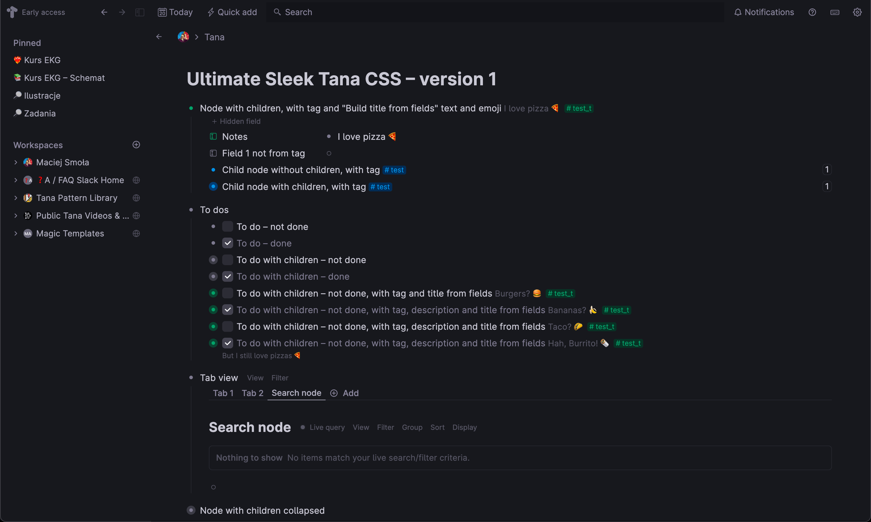
Dimming and removal of various Tana UI elements
Ultimate Sleek Tana CSS by macieksmola
Details
Authormacieksmola
LicenseNo License
Categoryapp.tana.inc
Created
Updated
Code size7.7 kB
Code checksumc5db33ac
Statistics
Learn how we calculate statistics in the FAQ.
Failed to fetch stats.
Description
Notes
:burrito: :sunglasses: burUltimate Sleek Tana CSS – version 1
At the moment only for the dark mode
Topbar
- dimmed Tana icon
- dimmed search bar background
- removed vertical separators
- removed bottom separator
Sidebar - colored the same way as the rest of the app
Parent node bar - (visible when swiping up and minimizing it to the stripe at the top of the screen)
- removed shadows and separator
Tab view - removed line sitting at the top of the tabs list
Search node - search bar options dimmed and colored as gray
- no search node dot pulsating animation
- smaller “Nothing to show” module when query has no results
Checkboxes - changed checkbox color and size to bigger and gray
- dimmed completed nodes text
Nodes - dimmed text of “Build title from fields” at the end of the node’s title
- dimmed node’s description and spaced out its letters more
- made nodes’ inner bullets bigger
Text - a bit bigger letter spacing
- disabled text wrapping so it can go to the end of the window
Fields - removed fields’ separators
Other - dimmed various vertical and horizontal lines like e.g. lines going down from expanded nodes
- dimmed “+” at the end of the nodes’ tree
If you like it, you can thank me via https://www.buymeacoffee.com/maciejsmola ;)
Source code
/* ==UserStyle==
@name           Ultimate Sleek Tana CSS
@namespace      github.com/openstyles/stylus/tana
@version        1.0.0
@description    Dimming and removal of various Tana UI elements
@author         Maciej Smoła
==/UserStyle== */
@-moz-document url-prefix("https://app.tana.inc") {


    /* TOPBAR */
    /* Dim Tana Early access logo and Search Icon */
    .TopBar-module_topBar__a-A3U {
        color: var(--colorGray525)
    }

    /* Dim TopBar's search bar background */
    .TopBar-module_topBar__a-A3U .TopBar-module_searchBarContainer__3AxR8 .TopBar-module_searchBar__vLIGY {
        background-color: var(--colorGray850);
    }

    /* Remove TopBar's bottom line (default = 1px) */
    .EditorPage-module_el__9-h9C {
        gap: 0px;
    }

    /* Remove Top-bar borders */
    header {
        border-top: none!important;
        box-shadow: none!important;
    }
    header > div,
    header div[class^="TopBar-module_separator"] {
        border-left: none!important;
    }


    /* SIDEBAR */
    /* Lighten up sidebar */
    /* Docked, Non-focused */
    .SidePane-module_sidePaneContainer__TNPOh.SidePane-module_docked__nP-vd .SidePane-module_sidePane__wxyI- {
        background-color: var(--colorGray825);
    }
    /* Docked, Focused */
    .TopBar-module_topBar__a-A3U .TopBar-module_sideBarController__0VGw0 {
        background-color: var(--colorGray825);
    }
    /* Hovered */
    .SidePane-module_sidePaneContainer__TNPOh.SidePane-module_isHovered__Uh-Ru .SidePane-module_sidePane__wxyI- {
        background-color: var(--colorGray825);
    }


    /* PARENT NODE BAR */
    /* Tweak Parent Node TopBar looks (visible when scrolling down the node) */
    .PanelToolbar-module_el__zgE-Y.PanelToolbar-module_anchorIsNotVisible__-3-jb {
        /* Alternative slight fadeout at the top:
        box-shadow: 0 0px 20px 0 var(--colorGray100); */
        box-shadow: 0 0px 0px 0;
    }


    /* TAB VIEW */
    .navigation > .menuSide button.mainLevel {
        border: 0;
        border-bottom: 0px solid transparent;
        border-bottom-color: transparent;
        color: var(--colorUITextMuted);
        margin-bottom: -1px;
        ;
        border-radius: 0;
    }
    .Button-module_button__WROwO.Button-module_solid__bDfUL {
        background-color: var(--colorButtonBackground);
        box-shadow: none;
    }
    /* var(--shadow1PxDepth) var(--colorButtonShadow)*/
    /* SEARCH NODE */
    /* Dim search node display options */
    .Button-module_button__WROwO.Button-module_smaller__Cszgf {
        --colorButtonText: var(--colorGray600);
        font-weight: 450;
    }
    .SearchRefreshButton-module_searchIndicator__077KE {
        --colorBlue400: var(--colorGray600);
    }

    /* No search node dot animation */
    .SearchRefreshButton-module_searchRefreshButton__PK-X8.SearchRefreshButton-module_searchActive__zneUT .SearchRefreshButton-module_searchIndicator__077KE:before {
        animation: none !important;
    }

    /* Smaller "Nothing to show" when no results */
    .Message-module_el__hrXRU.Message-module_info__SUFMT {
        color: var(--colorGray500) !important;
        border: 1px solid var(--colorGray300) !important;
        background: transparent !important;
    }
    html.isDarkMode .Message-module_el__hrXRU.Message-module_info__SUFMT {
        color: var(--colorGray600) !important;
        border: 1px solid var(--colorGray750) !important;
        background: transparent !important;
    }
    .Message-module_el__hrXRU.Message-module_regular__RO0-i {
        padding: 0.75rem;
        gap: 1rem;
        border-radius: var(--radius300);
        font-size: var(--size300);
    }
    .Message-module_el__hrXRU.Message-module_info__SUFMT .Message-module_icon__TpJjJ {
        display: none
    }

    .Message-module_el__hrXRU .Message-module_body__KXKqH {
        flex-direction: row !important;
    }


    /* CHECKBOXES */
    /*  Dim completed items */
    .itemdone-checkbox .listContentItem .editable {
        color: var(--colorGray500);
        /*  text-decoration: line-through; */
        opacity: 1;
    }

    /* Checkbox shadow + light gray background */
    .doneCheckbox input[type=checkbox]:checked {
        background-color: var(--colorGray650);
        box-shadow: 0 0 0 1px var(--colorEditorBackground),
        inset 0 0 0 3px var(--colorEditorBackground);
        background-position: top;
        opacity: 1
    }
    .doneCheckbox input[type=checkbox]:checked:hover {
        background-color: var(--colorGray600);
        box-shadow: 0 0 0 4px var(--colorGray200),
        inset 0 0 0 2px var(--colorEditorBackground);
        background-position: top;
    }
    .doneCheckbox input[type=checkbox]:checked:focus {
        background-color: var(--colorGray650);
        box-shadow: 0 0 0 4px var(--colorGray500),
        inset 0 0 0 2px var(--colorEditorBackground);
        background-position: top;
    }
    .doneCheckbox input[type=checkbox] {
        background-color: var(--colorGray725);
        box-shadow: 0 0 0 1px var(--colorEditorBackground),
        inset 0 0 0 3px var(--colorEditorBackground);
        background-position: top;
        opacity: 1
    }
    .doneCheckbox input[type=checkbox]:hover {
        background-color: var(--colorGray675);
        box-shadow: 0 0 0 4px var(--colorGray200),
        inset 0 0 0 2px var(--colorEditorBackground);
        background-position: top;
    }
    .doneCheckbox input[type=checkbox]:focus {
        background-color: var(--colorGray725);
        box-shadow: 0 0 0 4px var(--colorGray500),
        inset 0 0 0 2px var(--colorEditorBackground);
        background-position: top;
    }


    /* NODES */
    /* Dim text of "Build title from fields" at the end of the node's title */
    .wrapEditableAndMenu .titleFields {
        /*font-size: var(--size400); – uncomment to get it to the same font size as node's title*/
        color: var(--colorGray600);
        opacity: 1;
    }

    /* Dim node's description (text under the node's title) + more letter spacing */
    .listDescription {
        letter-spacing: 0.01em;
        color: var(--colorGray600);
    }

    /* Bigger inner bullets - default 5 px */
    :root {
        --bulletDiameterInner: 6px;
    }


    /* TEXT */
    /* Bigger letter spacing */
    body {
        letter-spacing: 0.01em;
    }

    /* Disable text wrapping - make it run to the end of screen*/
    .wrapEditableAndMenu {
        padding: 0;
    }


    /* FIELDS */
    /* Remove fields' separators */
    .bulletAndContent.istuple {
        box-shadow: none;
    }
    /* Remove separator between fields and nodes - DISABLED, enable if you want */
    .bulletAndContent.istuple + .bulletAndContent.istuple {
        box-shadow: none;
    }


    /* OTHER */
    /* Dim various vertical and horizontal lines*/
    body {
        --colorUIStroke: var(--colorGray750);
        --colorUIStrokeHover: var(--colorGray700);
        --colorUIStrokeSoft: var(--colorGray750);
        --colorBulletExpandLine: var(--colorGray750);
        --colorBulletExpandLineReference: var(--colorGray750);
        --colorBulletExpandLineHoverBackground: var(--colorGray775);
        --colorUITupleStroke: var(--colorGray750);
        --colorButtonStroke: var(--colorGray100);
    }

    /* Dim "+" at the end of the node's tree */
    div.placeHolderButton > svg {
        color: var(--colorGray600);
        opacity: 1
    }
}