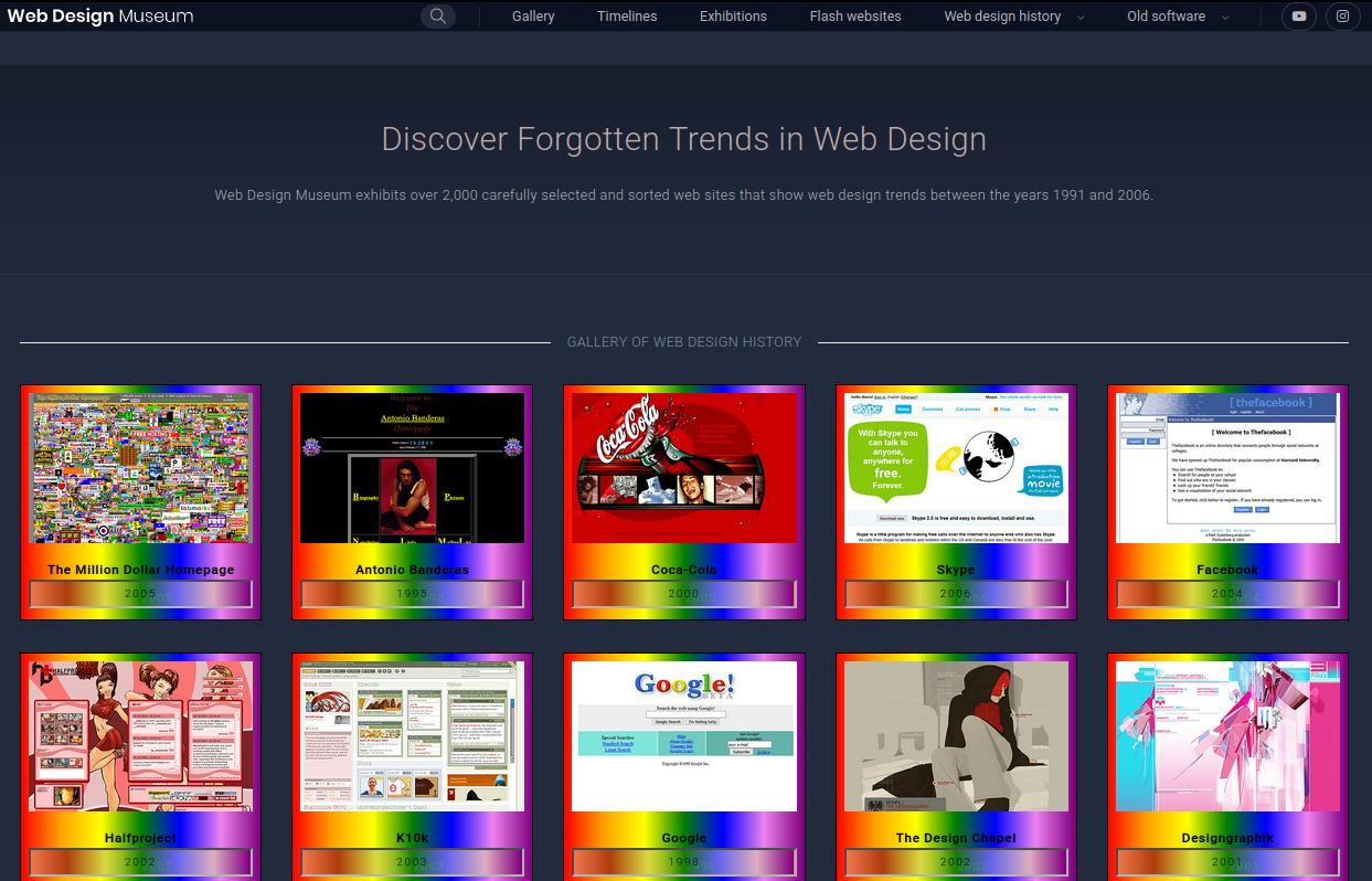
Web Design Museum but kinda nicer looking in a way.
Web Design Museum (sort of mystifyed) by coolslutguy420_2nd-ressurection
Details
Authorcoolslutguy420_2nd-ressurection
LicenseNo License
Categorywebdesignmuseum
Created
Updated
Code size3.5 kB
Code checksumd4b4a15d
Statistics
Learn how we calculate statistics in the FAQ.
Failed to fetch stats.
Description
Notes
Userstyle doesn't have notes.Source code
/* ==UserStyle==
@name           Web Design Museum (sort of mystifyed)
@namespace      github.com/openstyles/stylus
@version        1.0.0
@description    Web Design Museum but kinda nicer looking in a way.
@author         Me
==/UserStyle== */

@-moz-document domain("webdesignmuseum.org") {
	body {
		transition: none !important;
		animation: none !important;
		 background: #222b3d;
	}
	h1, h2, h3, h4 {
		color: #c0acac !important;
		border: none !important;
	}
	.btn-youtube {
padding: 2px;
}
	.btn-instagram {
padding: 2px;

}
	.btn-facebook {
padding: 2px;
border-radius: 100% !important;
		width: 60px
}
	.btn-facebook:hover {
		padding: 1px;
		transform: rotate(60deg);
		width: 20px;
		background: #4d0000;
		color: #f00;
		text-shadow: #4f0 55px 5px 10px 3px;
		transition: 3s;
		border: dotted 1px #3a0000;
		box-shadow: #a91212de 0px 0px 50px 3px ;
	}
	.btn-pinterest {
padding: 2px;
		width: 30px;
		border-radius: 100% !important;
}
	.btn-pinterest:hover {

		font-size: 13px;
		transition: 0.5s linear;
}
	img {
		transition: none !important;
		animation: none !important;
		transform: none !important;
	}
	.bg-lighter {
		border: black 1px solid !Important ;
	background:linear-gradient(90deg, #ff0000, #ffa000, #ffff00, #008000, #0000ff, #ee82ee, #800080) !Important;
	}
	.img-thumbnail {
		border: black 1px solid !Important ;
	background:linear-gradient(90deg, #ff0000, #ffa000, #ffff00, #008000, #0000ff, #ee82ee, #800080) !Important;
	}
	.h1 a, .h1 a[class*="hover-"], .h2 a, .h2 a[class*="hover-"], .h3 a, .h3 a[class*="hover-"], .h4 a, .h4 a[class*="hover-"], .h5 a, .h5 a[class*="hover-"], .h6 a, .h6 a[class*="hover-"], .sidebar.sidebar-light .sidebar-profile h3, .sidebar.sidebar-light .sidebar-profile h4, .sidebar.sidebar-light .sidebar-profile h5, .sidebar.sidebar-light .sidebar-profile h6, h1 a, h1 a[class*="hover-"], h2 a, h2 a[class*="hover-"], h3 a, h3 a[class*="hover-"], h4 a, h4 a[class*="hover-"], h5 a, h5 a[class*="hover-"], h6 a, h6 a[class*="hover-"] {
		color: black !important;
	}
	.figure-caption p {
		color: black;
		background:linear-gradient(90deg, #f0774e, #ad3d0d, #d8d840, #2280008f, #6666eb, #deadc2, #800080) !Important;
		width: 100%;
		border: black inset !Important ;
		text-shadow: #4f06 17px 5px 0.9px;
		letter-spacing: 2px;
	 transition: 0.9s linear;
	}
	.figure-caption p:hover {
		font-weight: bold;
		letter-spacing: 7px;
		transition:5s ease-in ;
			text-shadow: #ff00a69c 55px 0px 0px 0.9px;
	}

	.figure-caption h2 {
		color: black !important;
		font-weight: bold;
	}
	.page-link {
		color: #121212 !important;
		background: #6f7e9b ;
	}
	.page-link:hover {
		color: #fff4f4 !important;
		background: #5273b3;
		transition: 2s;
	}
	.topbar-inverse {
		height: 30px;
	}
	.form-control {
		background: #6f7e9b !Important;
	}
	.site-footer, .site-footer a {
		 background: #222b3d;
		border: none !important;
	}
	.card {
		 background: #222b3d;
		color: #c0acac !important;
		box-shadow: none;

	}

	.lookup-circle input {
		height: 25px;
	}
	svg {
		border-radius: 100% !important;
	}
	.btn {
		height: 30px !important;
	}
	.next-page, a.next-page, a.prev-page {
		 background: #3c4c6b;
		border-radius: 100%;
		height: 50px;
		width: 19px;
			padding-top: 20px;
		padding-bottom: 40px;
	}
	.btn-twitter {
		display: none;
	}
	.form-control {
		height: 30px;

	}
	.btn-secondary {
		height: 25px !important;
	}
	.input-group-append .btn  {
		height: 30px;
		padding: 2px;
		letter-spacing: 1px;
	}

}