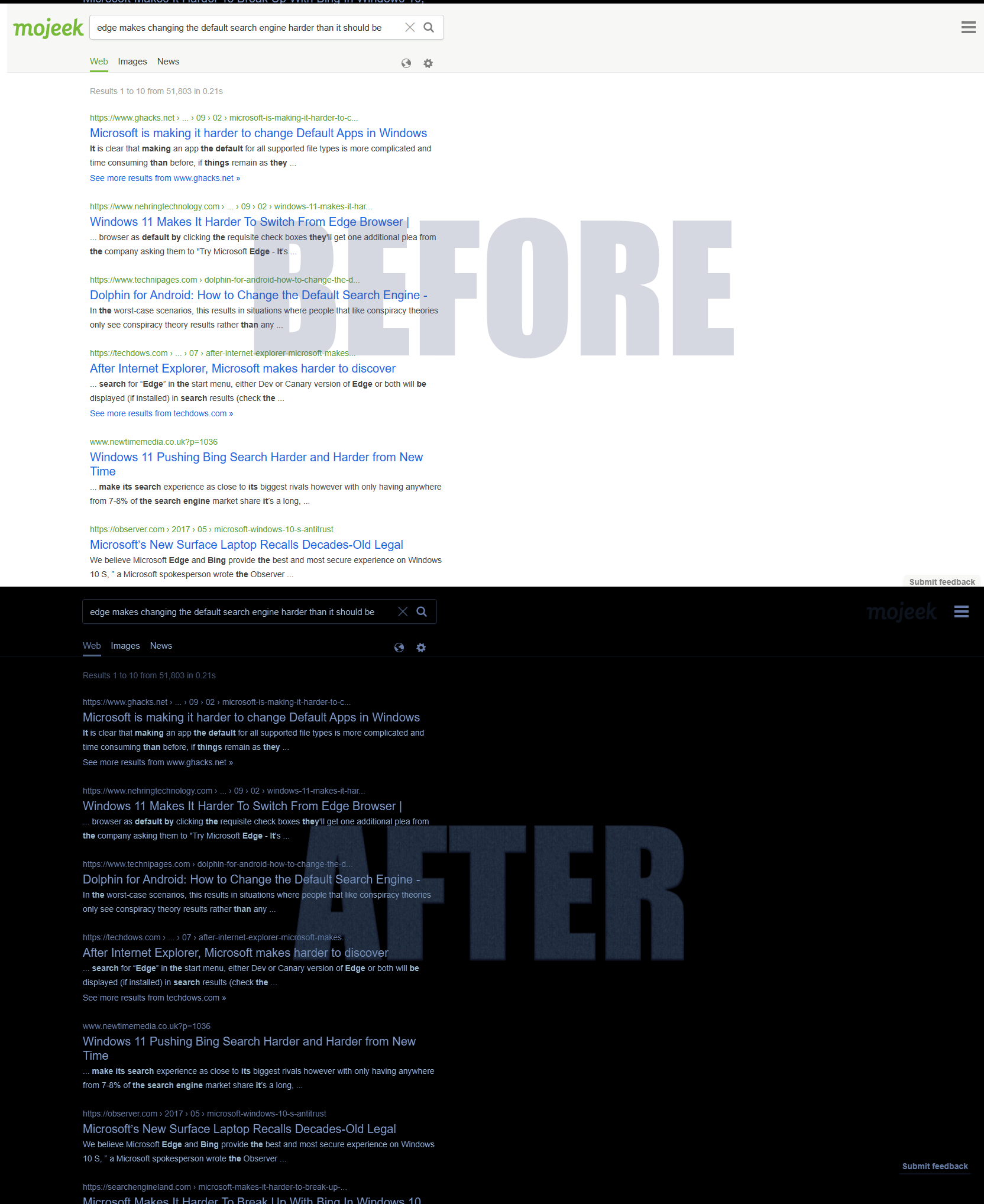
It's dark, it's mojeek, that's it.
Dark mojeek.com by osirisgothra
Details
Authorosirisgothra
LicenseShare Alike, Creative Commons
Categorywww.mojeek.com
Created
Updated
Code size2.0 kB
Code checksum62924c8d
Statistics
Learn how we calculate statistics in the FAQ.
Failed to fetch stats.
Description
Notes
Release 2
Now filter based, which should be fine for now. If anyone wants me to make changes or do something spectacular, let me know. Errors should be minimal, if any.
Release 1
Not much to say other than its dark and this is the first release, beta, very
Source code
/* ==UserStyle==
@name         Dark mojeek.com
@version      20240622.23.30
@namespace    https://userstyles.world/user/osirisgothra
@description  Its dark
@author       osirisgothra
@license      Share Alike, Creative Commons
==/UserStyle== */

@-moz-document domain("mojeek.com") {
/*

	You'll have to live with this until I can write a proper stylesheet for it
	but I have too much work to do and not the time to do it.  For now I'll just
	impose a cheesy filter to do my work for me.

    Update #1: Fix for browsers using the mozilla engine (Firefox being the most well known)
               Chromium-based browser users can remove this line (i.e., Chrome, HEdge)

	You can control the color values through hue-rotate (0deg -360deg, 180deg being original when invert is untouched and sepia 0%)
	You can control the color intesity through saturate (100% being original when invert is untouched and sepia 0%)
	You can reset ALL color and make it unform by using sepia, set to 0% to allow colors to be originals
	The funtion of contrast and brightness should be obvious enough.

*/
*
{
    /* Fix for mozilla-based browsers (Firefox, etc)
    */
    background: white;
}
body
{
	filter: invert(99.95%) sepia(100.125%) hue-rotate(180.2deg) saturate(140.241%) contrast(112.345%) brightness(77.7%);
}
body > div.large-footer > div.header.nb > div > div.header-logo > a > img
{
	display: block;
	position: absolute;
	right: 80px;
	opacity: 20%;
	top: 25px;
	transition: all 1250ms;
	animation: wobble 250ms 5;
	animation-play-state: running;
}
body > div.large-footer > div.header.nb > div > div.header-logo > a > img:hover
{
	transition: all 250ms;
  box-shadow: #aaa 0px 0px 12px;
	border-radius: 12px;
	padding: 4px;
	animation: wobble 250ms infinite;

}

@keyframes wobble
{
	0% { right: 80px; transform: rotate(0deg);  filter: blur(1.125px); }
	50% { right: 100px;transform: rotate(-10deg); filter: blur(2.025px); }
	100% { right: 80px;transform: rotate(0deg);  filter: blur(1.125px);  }
}

}