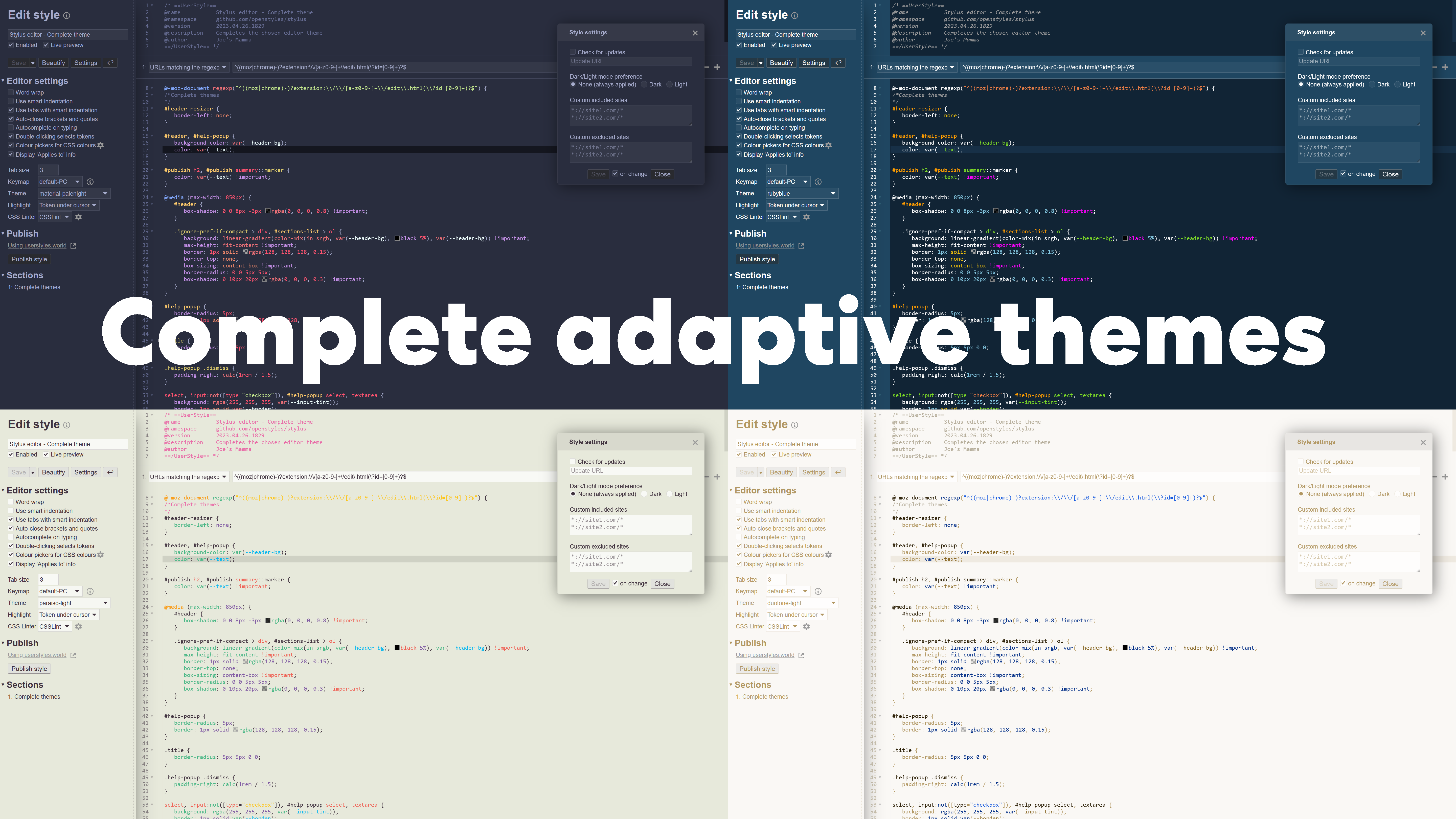
Completes the chosen editor theme (eg. panda-syntax, monokai, duotone-light, etc.) for the rest of the editor UI (sidebar, settings windows, etc.).
Complete themes - Stylus Editor by JoesMamma
Details
AuthorJoesMamma
LicenseNo License
Categorystylus
Created
Updated
Size32 kB
Statistics
Learn how we calculate statistics in the FAQ.
Failed to fetch stats.
Description
Notes
✨New:
− Corner radius for buttons and text-boxes setting -- 2023/09/17
− Buttons' contrast (opacity) setting -- 2023/06/22
− Enable/disable sidebar shadow setting -- 2023/05/24
− Set scrollbar widths setting -- 2023/05/24
🔺Still to fix (known issues):
− Nothing???
If you find some part of the editor that needs to be fixed, send an email to 'feedback.joesmamma@gmail.com' and I should respond within a couple of weeks.
🔨Fixed:
− Some themes are light/dark mode sensitive & therefore were broken on dark mode, these are now fixed -- 2023/09/25
− Scrollbar track incorrect background in Chromium on dark mode (was black, now transparent) -- 2023/09/25
− Sidebar-elements under the 'Publish' heading shifting up/down when hovering over 'Push update' and 'Disconnect' buttons (on published styles) -- 2023/07/10
− Reset name button position when in compact view (when window is narrow) -- 2023/07/05
− Scrollbars blocking text in textboxes of 'Find and replace' pop-up on Chromium -- 2023/06/28
− Scrollbars too wide on autocomplete pop-up on Chromium (these have to be hidden on Firefox) -- 2023/06/28
− Corrected scrollbar track background colour to transparent on Chromium -- 2023/06/28
− Radio-checkbox checked circle colour to match text -- 2023/06/26
− Slight colour adjustment of resizer-grips and sidebar border to better match (text colour of) some themes -- 2023/06/26
−'Save Beautify Settings ↩' sidebar button-row: fixed hover-effect -- 2023/06/26
− Header dropdown-menu backgrounds (in compact view when window is narrow) -- 2023/06/22
− Default theme with dark mode -- 2023/05/31
− Autocomplete suggestion list background colour -- 2023/04/30
− Alert box ('Save as template' confirmation, Metadata missing alert, etc.) -- 2023/04/30
−'Find and replace' pop-up background colour -- 2023/04/29
Source code
Source code has over 10K characters, so we truncated it. You can inspect the full source code on install link./* ==UserStyle==
@name Complete themes - Stylus Editor
@namespace github.com/openstyles/stylus
@homepageURL https://userstyles.world/style/9548/stylus-editor-complete-themes
@version 2024.09.26.2004
@description REFRESH PAGE TO APPLY THEME CHANGES. Completes the chosen editor theme (eg. panda-syntax, monokai, duotone-light, etc.) for the rest of the editor UI (sidebar, settings windows, etc.).
@author Joe's Mamma —— https://userstyles.world/user/JoesMamma —— feedback.joesmamma@gmail.com
@var select moz-scrollbar-width "Scrollbar width (Firefox)" ["thin:Thin", "auto:Normal", "none:No scrollbars"]
@var range webkit-scrollbar-width "Scrollbar width (Chromium)" [8, 0, 20, 1, "px"]
@var checkbox header-shadow "Sidebar shadow" 1
@var checkbox grab-handle "Sidebar dotted resizer" 1
@var range input-radius "Text-box corner radius" [3, 0, 6, 3, "px"]
@var range btn-radius "Button corner radius" [3, 0, 6, 3, "px"]
@var range btn-opacity "Button tint" [50, 25, 75, 25, "%"]
==/UserStyle== */
/**/
/* ————————————————————————————————————— HELP & FEEDBACK ———————————————————————————————————————— */
/* Send an email to 'feedback.joesmamma@gmail.com' and I should respond within a couple of weeks. */
/* Like this userstyle? Consider leaving a review. */
@-moz-document regexp("^((moz|chrome)-)?extension:\\/\\/[a-z0-9-]+\\/edit\\.html(\\?id=[0-9]+)?$") {
/*Complete themes
*/
* {
scrollbar-width: var(--moz-scrollbar-width);
scrollbar-color: var(--scroll) transparent;
}
*[data-ui-theme="light"]:not(.usercss) {
scrollbar-color: var(--notusercss-mainscroll);
}
::-webkit-scrollbar {
width: var(--webkit-scrollbar-width);
height: var(--webkit-scrollbar-width);
}
::-webkit-scrollbar,
::-webkit-scrollbar-track-piece {
background: transparent !important;
border: none !important;
}
::-webkit-scrollbar-thumb {
background: var(--scroll);
}
:not(select:hover)::-webkit-scrollbar-thumb:hover,
:not(select:active)::-webkit-scrollbar-thumb:active {
background: color-mix(in srgb, var(--scroll), rgb(var(--light-dark)) 10%);
}
:not(select:active)::-webkit-scrollbar-thumb:active {
box-shadow: inset 0 0 7px hsla(0, 0%, 0%, .3);
}
.CodeMirror-scrollbar-filler {
background: transparent !important;
}
.compact-layout #header {
border-bottom: 1px solid rgba(var(--color), .2);
box-shadow: 0 0 8px -3px rgba(0, 0, 0, .8) !important;
}
.compact-layout #url {
margin: 5px 10px;
align-items: center;
min-width: 10em;
}
.compact-layout #basic-info-name,
.compact-layout #url:not([href="null"]) {
display: flex;
}
.compact-layout #reset-name {
position: static;
}
.compact-layout #details-wrapper > details > :is(div, ol, main) {
background: linear-gradient(color-mix(in srgb, var(--header-bg), black 5%), var(--header-bg)) !important;
max-height: fit-content !important;
border: 1px solid rgba(128, 128, 128, .15);
border-top: none;
box-sizing: content-box !important;
border-radius: 0 0 5px 5px;
box-shadow: 0 10px 20px rgba(0, 0, 0, .3) !important;
margin-top: 10px;
}
#livePreview-settings main {
background-color: var(--header-bg);
border: 1px solid rgba(128, 128, 128, .15);
border-radius: 5px;
box-shadow: 3px 3px 30px rgba(0, 0, 0, 0.5);
}
#header {
box-shadow: 0 0 3rem -1.2rem rgba(0, 0, 0, var(--header-shadow));
}
#header-resizer {
border-left: none;
color: rgba(var(--color), .2);
}
#header-resizer::after {
opacity: var(--grab-handle);
}
.resize-grip {
border-top: none;
border-top-color: rgba(var(--color), .2);
background: var(--header-bg);
box-shadow: 0 -3px 4px var(--header-bg);
}
#header,
html:not(.usercss) body,
#help-popup,
#message-box > div {
background-color: var(--header-bg);
color: var(--text);
}
html[data-ui-theme="light"]:not(.usercss):has(.cm-s-default) .CodeMirror {
background-color: white;
}
html[data-ui-theme="dark"]:not(.usercss):has(.cm-s-default) .CodeMirror {
background-color: rgb(36, 36, 36);
}
#publish h2,
#publish summary::marker,
.regexp-report-note,
.select-wrapper::after {
color: var(--text) !important;
}
html:not(.usercss) .CodeMirror,
#help-popup .CodeMirror {
border-color: var(--border);
border-radius: calc(var(--input-radius) * 1.5);
}
.sectioned .section:not(:first-child) {
border-color: var(--border);
}
#help-popup,
#message-box > div {
border-radius: 5px;
border: 1px solid rgba(128, 128, 128, .15);
}
.title,
#message-box-title {
border-radius: 4.5px 4.5px 0 0;
}
#help-popup .contents .title {
border-radius: 0;
}
#message-box.danger #message-box-close-icon {
display: none;
}
#message-box-buttons {
border-radius: 0 0 4.5px 4.5px;
background-color: rgba(128, 128, 128, .15);
}
#help-popup .i-close {
padding-right: calc(1rem / 1.5);
}
#search-replace-dialog {
color: var(--text);
background-color: var(--header-bg) !important;
border-color: rgba(128, 128, 128, .15);
border-radius: 0 0 5px 5px;
}
#search-replace-dialog > * {
background-color: transparent;
}
#search-replace-dialog div[data-type="status"] {
background-color: rgba(128, 128, 128, .15);
border-radius: 0 0 4.5px 4.5px;
}
#search-replace-dialog:not(:focus-within):not(:hover) div[data-type="actions"] {
opacity: .9;
}
#search-replace-dialog div[data-type="actions"],
#search-replace-dialog div[data-type="tally"] {
opacity: 1;
}
#search-replace-dialog div[data-type="tally"] {
width: calc((16px + 1em) * 2 - 1em);
box-sizing: border-box;
padding-inline: 4px;
margin-right: calc(16px + 1em);
text-align: center;
}
#search-replace-dialog div[data-type="input-wrapper"] {
padding: .25rem;
max-width: 25em;
box-sizing: content-box;
}
#search-replace-dialog textarea {
padding: 0 3px 0 3px;
max-height: 1.3em;
scrollbar-width: none;
background: rgba(255, 255, 255, var(--input-tint)) !important;
color: var(--text) !important;
}
#search-replace-dialog .i-close[data-action="clear"] {
font-size: 1.2em !important;
}
#search-replace-dialog textarea::-webkit-scrollbar {
display: none;
}
select,
input:not([type="checkbox"]),
#help-popup select,
textarea,
#search-replace-dialog textarea,
.applies-to input.applies-value {
background: rgba(255, 255, 255, var(--input-tint));
border: 1px solid var(--border);
border-radius: var(--input-radius);
transition: none;
color: var(--text);
scrollbar-color: var(--select-scroll) transparent;
}
input[type="radio"] {
border-radius: 50%;
}
select {
background: var(--select-bg) !important;
}
.split-btn-menu {
background: color-mix(in srgb, var(--header-bg) calc(100% - var(--btn-opacity)), hsl(0, 0%, var(--btn-tint)));
border-color: rgb(117, 116, 122);
border-color: var(--b-border2-h);
border-width: 1px !important;
border-radius: calc(var(--btn-radius) * 2);
border-top-left-radius: var(--btn-radius);
line-height: var(--input-height) !important;
cursor: default;
padding: 4px 0;
font-size: 12px;
box-shadow: rgba(0, 0, 0, .2) 0 0 4px 0;
}
.split-btn-menu > * {
padding: 3px 7px 5.8px 10px;
height: calc(1px + 1em + 2 * 0.3333em);
user-select: none;
}
.split-btn-menu > a {
background: color-mix(in srgb, var(--header-bg) calc(100% - var(--btn-opacity)), hsl(0, 0%, var(--btn-tint))) !important;
color: var(--text) !important;
}
.split-btn-menu > a:hover {
background: rgba(var(--light-dark), .2) !important;
}
.icon.select-arrow,
.icon.checked,
#reset-name .i-close:not(:hover):not(:active) {
transition: none;
color: var(--text);
}
#reset-name .i-close:hover {
color: hsl(0, 0%, 30%);
transition: none;
}
#reset-name {
position: absolute;
margin: 0 0 0 calc(-16px - .25em);
padding: .25em .25em 0 0;
}
#reset-name .i-close {
font-size: 1.5em;
}
#name {
padding-right: calc(19px + .25em);
}
input[type="checkbox"]:not(.slider) {
border-color: var(--border);
border-radius: calc(var(--input-radius) / 1.5);
background: rgba(255, 255, 255, var(--input-tint));
}
input[type="checkbox"]:not(.slider):hover {
border-color: var(--check-hover-border);
background-color: rgba(255, 255, 255, var(--check-hover-tint));
}
input[type="radio"]:checked::after {
left: calc(14px / 2 - 14px / 3);
top: calc(14px / 2 - 14px / 3);
width: calc(14px / 2);
height: calc(14px / 2);
background-color: var(--text);
}
.icon .i-info,
.icon .i-config,
.i-plus,
.i-minus,
.i-close,
#search-replace-dialog div[data-type="actions"] * {
color: hsl(0, 0%, 60%);
transition: none;
}
.icon .i-info:hover,
.icon .i-config:hover,
.add-applies-to:hover .i-plus,
.remove-applies-to:hover .i-minus,
.i-close:hover,
#search-replace-dialog .i-close:hover,
#search-replace-dialog div[data-type="actions"] *:hover {
color: hsl(0, 0%, 30%);
}
a {
color: hsl(0, 0%, 60%);
transition: none;
}
a:hover {
color: hsl(0, 0%, 30%);
}
#usw-url::after {
content: url("data:image/svg+xml,%3Csvg xmlns='http://www.w3.org/2000/svg' class='svg-icon' viewBox='0 0 8 8'%3E%3Cpath fill='hsl(0, 0%, 60%)' d='M0 0v8h8v-2h-1v1h-6v-6h1v-1h-2zm4 0l1.5 1.5-2.5 2.5 1 1 2.5-2.5 1.5 1.5v-4h-4z'%3E%3C/path%3E%3C/svg%3E");
display: inline-block;
width: 11px;
height: 11px;
margin-left: 8px;
vertical-align: middle;
}
#usw-url:hover::after {
content: url("data:image/svg+xml,%3Csvg xmlns='http://www.w3.org/2000/svg' class='svg-icon' viewBox='0 0 8 8'%3E%3Cpath fill='hsl(0, 0%, 30%)' d='M0 0v8h8v-2h-1v1h-6v-6h1v-1h-2zm4 0l1.5 1.5-2.5 2.5 1 1 2.5-2.5 1.5 1.5v-4h-4z'%3E%3C/path%3E%3C/svg%3E");
}
#usw-progress .success {
margin-top: 0;
}
#url {
display: inline-block;
margin: 5px 0 12px 2px;
}
#url:hover > i {
color: hsl(0, 0%, 30%) !important;
}
#url::before {
content: "Visit homepage"
}
#url > i {
color: hsl(0, 0%, 60%);
transition: none;
margin-left: 8px;
width: 11px;
height: 11px;
}
#cancel-button {
display: flex;
cursor: pointer;
margin-left: 5px;
height: 23px;
align-items: center;
}
#cancel-button::after {
content: "B...