/* ==UserStyle==
@name WorkFlowy Move 360px Wide Page LEFT for 1920x1080 Screen Res ☚
@version 20230513.06.21
@namespace userstyles.world/user/Styling
@description It moves the page left which can be useful if you have it beside another window and you want to refer back and forth to each.
Sometimes it's good just to reposition the WorkFlowy page to the left side of your monitor if that's easier to read without turning your head.
It can also be great for multi-monitor setups, for example, moving your WorkFlowy page to the left of a monitor on the right so you can easily see the WorkFlowy page while using a monitor on its left.
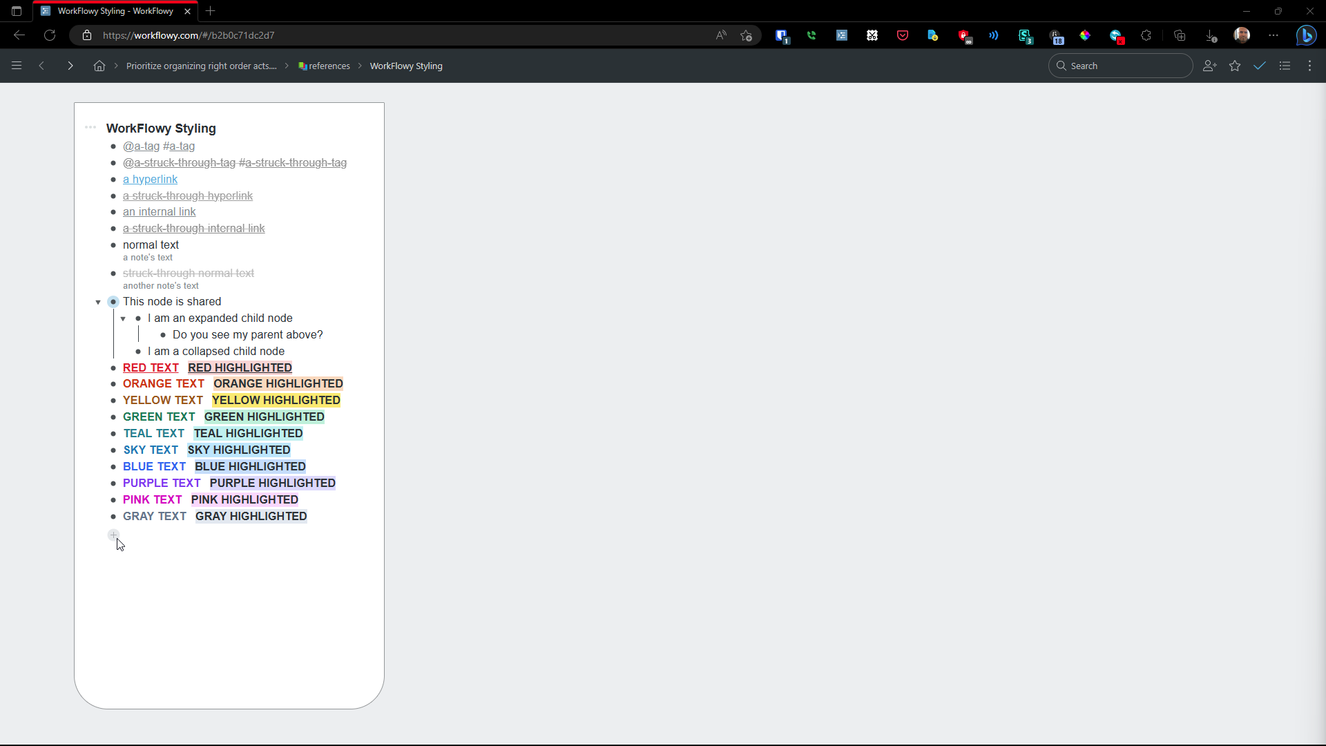
The example shown in the thumbnail was made with WorkFlowy's Vintage theme found at WorkFlowy Settings > Appearance.
@author Styling
@license CC BY-NC-SA 4.0
==/UserStyle== */
@-moz-document url-prefix("https://workflowy.com") {
/* WorkFlowy ☛thin☚ on the Left Side of Window ⮜⮜⮜
What this primarily does is MOVE a narrow page provded by my "WF ☛thin☚" userstyle to the left side of its window.
This is handy both for dual (or more) monitor setups and for a single monitor where you want WorkFlowy open on the left side of a window so you can easily refer back and forth to the window(s) to WorkFlowy's left.
N.B. When not overridden by enabling my "WF ☚☚☚☚WIDE☛☛☛☛" userstyle, this sizes WorkFlowy for a 500px wide (minimuum width in Edge, although some other browsers have a larger minimum width, in which case you can still use this, but your window itsel will be a little wider [for example, 524px wide in Chrome and Brave {Advantage Edge! <Edge also has shorter top address and favorites/bookmarks bars, giving you more vertical screen real estate>})].
This also adds styling to the border corners so it loosely resembles a 3-inch by 5-inch "Rite in the Rain" brand waterproof pocket notebook's corners, the kind I carry. Delete or change the border-radius values if you wish. You may also want to put in a border-color value other than grayish/greyish.
This userstyle further sets the font to Arial, Helvetica, 'Helvetica Neue', Sans-Serif (in that order); increases the margin between nodes aka bullets by 2px (to better match WorkFlowy's styling on their mobile apps); and adds a tiny bit of spacing between the letters, which you may or may not like. In general, a bit of extra letter spacing improves legibility when reading light text on a dark background, however.
There are a few minor additional tweaks that make WorkFlowy line up a bit better with the bullets, the distance between lines be more uniform and thus highlighting of lines retain similar-size gaps, etc.
N.B. When not overridden by enabling my "WF ☚☚☚☚WIDE☛☛☛☛" userstyle, this sizes WorkFlowy for a 500px wide (minimuum width in Edge, although some other browsers have a larger minimum width, in which case you can still use this, but your window itsel will be a little wider [for example, 524px wide in Chrome and Brave {Advantage Edge! <Edge also has shorter top address and favorites/bookmarks bars, giving you more vertical screen real estate>})].
This also adds styling to the border corners so it loosely resembles a 3-inch by 5-inch "Rite in the Rain" brand waterproof pocket notebook's corners, the kind I carry. Delete or change the border-radius values if you wish. You may also want to put in a border-color value other than grayish.
This userstyle further sets the font to Arial, Helvetica, 'Helvetica Neue', Sans-Serif (in that order); increases the margin between nodes aka bullets by 2px (to better match WorkFlowy's styling on their mobile apps); and adds a tiny bit of spacing between the letters, which you may or may not like. In general, a bit of extra letter spacing improves legibility when reading light text on a dark background, however.
There are a few minor additional tweaks that make WorkFlowy line up a bit better with the bullets, the distance between lines be more uniform and thus highlighting of lines retain similar-size gaps, etc.
The example shown in the thumbnail was made with contrasting white/black page/background colors for demonstration.
Additionally, you will probably want to get these userstyles fom my userstyles homepage:
WF ☛thin☚ Right⮞⮞⮞
(WorkFlowy ☛thin☚ on the Right Side of Window ⮞⮞⮞)
WF ☚☚☚☚WIDE☛☛☛☛
(WorkFlowy ☚☚☚☚WIDE☛☛☛☛ Sliding-Width Page)
This plays nice with all my WF ☛thin☚ userstyles by overriding them.
WF ☛thin☚
(WF ☛thin☚ for 500px Wide or Larger Browser Windows)
This one is centered. You can LEAVE WF ☛thin☚ ENABLED ALL THE TIME. Then, just also enable ONE OF "WF ☛thin☚ ⮜⮜⮜Left," or "WF ☛thin☚ Right⮞⮞⮞," "WF ☚☚☚☚WIDE☛☛☛☛" when you want one of those.
Finally, I also made 16 WorkFlowy themes as userstyles!
These range from white to black, light to dark, from the very colorful to the subdued, from those with transparency effects on moving animated backgrounds to classic pages on wooden desktops.
I designed them for "circadian rhythm" health protection, as in bluer/whiter/brighter light in the morning, redder/darker/dimmer night at light, so as not to mess up melatonin production specifically and your sleep cycle generally.
They complement the WF ☛thin☚ and WF ☚☚☚☚WIDE☛☛☛ userstyles. If you're curious about these themes, they're all at my userstyles profile page. */
}
@-moz-document url-prefix("https://workflowy.com") {
/* This WF Userstyle's Notes
For this to work correctly, you must disable WorkFlowy's "Full width page" feature, found at Workflowy Settings > Experimental features. */
}
@-moz-document url-prefix("https://workflowy.com") {
/* CC BY-NC-SA 4.0 License
Copyright (c) 2023 C. Will Dollis
Creative Commons Attribution-NonCommercial-ShareAlike 4.0 International (CC BY-NC-SA 4.0)
CC BY-NC-SA 4.0 License Summary:
This license allows reusers to distribute, remix, adapt, and build upon the material in any medium or format for noncommercial purposes only, and only so long as attribution is given to the creator. If you remix, adapt, or build upon the material, you must license the modified material under identical terms.
CC BY-NC-SA 4.0 includes the following elements:
BY - Credit must be given to the creator
NC - Only noncommercial uses of the work are permitted
SA - Adaptations must be shared under the same terms
See this URL for FULL CC BY-NC-SA 4.0 license terms:
https://creativecommons.org/licenses/by-nc-sa/4.0/legalcode
*/
}
@-moz-document url-prefix("https://workflowy.com") {
/* WF ☛thin☚ ⮜⮜⮜Left's CSS */
@media only screen and (min-width: 681px) {
.page {
position: relative !important;
right: 1px !important;
}
}
@media only screen and (min-width: 683px) {
.page {
right: 2px !important;
}
}
@media only screen and (min-width: 685px) {
.page {
right: 3px !important;
}
}
@media only screen and (min-width: 687px) {
.page {
right: 4px !important;
}
}
@media only screen and (min-width: 689px) {
.page {
right: 5px !important;
}
}
@media only screen and (min-width: 689px) {
.page {
right: 4px !important;
}
}
@media only screen and (min-width: 699px) {
.page {
right: 10px !important;
}
}
@media only screen and (min-width: 719px) {
.page {
right: 20px !important;
}
}
@media only screen and (min-width: 759px) {
.page {
right: 40px !important;
}
}
@media only screen and (min-width: 799px) {
.page {
right: 60px !important;
}
}
@media only screen and (min-width: 839px) {
.page {
right: 80px !important;
}
}
@media only screen and (min-width: 879px) {
.page {
right: 100px !important;
}
}
@media only screen and (min-width: 919px) {
.page {
right: 120px !important;
}
}
@media only screen and (min-width: 959px) {
.page {
right: 140px !important;
}
}
@media only screen and (min-width: 1000px) {
.page {
right: 160px !important;
}
}
@media only screen and (min-width: 1040px) {
.page {
right: 180px !important;
}
}
@media only screen and (min-width: 1080px) {
.page {
right: 200px !important;
}
}
@media only screen and (min-width: 1120px) {
.page {
right: 220px !important;
}
}
@media only screen and (min-width: 1160px) {
.page {
right: 240px !important;
}
}
@media only screen and (min-width: 1200px) {
.page {
right: 260px !important;
}
}
@media only screen and (min-width: 1240px) {
.page {
right: 280px !important;
}
}
@media only screen and (min-width: 1280Px) {
.page {
right: 300px !important;
}
}
@media only screen and (min-width: 1320px) {
.page {
right: 320px !important;
}
}
@media only screen and (min-width: 1360px) {
.page {
position: relative !important;
right: 340px !important;
}
}
@media only screen and (min-width: 1400px) {
.page {
right: 360px !important;
}
}
@media only screen and (min-width: 1419px) {
.page {
right: 370px !important;
}
}
@media only screen and (min-width: 1440px) {
.page {
right: 380px !important;
}
}
@media only screen and (min-width: 1480px) {
.page {
right: 400px !important;
}
}
@media only screen and (min-width: 1520px) {
.page {
right: 420px !important;
}
}
@media only screen and (min-width: 1560px) {
.page {
right: 440px !important;
}
}
@media only screen and (min-width: 1600px) {
.page {
right: 460px !important;
}
}
@media only screen and (min-width: 1640px) {
.page {
right: 480px !important;
}
}
@media only screen and (min-width: 1680px) {
.page {
right: 500px !important;
}
}
@media only screen and (min-width: 1720px) {
.page {
right: 520px !important;
}
}
@media only screen and (min-width: 1760px) {
.page {
...