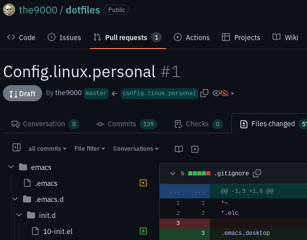
Wider, cyan colors, enhanced contrast.
github.com - wider, cyan colors for dark theme by the9000
Details
Authorthe9000
LicenseCC Zero
Categorygithub.com
Created
Updated
Code size2.9 kB
Code checksumb523d8f0
Statistics
Learn how we calculate statistics in the FAQ.
Failed to fetch stats.
Description
Notes
- Wider main column, comfortably view a diff with line length of 120.
- Cyan colors instead of blue colors.
- Darker diff backgrounds, monospace spans, tooltip backgrounds, for enhanced contrast.
- "Ready for review" button made highly visible by a border.
- Resolve and unresolve buttons with icons.
Source code
/* ==UserStyle==
@name           github.com - 6/22/2022, 3:53:11 PM
@namespace      github.com/openstyles/stylus
@version        1.0.0
@description    A new userstyle
@author         Me
==/UserStyle== */

@-moz-document domain("github.com") {
    /* Colors. */
    [data-color-mode="light"][data-light-theme="dark"], [data-color-mode="dark"][data-dark-theme="dark"] {
        --color-diff-blob-addition-word-bg: hsl(120, 70%, 20%, 60%);
        --color-diff-blob-addition-line-bg: hsl(150, 20%, 10%) !important;
        --color-diff-blob-deletion-line-bg: hsl(0, 20%, 10%) !important;
    }


    /* Make "Ready for review" button highly visible. */
    .branch-action-item .btn {
        border-color: #cc3;
        background-color: #333308;
    }

    /* Make "Resolve conversation"  and "Unresolve conversation" look distinct. */
    form[action $= "/resolve"] > button::before {
        content: "✅ ";
    }
    form[action $= "/unresolve"] > button::before {
        content: "👈 ";
    }

    /* Wider default central column. */
    .container-xl {
        max-width: 140em;
    }

    .container_ld {
        max-width: none; /* Unset it. */
    }

    /* More readabale tooltips */
    tool-tip {
        background-color: #113333;
    }

    /* Darker monospace spans. */
    .markdown-body code, .markdown-body tt {
        background-color: #222; /* IDK if relative colors even work in Firefox. */
    }

    /* Cyanization. */

    [data-color-mode="light"][data-light-theme="dark"], [data-color-mode="dark"][data-dark-theme="dark"] {
        --color-accent-emphasis: hsl(180, 30%, 30%) !important;
        --color-accent-muted: hsl(180, 30%, 25%);
        --color-accent-subtle: hsl(180, 75%, 12%);
        --color-accent-fg: hsl(180, 30%, 50%) !important;
    }

    span.Counter {
        background-color:  var(--color-accent-subtle);
    }

    /* File browser links. */
    a.iJtJJh, a.bJBoUI, .hUWqlv {
        color: var(--color-accent-fg);
    }

    /* File browser intermediate paths. */
    .bFrOJy .segmentedControl-content, .dfAUyE .segmentedControl-content {
        color: var(--color-accent-fg);
        border-color: var(--color-accent-muted);
    }

    .gbKtit {
        background-color: var(--color-accent-subtle);
    }

    /* File action code / blame buttons. */
    .kdEavw {
        background-color: var(--color-accent-fg);
    }

    .ivYJSK {
        background-color: var(--color-accent-subtle);
    }

    /* File Action bar elements. */
    .kbjJSF, .jepClM, .ddNLNa, .kdEavw {
        color: var(--color-accent-emphasis);
    }

    /* File browser tree marker. */
    .hLwWNO .PRIVATE_TreeView-item[aria-current="true"] > .PRIVATE_TreeView-item-container::after {
        background-color: var(--color-accent-fg);
    }

    /* Info icons. */
    .jyqKxg {
        color: var(--color-accent-emphasis);
    }

}