An evolution of the userstyle "Kbin Slim by the8thbit"
https://userstyles.world/style/10437/kbin-slim
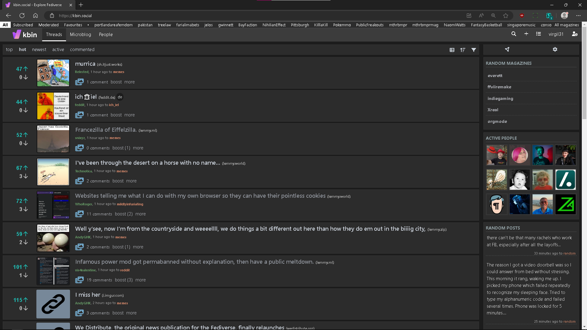
kbin.social compact and reddit-like by virgil31
Details
Authorvirgil31
LicenseNo License
Categorykbin.social
Created
Updated
Code size12 kB
Code checksum52455d6a
Statistics
Learn how we calculate statistics in the FAQ.
Failed to fetch stats.
Description
Notes
With a full page width usage, enhanced colors (buttons, magazines, usernames, ...), article images to the left and a placeholder image to keep the formatting.
Source code
Source code has over 10K characters, so we truncated it. You can inspect the full source code on install link./* ==UserStyle==
@name Reddit like kbin.social - 6/23/2023, 12:00:00 AM
@namespace github.com/openstyles/stylus
@version 1.0.0
@description Reddit like kbin.social
@author virgil31
==/UserStyle== */
@-moz-document url-prefix("https://kbin.social") {
.theme--kbin,
.theme--light,
.theme--dark,
.theme--solarized-light,
.theme--solarized-dark {
--kbin-success-color: #00ce5c !important;
--kbin-danger-color: #FF3131 !important;
}
.btn,
input[type="checkbox"],
markdown-toolbar > * {
cursor: pointer;
}
@media (min-width: 690px) {
.theme--kbin {
--kbin-body-line-height: normal;
}
.dropdown__menu {
padding: 0;
}
#header menu li {
height: 100%;
display: flex;
align-items: center;
justify-content: center;
}
#header menu li a {
padding: 0.5rem 0.75rem 0.5rem;
}
.kbin-container {
padding: 0.5rem;
gap: 0.775rem;
}
#middle {
padding-bottom: 0;
}
#middle #main,
#middle #sidebar {
padding: 0;
}
.options {
height: auto;
}
.options > * a,
.options > * button {
padding: 0.3rem 0.55rem;
height: auto;
border-bottom: none;
}
.options > * a:focus-visible,
.options > * a:hover,
.options > * button.active,
.options > * button:focus-visible,
.options > * button:hover {
border-bottom: none;
height: auto;
}
.options > * a.active {
color: var(--kbin-link-color);
font-weight: bold;
border-bottom: none;
height: auto;
}
.options > * a.active:hover {
color: var(--kbin-link-hover-color);
}
.theme--kbin .options--top,
.theme--kbin .section--top {
margin-top: 0 !important;
}
#sidebar .section {
padding: 0.42rem;
}
#sidebar .info li,
#sidebar .meta li {
min-height: 34px;
padding: 0;
padding-left: 0.3rem;
}
#sidebar .info li,
#sidebar .meta li:last-child {
border-bottom: none;
}
.related-magazines ul > li,
.user-list ul > li {
padding-left: 0.3rem;
}
.user-list ul > li > a,
.user-inline {
opacity: 0.7;
}
.user-inline:hover {
opacity: 1;
}
.user-list ul > li > a:hover {
color: var(--kbin-meta-link-hover-color);
}
.related-magazines ul > li > a,
.user-list ul > li > a {
display: flex;
width: 100%;
align-items: center;
justify-content: space-between;
padding: 2.5px 0 !important;
color: var(--kbin-meta-link-color);
font-weight: 700;
}
.related-magazines ul > li > a > img,
.user-list ul > li > img {
border-radius: 100%;
}
.related-magazines ul > li > a *:first-child,
.user-list ul > li > *:first-child {
order: 1;
}
.preview {
display: unset;
}
.entry {
padding: 0.2rem;
margin-bottom: 5px;
grid-template-areas: "vote title image" "vote shortDesc image" "vote meta image" "vote footer image" "body body body";
grid-template-rows: auto minmax(0, auto) auto auto minmax(0, auto);
}
.view-compact .entry {
grid-template-rows: none;
}
.entry .short-desc {
margin: 0 !important;
padding: 0 !important;
}
.entry .short-desc p {
margin-bottom: 0.25rem;
}
.entry header {
margin: 0.2rem 0;
}
.entry header h2 {
line-height: 1rem;
}
.entry .entry__meta {
font-size: 0.65rem;
margin-top: 0;
}
.entry figure a {
height: 100%;
display: flex;
align-items: center;
border-radius: 2.75px;
background: var(--kbin-body-bg);
}
.entry figure a img {
padding: 0.15rem;
border-radius: 5px;
display: flex;
}
.view-compact .entry figure a img {
height: 85px !important;
width: 102px !important;
}
.entry figure img {
height: 100px;
width: 120px;
}
.entry .vote,
.entry .vote,
.view-compact .entry .vote,
.entry .vote {
margin-right: 0.5rem !important;
margin-left: 0.5rem !important;
gap: 0;
justify-items: end;
align-content: center;
}
.entry .vote form,
.view-compact .entry .vote form {
height: min-content;
line-height: initial;
}
.entry .vote form button,
.view-compact .entry .vote form button {
height: min-content;
padding: 0.1rem;
background: transparent;
}
.entry .vote form button span,
.view-compact .entry .vote form button span {
font-size: 1rem;
font-weight: bold;
}
.entry footer {
display: flex;
align-items: flex-end;
}
.entry footer menu {
align-items: center;
/*min-height: 25px;*/
}
.entry footer menu li {
height: 100%;
padding: 0;
display: flex;
align-items: center;
}
.entry .loader {
position: inherit;
opacity: 0.5;
}
#sidebar .magazine__subscribe {
margin-bottom: 0.75rem;
}
#sidebar .section menu > li {
padding: 0.3rem 0;
display: flex;
align-items: flex-end;
}
#sidebar .section figure > .row:first-child {
display: flex;
width: 100%;
justify-content: flex-start;
align-items: center;
gap: 0.55rem;
margin-bottom: 0.15rem;
padding-right: 0.75rem;
}
#sidebar .section figure > .row:first-child > a {
padding: 0;
margin: 0;
min-width: fit-content;
}
#sidebar .section figure > .row:first-child > a > img {
height: 3.25rem !important;
width: auto;
aspect-ratio: 1;
margin-bottom: 0 !important;
border-radius: 100%;
}
#sidebar .section figure > .row:first-child > blockquote {
margin: 0 !important;
padding: 0 !important;
}
#sidebar .section figure > .row:first-child > blockquote > p {
margin-bottom: 0.4rem;
margin-top: 0;
}
#sidebar .section figure > .row:first-child > blockquote > div {
height: 0;
font-size: 0;
}
#sidebar .section figure > figcaption {
font-size: 0.6rem;
opacity: 0.8;
}
#sidebar .entries figure,
#sidebar .posts figure {
padding: 0 0.15rem;
margin-top: 0.35rem;
}
#sidebar .entries figure:first-child,
#sidebar .posts figure:first-child {
padding-top: 0;
margin-top: 0;
}
#sidebar section h3 {
margin-bottom: 0.4rem;
padding-bottom: 0.1rem;
}
#sidebar .settings .theme {
border: 1px var(--kbin-sidebar-header-text-color) solid;
}
.pagination {
padding: 0;
}
.entry__body {
margin-top: 0.5rem;
}
.comment {
grid-gap: 0;
column-gap: 0.5rem;
padding: 0.5rem;
}
.comment figure > a > img {
border-radius: 5px;
}
.comment footer > .js-container {
margin-top: 0.25rem;
}
.comment footer .comment-add > div {
margin-bottom: 0.5rem;
}
.comment footer .comment-add > div > textarea {
padding: 0.5rem 0.45rem;
}
.user-box .user-main {
padding: 0.5rem !important;
margin: 0 !important;
margin-bottom: 0 !important;
align-items: center;
justify-content: center;
top: 0 !important;
}
.user-box .with-cover .user-main {
margin-top: -60px !important;
}
.user-box .user-main img {
border: var(--kbin-section-border);
border-radius: 5px;
}
.user-box .user-main h1 {
margin-top: 0 !important;
}
.user-box .user-main small {
margin-bottom: 0.5rem !important;
}
.user-box .user-main .user__follow {
margin: 0 !important;
}
.user-box .about {
top: 0 !important;
margin-bottom: 0 !important;
}
}
/* My Styles */
#middle > div.kbin-container {
margin-left: 0px;
margin-right: 0px;
max-width: none;
grid-template-columns: 5fr 1fr;
}
#header > div.kbin-container {
margin-left: 0px;
margin-right: 0px;
padding-left: 0px;
padding-right: 0px;
max-width: none;
}
a.magazine-inline {
color: lightsalmon;
}
a.user-inline {
color: lightgreen;
}
button[title=Favourite]{
text-align: right;
color: lightse...