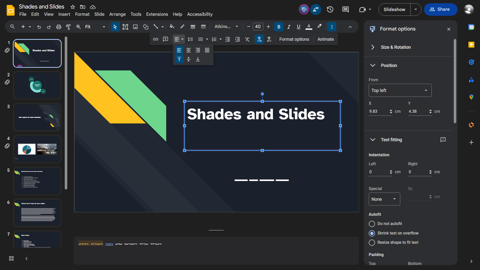
A Material 3 themed dark mode for Google Slides.
Shades & Slides by winghongchan
Details
Authorwinghongchan
LicenseGPL-3.0-or-later
Categorygoogle
Created
Updated
Code size227 kB
Code checksum14dc79f1
Statistics
Learn how we calculate statistics in the FAQ.
Failed to fetch stats.
Description
Notes
Components of Google Slides that are <iframe>s such as the Google Drive, Images, Photos pickers, Google Meet side sheet, and Share dialog are handled by Dark Docs, my matching userstyle for Google Docs.
Browser-specific notes
| Chromium-based (including Chrome, Edge, Vivaldi, &c.) | Firefox and derivatives |
|---|---|
| If the presenter view opens with a white sidebar and top bar, close presenter view and re-open it from the slideshow view’s mini toolbar in the bottom left. | Dark Docs uses the newer :has() selector. Support for it in Firefox is currently in development, but you can enable support for it by setting the layout.css.has-selector.enabled preference to true. Follow along with Mozilla’s work on this at Bugzilla. |
Options
These options are available to you from the Stylus popup (how do I find these options?):
- Ripple animations - the growing circle animation that happens when you click on things. If you find these animations too laggy, distracting, &c. you can turn this off to disable them.
Latest updates
-
2024.02.27
- The new comments UI has been darkened. There are minor outstanding bugs regarding the comments, and these will be fixed in a later update when I have the time.
-
2024.01.26
- The new split Share button has been repaired. The menu it opens is now legible.
-
2023.12.18
- Icons in the Slideshow toolbar have been repaired.
Trivia
-
Why is it called “Shades & Slides”?
- I wanted an alliterating name but I couldn’t come up with anything as good as “Dark Docs”. Oh well. Shades & Slides is kinda beachy (shades = sunglasses; slides = sandals) so those words go together.
-
Why is Shades & Slides a separate install from Dark Docs?
- Making userstyles is a learning process and I learned some things from making Dark Docs. Shades & Slides is a separate codebase from Dark Docs and it takes better advantage of the utility classes Google’s devs use and also has better-designed mixins. However, this makes the mixins in Shades and Slides incompatible with Dark Docs.
Source code
Source code has over 10K characters, so we truncated it. You can inspect the full source code on install link./* ==UserStyle==
@name Shades & Slides
@namespace userstyles.world/user/winghongchan
@version 2024.02.27
@description A Material 3 themed dark mode for Google Slides.
@author Walter winghongchan
@homepageURL https://github.com/winghongchan/dark-docs
@supportURL https://github.com/winghongchan/dark-docs/issues
@license GPL-3.0-or-later
@preprocessor less
@var checkbox ripples "Ripple animations" 1
==/UserStyle== */
@-moz-document url-prefix("https://docs.google.com/presentation/d/"), url-prefix("https://docs.google.com/presentation/u/") {
// Variables
:root {
// Colour
--ddocs-primary: #a8c7fa;
--ddocs-primary-icon: invert(100%) hue-rotate(190deg) brightness(125%) saturate(95%);
--ddocs-primary-hover: rgba(168, 199, 250, var(--ddocs-hover-state-layer-opacity)); // Not “on-” state layers are the role colour at a reduced opacity.
--ddocs-primary-focus: rgba(168, 199, 250, var(--ddocs-focus-state-layer-opacity));
--ddocs-primary-pressed: rgba(168, 199, 250, var(--ddocs-pressed-state-layer-opacity));
--ddocs-on-primary: #062e6f;
--ddocs-on-primary-checkmark: url("data:image/svg+xml;base64,PHN2ZyB4bWxucz0iaHR0cDovL3d3dy53My5vcmcvMjAwMC9zdmciIHZpZXdCb3g9IjAgMCAxIDEiIHByZXNlcnZlQXNwZWN0UmF0aW89InhNaW5ZTWluIG1lZXQiPjxwYXRoIGQ9Ik0uMDQuNjI3LjE0Ni41Mi40My44MDQuMzIzLjkxem0uMTc3LjE3N0wuODU0LjE2Ny45Ni4yNzMuMzIzLjkxeiIgZmlsbD0iIzA2MmU2ZiIvPjwvc3ZnPgo=");
--ddocs-on-primary-hover: #9bbaef; // “on-” state layers are the “on-” colour at a reduced opacity overlaid on the corresponding not “on-” colour.
--ddocs-on-primary-focus: #94b4e9;
--ddocs-on-primary-pressed: #94b4e9;
--ddocs-primary-container: #004a77;
--ddocs-on-primary-container: #c2e7ff;
--ddocs-on-primary-container-icon: invert(100%) hue-rotate(180deg) saturate(150%);
--ddocs-on-primary-container-hover: #0f5682;
--ddocs-on-primary-container-focus: #185d88;
--ddocs-on-primary-container-pressed: #185d88;
--ddocs-secondary: #7fcfff;
--ddocs-on-secondary: #003355;
--ddocs-secondary-container: #0842a0;
--ddocs-secondary-container-hover: #184fa8; // Determined the colour by overlapping the -on colour at 8% opacity on top of the container. Not a problem until Dark Docs begins support for custom colours.
--ddocs-secondary-container-focus: #2156ac;
--ddocs-on-secondary-container: #d3e3fd;
--ddocs-on-secondary-container-hover: rgba(211, 227, 253, var(--ddocs-hover-state-layer-opacity));
--ddocs-on-secondary-container-focus: rgba(211, 227, 253, var(--ddocs-focus-state-layer-opacity));
--ddocs-on-secondary-container-pressed: rgba(211, 227, 253, var(--ddocs-pressed-state-layer-opacity));
--ddocs-tertiary: #6dd58c;
--ddocs-on-tertiary: #0a3818;
--ddocs-on-tertiary-hover: #64c882;
--ddocs-on-tertiary-focus: #61c27e;
--ddocs-on-tertiary-pressed: #61c27e;
--ddocs-tertiary-container: #0f5223;
--ddocs-on-tertiary-container: #c4eed0;
--ddocs-warning: #E1C380;
--ddocs-on-warning: #3F2E00;
--ddocs-warning-container: #58440C;
--ddocs-on-warning-container: #FFDF99;
--ddocs-error: #f2b8b5;
--ddocs-on-error: #601410;
--ddocs-error-container: #8C1D18;
--ddocs-on-error-container: #F9DEDC;
--ddocs-background: #1f1f1f;
--ddocs-on-background: #e3e3e3;
--ddocs-on-background-hover: rgba(227, 227, 227, var(--ddocs-hover-state-layer-opacity)); // Just the state layer.
--ddocs-on-background-focus: rgba(227, 227, 227, var(--ddocs-focus-state-layer-opacity));
--ddocs-on-background-pressed: rgba(227, 227, 227, var(--ddocs-pressed-state-layer-opacity));
--ddocs-surface-dim: #101417;
--ddocs-surface: #1f1f1f;
--ddocs-surface-bright: #353A3D;
--ddocs-surface-container-lowest: #0A0F12;
--ddocs-surface-container-low: #28282a; // or #181C20 with tone-based surfaces https://material.io/blog/tone-based-surface-color-m3
--ddocs-surface-container: #2d2e31; // or #1C2024
--ddocs-surface-container-high: #313336; // or #262A2E
--ddocs-surface-container-highest: #444746; // or #313539
--ddocs-on-surface: #e3e3e3;
--ddocs-on-surface-disabled: color-mix(in srgb, var(--ddocs-on-surface), transparent 88%);
--ddocs-on-surface-hover: rgba(227, 227, 227, var(--ddocs-hover-state-layer-opacity));
--ddocs-on-surface-focus: rgba(227, 227, 227, var(--ddocs-focus-state-layer-opacity));
--ddocs-on-surface-pressed: rgba(227, 227, 227, var(--ddocs-pressed-state-layer-opacity));
--ddocs-on-surface-variant: #c4c7c5;
--ddocs-on-surface-variant-hover: rgba(196, 199, 197, var(--ddocs-hover-state-layer-opacity));
--ddocs-on-surface-variant-focus: rgba(196, 199, 197, var(--ddocs-focus-state-layer-opacity));
--ddocs-on-surface-variant-pressed: rgba(196, 199, 197, var(--ddocs-pressed-state-layer-opacity));
--ddocs-outline: #8e918f;
--ddocs-outline-variant: #444746;
--ddocs-inverse-surface: #e3e3e3; // inverse colours taken from the “Signed in as” bar. Might be a relic of m2
--ddocs-inverse-on-surface: #3c4043;
--ddocs-inverse-on-surface-hover: #d5d6d6;
--ddocs-inverse-on-surface-focus: #cfcfd0;
--ddocs-inverse-on-surface-pressed: #cfcfd0;
// State layers (a translucent overlay is placed over things that are hovered, focused, &c.)
--ddocs-hover-state-layer-opacity: 8%;
--ddocs-focus-state-layer-opacity: 12%;
--ddocs-pressed-state-layer-opacity: 12%;
--ddocs-dragged-state-layer-opacity: 16%;
// Shape
--ddocs-corner-none: 0rem;
--ddocs-corner-xs: 0.25rem;
--ddocs-corner-s: 0.5rem;
--ddocs-corner-m: 0.75rem;
--ddocs-corner-l: 1rem;
--ddocs-corner-xl: 1.75rem;
// Shadow
--ddocs-level1: 0px 3px 1px -2px rgb(0 0 0 / .2), 0px 2px 2px 0px rgb(0 0 0 / .14), 0px 1px 5px 0px rgb(0 0 0 / .12);
--ddocs-level2: 0px 2px 4px -1px rgb(0 0 0 / .2), 0px 4px 5px 0px rgb(0 0 0 / .14), 0px 1px 10px 0px rgb(0 0 0 / .12);
--ddocs-level3: 0px 5px 5px -3px rgb(0 0 0 / .2), 0px 8px 10px 1px rgb(0 0 0 / .14), 0px 3px 14px 2px rgb(0 0 0 / .12);
--ddocs-level4: 0px 5px 5px -3px rgb(0 0 0 / .2), 0px 8px 10px 1px rgb(0 0 0 / .14), 0px 3px 14px 2px rgb(0 0 0 / .12);
--ddocs-level5: 0px 8px 10px -6px rgb(0 0 0 / .2), 0px 16px 24px 2px rgb(0 0 0 / .14), 0px 6px 30px 5px rgb(0 0 0 / .12);
// Type
--ddocs-type-brand: Google Sans,Roboto,sans-serif;
--paleblue-icons: hue-rotate(3.6deg) saturate(32.2%) brightness(170%); /* To desaturate blue icons to make them more legible against a dark background. If it is an inline SVG, changing its fill color to palerblue is preferable. */
--palegreen-icons: hue-rotate(-2deg) saturate(38%) brightness(182%);
--white-icons: brightness(300%) saturate(10%);
--whiter-icons: brightness(325%);
--darkfilter: invert() hue-rotate(180deg) contrast(80%);
--on: background-color 0.02s ease-in, border-color 0.06s ease, color 0.05s ease, filter 0.01s ease;
--off: background-color 0.25s ease, border-color 0.15s ease, color 0.25s ease, filter 0.25s ease;
// Dark Docs m2 variables (will be removed once side panels and the homepage get Material U’d)
--palerblue: #8AB4F8; /* For blue text, icons, nearby items that need to be paleblue, and paleblue buttons on hover. */
--paleblue: #669DF7; /* For blue buttons and other wider areas of paleblue. */
--blue-ripple: #394457; /* Background color to indicate that something is active (toggled on or being clicked, for example). */
--palergreen: #81C995; /* Mostly for suggesting mode. */
--green-ripple: #37493F;
--paleyellow: #FDD663; /* Mostly for comments. */
--yellow-ripple: #454134;
--lightestgray: #F8F9FA; /* For most text. */
--lightergray: #DADCE0;
--lightgray: #BDC1C6; /* For subtext that gives more info, like a placeholder, an email below a name, or a description under an option. */
--gray: #5F6368;
--mediumdarkgray: #4A4E51; /* Hover state on menus. */
--darkgray: #3C4043; /* Multiple purposes, like outlining dialog boxes to make them separate from what's behind them, or menus. */
--darkergray: #303235; /* A hover state. */
--darkestgray: #202124; /* For backgrounds. */
/* Note to self: https://m3.material.io/foundations/interaction-states The state layer is an overlay with a fixed opacity for each state and uses the same color as the content. … components using the activated or selected states change the container and content color directly.
“The default for modern web browsers is 16px, so the conversion is SP_SIZE/16 = rem.” https://m3.material.io/styles/typography/type-scale-tokens So, 1rem = 16px font size. */
}
@keyframes ripple {
0% {
background-size: 0%;
}
100% {
background-size: 480%;
}
}
}
.on-surface-icon() {
&:not(.docs-icon-editors-ia-apps-script, .docs-icon-editors-ia-presentation-yellow, .docs-icon-editors-ia-spreadsheet-green, .docs-icon-star-filled-20-blue600) {
filter: var(--whiter-icons);
}
}
.on-surface-variant-icon() {
&:not(.docs-icon-document, .docs-icon-drawing, .docs-icon-editors-ia-apps-script, .docs-icon-editors-ia-presentation-yellow, .docs-icon-editors-ia-spreadsheet-green, .docs-icon-excel, .docs-icon-pdf, .docs-icon-powerpoint, .docs-icon-presentation, .docs-icon-spreadsheet, .docs-icon-star-filled-20-blue600, .docs-icon-word) {
filter: var(--white-icons);
}
&:is(.docs-icon-close-fullscreen-20x20, .docs-icon-overflow-three-dots, .docs-icon-reload) {
filter: invert() opacity(.8);
}
}
.animate-ripple() when (@ripples = 1) {
animation: ripple 0.12s ease-in forwards;
background-image: radial-gradient(circle, color-mix(in srgb, currentColor, transparent calc(100% + 7% - var(--ddocs-pressed-state-la...