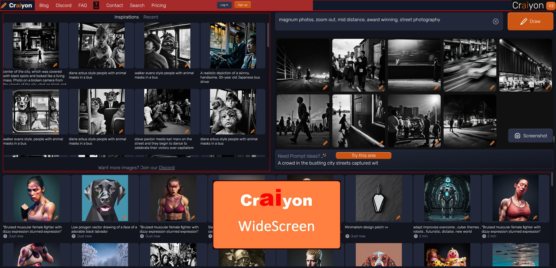
Take advantage of a large screen...
Craiyon Widescreen v.3 by decembre
Details
Authordecembre
LicenseNo License
Categorywidescreen, craiyon, wide, large, large screen
Created
Updated
Size26 kB
Statistics
Learn how we calculate statistics in the FAQ.
Failed to fetch stats.
Description
Notes
Userstyle doesn't have notes.Source code
Source code has over 10K characters, so we truncated it. You can inspect the full source code on install link./* ==UserStyle==
@name Craiyon Widescreen v.3
@namespace https://www.craiyon.com
@version 3.00.0
@author decembre
@description Using at its maximum a WideScreen
@license unlicense
==/UserStyle== */
@-moz-document domain("craiyon.com") {
/* ==== 0- Craiyon Widescreen v.3 - TEST FRESH ==== */
/* (new3) SUPP */
/* .flex.w-full.flex-row.justify-center.xl\:justify-between .relative, */
.relative.z-50.mt-24.hidden.\!w-\[336px\].flex-col.rounded-lg.xl\:flex ,
.mt-28.flex.flex-col.items-center.justify-center.text-center.text-base.text-white ,
.mt-10.flex.flex-col.items-center.justify-center.text-center.text-base.text-white.w-full.overflow-hidden ,
.flex.w-full.flex-col.justify-center a[href="/pricing"] ,
#merch-widget ,
#titleContainer p.text-white ,
footer ,
.pointer-events-none:not(img):before ,
.pointer-events-none:not(img):after ,
.pointer-events-none:not(img):not(.overflow-hidden) ,
.toaster {
display: none !important;
}
.vm-placement:not([style="display:none"]) {
min-height: 0px !important;
}
/* (new2) WIDE */
.flex.flex-col.items-center .flex.w-full.flex-col.px-4 {
display: inline-block !important;
width: 100% !important;
min-width: 100vw !important;
padding: 0 !important;
}
.flex.flex-col.items-center .flex.w-full.flex-col.px-4 .flex-row.mt-12 {
margin-top: 2.5rem !important;
}
.flex.flex-col.items-center .flex.w-full.flex-col.px-4 .mt-16.flex.flex-row.justify-center {
display: inline-block !important;
width: 100% !important;
min-width: 100vw !important;
margin: 0 !important;
background: green !important;
}
/* TOP to RIGHT */
/* (new3) WIDESCREEN */
.max-w-screen-md.grow-\[2\]{
max-width: 99% !important;
margin: 0 0 0 -10px !important;
/* border: 1px solid aqua !important; */
}
/* (new3) TOP HEADER */
#main > header {
position: fixed;
display: inline-block !important;
width: 100% !important;
height: 4.1vh !important;
padding: 0 5px !important;
border-radius: 0 0 0 0 !important;
z-index: 1 !important;
background: #111827 !important;
border: 1px solid red;
}
#main > header .realtive.mx-auto.flex {
position: fixed;
display: inline-block !important;
left: 0 !important;
padding: 2px 2px !important;
}
#main > header .realtive.mx-auto.flex .hidden.flex-row.items-center.justify-center.space-x-4 {
position: fixed;
display: inline-block !important;
width: 50% !important;
left: 80px !important;
top: 0 !important;
padding: 2px 8px !important;
background: brown !important;
}
#main > header .realtive.mx-auto.flex .hidden.flex-row.items-center.justify-center.space-x-4 .flex.items-center.justify-center.space-x-4 {
float: left !important;
clear: none !important;
width: 48% !important;
margin: 2px 0 0 0 !important;
padding: 2px 8px !important;
}
#main > header .realtive.mx-auto.flex .hidden.flex-row.items-center.justify-center.space-x-4 .flex.items-center.justify-center.space-x-4 + div {
width: 48% !important;
margin: -0.8vh 0 -0.5vh 0 !important;
padding: 2px 8px !important;
transform: scale(0.6) !important;
}
#main > header .realtive.mx-auto.flex .hidden.flex-row.items-center.justify-center.space-x-4 + .absolute.bottom-0 {
background-color: red !important;
}
/* (new3) RIGHT PANEL - APP / CREATE */
#app {
position: fixed !important;
width: 50% !important;
top: 4.6vh !important;
right: 10px !important;
z-index: 500000 !important;
}
#app .w-full {
width: 100% !important;
}
#app .w-full .aspect-w-1.aspect-h-1.mt-8 {
position: relative;
margin-top: 0.5rem;
padding-bottom: 40% !important;
background: #111 !important;
}
#app .w-full .aspect-w-1.aspect-h-1.mt-8 + .mt-12.flex.w-full.flex-col.items-start.justify-center.space-y-8.rounded-lg {
width: 100% !important;
margin-top: 0.3rem !important;
padding: 0.5rem !important;
}
#app .w-full .aspect-w-1.aspect-h-1.mt-8 + .mt-12.flex.w-full.flex-col.items-start.justify-center.space-y-8.rounded-lg .flex.flex-col.items-start.justify-center.space-y-4 {
float: left !important;
}
#app .w-full .aspect-w-1.aspect-h-1.mt-8 + .mt-12.flex.w-full.flex-col.items-start.justify-center.space-y-8.rounded-lg #promptContainer {
margin: 0 !important;
}
#app .w-full .aspect-w-1.aspect-h-1.mt-8 + .mt-12.flex.w-full.flex-col.items-start.justify-center.space-y-8.rounded-lg button {
position: absolute !important;
float: right !important;
width: 20% !important;
margin: -3vh 0 0 200px !important;
padding: 0 0.5rem !important;
}
#app .w-full .mt-6.flex.w-full.flex-col.justify-center.space-y-3.space-x-0 {
position: absolute !important;
width: 16% !important;
right: 10px !important;
margin: -15vh 0 0 0px !important;
padding: 0 0.5rem !important;
}
.flex.flex-col.items-center .flex.w-full.flex-col.px-4 .mt-16.flex.flex-row.justify-center .max-w-screen-md {
position: fixed !important;
display: inline-block !important;
width: 100% !important;
min-width: 100vw !important;
max-width: 100vw !important;
height: 80vh !important;
right: 0 !important;
top: 8.5vh !important;
padding: 2px 2px !important;
overflow: hidden !important;
overflow-y: auto !important;
background: #111 !important;
}
/* (new3) CRAIYON LOGO VERSION - SURVEY */
.max-w-screen-md #titleContainer {
position: fixed;
display: inline-block !important;
width: 155px !important;
top: 2.2vh !important;
right: 0 !important;
padding: 0 0px !important;
z-index: 500000 !important;
border-radius: 0 0 0 0 !important;
background: #111827 !important;
}
#titleContainer > .flex {
position: fixed !important;
display: inline-block !important;
width: 8vw !important;
height: 4vh !important;
right: 0 !important;
top: 0 !important;
padding: 2px 2px !important;
z-index: -1 !important;
background: #111 !important;
}
#titleContainer > .flex h1 {
height: 3.5vh !important;
}
#titleContainer > .flex p {
display: none !important;
}
/* CREATE FORM INPUT */
.mb-6.flex.w-full.flex-col.justify-center.space-y-3 {
position: fixed !important;
width: 60.5vw !important;
height: 8vh !important;
right: 160px !important;
top: 0 !important;
margin: 0 !important;
padding: 2px 2px !important;
z-index: -1 !important;
}
.mb-6.flex.w-full.flex-col.justify-center.space-y-3:focus-within,
.mb-6.flex.w-full.flex-col.justify-center.space-y-3:hover {
position: fixed !important;
width: 60.5vw !important;
height: 8vh !important;
right: 160px !important;
top: 0 !important;
margin: 0 !important;
padding: 2px 2px !important;
z-index: 500000 !important;
}
.mb-6.flex.w-full.flex-col.justify-center.space-y-3 textarea#prompt{
display: inline-block !important;
height: auto !important;
height: 7.5vh !important;
padding: 2px 2px !important;
resize: vertical !important;
}
.mb-6.flex.w-full.flex-col.justify-center.space-y-3 textarea#prompt:focus ,
.mb-6.flex.w-full.flex-col.justify-center.space-y-3:hover textarea#prompt{
display: inline-block !important;
height: auto !important;
min-height: 84vh !important;
max-height: 84vh !important;
padding: 2px 2px !important;
resize: vertical !important;
}
.mb-6.flex.w-full.flex-col.justify-center.space-y-3 + .flex.w-full.flex-col.items-center {
position: fixed !important;
display: inline-block !important;
width: 68.8vw !important;
right: 0 !important;
top: 8vh !important;
padding: 2px 2px !important;
z-index: -1 !important;
}
.mb-6.flex.w-full.flex-col.justify-center.space-y-3 + .flex.w-full.flex-col.items-center > div{
float: left !important;
width: 49% !important;
height: 14vh !important;
margin: 0 0px 0 10px !important;
padding: 2px 2px !important;
}
/* BUTTONS FIRST */
.mb-6.flex.w-full.flex-col.justify-center.space-y-3 + .flex.w-full.flex-col.items-center > div:first-of-type{
float: left !important;
width: 29% !important;
height: 14vh !important;
margin: 0 0px 0 10px !important;
padding: 2px 2px !important;
}
/* .mb-6.flex.w-full.flex-col.justify-center.space-y-3 + .flex.w-full.flex-col.items-center > div:first-of-type button */
/* INPUT LAST */
.mb-6.flex.w-full.flex-col.justify-center.space-y-3 + .flex.w-full.flex-col.items-center > div:last-of-type{
float: left !important;
width: 68% !important;
height: 14vh !important;
margin: 0 0px 0 10px !important;
padding: 2px 2px !important;
}
/* (new2) RESULTS */
#app + #search-results {
position: fixed !important;
width: 48% !important;
top: -2vh !important;
left: 10px !important;
border: 1px solid red !important;
}
#app + #search-results .mb-6.flex.w-full.flex-row.items-center.justify-center.space-x-4 {
margin-bottom: 0.5rem !important;
}
#app + #search-results .grid.w-full.grid-cols-2.gap-4.lg\:grid-cols-4:not(.overflow-hidden):not(.pointer-events-none) {
grid-template-columns: minmax(0px, 1fr) minmax(0px, 1fr) minmax(0px, 1fr) minmax(0px, 1fr);
height: 50vh !important;
overflow: hidden !important;
overflow-y: auto !important;
}
#app + #search-results .grid.w-full.grid-cols-2.gap-4.lg\:grid-cols-4.overflow-hidden.pointer-events-none {
position: fixed !important;
display: grid !important;
grid-template-columns: minmax(0px, 1fr) minmax(0px, 1fr) minmax(0px, 1fr) minmax(0px, 1fr) minmax(0px, 1fr) minmax(0px, 1fr) minmax(0px, 1fr) minmax(0px, 1fr);
height: 35vh !important;
width: 99% !important;
bottom: 1vh !important;
left: 10px !im...