Take advantage of a large screen...
Craiyon Widescreen v.6 by decembre
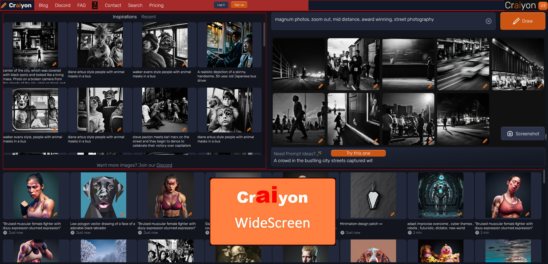
Details
Authordecembre
LicenseNo License
Categorywidescreen, craiyon, wide, large, large screen
Created
Updated
Code size17 kB
Code checksumb7f0dbae
Statistics
Learn how we calculate statistics in the FAQ.
Failed to fetch stats.
Description
Notes
Userstyle doesn't have notes.Source code
Source code has over 10K characters, so we truncated it. You can inspect the full source code on install link./* ==UserStyle==
@name Craiyon Widescreen v.6
@namespace https://www.craiyon.com
@version 6.00.0
@author decembre
@description Using at its maximum a WideScreen
@license unlicense
==/UserStyle== */
@-moz-document domain("craiyon.com") {
/* === Craiyon Widescreen v.6 (new6)- REWORK */
/* SUPP */
#main > header .font-rubik.text-base.font-normal.text-white .mx-auto.flex a.flex.text-base.font-medium.text-white img + img ,
a[href="/pricing"] ,
.overflow-x-hidden.bg-dark-blue div[style*="#CC5514;"],
.relative.mt-24.hidden {
display: none !important;
}
/* WIDE */
#main-widget .w-full.max-w-screen-md {
max-width: 100% !important;
}
#main-widget .w-full #inspirations-widget {
max-width: 100% !important;
}
/* TOP */
#titleContainer {
display: flex;
background: brown !important;
}
/* (new4) TOP HEADER */
#main > header {
position: fixed;
display: inline-block !important;
width: 100% !important;
height: 4vh !important;
padding: 0 5px !important;
border-radius: 0 0 0 0 !important;
z-index: 1 !important;
background: #111827 !important;
/*border: 1px solid red;*/
}
#main > header .font-rubik.text-base.font-normal.text-white {
position: fixed;
display: inline-block !important;
width: 50% !important;
height: 4vh !important;
left: 0 !important;
padding: 2px 2px !important;
/*border: 1px solid aqua !important;*/
}
#main > header .font-rubik.text-base.font-normal.text-white .mx-auto.flex{
position: fixed;
display: inline-block !important;
width: 55% !important;
height: 4vh !important;
left: 0px !important;
top: 0 !important;
padding: 2px 0 0 30px !important;
background: brown !important;
}
#main > header .font-rubik.text-base.font-normal.text-white .mx-auto.flex a.flex.text-base.font-medium.text-white {
float: left !important;
clear: none !important;
width: 18% !important;
height: 3.5vh !important;
line-height: 2.5vh !important;
margin: 1px 0 0 0 !important;
padding: 4px 8px !important;
/*border: 1px solid yellow !important;*/
}
#main > header .font-rubik.text-base.font-normal.text-white .mx-auto.flex a.flex.text-base.font-medium.text-white img {
width: 100% !important;
height: 3.4vh !important;
line-height: 3vh !important;
margin: -4px 0 0 0 !important;
padding: 0px 8px !important;
/*border: 1px solid yellow !important;*/
}
#main > header .font-rubik.text-base.font-normal.text-white .hidden.flex-row.items-center {
float: right !important;
margin: -0.6vh 0 0vh 0 !important;
padding: 2px 8px !important;
transform: scale(0.8) !important;
/*border: 1px dotted yellow !important;*/
}
/* (new5) CRAIYON LOGO VERSION - SURVEY */
#main header .mx-auto{
position: fixed !important;
display: inline-block !important;
width: 100% !important;
min-width: 100% !important;
top: 0vh !important;
right: 0 !important;
padding: 0 0px !important;
z-index: 50000000 !important;
border-radius: 0 0 0 0 !important;
background: #111827 !important;
/*border: 1px solid yellow !important;*/
}
#app #titleContainer {
position: fixed !important;
display: inline-block !important;
width: 44.5% !important;
bottom: 0vh !important;
right: 0 !important;
padding: 0 0px !important;
z-index: 50000000 !important;
border-radius: 0 0 0 0 !important;
background: brown !important;
/*border: 1px solid yellow !important;*/
}
#app #titleContainer > a.mb-6.flex.flex-row.items-center {
position: fixed !important;
display: inline-block !important;
width: 5vw !important;
height: 2.8vh !important;
line-height: 2.5vh !important;
margin: 0 0 4px 0 !important;
right: 10% !important;
bottom: 0vh !important;
padding: 2px 2px !important;
text-align: center !important;
z-index: -1 !important;
background: #111 !important;
/*border: 1px solid aqua !important;*/
}
#titleContainer > .flex h1 {
height: 3.5vh !important;
}
#titleContainer > .flex p {
display: none !important;
}
/* (new5) LEFTSIDE - DRAW + INSPIRATION */
.relative.flex.flex-col.items-center > .flex.w-full.flex-row.justify-center .mx-4.mt-16.flex.w-full.max-w-screen-md.flex-col {
position: fixed !important;
max-width: 53% !important;
top: -6vh !important;
/*border: 1px solid aqua !important;*/
}
/* (new5) CRAION - INSPIRATIONS - Masonry */
/* ===
Masonry : grid-template-rows: masonry
Can be enabled by setting layout.css.grid-template-masonry-value.enabled to true
FROM DEMOS:
== https://cdpn.io/jensimmons/fullembedgrid/QWj
==== */
/*#main-widget > .w-full {
background: olive!important;
border: 1px solid red !important;
}
#main-widget:has(.w-full) + #inspirations-widget{
background: goldenrod!important;
border: 1px solid red !important;
}
#main-widget:has(.w-full) + #inspirations-widget .mb-6 + .w-full {
background: gainsboro !important;
border: 1px solid red !important;
}*/
/*#main-widget .w-full #inspirations-widget .flex.w-full.flex-col.gap-2,*/
/*#main-widget:has(.w-full) + #inspirations-widget .mb-6.w-full + .w-full.overflow-hidden.pointer-events-none .flex.w-full.gap-2 */
/*#inspirations-widget:not(:has(.space-x-4 button:first-of-type.text-white)) > .w-full:not(.overflow-hidden):not(.mb-6) .flex.w-full.gap-2 ,*/
/*#main-widget:has(.w-full) + #inspirations-widget >.w-full + .w-full .flex.w-full.gap-2 .flex.w-full.flex-col.gap-2 ,
#main-widget:has(.w-full) + #inspirations-widget >.w-full:not(.overflow-hidden) + .w-full .flex.w-full.gap-2 .flex.w-full.flex-col.gap-2 {
display: grid;
grid-template-rows: masonry;
grid-template-columns: repeat(auto-fill, minmax(8rem, 1fr));
gap: 0.5rem;
width: 100% !important;
}*/
/* INSPIRATION */
#inspirations-widget:has(.space-x-4 button:first-of-type.text-white) .mb-6.w-full + .w-full {
/*background: blueviolet!important;*/
border: 1px solid red !important;
}
#inspirations-widget:not(:has(.space-x-4 button:first-of-type.text-white)) .mb-6 + .w-full > .flex.w-full.gap-2 > .flex.w-full.flex-col.gap-2 {
display: none !important;
}
/* INSPIRATION CONTAINER */
#inspirations-widget:has(.space-x-4 button:first-of-type.text-white) .mb-6.w-full + .w-full {
position: fixed !important;
width: 53.6% !important;
height: 30vh !important;
bottom: 0vh !important;
left: 5px !important;
padding: 4vh 5px 5px 5px !important;
z-index: 500 !important;
background: black !important;
/*border: 1px solid aqua !important;*/
}
#inspirations-widget:has(.space-x-4 button:first-of-type.text-white) .mb-6.w-full + .w-full:before {
content: 'INSPIRATION' !important;
position: fixed !important;
display: inline-block !important;
width: 53% !important;
margin: -3vh 0 0 0 !important;
text-align: center !important;
z-index: 500000 !important;
color: gold !important;
background: brown !important
}
/* INSPIRATION CONTAINER HOVER */
#inspirations-widget:has(.space-x-4 button:first-of-type.text-white) .mb-6.w-full + .w-full:hover {
position: fixed !important;
height: 79vh !important;
bottom: 0vh !important;
left: 5px !important;
padding: 5px !important;
z-index: 500 !important;
overflow: hidden !important;
overflow-y: auto !important;
background: brown !important;
/*border: 1px solid aqua !important;*/
}
/* INSPIRATION GRID */
#inspirations-widget:has(.space-x-4 button:first-of-type.text-white) .mb-6 + .w-full > .flex.w-full.gap-2 > .flex.w-full.flex-col.gap-2 {
display: grid !important;
grid-template-rows: masonry;
grid-template-columns: repeat(auto-fill, minmax(8rem, 1fr));
gap: 0.5rem;
width: 100% !important;
width: 55.5% !important;
height: 59vh !important;
bottom: 0vh !important;
left: 5px !important;
padding: 5px !important;
z-index: 500 !important;
/*background: #111 !important;*/
/*border: 1px solid aqua !important;*/
}
/* RECENTS */
#inspirations-widget:not(:has(.space-x-4 button:first-of-type.text-white)) > .w-full:not(.overflow-hidden):not(.mb-6) .flex.w-full.gap-2 .flex.w-full.flex-col.gap-2 {
max-width: 100% !important;
/*background: blueviolet !important;*/
/*border: 1px solid red !important;*/
}
/* RECENTS CONTAINER */
#inspirations-widget:not(:has(.space-x-4 button:first-of-type.text-white)) > .w-full:not(.overflow-hidden):not(.mb-6) {
position: fixed !important;
width: 53.6% !important;
height: 30vh !important;
bottom: 0vh !important;
left: 5px !important;
padding: 4vh 5px 5px 5px !important;
z-index: 500 !important;
background: black !important;
/*border: 1px solid aqua !important;*/
}
/* RECENTS CONTAINER HOVER */
#inspirations-widget:not(:has(.space-x-4 button:first-of-type.text-white)) > .w-full:not(.overflow-hidden):not(.mb-6):hover {
position: fixed !important;
height: 79vh !important;
bottom: 0vh !important;
left: 5px !important;
padding: 5px !important;
z-index: 500 !important;
overflow: hidden !important;
overflow-y: auto !important;
background: brown !important;
/*border: 1px solid aqua !important;*/
}
#inspirations-widget:not(:has(.space-x-4 button:first-of-type.text-white)) > .w-full:not(.overflow-hidden):not(.mb-6):before {
content: 'RECENTS' !important;
position: fixed !important;
display: inline-block !important;
width: 53% !important;
margin: -3vh 0 0 0 !important;
text-align: center !important;
z-index: 500000 !important;
color: gold !important;
background: brown !important
}
/* RECENTS GRID */
#inspirations-widget:not(:has(.space-x-4 button:first-of-type.text-white)) > .w-full:not(.ov...