It's wac's "responsive discord" style but i made it worse
Responsive Discord but i freaked it by quat1024
Details
Authorquat1024
LicenseGNU
Categorydiscord
Created
Updated
Size7.0 kB
Statistics
Learn how we calculate statistics in the FAQ.
Failed to fetch stats.
Description
Notes
THIS IS A MODIFIED VERSION OF THIS STYLE https://userstyles.world/style/2465/responsive-discord AND ITS JANKY AS HELL!!!!!!!! You gotta be careful!!!
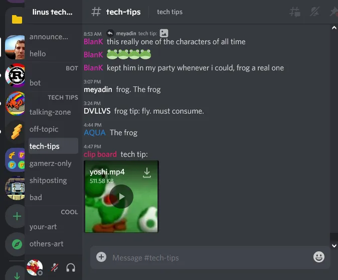
The original style was designed for mobile and touch devices, this style is designed for my vertical monitor and otherwise situations where the window is all scrungly and small. Its just stuff cobbled together over a couple days that i keep tweaking and revisiting. Its gonna look bad and there are known bugs with it. The goal was just to make more stuff fit on the page.
you have to use compact mode or its gonna break sorry
Don't use this style unless you know a good amount of CSS and are willing to go dig inside to tweak it the way you want. Consider it a ✨ starting point ✨ for your own css efforts
Source code
/* ==UserStyle==
@name         Responsive Discord but i freaked it
@version      69.420.2
@namespace    userstyles.world/user/wac
@description  its discord for my portrait mode screen lol
@author       wac, tweaked by quat
@license      GNU
==/UserStyle== */
/*
*
* THIS STYLE IS BASED ON https://userstyles.world/style/2465/responsive-discord THIS THEME by wac
* I THINK THEY KNOW MORE ABOUT WHAT THE SHIT THEYRE DOING!!!!!!!!!!!! Im just hacking away at it dont mind me!!!
*
* remember to use COMPACT MODE on discord because this will almost certainly explode into a million pieces on big mode!!!
Like sometimes the damn compactmode class is referenced just for css specificity haxxx dont question it
*
*/
@-moz-document domain("discord.com") {

	/* Remove dumb discord shit. If you like gifs and stickers you can open them from the emote picker widget */
	[aria-label="Boost this server"],
	[aria-label="Open sticker picker"],
	[aria-label="Open GIF picker"],
	[aria-label="Send a gift"],
	[data-list-item-id^="private-channels"][data-list-item-id$="_nitro"], /*i dunno if theres a changelog field im supposed to fill out or something but this selector added in 69.420.1 */
	.container-JMJRDf {
		display: none !important;
	}

	/* how do you feel knowing i hid the thing you wasted money on */
	[class^=avatarDecoration], div[aria-label*="Super reacted by"], div[aria-label="Add Super Reaction"], div[aria-label*="super react"] {
 	   display: none;
	}

	/* This makes the server picker on the left get kinda srungly when you reduce the screen size
	It looks kinda goofy ahh but it does free up a lot of important real estate for messages */
	.guilds-2JjMmN {
		width: min(72px, 7.5vw) !important;
	}

	/* Literally just fixing a discord bug... (subscribed-to channels wiggle around when
	you hover them and the icon gets swapped for the smaller Invite to Server icon) */
	.premiumChannelIcon-2P8uBD {
		padding: 0;
	}

	/* this is the width of my vertical monitor */
	@media only screen and (max-width: 1024px) {
		/*= ================ CHANNEL LIST=========== */
		:root {
			--channelbar-width: min(180px, 17vw);
		}
		.sidebar-1tnWFu {
			width: var(--channelbar-width, 72px) !important;
			overflow-x: hidden !important;
		}

		/* crop Server banners to the center of the image on the now-thinner channelbar instead of the left edge */
		.bannerImage-ubW8K- {
			margin-left: calc((240px - var(--channelbar-width)) / -2);
		}

		/* Hide channel list icons that arent important to see in tiny mode because the icons take up a ton of space */
		/* feel free to add or remove entries as you see fit */
		[aria-label="Text"],
		[aria-label="Text (NSFW)"],
		[aria-label="Text (Limited)"],
		[aria-label="Text (Active Threads)"],
		.arrow-2HswgU,
		.headerChildren-2qV9P8 {
			display: none;
		}
		/* I keep clicking these mfs that appear on hover on accident */
		[aria-label="Create Channel"],
		[aria-label="Create Invite"],
		[aria-label="Edit Channel"] {
			display: none !important;
		}

		/* Text and voice channels */
		.content-1gYQeQ {
			padding: 0;
			padding-left: 2px;
		}

		/* Threads..... this makes the name overlap the little elbow, im not sure how to fix it */
		.typeThread-2Aqh6X .content-1gYQeQ {
			margin-left: 18px;
		}

		/* section headings (epic styling imo) */
		.wrapper-1S43wv {
			padding: 0;
			padding-left: 10px;
			border-top: 1px solid rgba(255, 255, 255, 0.04);
			text-align: right;
		}

		/* memebrs chatting in a voice channel */
		.list-2x9Cl9 {
			padding-left: 18px;
		}

		/* tighten spacing on the channel list in general */
		.content-2a4AW9 li {
			padding-top: 0px;
		}

		/* give a TINY bit of space to the user name at the bottom of the channel list
		   Original theme had more aggressive relayouts here*/
		[aria-label="User area"] .container-YkUktl,
		[aria-label="User area"] .container-YkUktl .flex-2S1XBF {
			padding: 0;
		}
		[aria-label="Set Status"] {
			margin: 4px;
			min-width: unset;
		}

		/* More room in the compose message box */
		[aria-label="Upload a file or send invites"] {
			padding: 0 10px;
		}

		/* Fixes the "Events" display (prevents it from wrapping) idk what th is does lol it was in the original theme*/
		.name-28HaxV {
			height: 20px;
			/* value from line-height */
			white-space: nowrap;
			overflow: hidden;
			text-overflow: ellipsis;
		}

		/*================= TOP BAR THING ================*/
		/* hide toolbar containing threads, notifs, pin messages, users sidebar etc unless hovered
        this gives a ton more screen real estate to the channel name and description. Its not a very good
		solution tbh (they all shift around when you hover over them waaagh) but it works so thats kinda epic
		Please fix this for me thanks */
		.toolbar-3_r2xA {
			max-width: 100px;
			opacity: 0.2;
		}
		.toolbar-3_r2xA:hover {
			max-width: unset;
			opacity: 1;
		}

		/*================= CONTENST OF THE CHANNEL ================*/
		/* Makes images and embeds horizontally scrollable, so they don't just cut off */
		.messageAttachment-CZp8Iv,
		.grid-1aWVsE {
			/* ORIGINAL THEME HAD THIS UNCOMMENTED: (i dont think its important though */
			/*x-width: calc(100vw - 72px - var(--channelbar-width) - 16px - 12px);*/
			/* In order: screen width, server sidebar, channels sidebar, right padding, fix*/
			overflow: auto;
		}

		/* Less room for timestamps because theyre too fucking wide */
		.compact-2Nkcau.wrapper-30-Nkg {
			padding-left: 4rem;
		}
	}

	/* even smoller screens */
	@media only screen and (max-width: 900px) {
		/* Trim off more padding???? */
		.compact-2Nkcau .contents-2MsGLg {
			margin-left: 0;
			padding-left: 0;
		}
		.message-2CShn3 {
			padding-right: 0 !important;
		}
		.compact-2Nkcau .contents-2MsGLg {
			text-indent: 0em;
		}
		[aria-roledescription="Message"] {
			padding-left: 0.2rem !important;
			/* THIS IS janky sorry */
		}
		/* Move the timestamps above usernames so theres more room for message content
		     UNBELIEVEABLE hacky css inbound..... (the .compact selector is just a specificity hack)
		   SHOUTOUTS TO DISCORD FOR ALSO TAGGING (edited) WITH THE TIMESTAMP CLASS BTW realy good work guys */
		.compact-2Nkcau h2 .timestamp-p1Df1m {
			position: relative;
			bottom: 17px;
			text-align: left;
			font-size: 0.6rem;
			width: 0px;
			white-space: nowrap;
			margin: 0;
			/* u know the css is good because it has a random unexplainable pixel offset glued to the end */
			margin-right: -4px;
		}

		/* This mf is too big sorry */
		.botTagCompact-1idyyC {
			transform: scale(80%)
		}

		/* replies look like SHIT without this */
		div[id^="message-reply-context"] {
			position: relative;
			left: 45px;
			top: 5px;
			font-size: 0.7rem;
		}

		div[id^="message-reply-context"]:before{
			display: none;
		}
	}
}