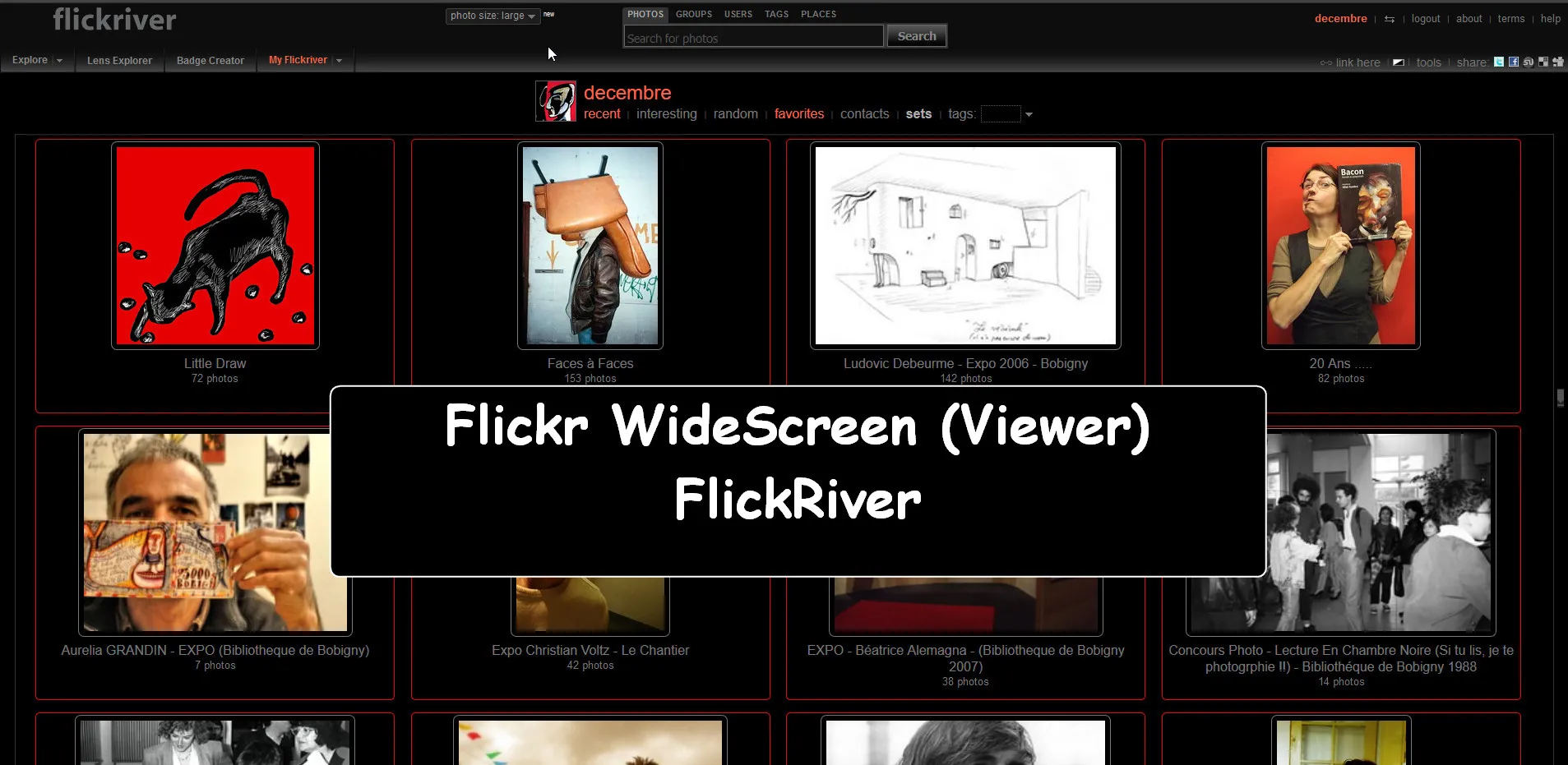
▶ WIDE style For:
FlickRiver (Flickr viewer)
▶ For a WIDESCREEN!
Less Scrolling:
Thumbnail fit your large screen.
Flickr WideScreen (Viewer) - FlickRiver v.16 by decembre
Imported and mirrored from https://raw.githubusercontent.com/uso-archive/data/flomaster/data/usercss/126659.user.css
Details
Authordecembre
Licenseunlicense
Categoryflickriver, widescreen, flickr
Created
Updated
Size20 kB
Statistics
Learn how we calculate statistics in the FAQ.
Failed to fetch stats.
Description
Notes
For FlickRiver (a Flickr viewer) and a Large Screen...
What it do :
- Less scrolling experience,
- Smaller Thumbnails which fit All the screen:
- Each row display 2x4 thumbs.
- Show a Counter for each original row, so tou know where you are......
- Add compatibility with Previewer addons (now you can preview the thumb on hover).
Like this one (the better for me!):
- PhotoShow by Vincent W.
▶ Change in v.16:
- Center Images vertically
- Description
- Corrections for Sets pages
- Better loading when only one row.
Test link:
FlickRiver: .ruzz
- Auto loading work fine now....
- Better "Large" and "Fit Scale" views;
- Add indicator for visited images ( need you keep history in your browser settings)
Note:
- You can install too "View on Flickriver" Greasemonkey script:
"adds Flickriver links to various Flickr photo pages - user photos, favorites, pools etc, allowing to quickly open the corresponding Flickriver view" - It is useful too when you want use:
Flickr Functional Suite - NEW 2014 is a new working version
It's a part of my "Flickr WideScreen Collection".
▶ My "Flickr WideScreen" Userstyles:
► To install them all at once, as Userscript or Userstyle, a new alternative:
Flickr WideScreen - BigONE [userstyles.world - USw]
or
Flickr WideScreen - BigONE [GreasyFork]
► For Better result you need to use dark and minimal scrollbars with it:
- For Firefox Quantum / Chrome (with Stylus):
Overlay Scrollbars - easy customizable - For Waterfox "Classic" 56:
My Firefox - Slim Dark Scrollbar
▶ You Can Find Many Other Updated Infos About Flickr Extensions / Userscripts / Userstyles / Applications..
In :
► My BIG List (After New Photo Page Design (Created in 2015) - Updated in 2022.
I have Updated all links from userscripts.org (defunct) ,
to point now to userscripts-mirror.org (Archives).
►To install Userstyles (CSS customization) :
Stylish
or better now:
Stylus, Easily install themes and skins for many popular sites [all Browsers Addons]
Stylus Addons).
▶ Last note about FlickRiver:
In 2025, it work always, but seems to have randomly problem.
Read:
Source code
Source code has over 10K characters, so we truncated it. You can inspect the full source code on install link./* ==UserStyle==
@name Flickr WideScreen (Viewer) - FlickRiver v.15
@namespace USO Archive
@author decembre
@description ▶ WIDE style For Flickriver (a Flickr viewer): https://www.flickriver.com/ ▶ It's for a WIDESCREEN(1920x1080)! Less Scrolling: Thumbnail fit your large screen...
@version 20220325.00.25
@license NONE
@preprocessor uso
==/UserStyle== */
@namespace url(http://www.w3.org/1999/xhtml);
@-moz-document domain("flickriver.com") {
/* ==== Flickr WideScreen (Viewer) - FlickRiver v.15.1 ==== */
/* TEST view large
http://www.flickriver.com/photos/pryingopen/popular-interesting/
==== */
img.photo-protector {
display: none !important;
opacity: 0 !important;
visibility: hidden !important;
}
/* (new8) TOP HEADER */
#logo {
left: 64px;
position: absolute;
top: 20px;
}
#login-logout {
font-size: 0.8em;
padding-bottom: 2px;
position: absolute;
right: 10px;
top: 25px;
}
#header {
position: relative;
height: 63px;
padding-bottom: 0 !important;
padding-left: 2px;
padding-top: 0.5em;
border: medium none;
overflow: hidden;
background: #0d0d0d !important;
}
/* (new8) */
body.river.viewlarge:not(.fitscreen) ,
body.river:not(.fitscreen) {
width: 100% !important;
margin-left: 0 !important;
margin-top: -16px !important;
}
#top-badge-menu {
position: absolute;
top: -3px;
left: 28%;
}
.top-toolbar {
display: inline-block !important;
width: 1907px !important;
height: 55px !important;
margin-bottom: 14px !important;
margin-top: -14px !important;
}
#tool-menu {
float: right;
font-size: 0.9em;
margin-right: 6px;
margin-top: -24px;
padding-bottom: 2px;
text-align: right;
}
/* LARGE */
body.river.viewlarge > center #tool-menu {
float: right;
font-size: 0.9em;
margin-right: 6px;
margin-top: -24px;
padding-bottom: 2px;
text-align: right;
}
.menu {
margin-top: -20px !important;
padding-top: 0;
}
/* (new8) PHOTO PAGE */
.river:not(.fitscreen):not(.viewlarge) #photos .photos-page {
float: left !important;
clear: none !important;
width: 48% !important;
height: 285px !important;
margin-left: 1em;
margin-bottom: 5px !important;
/* padding-right: 1em !important; */
overflow: hidden !important;
border: 1px solid #222 !important;
}
/* SHOTS IN DOUBLE NOT DISPLAYED */
.river:not(.fitscreen).river:not(.fitscreen):not(.viewlarge) #photos .photos-page .photo-panel:not(.set) {
/* display: inline-block !important; */
float: left !important;
clear: right !important;
width: 24% !important;
/* min-width: 475px !important; */
/* max-width: 500px !important; */
margin-right: -0.8em;
margin-left: 1em;
/* margin: auto !important; */
margin-bottom: -6em;
margin-top: 0em;
/* padding-right: 1em !important; */
padding: 2px 0 0;
/* text-align: center !important; */
transform: scale(0.4);
transform-origin: left top 0;
}
/* (new15) */
.river:not(.fitscreen):not(.viewlarge) .photo-panel .photo-img-container,
.river:not(.fitscreen):not(.viewlarge) .photo-panel .photo-video-container {
position: relative;
width: 500px !important;
height: 634px !important;
/* border: 2px solid #222 !important; */
/* border: 2px solid aqua !important; */
}
/* (new10) A VOIR for SET */
/* .river:not(.fitscreen):not(.viewlarge) #photos div.photos-page[id=""]:nth-child(2n):last-of-type,
.river:not(.fitscreen):not(.viewlarge) .photos-page:last-of-type {
display: inline-block;
float: left;
height: 490px !important;
margin-top: 0px !important;
opacity: 0;
transform: scale(0.3);
transition: all 0.7s ease 0s;
min-width: 100% !important;
outline: 1px solid #222 !important;
} */
/* (new9) BIG PROGRESS BAR */
#big-progress {
display: inline-block !important;
float: left !important;
width: 100% !important;
height: 20px !important;
margin-bottom: 0px;
top: 0px !important;
padding-bottom: 0px !important;
text-align: center !important;
/* background: blue !important; */
}
/* (new10) FIRST LOAD + SETS*/
.river>center {
display: inline-block !important;
min-height: 100vh !important;
}
.river>center > #photos {
display: inline-block !important;
height: 100% !important;
min-height: 100vh !important;
min-height: 100vh !important;
/* background: green !important; */
}
/*.river:not(.fitscreen):not(.viewlarge) .tools-panel[style="display:none;"] + br + center .top-toolbar + #user-tags + #photos .photos-page:not([id=""]):not(:first-of-type) */
.river:not(.fitscreen):not(.viewlarge) .tools-panel[style="display:none;"] + br + center .top-toolbar + #user-tags + #photos .photos-page:not([id=""]):only-of-type {
/* position:fixed !important; */
/* position: relative !important; */
/* display: inline-block !important; */
clear: none;
float: left !important;
height: auto !important;
width: 100% !important;
min-width: 99.9% !important;
max-width: 99.9% !important;
top: 0px !important;
margin-top: 0px !important;
margin-left: 0px !important;
/* margin-bottom: 5px; */
/* margin-left: 0em !important; */
overflow: hidden;
opacity: 1 !important;
/* transform: scale(0.9) !important; */
/* background: aqua !important; */
border: 1px solid red !important;
}
.river:not(.fitscreen):not(.viewlarge) .tools-panel[style="display:none;"] + br + center .top-toolbar + #user-tags + #photos .photos-page:not([id=""]):only-of-type .photo-panel:not(.set) {
clear: right;
float: left;
width: 24%;
margin: 0 -0.8em -6em 1em;
padding: 2px 0 0;
transform: scale(0.7);
transform-origin: left top 0;
}
/* (new10) SETS */
.river:not(.fitscreen):not(.viewlarge) .tools-panel[style="display:none;"] + br + center .top-toolbar + #user-tags + #photos .photos-page:not([id=""]):only-of-type .photo-panel.set {
/* display: inline-block !important; */
clear: right;
float: left !important;
width: 26.3% !important;
height: 260px !important;
line-height: 260px !important;
margin: 5px -150px -35px 20px !important;
padding: 2px 0 0;
border-radius: 5px 5px 0 0 !important;
transform: scale(0.7);
transform-origin: left top 0;
background: black !important;
border: 1px solid red !important;
}
.river:not(.fitscreen):not(.viewlarge) .photo-panel.set .photo-meta {
max-width: 502px !important;
min-width: 502px !important;
left: -1px !important;
bottom: -53px !important;
border-radius: 0 0 5px 5px !important;
background: #333 !important;
border: 1px solid red !important;
}
.photo-panel.set img {
display: inline-block !important;
height: 240px !important;
border: 1px solid #777;
border-radius: 7px;
padding: 6px;
}
/* (new15) IMAGE - for MEDIUM 640 */
.river:not(.fitscreen):not(.viewlarge) #photos .photos-page .photo-img-container > a >img[src$="_z.jpg"] {
max-width: 500px !important;
height: auto !important;
/* max-height: 400px !important; */
height: 634px !important;
object-fit: contain !important;
border: none !important;
/* outline: 1px solid violet !important; */
}
/* (new13) METAS */
.river:not(.fitscreen):not(.viewlarge) .photo-meta {
position: absolute !important;
display: inline-block !important;
height: 50px !important;
line-height: 50px !important;
min-width: 503px !important;
max-width: 503px !important;
margin-top: 0.4em;
bottom: -60px !important;
left: 0 !important;
padding-bottom: 1px;
transform: scale(1) !important;
transform-origin: top center;
/* translate: */
font-size: 30px !important;
overflow: hidden !important;
z-index: 5000 !important;
background: #333 !important;
}
.river:not(.fitscreen):not(.viewlarge) .photo-meta:hover {
position: absolute !important;
display: inline-block !important;
/* height: 50px !important; */
height: auto !important;
min-height: 50px !important;
line-height: 40px !important;
/* width: 226% !important; */
min-width: 503px !important;
max-width: 503px !important;
margin-top: 0.4em;
bottom: -60px !important;
left: 0 !important;
padding-bottom: 5px;
padding-top: 20px !important;
transform: scale(1) !important;
transform-origin: top center;
font-size: 30px !important;
overflow: hidden !important;
z-index: 5000 !important;
color: gold !important;
background: #333 !important;
}
.photo-title {
display: inline-block;
min-width: 90% !important;
padding-right: 5px !important;
padding-left: 5px !important;
}
.river:not(.fitscreen):not(.viewlarge) .photo-meta .photo-owner {
display: inline-block;
min-width: 90%;
padding: 5px !important;
}
.river:not(.fitscreen):not(.viewlarge) .photo-meta:hover .photo-title a {
border-bottom: none ;
text-decoration: none !important;
color: gold !important;
}
.river:not(.fitscreen):not(.viewlarge) .photo-more-info-panel {
position: absolute !important;
/* display: inline-block !important; */
height: 155px !important;
line-height: 1em;
width: 225% !important;
min-width: 225% !important;
max-width: 225% !important;
padding: 0 5px 0 5px !important;
margin-top: 0em !important;
top: 0em !important;
font-size: 37px !important;
transform: scale(1) !important;
overflow: hidden !important;
/* overflow-y: auto !important; */
z-index: 5000000 !important;
border: 1px dotted #4e4e4e;
/* background: green !important; */
}
.river:not(.fitscreen):not(.viewlarge) .photo-more-info-panel.docked {
position: absolute !important;
/* display: inline-block !important; */
height: 658px !important;
top: 0.2em !important;
padding: 5px !important;
/* margin-top: -10em !important; */
/* background-image: linear-gradient( to right, red, #f06d06, rgb(255, 255, 0), green) !important; */
/* background-image: lin...