Compact userstyle for a widescreen:
Less scrolling !
UserStyles.World (USw) - WideScreen v.62 by decembre
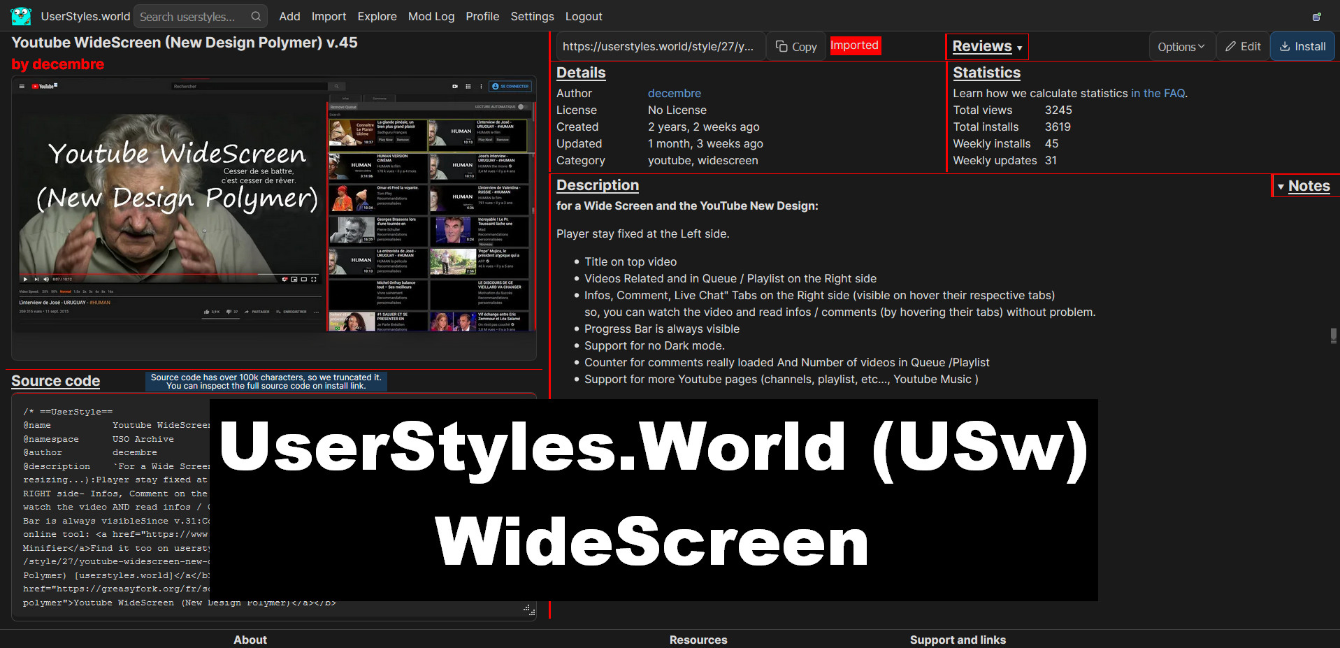
Details
Authordecembre
LicenseNo License
CategoryUserStyles.World, widescreen
Created
Updated
Code size89 kB
Code checksum4cbf3d48
Statistics
Learn how we calculate statistics in the FAQ.
Failed to fetch stats.
Description
Notes
▶ NOTES (2023.08):
- Updated ONLY on Userstyles.world (USw) and GreasyFork:
Usersytles.org is broken for me (their new design don't permit Login! - request done 2023.08)
Tested for Dark and Light Mode... and not "Follow System Theme".
Test Links (with reviews):
UserStyles.world Tweaks - by vednoc
Last Changes
v.62:
- Support the New section "Reviews" in our profile page (show - With edit function - our Reviews done Others Userstyles)
Read:
[Add the list of userstyles that we reviewed/faved #106 - Userstyles-world / GitHub]
v.61:
- Improve Docs
- Userstyles Edit page: Indicator for limit of Characters (50) in Title form
- Correction for Search and Home pages
v.54: - Adaptation for NEW "Opt in and help us test (unfinished) features." enable / disable
- Well balanced cards size
v.42: - Big Site's Code Update which need a total Rewriting of this userstyle...
Find it here (same version):
- UserStyles.World (USw) - WideScreen [userstyles.world- USw]
- UserStyles.World (USw) - WideScreen [Greasyfork]
And (but not Updated Here, because Userstyles.org became sooo crappy and unusable):
Source code
Source code has over 10K characters, so we truncated it. You can inspect the full source code on install link./* ==UserStyle==
@name UserStyles.World (USw) - WideScreen v.62
@namespace userstyles.world.com
@version 620.00.5
@author decembre
@description Compact userstyle for a widescreen: Less scrolling
@license unlicense
@preprocessor uso
==/UserStyle== */
@-moz-document domain("userstyles.world") {
/* ==== 0- UserStyles.World (USw) - WideScreen ) v.62 (new62.5) - TEST > ENABLE-OPT : A / B / A+B -(URL PREF) ==== */
/* (new42) START- WIDESCREEN - ALL */
html[data-color-scheme="dark"] {
background: #222 !important;
}
html[data-color-scheme="light"] {
background: white !important;
}
html:not([data-color-scheme="light"]):not([data-color-scheme="dark"]) {
background: white !important;
}
/* (new42) TOP NAVBAR - ALL */
.navbar {
position: sticky !important;
display: inline-block !important;
width: 100% !important;
min-width: 100% !important;
top: 0rem !important;
z-index: 500 !important;
}
nav > .wrapper {
display: inline-block !important;
width: 100% !important;
min-width: 100% !important;
}
nav.navbar ul.menu {
padding: 0 !important;
}
nav a.left {
display: inline-block !important;
height: 4vh !important;
line-height: 4vh !important;
margin-right: auto;
padding: 0 !important;
}
nav a.left svg {
position: relative !important;
display: inline-block !important;
height: 38px !important;
line-height: 38px !important;
top: 0.5vh !important;
}
nav a.left .name {
position: relative !important;
display: inline-block !important;
height: 2vh !important;
line-height: 2vh !important;
top: -1vh !important;
padding: 0 !important;
}
.navbar .menu {
align-items: center;
display: inline-flex !important;
}
/* (new52) NAVBAR SIDEBAR - [data-flags="sidebar"] > [data-flags*="sidebar"] */
[data-flags*="sidebar"] {
padding-left: 0 !important;
}
body[data-flags*="sidebar"] #navbar .name::after {
content: "🔻";
position: relative ;
height: 1rem;
left: 10px !important;
right: 0 !important;
top: 0px;
z-index: 0;
}
#navbar a.logo:hover:not(.btn),
#navbar a.logo:active:not(.btn),
#navbar a.logo:focus:not(.btn) {
text-decoration: unset !important;
}
body[data-flags*="sidebar"] #navbar {
position: sticky !important;
display: inline-block !important;
width: 100% !important;
min-width: 15% !important;
max-width: 15% !important;
height: 5vh !important;
top: 0rem !important;
left: 0 !important;
padding-top: 0.9vh !important;
border-radius: 0 0 5px 0!important;
overflow: hidden !important;
overflow-y: hidden !important;
z-index: 500 !important;
border: none !important;
}
body[data-flags*="sidebar"] #navbar:hover {
position: sticky !important;
display: inline-block !important;
width: 100% !important;
height: 5vh !important;
top: 0rem !important;
left: 0 !important;
padding: 0.6vh 0 0 0 !important;
overflow: visible !important;
overflow-y: visible !important;
z-index: 500 !important;
/* border: 1px solid aqua !important; */
}
body[data-flags*="sidebar"] #navbar:hover .menu {
position: relative !important;
display: inline-block !important;
width: 100% !important;
min-width: 100% !important;
max-width: 100% !important;
padding: 0.2vh 15px 0 15px !important;
border-radius: 0 0 5px 0 !important;
z-index: 5000 !important;
/* background: red !important; */
border: 1px solid red !important;
}
/* DARK /NOT DARK */
html[data-color-scheme="dark"] body[data-flags*="sidebar"] #navbar:hover .menu {
background: #111 !important;
}
html[data-color-scheme="light"] body[data-flags*="sidebar"] #navbar:hover .menu {
background: white !important;
}
/* (new54) DROPDOWN MENU - OPTIONS */
.Dropdown:hover > ul,
.Dropdown:focus-within > ul {
display: flex;
left: 40% !important;
top: 0vh !important;
/* background: red !important; */
}
#navbar .Dropdown:hover ,
#navbar .Dropdown:focus-within {
margin: 0 0 0 -10px !important;
padding: 0 0 0 5px !important;
border-left: 3px solid red !important;
}
/* (new53) DROPDOWN MENU - OPTIONS */
main#content section.header.flex .Dropdown:hover > ul,
main#content section.header.flex.Dropdown:focus-within > u {
display: flex;
left: 5% !important;
top: 2vh !important;
}
/* (new42) MAIN CONTAINER - ALL */
html body > main {
display: inline-block;
height: 100vh !important;
min-height: calc(100vh - 130px);
width: 100%;
/* border: 1px solid red !important; */
}
/* (new42) 2nd CONATINER - ALL */
main .wrapper {
width: 100%;
min-width: 100% !important;
max-width: 100% !important;
margin: auto;
padding: 0 1rem 0 1rem;
/* border: 1px solid violet !important; */
}
/* (new42) CARDS CONTAINER - ALL */
.rwrap {
flex-flow: row wrap;
margin-top: 0 !important;
overflow-x: hidden !important;
/* border: 1px solid aqua !important; */
}
/* (new54) FOOTER - STCKY BOTTOM - ALL */
/* .Footer-wrapper.u-LayoutMaxWidth , */
body > b ,
html body[data-flags*="view_redesign"] > body > b ,
html body[data-flags*="sidebar"] > b {
position: fixed !important;
height: 3vh !important;
width: 100% !important;
bottom: 0.2vh !important;
left: 0 !important;
right: 0 !important;
transition: unset !important;
overflow: hidden !important;
z-index: 50000000 !important;
/* background: red !important; */
}
.u-LayoutMaxWidth {
width: 100%;
padding: 0 1rem !important;
margin: 0 !important;
}
/* (new54) */
footer.Footer{
position: fixed !important;
/* display: inline-block !important; */
height: 3vh !important;
width: 100% !important;
bottom: 0.2vh !important;
overflow: hidden !important;
z-index: 5000 !important;
transition: height ease 0.7s !important;
}
/* (new54) */
footer.Footer:hover{
position: fixed !important;
height: 30vh !important;
width: 99.9% !important;
bottom: 0.2vh !important;
overflow: hidden !important;
z-index: 5000 !important;
transition: height ease 0.7s !important;
}
/* (new53) MEMO - OPTions */
/* (new53) ENABLE-OPT A [SIDEBAR] - WIDESCSREEN - ALL */
body[data-flags*="sidebar"] {
width: 100% !important;
/* border: 1px solid aqua !important; */
}
/* (new53) ENABLE-OPT B [SIDEBAR] - WIDESCSREEN - ALL */
body[data-flags*="view_redesign"] {
width: 100% !important;
/* border: 1px solid lime !important; */
}
/* (new53) ENABLE-OPT A + B [SIDEBAR + NEW DESIGN] - WIDESCSREEN - ALL */
body[data-flags*="sidebar"][data-flags*="view_redesign"] {
width: 100% !important;
/* border: 1px dotted fuchsia !important; */
}
/* (new42) END - WIDESCREEN - ALL */
}
@-moz-document url-prefix("https://userstyles.world/search?q="), url-prefix("https://userstyles.world/search?"), url("https://userstyles.world/explore"), url("https://userstyles.world/") {
/* SHOME / SEARCH / EXPLORE */
/* (new54) URL PREF - HOME /SEARCH / EXPLORE - MAIN CONTAINER */
body[data-flags*="view_redesign"] > main ,
html body > main {
display: inline-block;
height: 100vh;
width: 100%;
margin: 1.2vh 0 0 0 !important;
}
body[data-flags*="sidebar"][data-flags*="view_redesign"] > main ,
body[data-flags*="sidebar"] > main {
display: inline-block;
height: 100vh;
width: 100%;
margin: 2.2vh 0 0 0 !important;
}
/* (new54) URL PREF - HOME /SEARCH / EXPLORE - SECTIONS ALL */
html body > main section:not(.Pagination-wrapper){
display: inline-block !important;
width: 100%;
min-width: 100% !important;
max-width: 100% !important;
margin: -1vh 0 0 0 !important;
}
/* (new54) URL PREF - HOME /SEARCH / EXPLORE - TOP TITLE */
html body > main section.header.flex:not(.Pagination-wrapper){
display: inline-block !important;
width: 100%;
min-width: 100% !important;
max-width: 100% !important;
}
/* (new54) URL PREF - HOME /SEARCH / EXPLORE - RESULTS */
html body > main#content section.header.flex + section + section:not(.Pagination-wrapper) {
display: inline-block !important;
width: 100%;
min-width: 100% !important;
max-width: 100% !important;
height: 100vh;
}
/* (new54) URL PREF - HOME /SEARCH / EXPLORE - TOP HEADER EXPLORE / SEARCH */
.wrapper .header {
position: sticky;
display: inline-block;
min-width: 100%;
right: 42px;
text-align: center;
top: -5px !important;
margin-top: -2rem;
width: 100%;
z-index: 500000 !important;
background: #111 !important;
}
/* (new54) URL PREF - HOME /SEARCH / EXPLORE - TOP TITTLE - STICKY */
.wrapper .header.flex {
position: sticky !important;
display: inline-block !important;
width: 100%;
min-width: 100%;
margin-top: 0rem !important;
right: 42px;
top: 0vh !important;
text-align: center;
z-index: 50000 !important;
background: red !important;
}
/* (new54) URL PREF - HOME /SEARCH / EXPLORE - TOP FORM - STICKY */
.wrapper .header.flex + section {
position: sticky;
display: inline-block !important;
width: 100vw !important;
min-width: 98.8vw !important;
max-width: 98.8vw !important;
top: 0vh !important;
right: 0 !important;
left: 0 !important;
margin: 0 0rem -1.5rem -1rem !important;
text-align: center;
z-index: 5000;
background: #111 !important;
}
/* (new54) URL PREF - HOME /SEARCH / EXPLORE - CARD SIZE */
.card.col.gap {
min-width: 13.9% !important;
max-width: 13.9% !important;
flex-basis: unset !important;
margin: 0 0.2rem 0.5rem !important;
padding: 0.2rem !important;
border: 1px solid red !important;
}
.wra...